Download to read offline
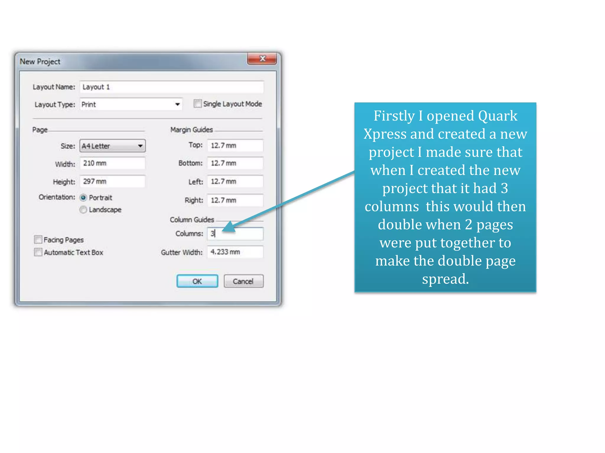
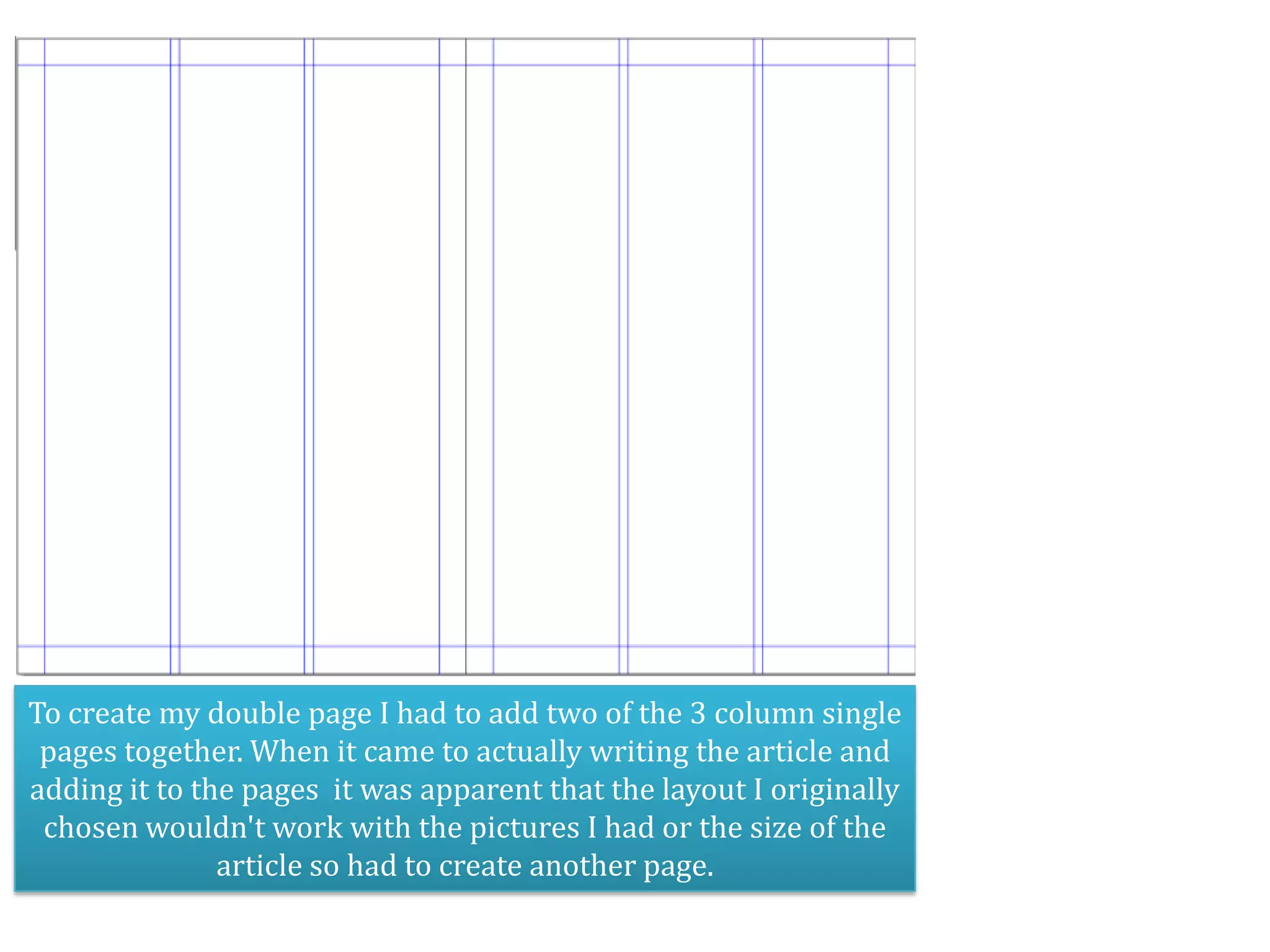
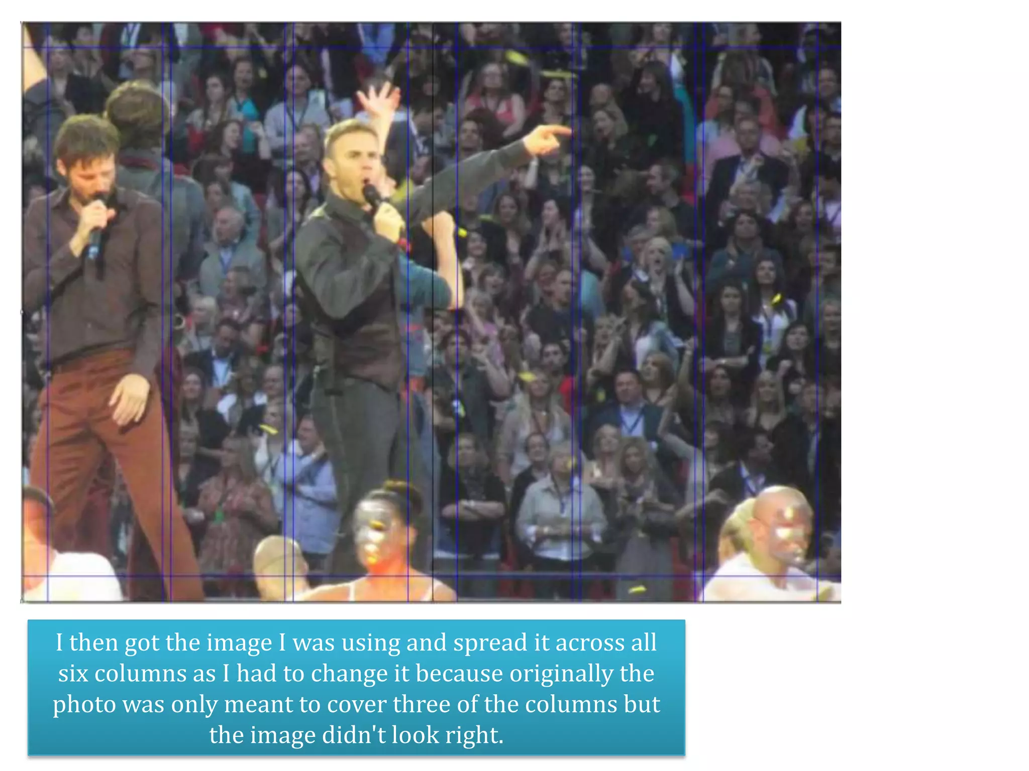
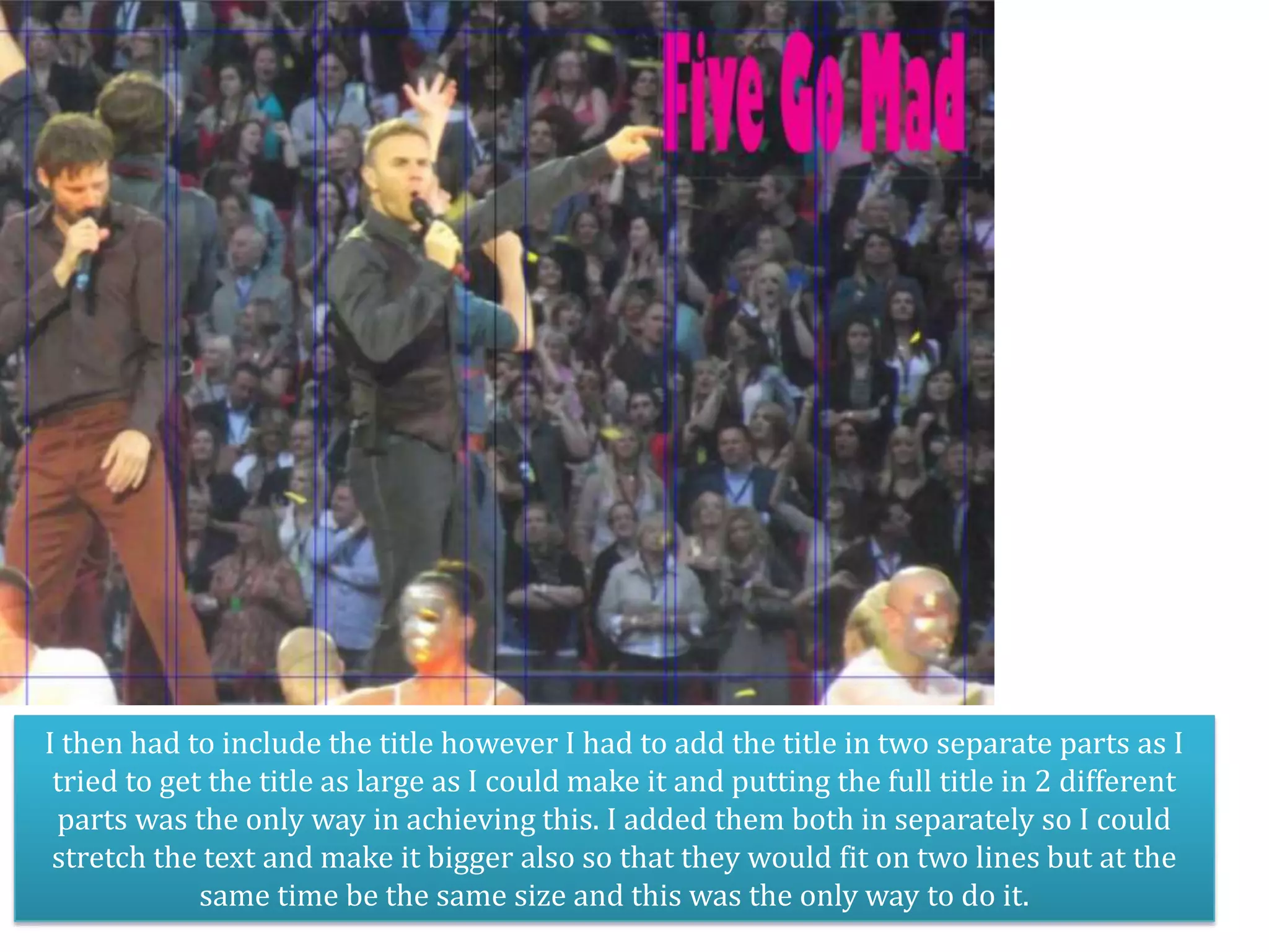
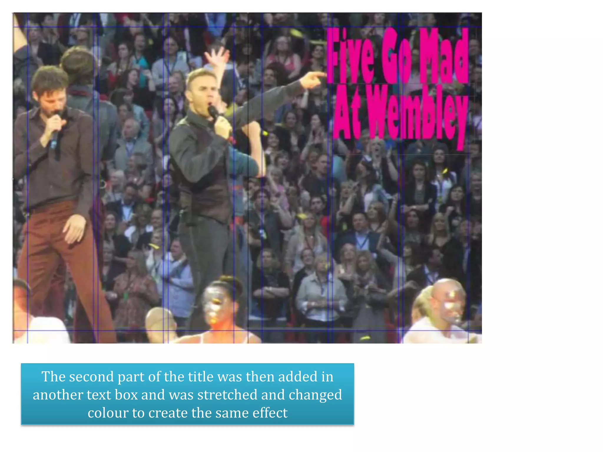
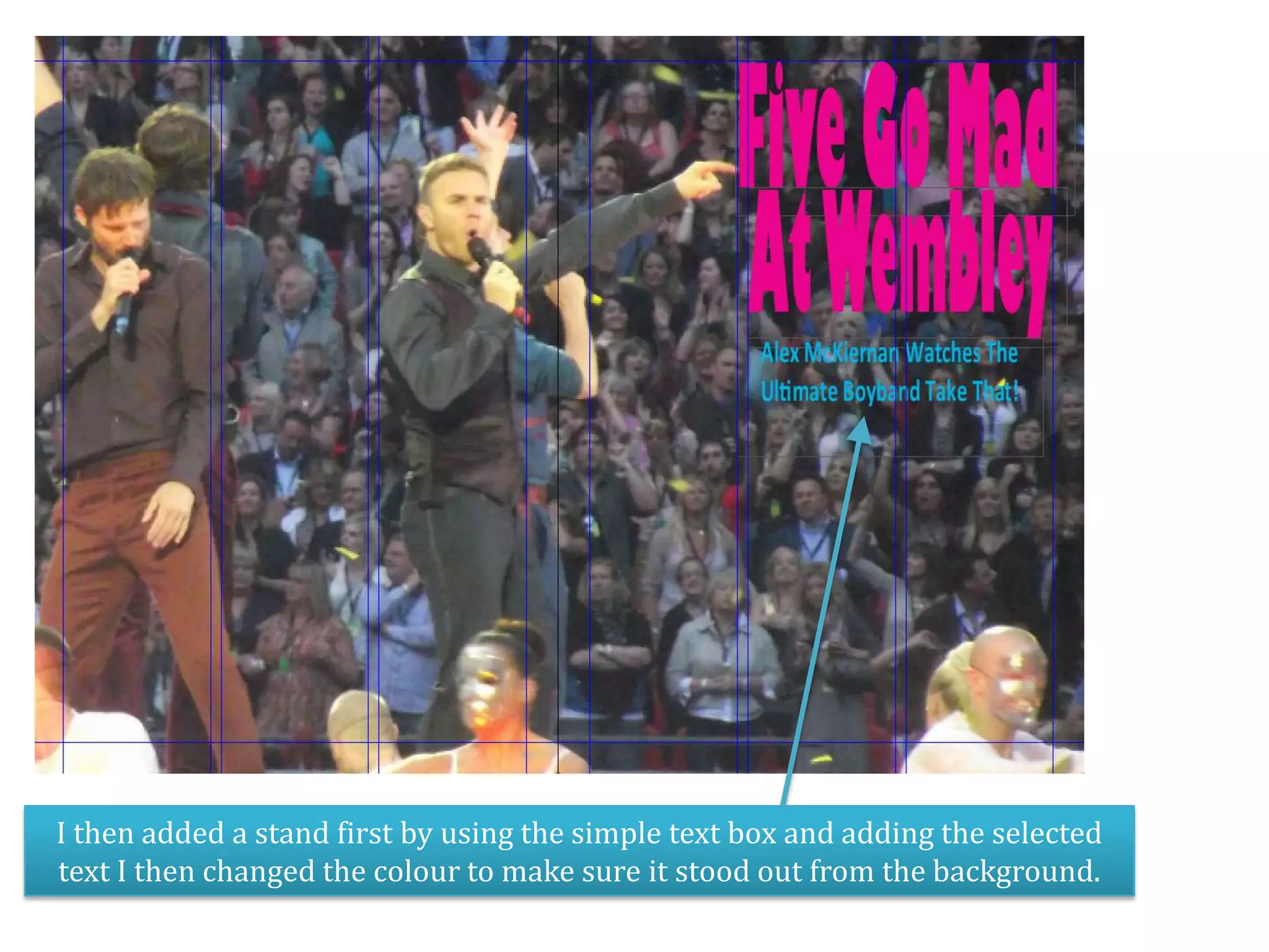
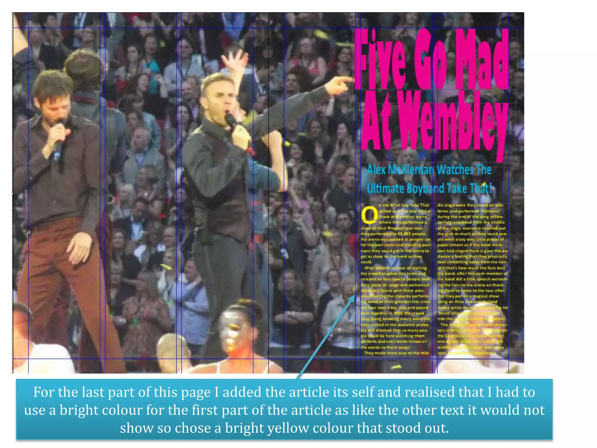
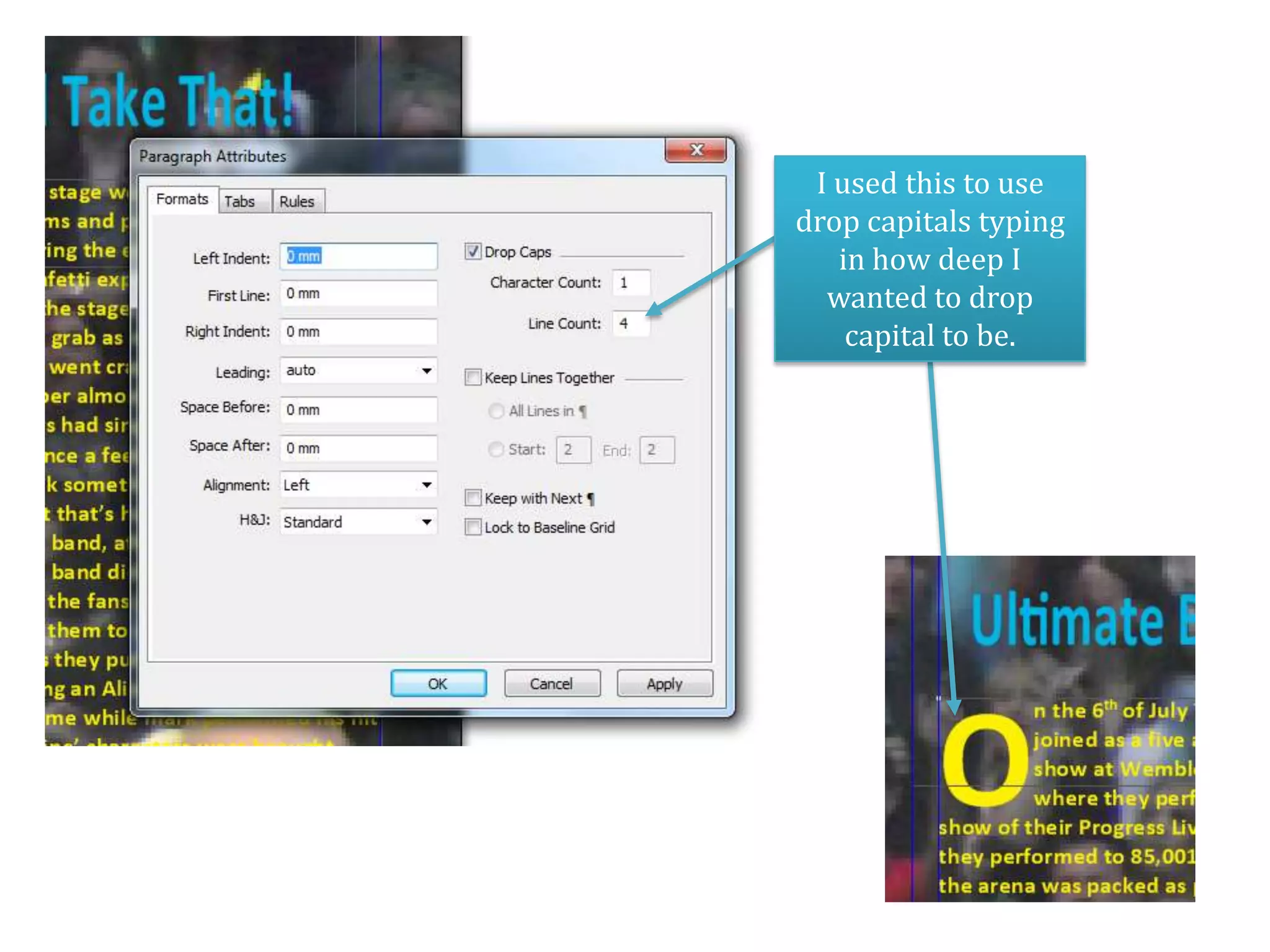

1. The document describes creating a double page spread in QuarkXpress with 6 columns to accommodate text and images for an article. 2. The original layout was changed to better fit the size of the article and pictures. Additional pages were added. 3. Text elements like the title, stand first, and article text were formatted and colored to make them visually stand out on the page.


