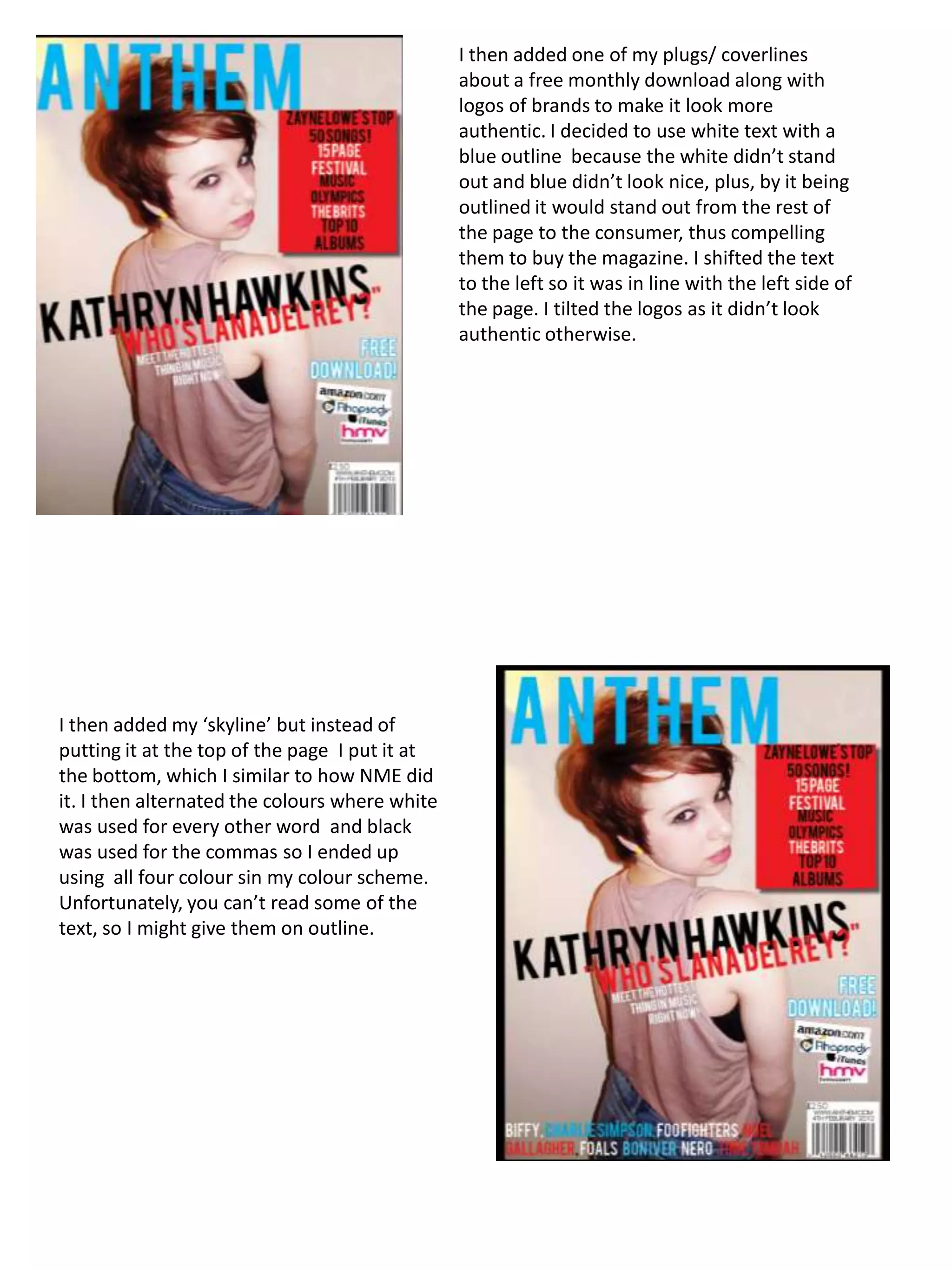
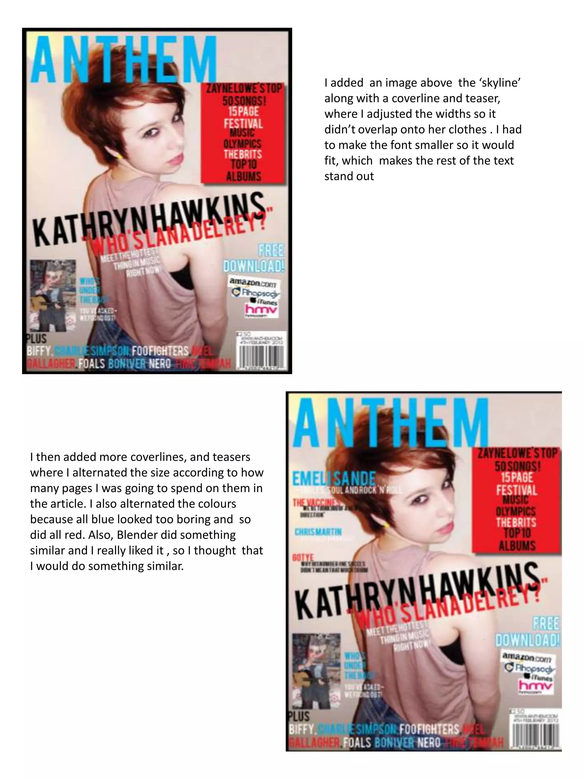
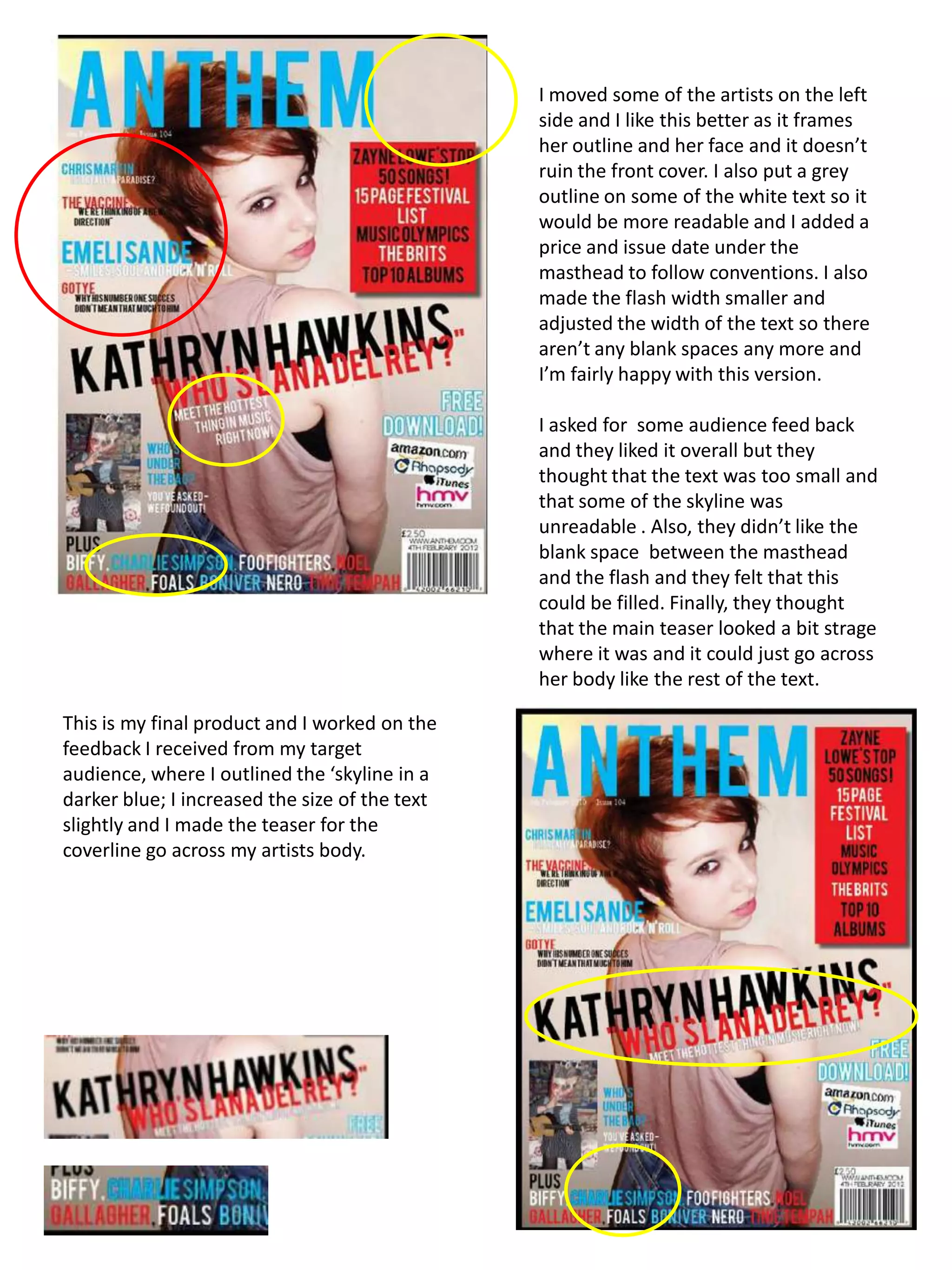
I then added one of my plugs/ coverlines
                                                about a free monthly download along with
                                                logos of brands to make it look more
                                                authentic. I decided to use white text with a
                                                blue outline because the white didn’t stand
                                                out and blue didn’t look nice, plus, by it being
                                                outlined it would stand out from the rest of
                                                the page to the consumer, thus compelling
                                                them to buy the magazine. I shifted the text
                                                to the left so it was in line with the left side of
                                                the page. I tilted the logos as it didn’t look
                                                authentic otherwise.


I then added my ‘skyline’ but instead of
putting it at the top of the page I put it at
the bottom, which I similar to how NME did
it. I then alternated the colours where white
was used for every other word and black
was used for the commas so I ended up
using all four colour sin my colour scheme.
Unfortunately, you can’t read some of the
text, so I might give them on outline.
I added an image above the ‘skyline’
                                                    along with a coverline and teaser,
                                                    where I adjusted the widths so it
                                                    didn’t overlap onto her clothes . I had
                                                    to make the font smaller so it would
                                                    fit, which makes the rest of the text
                                                    stand out


I then added more coverlines, and teasers
where I alternated the size according to how
many pages I was going to spend on them in
the article. I also alternated the colours
because all blue looked too boring and so
did all red. Also, Blender did something
similar and I really liked it , so I thought that
I would do something similar.
I moved some of the artists on the left
                                                side and I like this better as it frames
                                                her outline and her face and it doesn’t
                                                ruin the front cover. I also put a grey
                                                outline on some of the white text so it
                                                would be more readable and I added a
                                                price and issue date under the
                                                masthead to follow conventions. I also
                                                made the flash width smaller and
                                                adjusted the width of the text so there
                                                aren’t any blank spaces any more and
                                                I’m fairly happy with this version.

                                                I asked for some audience feed back
                                                and they liked it overall but they
                                                thought that the text was too small and
                                                that some of the skyline was
                                                unreadable . Also, they didn’t like the
                                                blank space between the masthead
                                                and the flash and they felt that this
                                                could be filled. Finally, they thought
                                                that the main teaser looked a bit strage
                                                where it was and it could just go across
                                                her body like the rest of the text.

This is my final product and I worked on the
feedback I received from my target
audience, where I outlined the ‘skyline in a
darker blue; I increased the size of the text
slightly and I made the teaser for the
coverline go across my artists body.

Presentation1

  • 1.
    I then addedone of my plugs/ coverlines about a free monthly download along with logos of brands to make it look more authentic. I decided to use white text with a blue outline because the white didn’t stand out and blue didn’t look nice, plus, by it being outlined it would stand out from the rest of the page to the consumer, thus compelling them to buy the magazine. I shifted the text to the left so it was in line with the left side of the page. I tilted the logos as it didn’t look authentic otherwise. I then added my ‘skyline’ but instead of putting it at the top of the page I put it at the bottom, which I similar to how NME did it. I then alternated the colours where white was used for every other word and black was used for the commas so I ended up using all four colour sin my colour scheme. Unfortunately, you can’t read some of the text, so I might give them on outline.
  • 2.
    I added animage above the ‘skyline’ along with a coverline and teaser, where I adjusted the widths so it didn’t overlap onto her clothes . I had to make the font smaller so it would fit, which makes the rest of the text stand out I then added more coverlines, and teasers where I alternated the size according to how many pages I was going to spend on them in the article. I also alternated the colours because all blue looked too boring and so did all red. Also, Blender did something similar and I really liked it , so I thought that I would do something similar.
  • 3.
    I moved someof the artists on the left side and I like this better as it frames her outline and her face and it doesn’t ruin the front cover. I also put a grey outline on some of the white text so it would be more readable and I added a price and issue date under the masthead to follow conventions. I also made the flash width smaller and adjusted the width of the text so there aren’t any blank spaces any more and I’m fairly happy with this version. I asked for some audience feed back and they liked it overall but they thought that the text was too small and that some of the skyline was unreadable . Also, they didn’t like the blank space between the masthead and the flash and they felt that this could be filled. Finally, they thought that the main teaser looked a bit strage where it was and it could just go across her body like the rest of the text. This is my final product and I worked on the feedback I received from my target audience, where I outlined the ‘skyline in a darker blue; I increased the size of the text slightly and I made the teaser for the coverline go across my artists body.