1. Evaluation of Digipak full
Colourscheme andMise enscene
For my digipak I have created a theme that will link with the main music video through two main
colours/filtersbeingused.Thislinkstothe videoasitonlyincludestwodifferentfilters includingblack
andwhite andcolouradjustedfootage of boththefemale andmaleprotagonist.FormydigipakIhave
choseninvertedcolour,whichhasthencome out lightpinkwitha contrast betweenthislightcolour
and the darkblack.I have decidedto use these coloursasitwill meanthe audience cansee alink,but
I have alsonotuseda detailedmise ensceneasitwill take attentionawayfromthe maleprotagonist.
The colours match with the genre as they are bland yet attention grabbing because of their huge
difference incontrastand colourdepth.Withinthe electronicrockgenre there isa large use of black
font and features such as copy right, so I have followed the large use of black to make sure that the
cover links with the genre.This will increase the popularity through the target audience as they will
look out for albums with shades such as black as the main staple for electronic rock. This will make
them more likely to buy the album and be attracted to it.
There are three fonts that I have used withinthis creation. This includes the ‘my chemical romance’
font from font space, and the ‘music’ font from font space. Font space is a free website with lots of
different types of fontthat are used internationally.This has helped me to make my font lookmore
professionalandaddedalotmore detail.The firstfontI haveusedcalled‘music’ isthickandhasneatly
cut edgesaroundeachletter,the fontisinblack andhas scratchedout inkon the surface whichadds
a rough effect. This is great as it goes with the rough story behind both of the protagonists that is
portrayed in the music video. Because there is a bold and noticeable outline to the font, it creates a
sense of hand printed letter, and gives the audience the impression that the font has been printed
witha stamp.The secondfontI usedcalled‘mychemical romance’and it isused forthe smallerbits
of information on the album cover, including both the front and the back of the panels. This font is
more ragged and untidy and gives the impression that someone has hand drawn the font with a
broken or misshaped pen/rough surface underneath. I love this font as It makes the audience think
that the videowill be as rough and untidyas the font, withthe mise enscene of the videomatching
due to the urban locations that we have used.
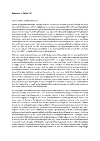
For the imagesthatI have usedIhave made sure that theyare able totie intothe genre andstoryline
of the musicvideo.Tomake thisworkI have made sure thatthe male protagonistinthe videoisused
within the images that I have used. It is important that this is done to include continuity with the
audience beingable torecognise andlinkthe two togetherwhenpurchasingthe album.For the first
three images at the top of the digipak cover I have included an extreme close up of the face of the
male actor, including his eyebrow, eye and hair. Because the image has been inverted it looks as
thoughhis hair and eyebrowsare brightand lighterthanusual,showinga contrast betweenthe two
colours.The middle imagealongthetopthree photosfeaturesthe maleactor’sbodywithblackpaint,
but wheninverteditlookslike white/pink,thiscreatesagreatcontrast withthe audience seeingthis
as fun and artisticand increasingthe likelihoodof the buyingalbum. Ihave alsoincludedacircle ring
to representthe outline of the CD and where it will be placedonce in the album.This showsa more
professional feel tothe albumas thisis foundonall top name/labelalbumcovers.The thirdphotois
a close up with the male’s hands covering his face, this shows a sense of secretive behaviour and
representshowhestruggleswithlifeatthe beginningof the musicvideo. Forthe bottomthree photos
thisincludesthe frontandback of the cover whichhave all the informationaboutthe new singleson
the CD. The front cover has both of the fonts shown on it, with the name of the band beingin large
2. font to stand out to the audience. We then have the name of the album in the other ‘my chemical
romance’fontwhichshowsthe roughside of the genre and strivingtobe differentfromthe rest. This
photo includes the male actor turning away from the camera through a straight shot, showing him
with a hand around his neck, representing the pressures from the outside world.The reverse of the
albumcoverhasanotherimage where he iscovering hisface fromthe camera.The handhaspainton
it whichallowsthe font/writingtoshowonthe back of the cover.This allowsthe theme of blackfont
torunthroughoutthe wholeof thedigipakcoverincludingthe nameof eachsingle thatisinthealbum,
the name and the name of the artist on the spine.The lastphotoalsoincludesthe suffocationonthe
male model,whichshowspressuresandamixturefromthe happinessof hislifeaswell asthe sadness
of the female protagonist’s life.
Whenit comes to copy rightinformationandinstitutionbadgesIhave made sure these are included
within the album cover. They are placed on the reverse of the cover with a chunk of writing stating
the rights of the music and who it belongs too. I have also included the institution name as this is
where the audience will be able to recognise the album and are reassured that they are buying the
correct album from the shop. I have also used a bar code as this means that there is a more
professional look to the cover, with it becoming more realistic due to real album covers having bar
codesto scan throughthe till inside ashop.This makesit suitthe otheralbumsand will make it look
more realistic and professional.
The layoutof the coveriswellthoughtoutandwellplannedduetomyearliersketchesandcomments
on the developmentwhichhasallowedme toimprove the coverinmany waysbefore the final thing
is published. I have decidedto include information on only2 out of the 6 panels as it will mean that
the audience are able to view the images through a clear perspective, but also given enough
information to make sure that the audience know what singles are included and whether they want
to buythe album. The layouthasleftthe coverlookingsimplisticyeteffective withpastel coloursand
black. I have used the layout throughout to make sure the designlooks well planned and able to be
understood, but also including the font that is able to suit the electronic rock genre.