
Recommended
More Related Content
What's hot
What's hot (20)
Viewers also liked
Viewers also liked (20)
Similar to Digipak practise
Similar to Digipak practise (20)
More from thomassmit
More from thomassmit (17)
Recently uploaded
Recently uploaded (20)
Digipak practise
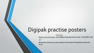
- 1. Digipak practise posters Based on the information: Jean Ralphio featuring Tommy Fresh: ‘Flush With Cash’ and Mouse Rat: Snake Juice: 5000 Candles in the wind (Li’l Sebastian) andThe Pit ‘Hip-Hop’ ‘Rock’
- 2. Adobe Photoshop • When creating my A4 poster, I decided to use Adobe Photoshop because it is easy- to-use and user-friendly. It is also a widely used and highly prominent software, helping hundreds of thousands of people and businesses alike to create visually appealing material (including band artwork designs). • Though it appears simple, there are however many professional features to apply, such as the use of filters and the ability to add and manipulate text from a variety of different fonts and styles. Using the appropriate features is crucial for creating the ‘right’ image for your band.Therefore, for my A4 poster and CD cover I have tried to emulate the specific genres of music I am portraying (Hip-Hop and Rock respectively).
- 3. A4 Poster Hip-Hop To create the glow and highlighted effect, I chose the ‘Diffuse Glow’ tool in the ‘Filter Gallery’ tab. I utilised this effect because it represents the lead singer featured as someone of importance to the album and furthermore it increases the aesthetic appeal of the poster. It also evokes the ‘cool’ and modern genre of Hip-Hop which I am presenting. For the font I used the ‘Reprised Stamp’ option.This made the font easy to read, whilst also being tall to clearly convey my information. It is black so as not to detract the eyes attention to the primary image. I also erased the corner edges of the ‘Entertainment 7wenty logo’ and the social media icons so that they could blend in with the image and give the poster a seamless, professional aspect. I incorporated three of the most popular social media logos.This is because they are widely used by millions of people and as a result, with my poster being located in public areas, this will publicise the band and their image to a wide, modern audience which will increase sales. This image shows how I tweaked and perfected the glow effect using the many adjustment tabs featured. Making my poster appeal to the audience will, as a result, incline them to purchase the album.
- 4. CD Cover Rock For the font I decided to utilise the ‘Niagara Solid’ type. This is similar to the ‘Reprised Stamp’ font I used for my poster which is easy to read and yet it also represents the discreet, yet striking rock image. Also, to create the black and white effect with highlighted tones, a running theme that I used for the A4 poster, I applied the ‘Reticulation’ filter to emphasise the gritty nature of the rock genre. Regarding the image choice, throughout my A4 poster and the CD cover, there is a unifying theme of the subject being on the right side of the frame. This helps create a specific image for the band so that the public will identify with their style when they see the CD in the shops and when purchasing online. To make the ‘entertainment 7wenty’ logo be in-keeping with the rest of the CD cover, I applied a ‘grain effect and made it black and white to correlate with the background and theme of the cover. I also erased the corner edges of logo to blend it into the image. I am pleased my choice of the location of a brick wall because it is a common, stereotypical sight in the Rock genre.