
Recommended
More Related Content
What's hot
What's hot (20)
Viewers also liked
Viewers also liked (20)
Similar to Evaluation question 2
Similar to Evaluation question 2 (20)
Recently uploaded
Recently uploaded (20)
Evaluation question 2
- 1. HOW EFFECTIVE IS THE COMBINATION OF YOUR MAIN PRODUCT AND ANCILLARY TEXTS?
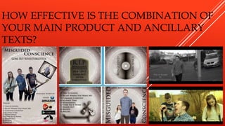
- 2. In order to link my music video and ancillary products, I thought through a few methods which would make each product link. These methods were; Linking the theme of death and grief Linking the colour scheme of the band Linking the props – the bands equipment Displaying the name of the band on each product Contain consistent clothing The reason behind the links between all three products is because all three products are based around selling the same thing which is the band. It is important to make the products work in conjunction with each other so people can see they’re based on the same thing and identify it as almost a brand. Having these connections also makes my products look consistent in there level of quality and overall professionalism as this is how a real music video, digipak and magazine advert would look and work with consistency.
- 3. THEME – DEATH AND GRIEF The over all theme of my music video is death and how grief affects peoples lives. In order to portray the feeling of this through the music video I portrayed a story of a girl who has lost her boyfriend. I display her boyfriend with a black and white filter to represent how he is dead. For the digipak I made the boyfriend the focal point of the front cover and made him look transparent and ghostly. This gives him the effect he’s dead and as he’s the focal point it allows him to be recognised as a link straight away. Also the inside back cover displays a picture of a grave stone displaying the image of death. I created a white portal effect background for the magazine advert that I made. This links to the theme of death because it’s supposed to represent the afterlife as they are standing in an almost heaven like atmosphere.
- 4. COLOUR SCHEME OF THE BAND - NATURAL Through out the music video the lighting of the narrative is dark, however during the times the in the video in which the band is playing the lighting is natural and bright. This is to represent letting something go, in the case of the lyrics letting go of grief. This natural lighting of the band members is shown in the digipak as well. This is an obvious link because the whole digipak is very grey and dull and the band members of the front stand out and are in colour. This is the same with the magazine advert as well. This colour scheme of the band also helps to advertise the band as consistently in each of the products I have created the band is main focal point thanks to the difference in colour scheme.
- 5. PROPS – BAND EQUIPMENT In the music video, as the band plays, you see them playing all their instruments. There are two guitarists playing a bass and an electric and the singer is singing into a microphone on a mic stand. This makes the band look very real and adds professionalism. The prop instruments also appear on the back cover of the digipak next to the track list. This is consistent because they’re the same instruments as you see in the music video but from a different perspective as they are not in use. The magazine advert matches these as well as it shows the band members posing with their instruments. As the same with the digipak, the instruments match the ones used in the music video and it shows the band members using them in the same way as they did in the video.
- 6. DISPLAYING THE NAME OF THE BAND From the first shot of my music video the name of the band and the song title appears at the bottom left and fades out after a few seconds. This is to give the viewer information on who the band are and gives fans confirmation that it’s officially by them. The name of the band appears at the front of cover of the digipak on the left and right hand side. This is to give it a unique way of displaying the band name and it is the largest piece of the text so the buyer can see that this is the name of the band. The magazine advert contains the name of the band at the top of the page. This is the largest piece of the text to advertise the band and make their name one of the focal points to make them more memorable.
- 7. CONSISTENT CLOTHING Through the music video the actors wear the same clothes as they do whilst playing instruments and during the narrative. This is display an identity for the band making them more recognisable. This identity is followed through in the digipak where they are wearing the same clothes as they are in the music video. Also they are the focal point of the front cover so the buyer of the digipak can automatically see the consistency in clothing. Finally in the magazine poster the band members are displayed and they are wearing the exact same clothes as they are in the digipak and music video. This is just another level of the consistency in advertising the band and making them recognisable.
- 8. I am very happy with how I have used consistency to link my music video, digipak and magazine advert to make them all be seen as one. The links that I have used make all the product look effective and professional like a real music video, digipak and magazine advert would. The band is very recognisable after viewing all of the products I created and all of it is thought through well.