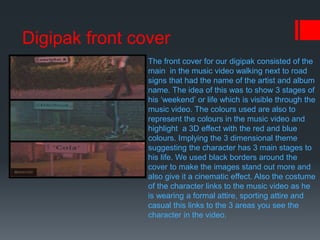
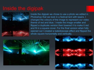
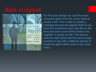
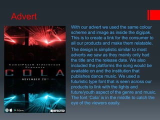
Digipak and Advert analysis
Digipak front cover
The front cover for our digipak consisted of the
main in the music video walking next to road
signs that had the name of the artist and album
name. The idea of this was to show 3 stages of
his ‘weekend’ or life which is visible through the
music video. The colours used are also to
represent the colours in the music video and
highlight a 3D effect with the red and blue
colours. Implying the 3 dimensional theme
suggesting the character has 3 main stages to
his life. We used black borders around the
cover to make the images stand out more and
also give it a cinematic effect. Also the costume
of the character links to the music video as he
is wearing a formal attire, sporting attire and
casual this links to the 3 areas you see the
character in the video.
Inside the digipak
Inside the digipak we chose to use a photo we edited in
Photoshop that we took in a festival tent with lasers. I
changed the colours of the image to represent our video
theme of red and blue. I made the image smaller and
flipped a duplicate version then lowered it to make it red
and fit in a square cover. For the final version when fully
opened out I created a kaleidoscope effect and flipped the
whole square horizontally and vertically.
Back of digipak
For the back design we used the main
character again from the music video to
create a link. This is also to create a
message through the digipak itself as we
have the characters every day life on the
front and back covers then inside is his
‘nightlife’ or going out life. The colours
used are light blues with the same image
overlaid on top with a different opacity to
create the glitch effect seen in the music
video.
Advert
With our advert we used the same colour
scheme and image as inside the digipak.
This is to create a link for the consumer to
all our products and make them relatable.
The design is simplistic similar to most
adverts we saw as they mainly only had
the title and the release date. We also
included the platforms the song would be
available on and the institution that
publishes dance music. We used a
futuristic type font that is seen across our
products to link with the lights and
future/youth aspect of the genre and music.
The font ‘Cola’ is in the middle to catch the
eye of the viewers easily.

Digipak and advert analysis

  • 1.
  • 2.
    Digipak front cover Thefront cover for our digipak consisted of the main in the music video walking next to road signs that had the name of the artist and album name. The idea of this was to show 3 stages of his ‘weekend’ or life which is visible through the music video. The colours used are also to represent the colours in the music video and highlight a 3D effect with the red and blue colours. Implying the 3 dimensional theme suggesting the character has 3 main stages to his life. We used black borders around the cover to make the images stand out more and also give it a cinematic effect. Also the costume of the character links to the music video as he is wearing a formal attire, sporting attire and casual this links to the 3 areas you see the character in the video.
  • 3.
    Inside the digipak Insidethe digipak we chose to use a photo we edited in Photoshop that we took in a festival tent with lasers. I changed the colours of the image to represent our video theme of red and blue. I made the image smaller and flipped a duplicate version then lowered it to make it red and fit in a square cover. For the final version when fully opened out I created a kaleidoscope effect and flipped the whole square horizontally and vertically.
  • 4.
    Back of digipak Forthe back design we used the main character again from the music video to create a link. This is also to create a message through the digipak itself as we have the characters every day life on the front and back covers then inside is his ‘nightlife’ or going out life. The colours used are light blues with the same image overlaid on top with a different opacity to create the glitch effect seen in the music video.
  • 5.
    Advert With our advertwe used the same colour scheme and image as inside the digipak. This is to create a link for the consumer to all our products and make them relatable. The design is simplistic similar to most adverts we saw as they mainly only had the title and the release date. We also included the platforms the song would be available on and the institution that publishes dance music. We used a futuristic type font that is seen across our products to link with the lights and future/youth aspect of the genre and music. The font ‘Cola’ is in the middle to catch the eye of the viewers easily.