
Recommended
More Related Content
What's hot
What's hot (20)
Similar to Analysis of digi pak
Similar to Analysis of digi pak (20)
Recently uploaded
Recently uploaded (20)
Analysis of digi pak
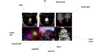
- 1. Front cover Spine Legalities Inside Left Inside right Back panels CD DVD Track list Record label
- 2. MAIN IMAGE: The image I have used is hand drawn, with a pencil. It was then outlined with a black marker pen. I then added a 3D effect to it to with the 3D effect app and changed the glitch so it went to the correct level of 3D. It was key that I got it to the right level of 3D as the image needed to be clear and the band name needed to be identifiable. The main image is also crucial as it is a picture of a helter skelter. This needed to be identifiable as it is a direct reference to the song within the album and the song I am basing all three products on. TEXT AND FONT: Alike to the main image the band name is also hand drawn. I had looked for different fonts on 1001Fonts.com but didn’t come across a font which suited the image, as they didn't look authentic enough for the image as all of it is hand drawn. The band names font was highly based upon ‘Slaves’ the punk rock band font style, as on their albums it looks very authentic also. SPINE: On the spine is where my band name is placed. The font for this is almost a type-writer style, I chose this as I believed this added to the authentic image of my front cover. I chose this font for the rest of my text on the digi pak and the mag ad, so there was clear links between all products. Also placed on the spine is the record label, this is conventional and needed on a digi pak as it makes it look professional and allows an audience to understand which record label it has come from and perhaps make judgement on if they buy or not.
- 3. MAIN IMAGE: The main image on my back cover is taken from my video, to create a distinct link and also make the whole promotional package more professional. I then added the 3D effect again, to create synergy throughout my digi pak. TRACKLIST AND LEGALITIES: My track list is taken from The White Albums track lost, making a clear reference to the actual album in which my song came from. The track list is also in the same font used on the spine within the front cover. The legalities are at the bottom, also in the same font. These are necessary as they are conventional and make the product look more professional. Like wise to the record label and barcode which are needed as they create a more real and professional product.
- 4. IMAGES: The top image is from the inside right of the digi pak has the two actors in the video featured on it. This also makes clear reference to my other products. Similarly to the other images on the digi pak there is the 3D effect on the image. The image is the two actors standing next to each other and looking very seriously at the camera, perhaps illustrating the themes and how they act within the video. This could also be conveyed by the black background on the image. The colour black has very negative connotations and so do the two actors in the video. The colour black could also be a choice as the colour scheme of the whole digi pak overall is very dark. The inside left image has fireworks within and strobe lights. The strobe lights is to make reference to the video, as the video has many strobe/ flashing lights within. There is also fireworks within the image. This was a deliberate choice as it conveys how the relationship within the video is full of fireworks. This image has the 3D effect on, to create synergy throughout all three products.
- 5. BACKPANEL IMAGE: The back panels image is also an image from the video. I chose this image as the mise en scene (lighting) is very good in this image and I though that the 3D effect would look very distorted and visually appealing on the image. The image also features the two actors from the video, which also makes clear links. CD: The CD is black, to match the colour scheme of my digi pak, however it has a white outline to brighten up the whole image as from audience feedback I was advised to make the CD’s bolder. The CD has the initials of the band on, in hand drawn text, which is similar to the front cover. The text is also the same font style as the track list, I did this so that it would look more professional. The last thing I added was the record label to the CD , so the audience are constantly reinforced. DVD: The DVD is very similar to the CD, with the initials being hand drawn an the font style being the same. The only distinction is that there is the DVD logo, so that people can establish that the 2nd CD is the music video and they will be able to watch it.