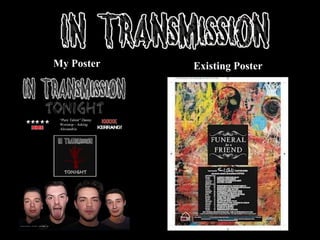
2. It was important when designing my poster to convey
a consistent design between it and my digipak. There
must be an element of synergy that links the two
together in order for an effective pair of ancillary
text’s to be created, and work well with my main
product, my music video. As I was using a different
design on my poster to my digipak I found it
necessary to use the same fonts and colour scheme
through out the two products. I also decided through
my research into existing products that I would
include the cover of my digipak onto my poster
design in order for the audience to easily establish a
connection between the two. My poster design also
worked well in comparison to my main text; my music
video. This is as it featured a close up of all the band
members which was at the bottom of the poster
design, the band were instantly recognisable when
viewed on either texts as they would remember the
faces. It also conveys Goodwin’s theory of the star
image into a print media text opposed to a music
video as it gives a clear and recognisable image of the
band.
3.
4. In order to maintain a professional and
effective combination between my main
product and my ancillary text it was
essential to make the band look as if they
fit the rock genre. Through my research
into existing bands in the genre I
gathered the general styles and clothes
that were consistent throughout rock
bands. There for I was able to establish
not only a good connection between my
ancillary texts and my main product due
to the bands style, but also link it clearly
with the genre to establish an exciting
image for the band.
5. Through my research in class into the existing products that exist I stumbled upon the Biffy Clyro album
artwork and instantly liked the design. Tying in the theme of nature and the band being unsigned and young I
thought it would a great idea to interlink the idea of nature and the seasons into my artwork. The general
concept of the bare tree was to signify winter and hard work, which would be considered the slow burning
and tough part of band life at the very beginning. As the band progress and more alums are made the tree
could enlarge and grow leaves to signify summer, which would highlight the bands success and how it has
been through the worst and put in the hard work in order to flourish in the summer. The tree was also edited in
order to create a vibrant and exciting front cover, which also gave the tree a 3d simulated type effect which
contrasted strongly with the nature and normality of the tree itself. The red and black colour scheme however
most importantly ties the album cover into the stereotypical colours and conventions of the rock genre and
makes it easily recognisable as a digipak front cover of this genre, as well as looking effective and
aesthetically pleasing.
6. It was important to maintain a sense of synergy and consistency throughout my ancillary texts and music
video. In order to do so I decided to use the bands logo featured both above and below on both texts, and also
develop a font (featured below) to use also. To do this I had to gather an idea of what kinds of fonts and styles
are popular in the industry, and what works effectively. Through my research into the digipak for the band
‘Paramore’ on their album ‘riot’ which is displayed on my blog, I was able to do so. The album consists of a
‘scratched’ type font which appears as if it has taken course as some kind of vandalising perhaps has been
done by the band and ties in with the rebel image usually associated with the rock genre. The digipak is also
very simple and only uses two colours on the font, black and orange; black for the background/main body and
orange for the title, to make it vibrant and stand out.
7. In my opinion the digipak
and the poster work together
extremely effectively as a
combination. I especially like
the faces at the bottom of the
digipak as they give an
instant portrayal of what the
band are like, and not to
sound clichéd, puts a face to
the name.
As I have seen many of these
posters and digipaks before it
is instantly apparent which
genre they fit. I think they
look very professional and
give a good first impression
for the band. In regards to the
music video also they most
definitely work together well.
The poster looks like
something I would see in
Kerrang, it works well in
combination with your video
and digipak and I especially
like the fonts used. Lastly the
synergy between the two
looks very convincing,
enforcing the combination.
8. The addition of my ancillary texts to support
my main text strengthen the personality and
image of the band most definitely. For
example the use of the faces on the front of
my magazine poster portrays an alternative
and wild image of the band, which would
increase their popularity within the genre. It is
also apparent that a sense of a consistent
identity is evident throughout all three texs,
for example using a consistent text and colour
scheme on both print products. Similarly in
terms of the video, the childlike and carefree
nature of the band is first presented, and then
conveyed in both the digipak’s inside panels
and also the front of the poster. Lastly I am
very happy with the outcome of my three
products and feel they all work effectively to
produce a professional and interesting media
product.