Downloaded 245 times
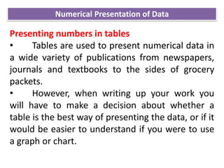
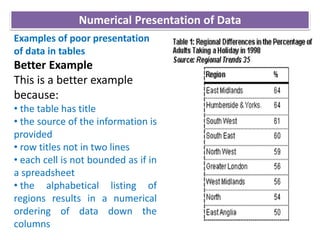

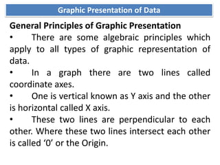
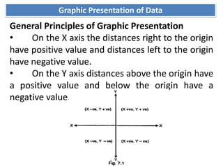
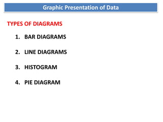
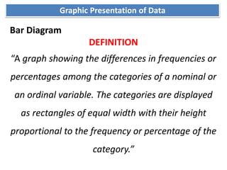
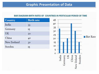
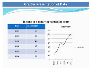
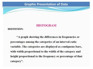
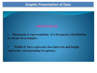
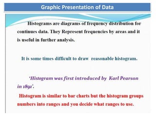
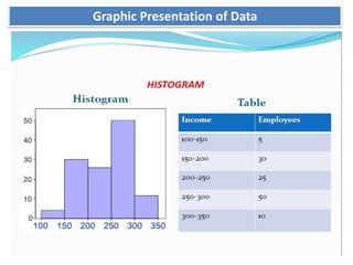

The document discusses numerical and graphical presentation of data. It describes including numbers in the main text, using tables, and using graphs. For tables, it provides guidelines on design, such as including a title and source. Tables are best when showing how a category varies at different points. Graphs enable studying relationships and are eye-catching. Common graph types discussed are bar graphs, line graphs, histograms and pie charts. Bar graphs show differences in frequencies using bars of equal width.