2
PRESENTATION OF DATA
Thisrefers to the organization of data into
tables, graphs, or charts so that logical and
statistical conclusions can be derived from
the collected measurements.
TEXTUAL OR NARRATIVE
PRESENTATION
•the data gathered are presented in
paragraph form
• data are written and read
• it is a combination of texts and figures
Presentation Title 4
5.
EXAMPLE
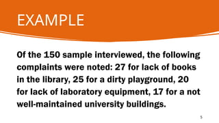
Of the 150sample interviewed, the following
complaints were noted: 27 for lack of books
in the library, 25 for a dirty playground, 20
for lack of laboratory equipment, 17 for a not
well-maintained university buildings.
5
6.
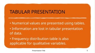
TABULAR PRESENTATION
• Numericalvalues are presented using tables.
• Information are lost in tabular presentation
of data.
• Frequency distribution table is also
applicable for qualitative variables.
Presentation Title 6
7.
7
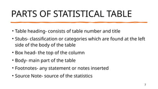
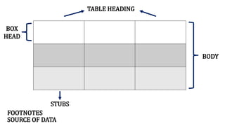
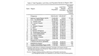
PARTS OF STATISTICALTABLE
• Table heading- consists of table number and title
• Stubs- classification or categories which are found at the left
side of the body of the table
• Box head- the top of the column
• Body- main part of the table
• Footnotes- any statement or notes inserted
• Source Note- source of the statistics
Presentation Title
GRAPHICAL PRESENTATION
• Trendsare easily seen in graphs compared to tables.
• It is good to present data using pictures or figures like the
pictograph.
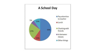
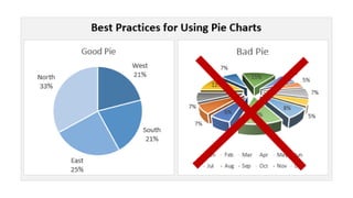
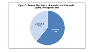
• Pie charts are used to present data as part of one whole.
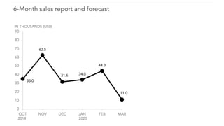
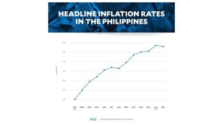
• Line graphs are for time-series data.
• It is better to present data using graphs than tables as they are
much better to look at.
Presentation Title 10
11.
11
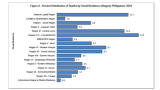
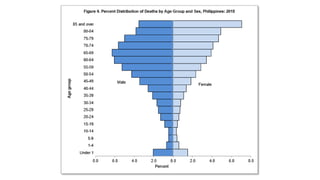
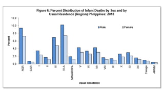
KINDS OF GRAPHSOR DIAGRAMS
• BAR GRAPH- used to show relationships/comparison between
groups
• PIE OR CIRCLE GRAPH- show percentages effectively
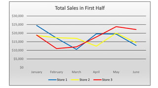
• LINE GRAPH- most useful in displaying data that changes
continuously over time
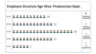
• PICTOGRAPH- or pictogram. It uses small or identical figures
of objects called isotopes in making comparisons. Each picture
represents a definite quantity.
Presentation Title