Presentation of Data
•Download as PPTX, PDF•
9 likes•1,028 views

Presentation of Data - Textual Presentation, Tabular Presentation , Diagrammatic Presentation

Recommended
More Related Content
What's hot
What's hot (20)
Similar to Presentation of Data
Similar to Presentation of Data (20)
More from Suresh Babu
More from Suresh Babu (20)
Recently uploaded
Recently uploaded (20)
Presentation of Data
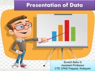
- 1. Suresh Babu G Presentation of Data Suresh Babu G Assistant Professor CTE CPAS Paippad, Kottayam
- 2. Suresh Babu G Presentation of Data • Textual or Descriptive Presentation. • Tabular Presentation. • Diagrammatic Presentation
- 3. Suresh Babu G Textual or Descriptive Presentation 1. In textual presentation, data are described within the text. When the quantity of data is not too large this form of presentation is more suitable.
- 4. Suresh Babu G In tabular presentation, data are presented in rows and columns. Sex Rural Urban Total Male 58 81 60 Female 30 63 34 Total 44 73 48 Enrolment rate of students by sex and location (per cent) Table 4.6 Source : Primary Education Data 2019 2. Tabular Presentation
- 5. Suresh Babu G Data presented in diagram Diagrammatic Presentation Geometric Diagram Frequency Diagram Arithmetic Line Graph Bar Diagram Pie Diagram Histogram Frequency Polygon Frequency Curve Ogive Simple Bar Multiple Bar Component Bar 3. Diagrammatic Presentation
- 6. Suresh Babu G Types of diagrams One Dimensional Diagram Two Dimensional Diagram Three Dimensional Diagram
- 7. Suresh Babu G Geometric Diagrams Bar Diagram 1. Simple bar diagram – A bar diagram comprises a group of equispaced and equiwidth rectangular bars for each class or category of data. A simple bar diagram is used to represent only one variable. Year Profit in thousand 1930 311 1933 645 1936 1087
- 8. Suresh Babu G 0 200 400 600 800 1000 1200 1930 1933 1936 Profit in thousand Years Simple Bar Diagram
- 9. Suresh Babu G 2. Multiple Bar diagram :- It denote more than one phenomenon. It is useful for direct comparison between two variables. No: of Libraries in Delhi No: of Libraries in Kerala 1970 30 40 1980 60 50 1990 80 70 2000 90 80
- 10. Suresh Babu G 0 10 20 30 40 50 60 70 80 90 100 1970 1980 1990 2000 No: of Libraries in Delhi No: of Libraries in Kerala Years No: of Libraries Multiple Bar Diagram
- 11. Suresh Babu G 3. Component Bar Diagram :- Also called sub- diagrams, are very useful in comparing the sizes of different component parts. Marks Malyalam English Hindi Student 1 40 20 20 Student 2 25 40 20 Student 3 35 20 30 Student 4 45 28 50
- 12. Suresh Babu G 0 20 40 60 80 100 120 140 Student 1 Student 2 Student 3 Student 4 Hindi English Malyalam Marks Component Bar Diagram
- 13. Suresh Babu G Pie Diagram • It is a circle whose area is properly divided among the components. • Steps :- convert the given value into angular component ( given value ÷ Total value x 360) ie, into 3600 , draw each component in a circle. Transport to school No: of Students Angular component Walk 10 10/48x360 = 75 Bus 12 12/48x360 = 90 Bicycle 18 18/48x360 = 135 Car 8 8/48x360 = 60 Total 48
- 14. Suresh Babu G No: of Students Walk Bus Bicycle Car Pie Diagram
- 15. Suresh Babu G Frequency Diagrams 1. Histogram :- A histogram is a two dimensional diagram. It is a set of rectangles with base as the intervals between class boundaries and with area proportional to the class frequency. Class Frequency 0 – 10 5 10 – 20 10 20 – 30 12 30 – 40 15 40 – 50 20 50 – 60 16 60 – 70 8
- 16. Suresh Babu G 0 5 10 15 20 25 15 25 35 45 55 65 75 Frequency 10 20 30 40 50 60 Class Intervals Histogram
- 17. Suresh Babu G 2. Frequency Polygon :- A frequency polygon is a plane bounded by straight lines, usually four or more lines. Class Mark Class Mid point Frequency 10 - 20 15 12 20 - 30 25 18 30 - 40 35 25 40 – 50 45 16 50 - 60 55 10
- 18. Suresh Babu G 0 5 10 15 20 25 30 15 25 35 45 55 Frequency Frequency Polygon Marks
- 19. Suresh Babu G 3. Frequency Curve :- The frequency curve is obtained by drawing a smooth freehand curve passing through the points of frequency. Class Mark Class Mid point Frequency 10 - 20 15 12 20 - 30 25 18 30 - 40 35 25 40 – 50 45 16 50 - 60 55 10
- 20. Suresh Babu G 0 5 10 15 20 25 30 0 10 20 30 40 50 60 Frequency Marks Frequency Curve
- 21. Suresh Babu G 4. Ogive or Cumulative Frequency Curve • Ogive is a cumulative frequency curve. There are two types of cumulative frequencies. 1. Less than Ogive :- In less than ogive we start with the upper limits of the classes and go on adding the frequencies. When these frequencies are plotted, we get a rising curve. Class Mark Frequency 0 - 10 8 10 - 20 15 20 - 30 20 30 - 40 25 40 – 50 18 50 - 60 9 60 – 70 5
- 22. Suresh Babu G 0 20 40 60 80 100 120 0 20 40 60 80 Class Cum. Frequency Less than 0 0 Less than 10 8 Less than 20 23 Less than 30 43 Less than 40 68 Less than 50 86 Less than 60 95 Less than 70 100 Class mark Cum. Frequency Less than Ogive
- 23. Suresh Babu G • More than Ogive :- In more than ogive we start with the lower limit of the classes and from the total frequencies we subtract the frequency of each class. When these frequencies are plotted we get a declining curve. Class Cum. Frequency More than 0 100 More than 10 92 More than 20 77 More than 30 57 More than 40 32 More than 50 14 More than 60 5
- 24. Suresh Babu G 0 20 40 60 80 100 120 0 20 40 60 80 Cum. Frequency Class mark More than Ogive
- 25. Suresh Babu G 0 20 40 60 80 100 120 0 10 20 30 40 50 60 70 80 Cum. Frequency Class Marks Median value Less than and More than Cum. Frequency Curve
- 26. Suresh Babu G Arithmetic Line Graph
- 27. Suresh Babu G Advantages of Diagrammatic Presentation • Diagrams are easy to understand. • You can represent huge volumes of data in a simplified manner. • They reveal hidden facts. • They quick to grasp and easy to compare. • Diagrams have a universal acceptability.
- 28. Suresh Babu G
- 29. Suresh Babu G