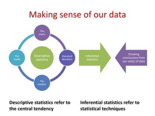
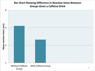
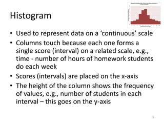
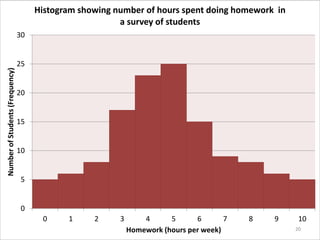
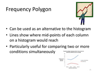
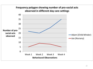
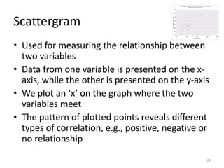
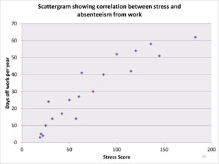
Data representation & analysis
• Descriptive statistics: measures of central
tendency – mean, median, mode, calculation
of mean, median and mode.
• Presentation and display of quantitative data:
graphs, tables, scattergrams, bar charts.
• Introduction to statistical testing: the sign test.
1
Making sense of our data
Descriptive statistics refer to
the central tendency
Inferential statistics refer to
statistical techniques
Descriptive
statistics
The
mean
Standard
deviation
The
median
The
mode
Inferential
statistics
Drawing
conclusions from
our set(s) of data
Tables of Raw Data
• Show scores prior to analysis
• Hard to identify patterns in the data
• Raw data cannot tell us much
3
Participant No. Score on
Memory Task
(Control
Condition)
Participant No. Score on
Memory Task
using Imagery
(Experimental
Condition)
1 15 1 18
2 11 2 24
3 13 3 16
4 11 4 24
5 14 5 17
6 16 6 29
7 17 7 20
8 22 8 25
9 15 9 18
10 14 10 27
Raw Data Table Showing Scores for Control and Experimental
Conditions on a Memory Task
4
Frequency Tables
• More useful than a raw data table
• Can organise the values into groups when
there are a large number of them, e.g., a 24-
hour period could be organised into 3-hour
segments of 8 values
• Patterns in the data are clearer
5
Frequency Table Showing Number of Hours Spent in Day Care
Total number of
hours spent in
day care
Number of
Children
Percentage (%)
12 1 2.0
11 1 2.0
10 2 4.0
9 3 6.0
8 9 18.0
7 2 4.0
6 15 30.0
5 4 8.0
4 10 20.0
3 1 2.0
2 2 4.0
1 0 0
Total N = 50 100
6
Summary Tables
• Include:
Measures of central tendency – mean,
median, mode
Measures of dispersion – range, standard
deviation
• Provide a clear
summary of data
7
Summary Table Showing Stress Scores in
No Exercise and Exercise Conditions
Stress Score in
No Exercise
Group (Control
Condition)
Stress Score in
Exercise Group
(Experimental
Condition)
Mode 31 15.87
Median 30 16
Mean 30.67 16
Range 34 17
SD 8.96 4.41
8
9
The mean is the average
of a set of data.
It is calculated by adding
up all the numbers in a
set of data and then
dividing them by the total
number.
1. Starts from true zero, e.g., physical quantities
such as time, height, weight
2. Are on a scale of fixed units separated by equal
intervals that allow us to make accurate comparisons,
e.g., someone completing a memory task in 20
seconds did it twice as fast as someone taking 40
seconds
The mean makes use of all the data.
The mean can only be used to measure
data that:
The mean is also
affected by extreme
scores
11
Extreme scores
• Time in seconds to solve a puzzle:
• 135, 109, 95, 121, 140
• Mean = 600 secs ÷ 5 participants =120 secs
• Add a 6th participant, who stares at it for 8 mins
• 135, 109, 95, 121, 140, 480
• Mean = 1080÷6=180 secs
12
Median
• The middle value of scores arranged in an
ordered list.
• It is not affected by extreme scores.
• It is not as sensitive as the mean because
not all scores are reflected in the median.
13
Mode
• The mode is the value that is most common in a data set,
e.g.,2, 4, 6, 7, 7, 7, 10,12 mode = 7.
• It is useful when the data is in categories, such as the
number of people who like blue, read books, play a musical
instrument.
• Not useful if there are many numbers that are the same.
14
Disadvantages of the Mode
 Small changes can make a big difference, e.g.,
1. 3, 6, 8, 9, 10, 10 mode=10
2. 3, 3, 6, 8, 9, 10 mode=3
 Can be bi/multimodal, e.g.,
3,5,8,8,10,12,16,16,16,20
15
Calculating the mean, median
and mode.
• Complete the worksheet for task 2.
Using Graphs to
Represent Data
• Graphs summarize quantitative data
• They act as a visual aid allowing us to see
patterns in a data set
• To communicate information effectively, a graph
must be clear and simple and have:
A title
Each axis labelled
 With experimental data, the IV is placed on the
horizontal x-axis while the DV is on the vertical y-
axis
16
Bar Chart
• Used to represent ‘discrete data’ where the data
is in categories, which are placed on the x-axis
• The mean or frequency is on the y-axis
• Columns do not touch and have equal width and
spacing
• Examples:
Differences in males/females on a spatial task
Score on a depression scale before and after
treatment
17
1
2
4
8
Without Caffeine
Group
With Caffeine Group
Meanreactiontime(secs) Bar Chart Showing Difference in Reaction times Between
Groups Given a Caffeine Drink
18
Histogram
• Used to represent data on a ‘continuous’ scale
• Columns touch because each one forms a
single score (interval) on a related scale, e.g.,
time - number of hours of homework students
do each week
• Scores (intervals) are placed on the x-axis
• The height of the column shows the frequency
of values, e.g., number of students in each
interval – this goes on the y-axis
19
0
5
10
15
20
25
30
0 1 2 3 4 5 6 7 8 9 10
NumberofStudents(Frequency)
Homework (hours per week)
Histogram showing number of hours spent doing homework in
a survey of students
20
Frequency Polygon
• Can be used as an alternative to the histogram
• Lines show where mid-points of each column
on a histogram would reach
• Particularly useful for comparing two or more
conditions simultaneously
21
0
5
10
15
20
25
30
35
40
Week 1 Week 2 Week 3 Week 4
Number of pro-
social acts
observed
Behavioural Observations
Frequency polygon showing number of pro-social acts
observed in different day care settings
Adam (Child Minder)
Joe (Nursery)
22
Scattergram
• Used for measuring the relationship between
two variables
• Data from one variable is presented on the x-
axis, while the other is presented on the y-axis
• We plot an ‘x’ on the graph where the two
variables meet
• The pattern of plotted points reveals different
types of correlation, e.g., positive, negative or
no relationship
23
0
10
20
30
40
50
60
70
0 50 100 150 200
Daysoffworkperyear
Stress Score
Scattergram showing correlation between stress and
absenteeism from work
24
Exam Hints
• You must be able to:
State the strength and direction of a correlation,
e.g., a weak negative correlation or a strong
positive correlation
Interpret information in tables
Interpret information in different types of graphs
Know the most appropriate graph to use to
display a given data set
Correctly label columns and rows on all tables
25
Exercise
• Groups of patients with depression were
assessed after six months for the effectiveness
of different treatments. The higher the score the
greater their improvement.
• Choose an appropriate graph to display the
following data:
Treatment Average Improvement
in Symptoms Score
CBT 67
Psychoanalysis 13
ECT 30
Medication 72
26

Mod 4 data presentation graphs bar charts tables

  • 1.
    Data representation &analysis • Descriptive statistics: measures of central tendency – mean, median, mode, calculation of mean, median and mode. • Presentation and display of quantitative data: graphs, tables, scattergrams, bar charts. • Introduction to statistical testing: the sign test. 1
  • 2.
    Making sense ofour data Descriptive statistics refer to the central tendency Inferential statistics refer to statistical techniques Descriptive statistics The mean Standard deviation The median The mode Inferential statistics Drawing conclusions from our set(s) of data
  • 3.
    Tables of RawData • Show scores prior to analysis • Hard to identify patterns in the data • Raw data cannot tell us much 3
  • 4.
    Participant No. Scoreon Memory Task (Control Condition) Participant No. Score on Memory Task using Imagery (Experimental Condition) 1 15 1 18 2 11 2 24 3 13 3 16 4 11 4 24 5 14 5 17 6 16 6 29 7 17 7 20 8 22 8 25 9 15 9 18 10 14 10 27 Raw Data Table Showing Scores for Control and Experimental Conditions on a Memory Task 4
  • 5.
    Frequency Tables • Moreuseful than a raw data table • Can organise the values into groups when there are a large number of them, e.g., a 24- hour period could be organised into 3-hour segments of 8 values • Patterns in the data are clearer 5
  • 6.
    Frequency Table ShowingNumber of Hours Spent in Day Care Total number of hours spent in day care Number of Children Percentage (%) 12 1 2.0 11 1 2.0 10 2 4.0 9 3 6.0 8 9 18.0 7 2 4.0 6 15 30.0 5 4 8.0 4 10 20.0 3 1 2.0 2 2 4.0 1 0 0 Total N = 50 100 6
  • 7.
    Summary Tables • Include: Measuresof central tendency – mean, median, mode Measures of dispersion – range, standard deviation • Provide a clear summary of data 7
  • 8.
    Summary Table ShowingStress Scores in No Exercise and Exercise Conditions Stress Score in No Exercise Group (Control Condition) Stress Score in Exercise Group (Experimental Condition) Mode 31 15.87 Median 30 16 Mean 30.67 16 Range 34 17 SD 8.96 4.41 8
  • 9.
    9 The mean isthe average of a set of data. It is calculated by adding up all the numbers in a set of data and then dividing them by the total number.
  • 10.
    1. Starts fromtrue zero, e.g., physical quantities such as time, height, weight 2. Are on a scale of fixed units separated by equal intervals that allow us to make accurate comparisons, e.g., someone completing a memory task in 20 seconds did it twice as fast as someone taking 40 seconds The mean makes use of all the data. The mean can only be used to measure data that: The mean is also affected by extreme scores
  • 11.
    11 Extreme scores • Timein seconds to solve a puzzle: • 135, 109, 95, 121, 140 • Mean = 600 secs ÷ 5 participants =120 secs • Add a 6th participant, who stares at it for 8 mins • 135, 109, 95, 121, 140, 480 • Mean = 1080÷6=180 secs
  • 12.
    12 Median • The middlevalue of scores arranged in an ordered list. • It is not affected by extreme scores. • It is not as sensitive as the mean because not all scores are reflected in the median.
  • 13.
    13 Mode • The modeis the value that is most common in a data set, e.g.,2, 4, 6, 7, 7, 7, 10,12 mode = 7. • It is useful when the data is in categories, such as the number of people who like blue, read books, play a musical instrument. • Not useful if there are many numbers that are the same.
  • 14.
    14 Disadvantages of theMode  Small changes can make a big difference, e.g., 1. 3, 6, 8, 9, 10, 10 mode=10 2. 3, 3, 6, 8, 9, 10 mode=3  Can be bi/multimodal, e.g., 3,5,8,8,10,12,16,16,16,20
  • 15.
    15 Calculating the mean,median and mode. • Complete the worksheet for task 2.
  • 16.
    Using Graphs to RepresentData • Graphs summarize quantitative data • They act as a visual aid allowing us to see patterns in a data set • To communicate information effectively, a graph must be clear and simple and have: A title Each axis labelled  With experimental data, the IV is placed on the horizontal x-axis while the DV is on the vertical y- axis 16
  • 17.
    Bar Chart • Usedto represent ‘discrete data’ where the data is in categories, which are placed on the x-axis • The mean or frequency is on the y-axis • Columns do not touch and have equal width and spacing • Examples: Differences in males/females on a spatial task Score on a depression scale before and after treatment 17
  • 18.
    1 2 4 8 Without Caffeine Group With CaffeineGroup Meanreactiontime(secs) Bar Chart Showing Difference in Reaction times Between Groups Given a Caffeine Drink 18
  • 19.
    Histogram • Used torepresent data on a ‘continuous’ scale • Columns touch because each one forms a single score (interval) on a related scale, e.g., time - number of hours of homework students do each week • Scores (intervals) are placed on the x-axis • The height of the column shows the frequency of values, e.g., number of students in each interval – this goes on the y-axis 19
  • 20.
    0 5 10 15 20 25 30 0 1 23 4 5 6 7 8 9 10 NumberofStudents(Frequency) Homework (hours per week) Histogram showing number of hours spent doing homework in a survey of students 20
  • 21.
    Frequency Polygon • Canbe used as an alternative to the histogram • Lines show where mid-points of each column on a histogram would reach • Particularly useful for comparing two or more conditions simultaneously 21
  • 22.
    0 5 10 15 20 25 30 35 40 Week 1 Week2 Week 3 Week 4 Number of pro- social acts observed Behavioural Observations Frequency polygon showing number of pro-social acts observed in different day care settings Adam (Child Minder) Joe (Nursery) 22
  • 23.
    Scattergram • Used formeasuring the relationship between two variables • Data from one variable is presented on the x- axis, while the other is presented on the y-axis • We plot an ‘x’ on the graph where the two variables meet • The pattern of plotted points reveals different types of correlation, e.g., positive, negative or no relationship 23
  • 24.
    0 10 20 30 40 50 60 70 0 50 100150 200 Daysoffworkperyear Stress Score Scattergram showing correlation between stress and absenteeism from work 24
  • 25.
    Exam Hints • Youmust be able to: State the strength and direction of a correlation, e.g., a weak negative correlation or a strong positive correlation Interpret information in tables Interpret information in different types of graphs Know the most appropriate graph to use to display a given data set Correctly label columns and rows on all tables 25
  • 26.
    Exercise • Groups ofpatients with depression were assessed after six months for the effectiveness of different treatments. The higher the score the greater their improvement. • Choose an appropriate graph to display the following data: Treatment Average Improvement in Symptoms Score CBT 67 Psychoanalysis 13 ECT 30 Medication 72 26

Editor's Notes

  • #11 Can also bring in the use of standardised ‘human designed’ scales such as IQ tests
  • #13 Introduce normal/skewed distribution curves. Graphs for normal distribution are on slide 14/15
  • #14 You might want to introduce nominal categories here with some examples