STATISTICAL TESTS ANDSUMMARY OPERATIONS. DIFFERENTIATE
BETWEEN RESULTS THAT ARE STATISTICALLY SOUND VS.
STATISTICALLY SIGNIFICANT
COURSE CODE: 22DSB3303R
Session – 6
2.
AIM OF THESESSION
Gaining an understanding of how to interpret statistical results and evaluate the significance of findings.
INSTRUCTIONAL OBJECTIVES
To differentiate between results that are statistically sound vs. statistically significant in statistical tests
and summary operations.
LEARNING OUTCOMES
Learners will gain an understanding of how to interpret statistical results and evaluate the significance
of findings.
3.
Statistical Analysis
Statistical Tests
Types of Statistical Analysis
Summary Operations
Statistically Sound Vs Statistically Significant
Case Studies and Examples
Summary
CONTENTS
4.
Statistical Analysis
Statisticalanalysis is the process of collecting and analyzing data in order to
discern patterns and trends. It is a method for removing bias from evaluating data
by employing numerical analysis.
This technique is useful for collecting the interpretations of research, developing
statistical models, and planning surveys and studies.
Statistical analysis is a scientific tool in AI and ML that helps collect and analyze
large amounts of data to identify common patterns and trends to convert them into
meaningful information
BASICS OF STATISTICS
Definition:Science of collection, presentation, analysis, and reasonable
interpretation of data.
Statistics presents a rigorous scientific method for gaining insight into data. For
example, suppose we measure the weight of 100 patients in a study. With so
many measurements, simply looking at the data fails to provide an informative
account. However statistics can give an instant overall picture of data based
on graphical presentation or numerical summarization irrespective to the
number of data points. Besides data summarization, another important task of
statistics is to make inference and predict relations of variables.
STATISTICAL DESCRIPTION OFDATA
• Statistics describes a numeric set of data by its
• Center
• Variability
• Shape
• Statistics describes a categorical set of data by
• Frequency, percentage or proportion of each category
9.
SOME DEFINITIONS
Variable -any characteristic of an individual or entity.A variable can take different
values for different individuals.Variables can be categorical or quantitative. Per S. S.
Stevens…
• Nominal - Categorical variables with no inherent order or ranking sequence such as names or
classes (e.g., gender).Value may be a numerical, but without numerical value (e.g., I, II, III).The only
operation that can be applied to Nominal variables is enumeration.
• Ordinal -Variables with an inherent rank or order, e.g. mild, moderate, severe. Can be compared for
equality, or greater or less, but not how much greater or less.
• Interval -Values of the variable are ordered as in Ordinal, and additionally, differences between values
are meaningful, however, the scale is not absolutely anchored. Calendar dates and temperatures on the
Fahrenheit scale are examples. Addition and subtraction, but not multiplication and division are
meaningful operations.
• Ratio -Variables with all properties of Interval plus an absolute, non-arbitrary zero point, e.g. age,
weight, temperature (Kelvin).Addition, subtraction, multiplication, and division are all meaningful
operations.
10.
SOME DEFINITIONS
Distribution -(of a variable) tells us what values the variable takes and how often it takes these
values.
• Unimodal - having a single peak
• Bimodal - having two distinct peaks
• Symmetric - left and right half are mirror images.
11.
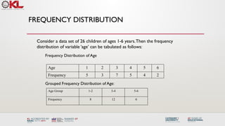
FREQUENCY DISTRIBUTION
Age 12 3 4 5 6
Frequency 5 3 7 5 4 2
Frequency Distribution of Age
Grouped Frequency Distribution of Age:
Age Group 1-2 3-4 5-6
Frequency 8 12 6
Consider a data set of 26 children of ages 1-6 years.Then the frequency
distribution of variable ‘age’ can be tabulated as follows:
12.
CUMULATIVE FREQUENCY
Age Group1-2 3-4 5-6
Frequency 8 12 6
Cumulative Frequency 8 20 26
Age 1 2 3 4 5 6
Frequency 5 3 7 5 4 2
Cumulative Frequency 5 8 15 20 24 26
Cumulative frequency of data in previous page
13.
DATA PRESENTATION
Two typesof statistical presentation of data - graphical and numerical.
Graphical Presentation:We look for the overall pattern and for striking deviations from
that pattern. Over all pattern usually described by shape, center, and spread of the data.An
individual value that falls outside the overall pattern is called an outlier.
Bar diagram and Pie charts are used for categorical variables.
Histogram, stem and leaf and Box-plot are used for numerical variable.
14.
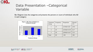
Data Presentation –Categorical
Variable
BarDiagram: Lists the categories and presents the percent or count of individuals who fall
in each category.
Treatment
Group
Frequency Proportion Percent
(%)
1 15 (15/60)=0.25 25.0
2 25 (25/60)=0.333 41.7
3 20 (20/60)=0.417 33.3
Total 60 1.00 100
Figure 1: Bar Chart of Subjects in
Treatment Groups
0
5
10
15
20
25
30
1 2 3
Treatment Group
Num
ber
of
Subjects
15.
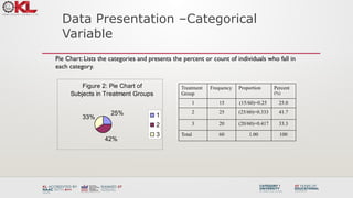
Data Presentation –Categorical
Variable
PieChart: Lists the categories and presents the percent or count of individuals who fall in
each category.
Figure 2: Pie Chart of
Subjects in Treatment Groups
25%
42%
33% 1
2
3
Treatment
Group
Frequency Proportion Percent
(%)
1 15 (15/60)=0.25 25.0
2 25 (25/60)=0.333 41.7
3 20 (20/60)=0.417 33.3
Total 60 1.00 100
16.
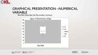
GRAPHICAL PRESENTATION –NUMERICAL
VARIABLE
Figure3: Age Distribution
0
2
4
6
8
10
12
14
16
40 60 80 100 120 140 More
Age in Month
Number
of
Subjects
Histogram: Overall pattern can be described by its shape, center, and spread.The
following age distribution is right skewed.The center lies between 80 to 100. No
outliers.
Mean 90.41666667
Standard Error 3.902649518
Median 84
Mode 84
Standard Deviation 30.22979318
Sample Variance 913.8403955
Kurtosis -1.183899591
Skewness 0.389872725
Range 95
Minimum 48
Maximum 143
Sum 5425
Count 60
NUMERICAL PRESENTATION
To understandhow well a central value characterizes a set of observations, let
us consider the following two sets of data:
A: 30, 50, 70
B: 40, 50, 60
The mean of both two data sets is 50. But, the distance of the observations from
the mean in data set A is larger than in the data set B. Thus, the mean of data
set B is a better representation of the data set than is the case for set A.
A fundamental concept in summary statistics is that of a central value for a set of
observations and the extent to which the central value characterizes the whole
set of data. Measures of central value such as the mean or median must be
coupled with measures of data dispersion (e.g., average distance from the
mean) to indicate how well the central value characterizes the data as a whole.
19.
METHODS OF CENTERMEASUREMENT
Commonly used methods are mean, median, mode, geometric mean etc.
Mean: Summing up all the observation and dividing by number of observations. Mean of
20, 30, 40 is (20+30+40)/3 = 30.
n
x
n
x
x
x
x
x
n
x
x
x
n
i
i
n
n
1
2
1
,
2
1
...
variable,
this
of
mean
Then the
.
variable
a
of
ns
observatio
are
...
,
Let
:
Notation
Center measurement is a summary measure of the overall level of a dataset
20.
METHODS OF CENTERMEASUREMENT
Median:The middle value in an ordered sequence of observations.That is, to find the
median we need to order the data set and then find the middle value. In case of an
even number of observations the average of the two middle most values is the
median. For example, to find the median of {9, 3, 6, 7, 5}, we first sort the data giving
{3, 5, 6, 7, 9}, then choose the middle value 6. If the number of observations is even,
e.g., {9, 3, 6, 7, 5, 2}, then the median is the average of the two middle values from
the sorted sequence, in this case, (5 + 6) / 2 = 5.5.
Mode:The value that is observed most frequently.The mode is undefined for
sequences in which no observation is repeated.
21.
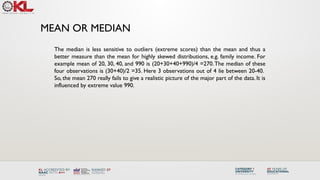
MEAN OR MEDIAN
Themedian is less sensitive to outliers (extreme scores) than the mean and thus a
better measure than the mean for highly skewed distributions, e.g. family income. For
example mean of 20, 30, 40, and 990 is (20+30+40+990)/4 =270.The median of these
four observations is (30+40)/2 =35. Here 3 observations out of 4 lie between 20-40.
So, the mean 270 really fails to give a realistic picture of the major part of the data. It is
influenced by extreme value 990.
22.
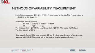
METHODS OFVARIABILITY MEASUREMENT
Commonlyused methods: range, variance, standard deviation, interquartile range, coefficient
of variation etc.
Range:The difference between the largest and the smallest observations.The range of
10, 5, 2, 100 is (100-2)=98. It’s a crude measure of variability.
Variability (or dispersion) measures the amount of scatter in a dataset.
23.
METHODS OFVARIABILITY MEASUREMENT
Variance:Thevariance of a set of observations is the average of the squares of the
deviations of the observations from their mean. In symbols, the variance of the n
observations x1, x2,…xn is
Variance of 5, 7, 3? Mean is (5+7+3)/3 = 5 and the variance is
4
1
3
)
5
7
(
)
5
3
(
)
5
5
( 2
2
2
1
)
(
....
)
( 2
2
1
2
n
x
x
x
x
S n
Standard Deviation: Square root of the variance.The standard deviation of the above
example is 2.
24.
METHODS OFVARIABILITY MEASUREMENT
Quartiles:Data can be divided into four regions that cover the total range of observed
values. Cut points for these regions are known as quartiles.
The first quartile (Q1) is the first 25% of the data.The second quartile (Q2) is between
the 25th
and 50th
percentage points in the data.The upper bound of Q2 is the median.
The third quartile (Q3) is the 25% of the data lying between the median and the 75%
cut point in the data.
Q1 is the median of the first half of the ordered observations and Q3 is the median of
the second half of the ordered observations.
In notations, quartiles of a data is the ((n+1)/4)qth
observation of the data, where q is the
desired quartile and n is the number of observations of data.
25.
METHODS OFVARIABILITY MEASUREMENT
Anexample with 15 numbers
3 6 7 11 13 22 30 40 44 50 52 61 68 80 94
Q1 Q2 Q3
The first quartile is Q1=11.The second quartile is Q2=40 (This is also the Median.)
The third quartile is Q3=61.
Inter-quartile Range: Difference between Q3 and Q1. Inter-quartile range of the previous
example is 61- 40=21.The middle half of the ordered data lie between 40 and 61.
In the following example Q1= ((15+1)/4)1 =4th
observation of the data.The 4th
observation is
11. So Q1 is of this data is 11.
26.
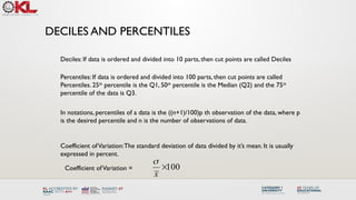
DECILES AND PERCENTILES
Percentiles:If data is ordered and divided into 100 parts, then cut points are called
Percentiles. 25th
percentile is the Q1, 50th
percentile is the Median (Q2) and the 75th
percentile of the data is Q3.
Deciles: If data is ordered and divided into 10 parts, then cut points are called Deciles
In notations, percentiles of a data is the ((n+1)/100)p th observation of the data, where p
is the desired percentile and n is the number of observations of data.
Coefficient ofVariation:The standard deviation of data divided by it’s mean. It is usually
expressed in percent.
100
x
Coefficient ofVariation =
27.
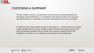
FIVE NUMBER SUMMARY
FiveNumber Summary:The five number summary of a distribution consists of the
smallest (Minimum) observation, the first quartile (Q1),
The median(Q2), the third quartile, and the largest (Maximum) observation written in
order from smallest to largest.
Box Plot:A box plot is a graph of the five number summary.The central box spans
the quartiles.A line within the box marks the median. Lines extending above and
below the box mark the smallest and the largest observations (i.e., the range).
Outlying samples may be additionally plotted outside the range.
CHOOSING A SUMMARY
Thefive number summary is usually better than the mean and standard deviation for
describing a skewed distribution or a distribution with extreme outliers.The mean and
standard deviation are reasonable for symmetric distributions that are free of outliers.
In real life we can’t always expect symmetry of the data. It’s a common practice to include
number of observations (n), mean, median, standard deviation, and range as common for
data summarization purpose.We can include other summary statistics like Q1, Q3,
Coefficient of variation if it is considered to be important for describing data.
30.
SHAPE OF DATA
•Shape of data is measured by
• Skewness
• Kurtosis
31.
SKEWNESS
• Measures asymmetryof data
• Positive or right skewed: Longer right tail
• Negative or left skewed: Longer left tail
2
/
3
1
2
1
3
2
1
)
(
)
(
Skewness
Then,
ns.
observatio
be
,...
,
Let
n
i
i
n
i
i
n
x
x
x
x
n
n
x
x
x
32.
KURTOSIS
• Measures peakednessof the distribution of data.The
kurtosis of normal distribution is 0.
3
)
(
)
(
Kurtosis
Then,
ns.
observatio
be
,...
,
Let
2
1
2
1
4
2
1
n
i
i
n
i
i
n
x
x
x
x
n
n
x
x
x
33.
SUMMARY OF THEVARIABLE‘AGE’ IN THE GIVEN DATA
SET
Mean 90.41666667
Standard Error 3.902649518
Median 84
Mode 84
Standard Deviation 30.22979318
Sample Variance 913.8403955
Kurtosis -1.183899591
Skewness 0.389872725
Range 95
Minimum 48
Maximum 143
Sum 5425
Count 60
Histogram of Age
Age in Month
Number
of
Subjects
40 60 80 100 120 140 160
0
2
4
6
8
10
34.
SUMMARY OF THEVARIABLE‘AGE’ IN THE GIVEN
DATA SET
60
80
100
120
140
Boxplot of Age in Month
Age(month)
35.
CLASS SUMMARY (FIRSTPART)
So far we have learned-
Statistics and data presentation/data summarization
Graphical Presentation: Bar Chart, Pie Chart, Histogram, and Box Plot
Numerical Presentation: Measuring Central value of data (mean, median, mode etc.),
measuring dispersion (standard deviation, variance, co-efficient of variation, range, inter-
quartile range etc), quartiles, percentiles, and five number summary
Any questions ?
36.
BRIEF CONCEPT OFSTATISTICAL
SOFTWARES
There are many softwares to perform statistical analysis and visualization of data. Some of
them are SAS (System for Statistical Analysis), S-plus, R, Matlab, Minitab, BMDP, Stata, SPSS,
StatXact, Statistica, LISREL, JMP, GLIM, HIL, MS Excel etc.We will discuss MS Excel and SPSS
in brief.
Some useful websites for more information of statistical softwares-
http://www.galaxy.gmu.edu/papers/astr1.html
http://ourworld.compuserve.com/homepages/Rainer_Wuerlaender/statsoft.htm#archiv
http://www.R-project.org
37.
MICROSOFT EXCEL
A SpreadsheetApplication. It features calculation, graphing tools, pivot tables and a
macro programming language calledVBA (Visual Basic for Applications).
There are many versions of MS-Excel. Excel XP, Excel 2003, Excel 2007 are capable of
performing a number of statistical analyses.
Starting MS Excel: Double click on the Microsoft Excel icon on the desktop or Click on
Start --> Programs --> Microsoft Excel.
Worksheet: Consists of a multiple grid of cells with numbered rows down the page
and alphabetically-tilted columns across the page. Each cell is referenced by its
coordinates. For example, A3 is used to refer to the cell in column A and row 3.
B10:B20 is used to refer to the range of cells in column B and rows 10 through 20.
38.
MICROSOFT EXCEL
Creating Formulas:1. Click the cell that you want to enter the
formula, 2. Type = (an equal sign), 3. Click the Function Button, 4.
Select the formula you want and step through the on-screen
instructions.
x
f
Opening a document: File Open (From a existing workbook). Change the
directory area or drive to look for file in other locations.
Creating a new workbook: FileNewBlank Document
Saving a File: FileSave
Selecting more than one cell: Click on a cell e.g. A1), then hold the Shift key and
click on another (e.g. D4) to select cells between and A1 and D4 or Click on a cell
and drag the mouse across the desired range.
39.
MICROSOFT EXCEL
Entering Dateand Time: Dates are stored as MM/DD/YYYY. No need to enter
in that format. For example, Excel will recognize jan 9 or jan-9 as 1/9/2007 and
jan 9, 1999 as 1/9/1999. To enter today’s date, press Ctrl and ; together. Use a
or p to indicate am or pm. For example, 8:30 p is interpreted as 8:30 pm. To
enter current time, press Ctrl and : together.
Copy and Paste all cells in a Sheet: Ctrl+A for selecting, Ctrl +C for copying and
Ctrl+V for Pasting.
Sorting: Data Sort Sort By …
Descriptive Statistics and other Statistical methods: ToolsData Analysis Statistical
method. If Data Analysis is not available then click on Tools Add-Ins and then select
Analysis ToolPack and Analysis toolPack-Vba
40.
MICROSOFT EXCEL
Statistical andMathematical Function: Start with ‘=‘ sign and then select
function from function wizard .
x
f
Inserting a Chart: Click on ChartWizard (or InsertChart), select chart, give, Input data
range, Update the Chart options, and Select output range/ Worksheet.
Importing Data in Excel: File open FileType Click on File Choose Option
( Delimited/Fixed Width) Choose Options (Tab/ Semicolon/ Comma/ Space/ Other)
Finish.
Limitations: Excel uses algorithms that are vulnerable to rounding and truncation errors
and may produce inaccurate results in extreme
cases.
41.
STATISTICS PACKAGE
FOR THESOCIAL SCIENCE (SPSS)
A general purpose statistical package SPSS is widely used in the social sciences,
particularly in sociology and psychology.
SPSS can import data from almost any type of file to generate tabulated reports, plots of
distributions and trends, descriptive statistics, and complex statistical analyzes.
Starting SPSS: Double Click on SPSS on desktop or ProgramSPSS.
Opening a SPSS file: FileOpen
• Data Editor
Various pull-down menus appear at the top of the Data Editor window. These
pull-down menus are at the heart of using SPSSWIN. The Data Editor menu
items (with some of the uses of the menu) are:
MENUS AND TOOLBARS
42.
STATISTICS PACKAGE
FOR THESOCIAL SCIENCE (SPSS)
FILE used to open and save data files
EDIT used to copy and paste data values; used to find data in a
file; insert variables and cases; OPTIONS allows the user to
set general preferences as well as the setup for the
Navigator, Charts, etc.
VIEW user can change toolbars; value labels can be seen in cells
instead of data values
DATA select, sort or weight cases; merge files
MENUS AND TOOLBARS
TRANSFORM Compute new variables, recode variables, etc.
43.
STATISTICS PACKAGE
FOR THESOCIAL SCIENCE (SPSS)
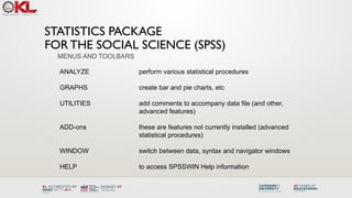
ANALYZE perform various statistical procedures
GRAPHS create bar and pie charts, etc
UTILITIES add comments to accompany data file (and other,
advanced features)
ADD-ons these are features not currently installed (advanced
statistical procedures)
WINDOW switch between data, syntax and navigator windows
HELP to access SPSSWIN Help information
MENUS AND TOOLBARS
44.
STATISTICS PACKAGE
FOR THESOCIAL SCIENCE (SPSS)
Navigator (Output) Menus
When statistical procedures are run or charts are created, the output will appear
in the Navigator window. The Navigator window contains many of the pull-down
menus found in the Data Editor window. Some of the important menus in the
Navigator window include:
INSERT used to insert page breaks, titles, charts, etc.
FORMAT for changing the alignment of a particular portion of the output
MENUS AND TOOLBARS
45.
STATISTICS PACKAGE
FOR THESOCIAL SCIENCE (SPSS)
• Formatting Toolbar
When a table has been created by a statistical procedure, the user can edit the
table to create a desired look or add/delete information. Beginning with version
14.0, the user has a choice of editing the table in the Output or opening it in a
separate Pivot Table (DEFINE!) window. Various pulldown menus are activated
when the user double clicks on the table. These include:
EDIT undo and redo a pivot, select a table or table body (e.g., to
change the font)
INSERT used to insert titles, captions and footnotes
PIVOT used to perform a pivot of the row and column variables
FORMAT various modifications can be made to tables and cells
46.
STATISTICS PACKAGE
FOR THESOCIAL SCIENCE (SPSS)
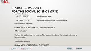
• Additional menus
CHART EDITOR used to edit a graph
SYNTAX EDITOR used to edit the text in a syntax window
• Show or hide a toolbar
Click on VIEW TOOLBARS to show it/ to hide it
⇒ ⇒
• Move a toolbar
Click on the toolbar (but not on one of the pushbuttons) and then drag the toolbar to
its new location
• Customize a toolbar
Click on VIEW TOOLBARS CUSTOMIZE
⇒ ⇒
47.
STATISTICS PACKAGE
FOR THESOCIAL SCIENCE (SPSS)
Importing data from an EXCEL spreadsheet:
Data from an Excel spreadsheet can be imported into SPSSWIN as follows:
1. In SPSSWIN click on FILE OPEN DATA. The OPEN DATA FILE Dialog
⇒ ⇒
Box will appear.
2. Locate the file of interest: Use the "Look In" pull-down list to identify the folder
containing the Excel file of interest
3. From the FILE TYPE pull down menu select EXCEL (*.xls).
4. Click on the file name of interest and click on OPEN or simply double-click on
the file name.
5. Keep the box checked that reads "Read variable names from the first row of
data". This presumes that the first row of the Excel data file contains variable
names in the first row. [If the data resided in a different worksheet in the Excel
file, this would need to be entered.]
6. Click on OK. The Excel data file will now appear in the SPSSWIN Data
Editor.
48.
STATISTICS PACKAGE
FOR THESOCIAL SCIENCE (SPSS)
Importing data from an EXCEL spreadsheet:
7. The former EXCEL spreadsheet can now be saved as an SPSS file (FILE ⇒
SAVE AS) and is ready to be used in analyses. Typically, you would label variable
and values, and define missing values.
Importing an Access table
SPSSWIN does not offer a direct import for Access tables. Therefore, we must follow
these steps:
1. Open the Access file
2. Open the data table
3. Save the data as an Excel file
4. Follow the steps outlined in the data import from Excel Spreadsheet to SPSSWIN.
Importing Text Files into SPSSWIN
Text data points typically are separated (or “delimited”) by tabs or commas.
Sometimes they can be of fixed format.
49.
STATISTICS PACKAGE
FOR THESOCIAL SCIENCE (SPSS)
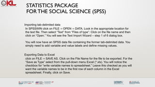
Importing tab-delimited data
In SPSSWIN click on FILE OPEN DATA. Look in the appropriate location for
⇒ ⇒
the text file. Then select “Text” from “Files of type”: Click on the file name and then
click on “Open.” You will see the Text Import Wizard – step 1 of 6 dialog box.
You will now have an SPSS data file containing the former tab-delimited data. You
simply need to add variable and value labels and define missing values.
Exporting Data to Excel
click on FILE SAVE AS. Click on the File Name for the file to be exported. For the
⇒
“Save as Type” select from the pull-down menu Excel (*.xls). You will notice the
checkbox for “write variable names to spreadsheet.” Leave this checked as you will
want the variable names to be in the first row of each column in the Excel
spreadsheet. Finally, click on Save.
50.
STATISTICS PACKAGE
FOR THESOCIAL SCIENCE (SPSS)
Running the FREQUENCIES procedure
1. Open the data file (from the menus, click on FILE OPEN DATA) of interest.
⇒ ⇒
2. From the menus, click on ANALYZE DESCRIPTIVE STATISTICS
⇒ ⇒
FREQUENCIES
3. The FREQUENCIES Dialog Box will appear. In the left-hand box will be a listing
("source variable list") of all the variables that have been defined in the data file. The
first step is identifying the variable(s) for which you want to run a frequency analysis.
Click on a variable name(s). Then click the [ > ] pushbutton. The variable name(s)
will now appear in the VARIABLE[S]: box ("selected variable list"). Repeat these
steps for each variable of interest.
4. If all that is being requested is a frequency table showing count, percentages
(raw, adjusted and cumulative), then click on OK.
51.
STATISTICS PACKAGE
FOR THESOCIAL SCIENCE (SPSS)
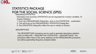
Requesting STATISTICS
Descriptive and summary STATISTICS can be requested for numeric variables. To
request Statistics:
1. From the FREQUENCIES Dialog Box, click on the STATISTICS... pushbutton.
2. This will bring up the FREQUENCIES: STATISTICS Dialog Box.
3. The STATISTICS Dialog Box offers the user a variety of choices:
DESCRIPTIVES
The DESCRIPTIVES procedure can be used to generate descriptive statistics
(click on ANALYZE DESCRIPTIVE STATISTICS DESCRIPTIVES). The
⇒ ⇒
procedure offers many of the same statistics as the FREQUENCIES procedure,
but without generating frequency analysis tables.
52.
STATISTICS PACKAGE
FOR THESOCIAL SCIENCE (SPSS)
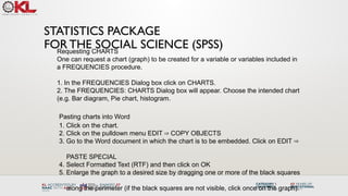
Requesting CHARTS
One can request a chart (graph) to be created for a variable or variables included in
a FREQUENCIES procedure.
1. In the FREQUENCIES Dialog box click on CHARTS.
2. The FREQUENCIES: CHARTS Dialog box will appear. Choose the intended chart
(e.g. Bar diagram, Pie chart, histogram.
Pasting charts into Word
1. Click on the chart.
2. Click on the pulldown menu EDIT COPY OBJECTS
⇒
3. Go to the Word document in which the chart is to be embedded. Click on EDIT ⇒
PASTE SPECIAL
4. Select Formatted Text (RTF) and then click on OK
5. Enlarge the graph to a desired size by dragging one or more of the black squares
along the perimeter (if the black squares are not visible, click once on the graph).
53.
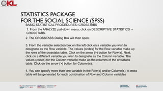
STATISTICS PACKAGE
FOR THESOCIAL SCIENCE (SPSS)
BASIC STATISTICAL PROCEDURES: CROSSTABS
1. From the ANALYZE pull-down menu, click on DESCRIPTIVE STATISTICS ⇒
CROSSTABS.
2. The CROSSTABS Dialog Box will then open.
3. From the variable selection box on the left click on a variable you wish to
designate as the Row variable. The values (codes) for the Row variable make up
the rows of the crosstabs table. Click on the arrow (>) button for Row(s). Next,
click on a different variable you wish to designate as the Column variable. The
values (codes) for the Column variable make up the columns of the crosstabs
table. Click on the arrow (>) button for Column(s).
4. You can specify more than one variable in the Row(s) and/or Column(s). A cross
table will be generated for each combination of Row and Column variables
54.
Limitations: SPSS usershave less control over data manipulation and statistical output than
other statistical packages such as SAS, Stata etc.
SPSS is a good first statistical package to perform quantitative research in social science
because it is easy to use and because it can be a good starting point to learn more
advanced statistical packages.
STATISTICS PACKAGE
FOR THE SOCIAL SCIENCE (SPSS)
55.
Statistical Tests
Statisticaltests are used to evaluate whether a hypothesis about a data set is true or
not. These tests can be used to determine whether a particular pattern or relationship
exists between two or more variables in a data set. Some commonly used statistical
tests in big data analysis include:
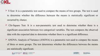
T-Test
Chi-Square Test
ANOVA
56.
T-Test: Itis a parametric test used to compare the means of two groups. The test is used
to determine whether the difference between the means is statistically significant or
occurred by chance.
Chi-Square Test: It is a non-parametric test used to determine whether there is a
significant association between two categorical variables. The test compares the observed
data with the expected data to determine whether there is a significant difference.
ANOVA: Analysis of Variance (ANOVA) is a parametric test used to compare the means
of three or more groups. The test determines whether the differences between the means
are statistically significant.
57.
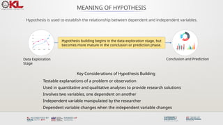
MEANING OF HYPOTHESIS
Hypothesisis used to establish the relationship between dependent and independent variables.
Key Considerations of Hypothesis Building
Testable explanations of a problem or observation
Used in quantitative and qualitative analyses to provide research solutions
Involves two variables, one dependent on another
Independent variable manipulated by the researcher
Dependent variable changes when the independent variable changes
Hypothesis building begins in the data exploration stage, but
becomes more mature in the conclusion or prediction phase.
Data Exploration
Stage
Conclusion and Prediction
58.
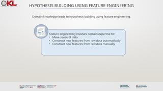
HYPOTHESIS BUILDING USINGFEATURE ENGINEERING
Domain knowledge leads to hypothesis building using feature engineering.
Feature engineering involves domain expertise to:
• Make sense of data
• Construct new features from raw data automatically
• Construct new features from raw data manually
59.
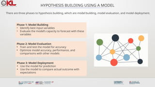
HYPOTHESIS BUILDING USINGA MODEL
There are three phases to hypothesis building, which are model building, model evaluation, and model deployment.
Phase 1: Model Building
• Identify best input variables
• Evaluate the model’s capacity to forecast with these
variables
Phase 2: Model Evaluation
• Train and test the model for accuracy
• Optimize model accuracy, performance, and
comparisons with other models
Phase 3: Model Deployment
• Use the model for prediction
• Use the model to compare actual outcome with
expectations
60.
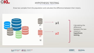
HYPOTHESIS TESTING
Draw twosamples from the population and calculate the difference between their means.
μ1
μ2
Calculating the
difference
between the two
means is
hypothesis
testing.
S1
S2
61.
HYPOTHESIS TESTING
Alternative Hypothesis
•Proposed model outcome is
accurate and matches the data.
• There is a difference between the
means of S1 and S2.
Null Hypothesis
• Opposite of the alternative
hypothesis.
• There is no difference between
the means of S1 and S2.
62.
HYPOTHESIS TESTING PROCESS
Choosingthe training and test dataset, and evaluating them with the null and alternative hypothesis.
Usually the training dataset is between 60% to 80% of the big dataset and the test dataset is between
20% to 40% of the big dataset.
63.
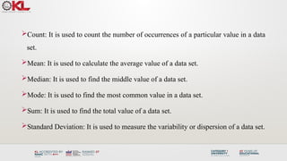
Summary Operations:
Summary operationsare used to aggregate and summarize data sets to extract useful
insights. These operations can be used to identify patterns and relationships within the
data, which can be used to make informed decisions. Some commonly used summary
operations in big data analysis include: (Statistical Analysis Methods)
• Count
• Mean
• Median
Count: It isused to count the number of occurrences of a particular value in a data
set.
Mean: It is used to calculate the average value of a data set.
Median: It is used to find the middle value of a data set.
Mode: It is used to find the most common value in a data set.
Sum: It is used to find the total value of a data set.
Standard Deviation: It is used to measure the variability or dispersion of a data set.
66.
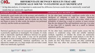
DIFFERENTIATE BETWEEN RESULTSTHAT ARE
STATISTICALLY SOUND VS STATISTICALLY SIGNIFICANT
• In big data analysis, it is important to understand the difference between results that are statistically sound and
results that are statistically significant.
STATISTICALLY SOUND STATISTICALLY SIGNIFICANT
Statistically sound results refer to the accuracy and reliability of
the analysis. This means that the data analysis was conducted
using sound statistical methods, and the results are free from
any biases or errors. In other words, the analysis was performed
correctly, and the results are trustworthy.
On the other hand, statistically significant results refer to the
likelihood of obtaining a result by chance. Statistical
significance is usually measured by the p-value, which is the
probability of observing a result as extreme or more extreme
than the one obtained if the null hypothesis were true. A p-value
of less than 0.05 is typically used as a cutoff to indicate
statistical significance.
Statistical significance does not necessarily mean that the result
is practically significant or meaningful. For example, if a study
finds a statistically significant difference between two groups
but the effect size is very small, it may not be practically
significant in terms of making decisions or taking actions based
on the result. Additionally, statistical significance can be
affected by sample size, so a large sample size can make a small
effect size statistically significant.
On the other hand, statistically sound results ensure that the
analysis is conducted using valid and reliable statistical
methods, regardless of whether the results are statistically
significant or not. A statistically sound analysis is one that is
performed using appropriate statistical techniques, and the
results are free from biases, errors, and other confounding
factors that may affect the accuracy and reliability of the
analysis.
67.
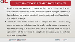
IMPORTANT FACTS RELATEDTO THE SESSION
Statistical tests and summary operations are important techniques used in data
analysis to make conclusions about a population based on a sample. The results of
these techniques can be either statistically sound or statistically significant, but they
have different meanings.
Statistically sound results indicate that the analysis has been conducted using
appropriate statistical techniques, and the results can be trusted to represent the
population accurately. A statistically sound result is obtained when the sample is
representative of the population, the sample size is adequate, and the statistical
model used is appropriate.
68.
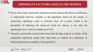
IMPORTANT FACTS RELATEDTO THE SESSION
On the other hand, statistically significant results indicate that there is a difference
or relationship between variables in the population based on the sample. A
statistically significant result is obtained when the p-value, which is the
probability of obtaining the observed results by chance, is less than the
significance level, which is usually set at 0.05.
Therefore, statistically sound results ensure that the data analysis is reliable, while
statistically significant results show that there is evidence of a difference or
relationship between variables in the population.
69.
IMPORTANT FACTS RELATEDTO THE SESSION
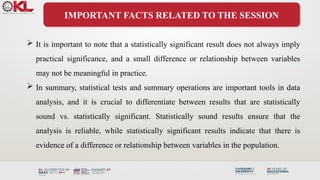
It is important to note that a statistically significant result does not always imply
practical significance, and a small difference or relationship between variables
may not be meaningful in practice.
In summary, statistical tests and summary operations are important tools in data
analysis, and it is crucial to differentiate between results that are statistically
sound vs. statistically significant. Statistically sound results ensure that the
analysis is reliable, while statistically significant results indicate that there is
evidence of a difference or relationship between variables in the population.
70.
EXAMPLES
Example 1
A studyis conducted to compare the effectiveness of two drugs for treating a specific
medical condition. A randomized controlled trial is conducted with a large sample size,
and the statistical model used is appropriate. The results show that there is no
statistically significant difference between the two drugs. However, the study is
statistically sound because it has been conducted using appropriate statistical
techniques, and the sample size is large enough to represent the population.
71.
EXAMPLES
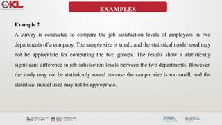
Example 2
A surveyis conducted to compare the job satisfaction levels of employees in two
departments of a company. The sample size is small, and the statistical model used may
not be appropriate for comparing the two groups. The results show a statistically
significant difference in job satisfaction levels between the two departments. However,
the study may not be statistically sound because the sample size is too small, and the
statistical model used may not be appropriate.
72.
SUMMARY
Statistical testsand summary operations are important techniques in data analysis.
Statistically sound results indicate that the analysis has been conducted using
appropriate statistical techniques, and the results can be trusted to represent the
population accurately.
Statistically significant results indicate that there is evidence of a difference or
relationship between variables in the population based on the sample.
To differentiate between results that are statistically sound vs. statistically significant,
it is important to consider factors such as the sample size, the appropriateness of the
statistical model used, and the significance level.
73.
SUMMARY
Both statisticalsoundness and statistical significance are important in drawing
meaningful conclusions from data.
74.
SELF-ASSESSMENT QUESTIONS
1. Whatis the importance of statistical soundness?
(a) It shows evidence of a difference or relationship between variables.
(b) It ensures that the analysis is reliable and trustworthy.
(c) It indicates practical significance.
(d) d. It is not important in data analysis.
2. What does it mean when results are statistically significant?
(a) The results show a significant difference between variables.
(b) The results represent the population accurately and have been conducted using appropriate statistical
techniques.
(c) The sample size is too small to draw meaningful conclusions.
(d) The statistical model used is inappropriate.
75.
TERMINAL QUESTIONS
1. Whatfactors should be considered when determining statistical significance?
2. How do sample size and statistical model selection impact statistical soundness
and significance?
3. Given a dataset, explain how you would determine if the results are statistically
sound and/or statistically significant.
4. Analyze a research study and determine if the results are statistically sound and/or
statistically significant.
76.
TERMINAL QUESTIONS
5. Critiquea research study and identify potential limitations related to
statistical soundness and/or statistical significance.
6. Create a presentation that explains the importance of statistical soundness
and statistical significance in data analysis.
77.
REFERENCES FOR FURTHERLEARNING OF THE
SESSION
Reference Books:
1. "Big Data: Principles and Best Practices of Scalable Realtime Data Systems" by Nathan
Marz and James Warren.
2. "Hadoop: The Definitive Guide" by Tom White.
3. "Data Science from Scratch: First Principles with Python" by Joel Grus
Sites and Web links:
1. https://hadoop.apache.org/
2. https://mattturck.com/big-data-landscape/
3. https://bigdata-madesimple.com/
#57 Hypothesis is used in research and analytics to understand the relationship between dependent and independent variables. Hypothesis building can begin in the data exploration stage, but it becomes more mature and perfect in the conclusion and predict phase.
Hypotheses are testable explanations of a problem or observation.
Formulating a hypothesis is used for both quantitative and qualitative analyses to address a research problem.
Hypotheses that suggest a causal relationship involve at least one independent and dependent variable; in other words, one variable which is presumed to affect the other. For example, Holiday season increases traffic and purchases on the website.
An independent variable is one whose value is manipulated by the researcher or data scientist.
A dependent variable is a variable whose values are presumed to change as a result of changes in the independent variable.
Let’s now look at hypothesis building using feature engineering.
#58 Hypothesis building, a way to design models and predict the unknown, can be done using feature engineering. This includes:
Identifying meaningful features based on data domain knowledge
Automatically constructing new features from the raw data based on domain expertise
Constructing new features manually from raw data based on domain expertise
#59 Hypothesis building using a model has three phases:
The first phase is “Model building” which comprises:
Identifying the best input variables for the model
Judging if the model can predict the outcome for the given input
The second phase is “Model Evaluation.” It’s a phase in which you train and test the model, changing different parameters used in the model aiming for accuracy. This is also the phase where the performance is optimized for the following:
Model accuracy
Model performance
Model comparisons
The third phase is Model Deployment. In this phase, you have finished selecting the model you will use to solve the business problem. The output of the model will help you take better decisions through:
Model prediction
Model matching (actual outcome meets the expectations)
#60 Population is a large dataset and samples are a part of it. A sample drawn from a population should have all the main attributes or features which represent the characteristics of the population. An ideal sample can be treated as the population itself and the hypothesis outcome for a sample would hold true for the entire population.
In the example displayed here:
Two samples are drawn from the population or a large dataset.
Each sample has a mean.
The process of calculating the difference between the means is known as hypothesis testing.
#61 Two kinds of hypothesis can be made initially:
Alternative Hypothesis: This hypothesis indicates that the proposed model outcome is accurate and fits the data. There is a difference between sample data S1 and S2.
Null Hypothesis: This hypothesis is the logical opposite of the alternative hypothesis and does not support the proposed model. It suggests that there is no difference between sample data S1 and S2.
#62 The process of hypothesis testing begins by dividing a big dataset into training and test datasets, irrespective of the size of the dataset. This is one of the best techniques to design an accurate model.
Typically, the “training dataset” size is anywhere between sixty and eighty percent of the big dataset and the “test dataset” ranges between twenty and forty percent of the big dataset.
The Training dataset is used to build a new proposed model. It makes use of the available features and responses of the data sample.
The Test dataset is used to test the proposed model. The test dataset acts as new unseen data.
The Null hypothesis that was formulated will be proven right when the proposed model does not predict better than the existing model.
The Alternative hypothesis will be proven right if the proposed model predicts better than the existing model.


![STATISTICS PACKAGE
FOR THE SOCIAL SCIENCE (SPSS)
Importing data from an EXCEL spreadsheet:
Data from an Excel spreadsheet can be imported into SPSSWIN as follows:
1. In SPSSWIN click on FILE OPEN DATA. The OPEN DATA FILE Dialog
⇒ ⇒
Box will appear.
2. Locate the file of interest: Use the "Look In" pull-down list to identify the folder
containing the Excel file of interest
3. From the FILE TYPE pull down menu select EXCEL (*.xls).
4. Click on the file name of interest and click on OPEN or simply double-click on
the file name.
5. Keep the box checked that reads "Read variable names from the first row of
data". This presumes that the first row of the Excel data file contains variable
names in the first row. [If the data resided in a different worksheet in the Excel
file, this would need to be entered.]
6. Click on OK. The Excel data file will now appear in the SPSSWIN Data
Editor.](https://image.slidesharecdn.com/co1session6statisticalanalysis-250731143641-b8157c39/85/CO1_Session_6-Statistical-Angalysis-pptx-47-320.jpg)

![STATISTICS PACKAGE
FOR THE SOCIAL SCIENCE (SPSS)
Running the FREQUENCIES procedure
1. Open the data file (from the menus, click on FILE OPEN DATA) of interest.
⇒ ⇒
2. From the menus, click on ANALYZE DESCRIPTIVE STATISTICS
⇒ ⇒
FREQUENCIES
3. The FREQUENCIES Dialog Box will appear. In the left-hand box will be a listing
("source variable list") of all the variables that have been defined in the data file. The
first step is identifying the variable(s) for which you want to run a frequency analysis.
Click on a variable name(s). Then click the [ > ] pushbutton. The variable name(s)
will now appear in the VARIABLE[S]: box ("selected variable list"). Repeat these
steps for each variable of interest.
4. If all that is being requested is a frequency table showing count, percentages
(raw, adjusted and cumulative), then click on OK.](https://image.slidesharecdn.com/co1session6statisticalanalysis-250731143641-b8157c39/85/CO1_Session_6-Statistical-Angalysis-pptx-50-320.jpg)


![[DSC Europe 25] Mijat Kustudic - Building Financial Intelligence with AI Agen...](https://cdn.slidesharecdn.com/ss_thumbnails/38y2lb5lse6wstegtvas-3-mijat-kustudic-building-financial-intelligence-with-ai-agents-260114111931-1a4783ce-thumbnail.jpg?width=640&height=640&fit=bounds)


![[DSC Europe 25] Nikola Vasiljevic - Player segmentation by combat playstyles ...](https://cdn.slidesharecdn.com/ss_thumbnails/mnvbf0yvrwaqsipzrrv3-2-nikola-vasiljevic-player-segmentation-by-playstyles-in-action-shooter-games-260114111931-b4d766cd-thumbnail.jpg?width=640&height=640&fit=bounds)
![[DSC Europe 25] Ivan Lukovic & Marija Djukic - From Data to Value: Why Maturi...](https://cdn.slidesharecdn.com/ss_thumbnails/ahrfps8xr6knowwhacxh-1-ivan-marija-dsc-2025-ld-v1-presentation-260115093812-be21adfc-thumbnail.jpg?width=640&height=640&fit=bounds)
![[DSC Europe 25] Elena Menshikova - AI-Powered Operational Excellence: Revolut...](https://cdn.slidesharecdn.com/ss_thumbnails/es6nholbqy3zaao2c2yd-2-elena-menshikova-data-ai-in-decision-making-260115093812-4fba8b38-thumbnail.jpg?width=640&height=640&fit=bounds)


![[DSC Europe 25] Dragan Jerosimovic - The Anatomy of a Narrative Simulation.pdf](https://cdn.slidesharecdn.com/ss_thumbnails/vzputuprdqr6zwbrwdcw-1-dragan-jerosimovic-the-anatomy-of-a-narrative-simulation-260114111931-9d04fba2-thumbnail.jpg?width=640&height=640&fit=bounds)
![[DSC Europe 25] Stefan Brankovic - #ResumeIsDead. AI-Powered Interviews and C...](https://cdn.slidesharecdn.com/ss_thumbnails/qnmbsv0xq3uysdrq3sev-2-stefan-brankovic-job-bolt-260114111931-a065aa3d-thumbnail.jpg?width=640&height=640&fit=bounds)
![[DSC Europe 25] Slobodan Dolinic - Smart and Intelligent Green Region.pptx](https://cdn.slidesharecdn.com/ss_thumbnails/0bribinjsp6ghwtvsvor-2-sigre-slobodan-dolinic-260115093812-c9c10e90-thumbnail.jpg?width=640&height=640&fit=bounds)


