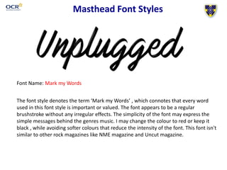
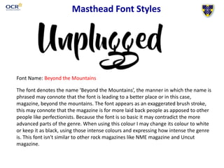
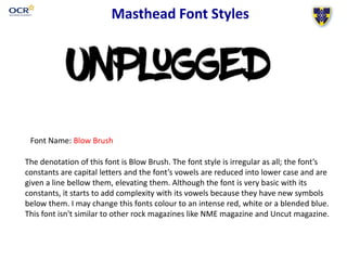
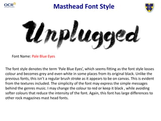
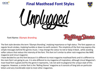
Masthead Font Styles
Name: William Hennegan
Candidate number: 3057
Centre number: 64135
St-Andrews Catholic School
Masthead Font Styles
Font Name: Mark my Words
The font style denotes the term ‘Mark my Words’ , which connotes that every word
used in this font style is important or valued. The font appears to be a regular
brushstroke without any irregular effects. The simplicity of the font may express the
simple messages behind the genres music. I may change the colour to red or keep it
black , while avoiding softer colours that reduce the intensity of the font. This font isn't
similar to other rock magazines like NME magazine and Uncut magazine.
Masthead Font Styles
Font Name: Beyond the Mountains
The font denotes the name ‘Beyond the Mountains’, the manner in which the name is
phrased may connote that the font is leading to a better place or in this case,
magazine, beyond the mountains. The font appears as an exaggerated brush stroke,
this may connote that the magazine is for more laid back people as apposed to other
people like perfectionists. Because the font is so basic it may contradict the more
advanced parts of the genre. When using this colour I may change its colour to white
or keep it as black, using those intense colours and expressing how intense the genre
is. This font isn't similar to other rock magazines like NME magazine and Uncut
magazine.
Masthead Font Styles
Font Name: Blow Brush
The denotation of this font is Blow Brush. The font style is irregular as all; the font’s
constants are capital letters and the font’s vowels are reduced into lower case and are
given a line bellow them, elevating them. Although the font is very basic with its
constants, it starts to add complexity with its vowels because they have new symbols
below them. I may change this fonts colour to an intense red, white or a blended blue.
This font isn't similar to other rock magazines like NME magazine and Uncut magazine.
Masthead Font Style
Font Name: Pale Blue Eyes
Screen grab of Masthead name in font style HERE
The font style denotes the term ‘Pale Blue Eyes’, which seems fitting as the font style losses
colour and becomes grey and even white in some places from its original black. Unlike the
previous fonts, this isn’t a regular brush stroke as it appears to be on canvas. This is evident
from the textures included. The simplicity of the font may express the simple messages
behind the genres music. I may change the colour to red or keep it black , while avoiding
softer colours that reduce the intensity of the font. Again, this font has large differences to
other rock magazines mast head fonts.
Final Masthead Font Styles
Font Name: Olympic Branding
The font style denotes the term ‘Olympic Branding’, implying importance or high status. The font appears as
regular brush strokes, implying humble or down to earth content. The simplicity of the font may express the
simple messages behind the genres music. I may change the colour to red or keep it black , while avoiding
softer colours that reduce the intensity of the font. This font isn't similar to other rock magazines like NME
magazine and Uncut magazine.
I have decided to use this font because it is different to most magazine masthead fonts and it is different to
the main font I am going to use. It is also different to my magazine of inspiration, although Uncut Magazine’s
mast head font is good and fits the genre it represents, I do not wish to plagiarise the unique style of this
magazine. However, a similar font is the ‘Rolling Stones’ magazine as it consists of long tails on particular
letters and very transferable style to most other magazines.

Mast head font list and analysis

  • 1.
    Masthead Font Styles Name:William Hennegan Candidate number: 3057 Centre number: 64135 St-Andrews Catholic School
  • 2.
    Masthead Font Styles FontName: Mark my Words The font style denotes the term ‘Mark my Words’ , which connotes that every word used in this font style is important or valued. The font appears to be a regular brushstroke without any irregular effects. The simplicity of the font may express the simple messages behind the genres music. I may change the colour to red or keep it black , while avoiding softer colours that reduce the intensity of the font. This font isn't similar to other rock magazines like NME magazine and Uncut magazine.
  • 3.
    Masthead Font Styles FontName: Beyond the Mountains The font denotes the name ‘Beyond the Mountains’, the manner in which the name is phrased may connote that the font is leading to a better place or in this case, magazine, beyond the mountains. The font appears as an exaggerated brush stroke, this may connote that the magazine is for more laid back people as apposed to other people like perfectionists. Because the font is so basic it may contradict the more advanced parts of the genre. When using this colour I may change its colour to white or keep it as black, using those intense colours and expressing how intense the genre is. This font isn't similar to other rock magazines like NME magazine and Uncut magazine.
  • 4.
    Masthead Font Styles FontName: Blow Brush The denotation of this font is Blow Brush. The font style is irregular as all; the font’s constants are capital letters and the font’s vowels are reduced into lower case and are given a line bellow them, elevating them. Although the font is very basic with its constants, it starts to add complexity with its vowels because they have new symbols below them. I may change this fonts colour to an intense red, white or a blended blue. This font isn't similar to other rock magazines like NME magazine and Uncut magazine.
  • 5.
    Masthead Font Style FontName: Pale Blue Eyes Screen grab of Masthead name in font style HERE The font style denotes the term ‘Pale Blue Eyes’, which seems fitting as the font style losses colour and becomes grey and even white in some places from its original black. Unlike the previous fonts, this isn’t a regular brush stroke as it appears to be on canvas. This is evident from the textures included. The simplicity of the font may express the simple messages behind the genres music. I may change the colour to red or keep it black , while avoiding softer colours that reduce the intensity of the font. Again, this font has large differences to other rock magazines mast head fonts.
  • 6.
    Final Masthead FontStyles Font Name: Olympic Branding The font style denotes the term ‘Olympic Branding’, implying importance or high status. The font appears as regular brush strokes, implying humble or down to earth content. The simplicity of the font may express the simple messages behind the genres music. I may change the colour to red or keep it black , while avoiding softer colours that reduce the intensity of the font. This font isn't similar to other rock magazines like NME magazine and Uncut magazine. I have decided to use this font because it is different to most magazine masthead fonts and it is different to the main font I am going to use. It is also different to my magazine of inspiration, although Uncut Magazine’s mast head font is good and fits the genre it represents, I do not wish to plagiarise the unique style of this magazine. However, a similar font is the ‘Rolling Stones’ magazine as it consists of long tails on particular letters and very transferable style to most other magazines.