SlideShare a Scribd company logo
Billboard is the masthead for billboard music magazine. It uses a bold black font which is similar to Berlin Sans FB.
Some of letters are connected while others are not. The letters that are connected stand out more than those that
are not. This may be because the letters that are connected involve a circle. For example: b, o, a and d, and these
are all filled in with colour. Doing this makes the masthead stand out more and also makes it more vibrant. As well
as this it is also unique, as I have never seen anything similar to this before for a masthead. An actual billboard is a
giant board that stands out and tries to grab peoples attention. Knowing this tells us what billboard magazine is
trying to do. What I mean is that they are trying to make the font black by using a dark colour, but they use bold
colours in the middle of letters to try make it stand out and grab peoples attention. The whole point of a masthead
is to make someone look at it and make them pick it up, which is exactly what Billboard magazine has done. I
personally really like this masthead, because I love how they have filled in certain letters with bold bright colour. I
would defiantly take this into consideration when making my magazine.
Rolling Stone is the masthead for the Rolling Stone music magazine. The font is very similar to Monotype Corsiva,
however is it not exactly the same. This font uses Serifs, and this is something that you don’t see a lot of in music
magazine, mainly because you can make the magazine look amazing with them or it can look not so good. The
colour scheme is very simple. They use a red font, with a white outline and a black shadow. I find that these three
colours (red, white and black), work really well together and can help give and indie vibe, which is what I am
aiming for. The phrase Rolling Stone relates to the phrase, ‘a rolling stone gathers no moss’. What I mean by this is
that if you keep going then overtime you will gather wealth and you will get what you have worked so hard for.
So the idea for using it as a masthead is very good idea, because it implies that starting off the magazine they
were not as popular, but as the years went on they carried on doing the magazine and soon enough it got very
popular. I think that this is a nice masthead, however I think I would want to modernise it a bit because I feel like
it can feel a bit old, even though it is an iconic masthead.
Q is the masthead for Q music magazine. This is a very simple masthead as it only includes one letter, and two
colours. The use of red and white work really well together, as I think those two colours helps the magazine give it
its indie/rock vibe. Having the letter ‘Q’ in a red box is helps the magazine stand out, because red can be quite a
bold colour to use. That must be one of the reasons why they use it. The font used for the letter Q is similar to
Adobe Garamond pro bold. There is no actual definition for Q, but it could stand for either one of the following
words: Question and/or Quality. It could stand for quality because the magazine could have a high ‘quality’ about
it. And we know it is high quality because it is a very popular music magazine. I like how they have taken the
simplistic route by using only used one letter, however I don’t think that this is what I want to try achieve.
Vibe is the masthead for Vibe music magazine. This is quite a simple masthead as it only uses one colour,
however is it very bold, as it stands out from the page. The font used it similar to Eras Bold ITC. As I said before
only one colour is used for this masthead. The use of the word ‘Vibe’ generally suggests an emotional state of
someone, and in this case it is all to do with music, so it could suggest how someone feels about music. Looking
at the magazines that vibe does they all have a pop/ rap theme, so that must be the type of vibe that they are
going for. Out of all the mastheads that I have looked at so far, this is my least favourite. This may be because
there is not enough colour in it, or it could be because of the type of music it is used for. But on the other hand it
is a good masthead because it is bold and stands out from the page.
NME is the masthead for the NME music magazine. It uses a bold red font which is very similar or almost the
same to Ariel Black. This font does not uses serifs, mainly because that is not the type of vibe that the
magazine is trying to have. Serifs are generally used in more fancy writing and therefore are generally used for
the very popular magazine that can pull it of. Furthermore, when u say NME it sounds like you are saying
enemy. This could imply that the magazine is an enemy to every other magazine, which could also tell us that
other magazines should look out for this magazine, because they are a very good music magazine. Using a red
bold colour is a good way of grabbing peoples attention, because it stands out so much from the page. And the
whole point of a masthead is to grab someone's attention, and that’s exactly what NME have done. My own
opinion of this masthead is a good one. I quite like this, because it is simple and straight to the point. I also like
how it could represent the word enemy.
Kerrang is a world popular rock music magazine. The font for this masthead is quite an unusual one because it
looks like cracked glass or something similar to that. The font is similar to Stencil, but it is not exactly the same. It
was quite hard to find one that was like this font because it seems to have a spray-paint effect, and there are not
many fonts on PowerPoint that do spray-paint styled fonts. The colours used are simple but effective. Black and
white are the two colours or shades that stand out from each other, which is why most magazines like to use
them. The use of the cracked glass in the font gives it that edgy/rock feel, which is what the magazine is aiming
for. The term ‘Kerrang’ is generally used to describe the noise made when playing a power chord on a distorted
electric guitar. This explains why the music magazine is all to do with hard rock and heavy metal music.
Personally I am not a huge fan of this type of font because it is not the style that I am aiming for, however I quite
like the cracked glass effect.

More Related Content

What's hot

Music mag analysis
Music mag analysisMusic mag analysis
Music mag analysis
ann migichi
 
Analysing magazines
Analysing magazines Analysing magazines
Analysing magazines
TPS_OM
 
AS Media Analysis of Music Magazines
AS Media Analysis of Music MagazinesAS Media Analysis of Music Magazines
AS Media Analysis of Music MagazinesIxDooom
 
Double page spread analysis
Double page spread analysisDouble page spread analysis
Double page spread analysis
emily_allenx
 
Double page spread analysis xxl
Double page spread analysis xxlDouble page spread analysis xxl
Double page spread analysis xxlchiaralcollu
 
Double Page Spread
Double Page SpreadDouble Page Spread
Double Page Spreadguest8722d5
 
Double Page Spread Analysis XXL
Double Page Spread Analysis XXLDouble Page Spread Analysis XXL
Double Page Spread Analysis XXLguest774dc26f
 
Research- Double page spread
Research- Double page spreadResearch- Double page spread
Research- Double page spreadalicegrimshaw
 
Evaluation 1
Evaluation 1Evaluation 1
Evaluation 1
ChloeFrancom
 
Analysing Existing Music Magazines
Analysing Existing Music MagazinesAnalysing Existing Music Magazines
Analysing Existing Music Magazines
Lauren_Maskrey
 
Planning For The Album Cover
Planning For The Album CoverPlanning For The Album Cover
Planning For The Album Coverrachael swan
 
Double Page Spread Analysis Rollingstone
Double Page Spread Analysis RollingstoneDouble Page Spread Analysis Rollingstone
Double Page Spread Analysis Rollingstoneguest774dc26f
 
Research- Double page spread
Research- Double page spreadResearch- Double page spread
Research- Double page spreadalicegrimshaw
 
Research- Double page spread
Research- Double page spreadResearch- Double page spread
Research- Double page spreadalicegrimshaw
 
Generic conventions
Generic conventionsGeneric conventions
Generic conventions
Harry Wise
 

What's hot (15)

Music mag analysis
Music mag analysisMusic mag analysis
Music mag analysis
 
Analysing magazines
Analysing magazines Analysing magazines
Analysing magazines
 
AS Media Analysis of Music Magazines
AS Media Analysis of Music MagazinesAS Media Analysis of Music Magazines
AS Media Analysis of Music Magazines
 
Double page spread analysis
Double page spread analysisDouble page spread analysis
Double page spread analysis
 
Double page spread analysis xxl
Double page spread analysis xxlDouble page spread analysis xxl
Double page spread analysis xxl
 
Double Page Spread
Double Page SpreadDouble Page Spread
Double Page Spread
 
Double Page Spread Analysis XXL
Double Page Spread Analysis XXLDouble Page Spread Analysis XXL
Double Page Spread Analysis XXL
 
Research- Double page spread
Research- Double page spreadResearch- Double page spread
Research- Double page spread
 
Evaluation 1
Evaluation 1Evaluation 1
Evaluation 1
 
Analysing Existing Music Magazines
Analysing Existing Music MagazinesAnalysing Existing Music Magazines
Analysing Existing Music Magazines
 
Planning For The Album Cover
Planning For The Album CoverPlanning For The Album Cover
Planning For The Album Cover
 
Double Page Spread Analysis Rollingstone
Double Page Spread Analysis RollingstoneDouble Page Spread Analysis Rollingstone
Double Page Spread Analysis Rollingstone
 
Research- Double page spread
Research- Double page spreadResearch- Double page spread
Research- Double page spread
 
Research- Double page spread
Research- Double page spreadResearch- Double page spread
Research- Double page spread
 
Generic conventions
Generic conventionsGeneric conventions
Generic conventions
 

Viewers also liked

Final key concepts research
Final key concepts researchFinal key concepts research
Final key concepts research
Isabelle Humm
 
Final audience profile
Final audience profileFinal audience profile
Final audience profile
Isabelle Humm
 
Final Final proposal for my music magazine
Final Final proposal for my music magazineFinal Final proposal for my music magazine
Final Final proposal for my music magazine
Isabelle Humm
 
Final survey analysis
Final survey analysisFinal survey analysis
Final survey analysis
Isabelle Humm
 
Suicide squad – film case study
Suicide squad – film case studySuicide squad – film case study
Suicide squad – film case study
Isabelle Humm
 
Final photo ideas
Final photo ideas Final photo ideas
Final photo ideas
Isabelle Humm
 
Final photo ideas for my photoshoot
Final photo ideas for my photoshootFinal photo ideas for my photoshoot
Final photo ideas for my photoshoot
Isabelle Humm
 
Ex machina – film case study
Ex machina – film case studyEx machina – film case study
Ex machina – film case study
Isabelle Humm
 
Final key concepts research
Final key concepts researchFinal key concepts research
Final key concepts research
Isabelle Humm
 
Final Audience profile
Final Audience profileFinal Audience profile
Final Audience profile
Isabelle Humm
 
Camera and editing doctor who clip
Camera and editing doctor who clipCamera and editing doctor who clip
Camera and editing doctor who clip
Isabelle Humm
 
Final survey analysis
Final survey analysisFinal survey analysis
Final survey analysis
Isabelle Humm
 
Final proposal for my music magazine
Final proposal for my music magazineFinal proposal for my music magazine
Final proposal for my music magazine
Isabelle Humm
 

Viewers also liked (13)

Final key concepts research
Final key concepts researchFinal key concepts research
Final key concepts research
 
Final audience profile
Final audience profileFinal audience profile
Final audience profile
 
Final Final proposal for my music magazine
Final Final proposal for my music magazineFinal Final proposal for my music magazine
Final Final proposal for my music magazine
 
Final survey analysis
Final survey analysisFinal survey analysis
Final survey analysis
 
Suicide squad – film case study
Suicide squad – film case studySuicide squad – film case study
Suicide squad – film case study
 
Final photo ideas
Final photo ideas Final photo ideas
Final photo ideas
 
Final photo ideas for my photoshoot
Final photo ideas for my photoshootFinal photo ideas for my photoshoot
Final photo ideas for my photoshoot
 
Ex machina – film case study
Ex machina – film case studyEx machina – film case study
Ex machina – film case study
 
Final key concepts research
Final key concepts researchFinal key concepts research
Final key concepts research
 
Final Audience profile
Final Audience profileFinal Audience profile
Final Audience profile
 
Camera and editing doctor who clip
Camera and editing doctor who clipCamera and editing doctor who clip
Camera and editing doctor who clip
 
Final survey analysis
Final survey analysisFinal survey analysis
Final survey analysis
 
Final proposal for my music magazine
Final proposal for my music magazineFinal proposal for my music magazine
Final proposal for my music magazine
 

Similar to Magazine Mastheads

Researching and analysing magazines
Researching and analysing magazinesResearching and analysing magazines
Researching and analysing magazinesabigailmusic
 
Fonts and colours
Fonts and coloursFonts and colours
Fonts and colours
AS Media Column E
 
Tasks 1 4 and hwk 2
Tasks 1 4 and hwk 2Tasks 1 4 and hwk 2
Tasks 1 4 and hwk 2
charlie__97
 
Masthead analysis (1)
Masthead analysis (1)Masthead analysis (1)
Masthead analysis (1)
10bertal
 
Tasks 1 4 and hwk 1
Tasks 1 4 and hwk 1Tasks 1 4 and hwk 1
Tasks 1 4 and hwk 1
charlie__1
 
Researching and analysing magazines
Researching and analysing magazinesResearching and analysing magazines
Researching and analysing magazinesabigailmusic
 
My magazine research
My magazine researchMy magazine research
My magazine researchadinewenner
 
My magazine research
My magazine research My magazine research
My magazine research adinewenner
 
My magazine research
My magazine research My magazine research
My magazine research adinewenner
 
Stylesheet
StylesheetStylesheet
StylesheetBirteb
 
Media research 2
Media research 2Media research 2
Media research 2abbiestone
 
Media research 2
Media research 2Media research 2
Media research 2abbiestone
 
Magazine analysis research
Magazine analysis researchMagazine analysis research
Magazine analysis researchhsmedia16
 
Question 1
Question 1Question 1
Question 1
bethanyhill1998
 
Stylesheet2
Stylesheet2Stylesheet2
Stylesheet2Birteb
 
Final why are fonts and colours important
Final why are fonts and colours importantFinal why are fonts and colours important
Final why are fonts and colours important
AS Media Column E
 
Anisa Music Magazine Evaluation
Anisa Music Magazine EvaluationAnisa Music Magazine Evaluation
Anisa Music Magazine Evaluationdhensonheywood
 
Front cover magazine analysis
Front cover magazine analysisFront cover magazine analysis
Front cover magazine analysis
JessicaCheung1998
 

Similar to Magazine Mastheads (20)

Mood board
Mood boardMood board
Mood board
 
Researching and analysing magazines
Researching and analysing magazinesResearching and analysing magazines
Researching and analysing magazines
 
Fonts and colours
Fonts and coloursFonts and colours
Fonts and colours
 
Media coursework
Media courseworkMedia coursework
Media coursework
 
Tasks 1 4 and hwk 2
Tasks 1 4 and hwk 2Tasks 1 4 and hwk 2
Tasks 1 4 and hwk 2
 
Masthead analysis (1)
Masthead analysis (1)Masthead analysis (1)
Masthead analysis (1)
 
Tasks 1 4 and hwk 1
Tasks 1 4 and hwk 1Tasks 1 4 and hwk 1
Tasks 1 4 and hwk 1
 
Researching and analysing magazines
Researching and analysing magazinesResearching and analysing magazines
Researching and analysing magazines
 
My magazine research
My magazine researchMy magazine research
My magazine research
 
My magazine research
My magazine research My magazine research
My magazine research
 
My magazine research
My magazine research My magazine research
My magazine research
 
Stylesheet
StylesheetStylesheet
Stylesheet
 
Media research 2
Media research 2Media research 2
Media research 2
 
Media research 2
Media research 2Media research 2
Media research 2
 
Magazine analysis research
Magazine analysis researchMagazine analysis research
Magazine analysis research
 
Question 1
Question 1Question 1
Question 1
 
Stylesheet2
Stylesheet2Stylesheet2
Stylesheet2
 
Final why are fonts and colours important
Final why are fonts and colours importantFinal why are fonts and colours important
Final why are fonts and colours important
 
Anisa Music Magazine Evaluation
Anisa Music Magazine EvaluationAnisa Music Magazine Evaluation
Anisa Music Magazine Evaluation
 
Front cover magazine analysis
Front cover magazine analysisFront cover magazine analysis
Front cover magazine analysis
 

Recently uploaded

“To be integrated is to feel secure, to feel connected.” The views and experi...
“To be integrated is to feel secure, to feel connected.” The views and experi...“To be integrated is to feel secure, to feel connected.” The views and experi...
“To be integrated is to feel secure, to feel connected.” The views and experi...
AJHSSR Journal
 
7 Tips on Social Media Marketing strategy
7 Tips on Social Media Marketing strategy7 Tips on Social Media Marketing strategy
7 Tips on Social Media Marketing strategy
Digital Marketing Lab
 
Grow Your Reddit Community Fast.........
Grow Your Reddit Community Fast.........Grow Your Reddit Community Fast.........
Grow Your Reddit Community Fast.........
SocioCosmos
 
Surat Digital Marketing School - course curriculum
Surat Digital Marketing School - course curriculumSurat Digital Marketing School - course curriculum
Surat Digital Marketing School - course curriculum
digitalcourseshop4
 
Social Media Marketing Strategies .
Social Media Marketing Strategies                     .Social Media Marketing Strategies                     .
Social Media Marketing Strategies .
Virtual Real Design
 
SluggerPunk Angel Investor Final Proposal
SluggerPunk Angel Investor Final ProposalSluggerPunk Angel Investor Final Proposal
SluggerPunk Angel Investor Final Proposal
grogshiregames
 
Unlock TikTok Success with Sociocosmos..
Unlock TikTok Success with Sociocosmos..Unlock TikTok Success with Sociocosmos..
Unlock TikTok Success with Sociocosmos..
SocioCosmos
 
Buy Pinterest Followers, Reactions & Repins Go Viral on Pinterest with Socio...
Buy Pinterest Followers, Reactions & Repins  Go Viral on Pinterest with Socio...Buy Pinterest Followers, Reactions & Repins  Go Viral on Pinterest with Socio...
Buy Pinterest Followers, Reactions & Repins Go Viral on Pinterest with Socio...
SocioCosmos
 
Multilingual SEO Services | Multilingual Keyword Research | Filose
Multilingual SEO Services |  Multilingual Keyword Research | FiloseMultilingual SEO Services |  Multilingual Keyword Research | Filose
Multilingual SEO Services | Multilingual Keyword Research | Filose
madisonsmith478075
 
SluggerPunk Final Angel Investor Proposal
SluggerPunk Final Angel Investor ProposalSluggerPunk Final Angel Investor Proposal
SluggerPunk Final Angel Investor Proposal
grogshiregames
 
Improving Workplace Safety Performance in Malaysian SMEs: The Role of Safety ...
Improving Workplace Safety Performance in Malaysian SMEs: The Role of Safety ...Improving Workplace Safety Performance in Malaysian SMEs: The Role of Safety ...
Improving Workplace Safety Performance in Malaysian SMEs: The Role of Safety ...
AJHSSR Journal
 
Your Path to YouTube Stardom Starts Here
Your Path to YouTube Stardom Starts HereYour Path to YouTube Stardom Starts Here
Your Path to YouTube Stardom Starts Here
SocioCosmos
 
LORRAINE ANDREI_LEQUIGAN_HOW TO USE TRELLO
LORRAINE ANDREI_LEQUIGAN_HOW TO USE TRELLOLORRAINE ANDREI_LEQUIGAN_HOW TO USE TRELLO
LORRAINE ANDREI_LEQUIGAN_HOW TO USE TRELLO
lorraineandreiamcidl
 

Recently uploaded (13)

“To be integrated is to feel secure, to feel connected.” The views and experi...
“To be integrated is to feel secure, to feel connected.” The views and experi...“To be integrated is to feel secure, to feel connected.” The views and experi...
“To be integrated is to feel secure, to feel connected.” The views and experi...
 
7 Tips on Social Media Marketing strategy
7 Tips on Social Media Marketing strategy7 Tips on Social Media Marketing strategy
7 Tips on Social Media Marketing strategy
 
Grow Your Reddit Community Fast.........
Grow Your Reddit Community Fast.........Grow Your Reddit Community Fast.........
Grow Your Reddit Community Fast.........
 
Surat Digital Marketing School - course curriculum
Surat Digital Marketing School - course curriculumSurat Digital Marketing School - course curriculum
Surat Digital Marketing School - course curriculum
 
Social Media Marketing Strategies .
Social Media Marketing Strategies                     .Social Media Marketing Strategies                     .
Social Media Marketing Strategies .
 
SluggerPunk Angel Investor Final Proposal
SluggerPunk Angel Investor Final ProposalSluggerPunk Angel Investor Final Proposal
SluggerPunk Angel Investor Final Proposal
 
Unlock TikTok Success with Sociocosmos..
Unlock TikTok Success with Sociocosmos..Unlock TikTok Success with Sociocosmos..
Unlock TikTok Success with Sociocosmos..
 
Buy Pinterest Followers, Reactions & Repins Go Viral on Pinterest with Socio...
Buy Pinterest Followers, Reactions & Repins  Go Viral on Pinterest with Socio...Buy Pinterest Followers, Reactions & Repins  Go Viral on Pinterest with Socio...
Buy Pinterest Followers, Reactions & Repins Go Viral on Pinterest with Socio...
 
Multilingual SEO Services | Multilingual Keyword Research | Filose
Multilingual SEO Services |  Multilingual Keyword Research | FiloseMultilingual SEO Services |  Multilingual Keyword Research | Filose
Multilingual SEO Services | Multilingual Keyword Research | Filose
 
SluggerPunk Final Angel Investor Proposal
SluggerPunk Final Angel Investor ProposalSluggerPunk Final Angel Investor Proposal
SluggerPunk Final Angel Investor Proposal
 
Improving Workplace Safety Performance in Malaysian SMEs: The Role of Safety ...
Improving Workplace Safety Performance in Malaysian SMEs: The Role of Safety ...Improving Workplace Safety Performance in Malaysian SMEs: The Role of Safety ...
Improving Workplace Safety Performance in Malaysian SMEs: The Role of Safety ...
 
Your Path to YouTube Stardom Starts Here
Your Path to YouTube Stardom Starts HereYour Path to YouTube Stardom Starts Here
Your Path to YouTube Stardom Starts Here
 
LORRAINE ANDREI_LEQUIGAN_HOW TO USE TRELLO
LORRAINE ANDREI_LEQUIGAN_HOW TO USE TRELLOLORRAINE ANDREI_LEQUIGAN_HOW TO USE TRELLO
LORRAINE ANDREI_LEQUIGAN_HOW TO USE TRELLO
 

Magazine Mastheads

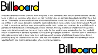
  • 1. Billboard is the masthead for billboard music magazine. It uses a bold black font which is similar to Berlin Sans FB. Some of letters are connected while others are not. The letters that are connected stand out more than those that are not. This may be because the letters that are connected involve a circle. For example: b, o, a and d, and these are all filled in with colour. Doing this makes the masthead stand out more and also makes it more vibrant. As well as this it is also unique, as I have never seen anything similar to this before for a masthead. An actual billboard is a giant board that stands out and tries to grab peoples attention. Knowing this tells us what billboard magazine is trying to do. What I mean is that they are trying to make the font black by using a dark colour, but they use bold colours in the middle of letters to try make it stand out and grab peoples attention. The whole point of a masthead is to make someone look at it and make them pick it up, which is exactly what Billboard magazine has done. I personally really like this masthead, because I love how they have filled in certain letters with bold bright colour. I would defiantly take this into consideration when making my magazine.
  • 2. Rolling Stone is the masthead for the Rolling Stone music magazine. The font is very similar to Monotype Corsiva, however is it not exactly the same. This font uses Serifs, and this is something that you don’t see a lot of in music magazine, mainly because you can make the magazine look amazing with them or it can look not so good. The colour scheme is very simple. They use a red font, with a white outline and a black shadow. I find that these three colours (red, white and black), work really well together and can help give and indie vibe, which is what I am aiming for. The phrase Rolling Stone relates to the phrase, ‘a rolling stone gathers no moss’. What I mean by this is that if you keep going then overtime you will gather wealth and you will get what you have worked so hard for. So the idea for using it as a masthead is very good idea, because it implies that starting off the magazine they were not as popular, but as the years went on they carried on doing the magazine and soon enough it got very popular. I think that this is a nice masthead, however I think I would want to modernise it a bit because I feel like it can feel a bit old, even though it is an iconic masthead.
  • 3. Q is the masthead for Q music magazine. This is a very simple masthead as it only includes one letter, and two colours. The use of red and white work really well together, as I think those two colours helps the magazine give it its indie/rock vibe. Having the letter ‘Q’ in a red box is helps the magazine stand out, because red can be quite a bold colour to use. That must be one of the reasons why they use it. The font used for the letter Q is similar to Adobe Garamond pro bold. There is no actual definition for Q, but it could stand for either one of the following words: Question and/or Quality. It could stand for quality because the magazine could have a high ‘quality’ about it. And we know it is high quality because it is a very popular music magazine. I like how they have taken the simplistic route by using only used one letter, however I don’t think that this is what I want to try achieve.
  • 4. Vibe is the masthead for Vibe music magazine. This is quite a simple masthead as it only uses one colour, however is it very bold, as it stands out from the page. The font used it similar to Eras Bold ITC. As I said before only one colour is used for this masthead. The use of the word ‘Vibe’ generally suggests an emotional state of someone, and in this case it is all to do with music, so it could suggest how someone feels about music. Looking at the magazines that vibe does they all have a pop/ rap theme, so that must be the type of vibe that they are going for. Out of all the mastheads that I have looked at so far, this is my least favourite. This may be because there is not enough colour in it, or it could be because of the type of music it is used for. But on the other hand it is a good masthead because it is bold and stands out from the page.
  • 5. NME is the masthead for the NME music magazine. It uses a bold red font which is very similar or almost the same to Ariel Black. This font does not uses serifs, mainly because that is not the type of vibe that the magazine is trying to have. Serifs are generally used in more fancy writing and therefore are generally used for the very popular magazine that can pull it of. Furthermore, when u say NME it sounds like you are saying enemy. This could imply that the magazine is an enemy to every other magazine, which could also tell us that other magazines should look out for this magazine, because they are a very good music magazine. Using a red bold colour is a good way of grabbing peoples attention, because it stands out so much from the page. And the whole point of a masthead is to grab someone's attention, and that’s exactly what NME have done. My own opinion of this masthead is a good one. I quite like this, because it is simple and straight to the point. I also like how it could represent the word enemy.
  • 6. Kerrang is a world popular rock music magazine. The font for this masthead is quite an unusual one because it looks like cracked glass or something similar to that. The font is similar to Stencil, but it is not exactly the same. It was quite hard to find one that was like this font because it seems to have a spray-paint effect, and there are not many fonts on PowerPoint that do spray-paint styled fonts. The colours used are simple but effective. Black and white are the two colours or shades that stand out from each other, which is why most magazines like to use them. The use of the cracked glass in the font gives it that edgy/rock feel, which is what the magazine is aiming for. The term ‘Kerrang’ is generally used to describe the noise made when playing a power chord on a distorted electric guitar. This explains why the music magazine is all to do with hard rock and heavy metal music. Personally I am not a huge fan of this type of font because it is not the style that I am aiming for, however I quite like the cracked glass effect.