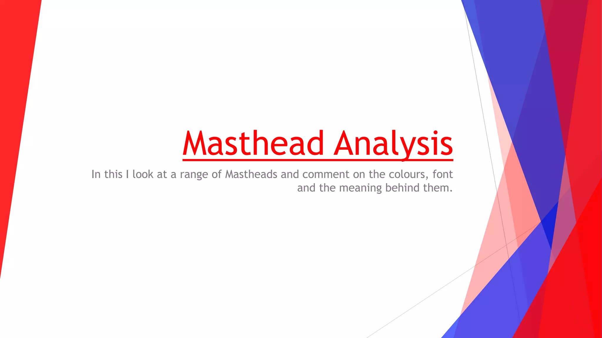
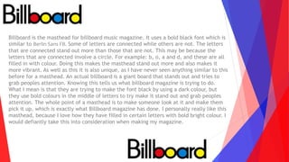
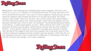
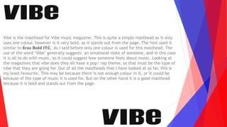
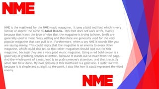
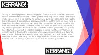
The document analyzes and comments on the colors, fonts, and meanings behind the mastheads of several music magazines, including Billboard, Rolling Stone, Q, Vibe, NME, and Kerrang. It notes design elements like bold colors, serif vs. sans-serif fonts, and how they relate to the magazines' brands and target audiences. Key takeaways for the author's own magazine masthead design are discussed.