The document discusses different font styles that could be used for the masthead of a hip-hop magazine. It analyzes 5 potential fonts:
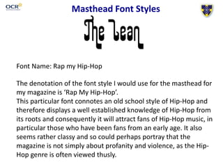
1) "Rap My Hip-Hop" which conveys an old school hip-hop style to attract long-time fans.
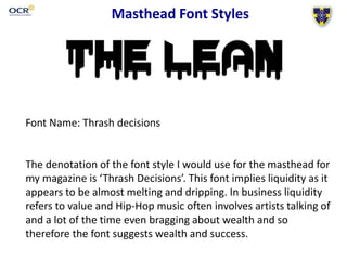
2) "Thrash Decisions" which implies wealth and success through a dripping effect, relating to common themes in hip-hop music.
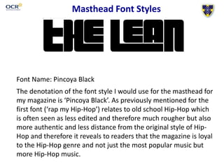
3) "Pincoya Black" which also relates to raw, old school hip-hop seen as more authentic to the genre.
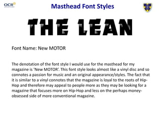
4) "New MOTOR" resembles a vinyl record, conveying a passion for music and original style through a nod to hip-