My suitable masthead fonts
•Download as PPTX, PDF•
0 likes•325 views

masthead font styles experiment.

Recommended
More Related Content
What's hot
What's hot (20)
Viewers also liked
Viewers also liked (20)
Similar to My suitable masthead fonts
Similar to My suitable masthead fonts (20)
More from Asuka Young
More from Asuka Young (18)
Recently uploaded
Recently uploaded (20)
My suitable masthead fonts
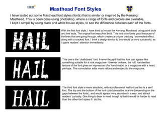
- 1. Masthead Font Styles I have tested out some Masthead font styles (fonts) that is similar or inspired by the Kerrang! Masthead. This is been done using photoshop, where a range of fonts and colours are available. I kept it simple by using black and white house styles, to see the difference between each of the fonts. With the first font style, I have tried to imitate the Kerrang! Masthead using paint tools and line tools, The original font was Ariel bold. This font style looks good because of the lines that are going through, which creates a unique cracking / connected effect, along with a cracked font. I think a design similar to this would be very successful, as it gains readers’ attention immediately. This one is the ‘chalkboard’ font. I never thought that this font can appear like something suitable for a rock magazine- however on here, the ruff, handwritten texture of the font gives an impression of a ‘hand-made’ or a magazine with a heart, perhaps. This connotation adds more values and respect to the magazine. The third font style is more simplistic, with a professional feel to it as this is a serif font. The top and the bottom of the font could almost be in a line (depending on the gaps between the fonts), and would appear very secretive in a way, and attract readers’ curiosity. One thing to bear in mind though is that it would be harder to read than the other font styles if I do this.
- 2. This is the font: Geneva. In my opinion this font is quite standard and connotes casualty, because the thickness of the font is the same / similar all the way through, it might connote equality and ease of reading of the magazine. Because it is also a familiar, conventional font for a magazine, it may attract audiences into buying it (Personal identification-Katz). This is the font: Euphemia UCAS. It is extremely similar to the last one, in a sense that the font size and thickness is the same throughout, but this time it looks a little more elegant and makes the readers feel informed / trust information that is inside. The sharp and clear ends of the font may signify clear and detailed articles inside. This will be a good representation for the Rock genre, but it will be more counter-stereotypical unlike Kerrang! for example, so the readers may feel uncomfortable. This is the font: Impact. As the name suggests, this gives a strong impact to the readers, making them have the impression of an energetic and enthusiastic magazine, It may also suggest that the magazine includes the most important and the most exciting music news, and genre wise this is suitable for the rock genre, because it can also represent action and excitement. This is the font: Nanum Brush Script. This font looks hand written and rushed, which creates movement and a story to the font. Stereotypically this may be a font often used in heavy metal sort of music genre, because it represents the madness / getting out of control. As this sort of font is out of balance, it may be good to attract readers for the uniqueness of the magazine.