SlideShare a Scribd company logo
1.   The top 4 favourite
     Masthead designs

2.


3.


4.
Pros                                                                     Cons
This font has the eroded look to it, fitting well                         The letters are too close together. The black
with the rocky, edgy genre of music                                       line at the top can stand too prominent over
                                                                          the magazine name itself
This font also has the eroded, edgy look to it,                           The font is too thin, spacing on the masthead
which fits well with the rock genre.                                      can be an issue as the lettering would be too
                                                                          central, rather than spread evenly over the FC
My magazine covers an indie field of music. This font                     The font may be too hard to read/illegible for
has an indie feel to it, with the curly, handwritten                      viewers. The font may disguise the rocky feel
effect, similar to that of a Fender Stratocaster font.
                                                                          to the magazine
This font bears resemblance to the Marshall Amplifier font                This font may seem a little to swirly and therefore detract
which I liked the most as it referenced a popular rock                    from the overall genre which I am trying to promote. I'd
music instrument, as well as the magazine title – ‘Amped’                 like to have a more rocky feel to the masthead

This font is very formal, sleek and very simplistic yet effective.        This font may seem a little too sleek and may fit a fashion
This font has also been borrowed from the font used by Gibson             magazine such as Vogue. This may detract from the feel
guitars, which represents the magazine genre extremely well               that the magazine is attempting to promote

The curvy look to the font gives it a fluid feel. The font type is also   Despite matching the unique/indie side to the magazine, it isn't
fairly simplistic despite the curvy variation. The font is also unique    entirely representative of the other genre aspects of the magazine,
to the other fonts which matches the indie side to the magazine.          which detracts from the atmosphere trying to be conveyed.


This font has an aggressive, sharp feel to it which                       Font may be too hard to read. Also adopts a sci-fi feel
matches the rocky side to the magazine genre                              to it which doesn’t suit the overall genre which the
                                                                          magazine is trying to promote
This font is fairly simplistic, adopting a twist on 'Times New            The font type, although simplistic, isn't representative of a
Roman'. The joining of the letters gives it a fluid, slick feel           music magazine which may give the magazine a different
to it                                                                     feel

More Related Content

What's hot

Colour and font
Colour and fontColour and font
Colour and font
Eva Clarke
 
Fonts1
Fonts1Fonts1
Fonts1
Oliboiii
 
Font Analysis
Font AnalysisFont Analysis
Font Analysis
AbbeyCronin
 
Contents page analysis
Contents page analysisContents page analysis
Contents page analysisLiamKeenan
 
Contents page analysis
Contents page analysisContents page analysis
Contents page analysisLiamKeenan
 
Fonts
Fonts Fonts
Fonts
philipslade
 
Font analysis
Font analysisFont analysis
Font analysis
bethdavies5
 
Assignment 9: Initial
Assignment 9: Initial Assignment 9: Initial
Assignment 9: Initial cbuabeng97
 
Newspaper analysis
Newspaper analysisNewspaper analysis
Newspaper analysis
09smisebmedia
 
Film Magazine Deconstructions
Film Magazine DeconstructionsFilm Magazine Deconstructions
Film Magazine DeconstructionsHigginsPlumb
 
Film Magazine Deconstructions by Hollie-Jade Higgins
Film Magazine Deconstructions by Hollie-Jade HigginsFilm Magazine Deconstructions by Hollie-Jade Higgins
Film Magazine Deconstructions by Hollie-Jade HigginsHigginsPlumb
 
Masthead ideas
Masthead ideasMasthead ideas
Masthead ideas
jessicahooker6
 
Decided magazine titles
Decided magazine titlesDecided magazine titles
Decided magazine titles
hannah burton
 
Font analysis 10 different fonts
Font analysis 10 different fontsFont analysis 10 different fonts
Font analysis 10 different fonts
louisahill99
 
Empire magazine analysis
Empire magazine analysisEmpire magazine analysis
Empire magazine analysis
emmahelenjohnson
 
FONTS
FONTSFONTS

What's hot (17)

Colour and font
Colour and fontColour and font
Colour and font
 
Fonts1
Fonts1Fonts1
Fonts1
 
Font Analysis
Font AnalysisFont Analysis
Font Analysis
 
Contents page analysis
Contents page analysisContents page analysis
Contents page analysis
 
Contents page analysis
Contents page analysisContents page analysis
Contents page analysis
 
Fonts
Fonts Fonts
Fonts
 
Font analysis
Font analysisFont analysis
Font analysis
 
Assignment 9: Initial
Assignment 9: Initial Assignment 9: Initial
Assignment 9: Initial
 
Newspaper analysis
Newspaper analysisNewspaper analysis
Newspaper analysis
 
Film Magazine Deconstructions
Film Magazine DeconstructionsFilm Magazine Deconstructions
Film Magazine Deconstructions
 
Film Magazine Deconstructions by Hollie-Jade Higgins
Film Magazine Deconstructions by Hollie-Jade HigginsFilm Magazine Deconstructions by Hollie-Jade Higgins
Film Magazine Deconstructions by Hollie-Jade Higgins
 
Masthead ideas
Masthead ideasMasthead ideas
Masthead ideas
 
Decided magazine titles
Decided magazine titlesDecided magazine titles
Decided magazine titles
 
Media Front Cover Analysis
Media Front Cover Analysis Media Front Cover Analysis
Media Front Cover Analysis
 
Font analysis 10 different fonts
Font analysis 10 different fontsFont analysis 10 different fonts
Font analysis 10 different fonts
 
Empire magazine analysis
Empire magazine analysisEmpire magazine analysis
Empire magazine analysis
 
FONTS
FONTSFONTS
FONTS
 

Similar to Masthead designs main task

My suitable masthead fonts
My suitable masthead fonts My suitable masthead fonts
My suitable masthead fonts
Asuka Young
 
Masthead ideas
Masthead ideasMasthead ideas
Masthead ideas
Faisal Choudhry
 
Style sheet
Style sheetStyle sheet
Style sheetm4rner
 
Font analysis
Font analysisFont analysis
Font analysis
cobes1
 
Fonts and colours
Fonts and coloursFonts and colours
Fonts and colours
AS Media Column E
 
My suitable masthead fonts
My suitable masthead fonts My suitable masthead fonts
My suitable masthead fonts
Asuka Young
 
Fonts and colours
Fonts and coloursFonts and colours
Fonts and colours
AS Media Column D
 
Masthead selection 3
Masthead selection 3Masthead selection 3
Masthead selection 3Tom-Garnett
 
Fonts
FontsFonts
Fonts
Harry Ames
 
Masthead selection
Masthead selectionMasthead selection
Masthead selectionTom-Garnett
 
Font Styles
Font StylesFont Styles
Font Styles
bethanyvaughan
 
Contents pages
Contents pagesContents pages
Contents pagesCraig Hunt
 
Task 5 – deciding which genre and style
Task 5 – deciding which genre and styleTask 5 – deciding which genre and style
Task 5 – deciding which genre and style
AS Media Column D
 
Task 5 – deciding which genre and style
Task 5 – deciding which genre and styleTask 5 – deciding which genre and style
Task 5 – deciding which genre and style
AS Media Column D
 
Task 5 – deciding which genre and style
Task 5 – deciding which genre and styleTask 5 – deciding which genre and style
Task 5 – deciding which genre and style
AS Media Column D
 
Masthead Font sStyles
Masthead Font sStylesMasthead Font sStyles
Masthead Font sStyles
jsharpling2125
 
Font analysis
Font analysisFont analysis
Fonts
FontsFonts

Similar to Masthead designs main task (20)

Style Sheet
Style SheetStyle Sheet
Style Sheet
 
My suitable masthead fonts
My suitable masthead fonts My suitable masthead fonts
My suitable masthead fonts
 
Masthead ideas
Masthead ideasMasthead ideas
Masthead ideas
 
Style sheet
Style sheetStyle sheet
Style sheet
 
Font analysis
Font analysisFont analysis
Font analysis
 
Font analysis
Font analysisFont analysis
Font analysis
 
Fonts and colours
Fonts and coloursFonts and colours
Fonts and colours
 
My suitable masthead fonts
My suitable masthead fonts My suitable masthead fonts
My suitable masthead fonts
 
Fonts and colours
Fonts and coloursFonts and colours
Fonts and colours
 
Masthead selection 3
Masthead selection 3Masthead selection 3
Masthead selection 3
 
Fonts
FontsFonts
Fonts
 
Masthead selection
Masthead selectionMasthead selection
Masthead selection
 
Font Styles
Font StylesFont Styles
Font Styles
 
Contents pages
Contents pagesContents pages
Contents pages
 
Task 5 – deciding which genre and style
Task 5 – deciding which genre and styleTask 5 – deciding which genre and style
Task 5 – deciding which genre and style
 
Task 5 – deciding which genre and style
Task 5 – deciding which genre and styleTask 5 – deciding which genre and style
Task 5 – deciding which genre and style
 
Task 5 – deciding which genre and style
Task 5 – deciding which genre and styleTask 5 – deciding which genre and style
Task 5 – deciding which genre and style
 
Masthead Font sStyles
Masthead Font sStylesMasthead Font sStyles
Masthead Font sStyles
 
Font analysis
Font analysisFont analysis
Font analysis
 
Fonts
FontsFonts
Fonts
 

More from Benjamin Irons

Task 5 shooting script
Task 5   shooting scriptTask 5   shooting script
Task 5 shooting scriptBenjamin Irons
 
Task 6 film company research
Task 6   film company researchTask 6   film company research
Task 6 film company researchBenjamin Irons
 
Task 4 audience profile
Task 4   audience profileTask 4   audience profile
Task 4 audience profileBenjamin Irons
 
Task 8 film magazine covers
Task 8   film magazine coversTask 8   film magazine covers
Task 8 film magazine coversBenjamin Irons
 
Research results task 3
Research results   task 3Research results   task 3
Research results task 3Benjamin Irons
 
Research results task 3
Research results   task 3Research results   task 3
Research results task 3Benjamin Irons
 
Audience questionnaire
Audience questionnaireAudience questionnaire
Audience questionnaireBenjamin Irons
 
Task 7 film posters research
Task 7   film posters researchTask 7   film posters research
Task 7 film posters researchBenjamin Irons
 
Task 2 marketing campaign pres.
Task 2   marketing campaign pres.Task 2   marketing campaign pres.
Task 2 marketing campaign pres.Benjamin Irons
 
Fotown dps draft article
Fotown dps draft articleFotown dps draft article
Fotown dps draft articleBenjamin Irons
 
Contents page analysis
Contents page analysisContents page analysis
Contents page analysisBenjamin Irons
 

More from Benjamin Irons (20)

Task 5 shooting script
Task 5   shooting scriptTask 5   shooting script
Task 5 shooting script
 
Task 6 storyboard
Task 6   storyboardTask 6   storyboard
Task 6 storyboard
 
Task 6 film company research
Task 6   film company researchTask 6   film company research
Task 6 film company research
 
Task 4 audience profile
Task 4   audience profileTask 4   audience profile
Task 4 audience profile
 
Task 8 film magazine covers
Task 8   film magazine coversTask 8   film magazine covers
Task 8 film magazine covers
 
Research results task 3
Research results   task 3Research results   task 3
Research results task 3
 
Research results task 3
Research results   task 3Research results   task 3
Research results task 3
 
Target audience
Target audienceTarget audience
Target audience
 
Audience questionnaire
Audience questionnaireAudience questionnaire
Audience questionnaire
 
Task 7 film posters research
Task 7   film posters researchTask 7   film posters research
Task 7 film posters research
 
Task 2 marketing campaign pres.
Task 2   marketing campaign pres.Task 2   marketing campaign pres.
Task 2 marketing campaign pres.
 
Call sheet
Call sheetCall sheet
Call sheet
 
Location recces
Location reccesLocation recces
Location recces
 
Fotown dps draft article
Fotown dps draft articleFotown dps draft article
Fotown dps draft article
 
Contents page analysis
Contents page analysisContents page analysis
Contents page analysis
 
Call sheet
Call sheetCall sheet
Call sheet
 
Masthead feedback
Masthead feedbackMasthead feedback
Masthead feedback
 
Flat plan
Flat planFlat plan
Flat plan
 
Focus group pres.
Focus group pres.Focus group pres.
Focus group pres.
 
Mood board
Mood boardMood board
Mood board
 

Masthead designs main task

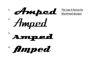
  • 1. 1. The top 4 favourite Masthead designs 2. 3. 4.
  • 2. Pros Cons This font has the eroded look to it, fitting well The letters are too close together. The black with the rocky, edgy genre of music line at the top can stand too prominent over the magazine name itself This font also has the eroded, edgy look to it, The font is too thin, spacing on the masthead which fits well with the rock genre. can be an issue as the lettering would be too central, rather than spread evenly over the FC My magazine covers an indie field of music. This font The font may be too hard to read/illegible for has an indie feel to it, with the curly, handwritten viewers. The font may disguise the rocky feel effect, similar to that of a Fender Stratocaster font. to the magazine This font bears resemblance to the Marshall Amplifier font This font may seem a little to swirly and therefore detract which I liked the most as it referenced a popular rock from the overall genre which I am trying to promote. I'd music instrument, as well as the magazine title – ‘Amped’ like to have a more rocky feel to the masthead This font is very formal, sleek and very simplistic yet effective. This font may seem a little too sleek and may fit a fashion This font has also been borrowed from the font used by Gibson magazine such as Vogue. This may detract from the feel guitars, which represents the magazine genre extremely well that the magazine is attempting to promote The curvy look to the font gives it a fluid feel. The font type is also Despite matching the unique/indie side to the magazine, it isn't fairly simplistic despite the curvy variation. The font is also unique entirely representative of the other genre aspects of the magazine, to the other fonts which matches the indie side to the magazine. which detracts from the atmosphere trying to be conveyed. This font has an aggressive, sharp feel to it which Font may be too hard to read. Also adopts a sci-fi feel matches the rocky side to the magazine genre to it which doesn’t suit the overall genre which the magazine is trying to promote This font is fairly simplistic, adopting a twist on 'Times New The font type, although simplistic, isn't representative of a Roman'. The joining of the letters gives it a fluid, slick feel music magazine which may give the magazine a different to it feel