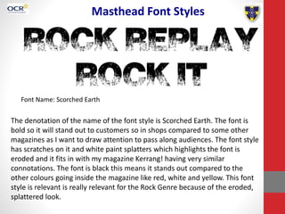
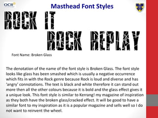
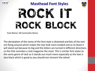
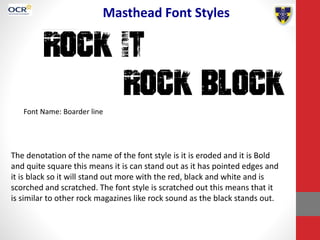
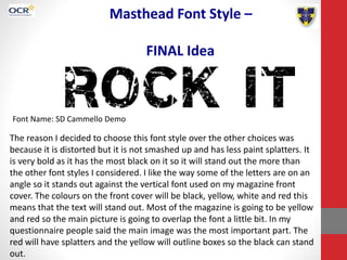
Masthead Font Styles
• Candidate Number: 3147
• Centre Number: 64135
• Candidate Name: Emily Vaughan
Masthead Font Styles
Font Name: Scorched Earth
The denotation of the name of the font style is Scorched Earth. The font is
bold so it will stand out to customers so in shops compared to some other
magazines as I want to draw attention to pass along audiences. The font style
has scratches on it and white paint splatters which highlights the font is
eroded and it fits in with my magazine Kerrang! having very similar
connotations. The font is black this means it stands out compared to the
other colours going inside the magazine like red, white and yellow. This font
style is relevant is really relevant for the Rock Genre because of the eroded,
splattered look.
Masthead Font Styles
Font Name: Broken Glass
The denotation of the name of the font style is Broken Glass. The font style
looks like glass has been smashed which is usually a negative occurrence
which fits in with the Rock genre because Rock is loud and diverse and has
‘angry’ connotations. The text is black and white therefore it can stand out
more then all the other colours because it is bold and the glass effect gives it
a unique look. This font style is similar to Kerrang! my magazine of inspiration
as they both have the broken glass/cracked effect. It will be good to have a
similar font to my inspiration as it is a popular magazine and sells well so I do
not want to reinvent the wheel.
Masthead Font Styles
Font Name: SD Cammello Demo
The denotation of the name of the font style is distorted and bits of the text
are flying around which makes the text look more eroded and as its black it
will stand out because its big and the letters are turned in different directions
so the title connotes a rock magazine the most. This is similar font styles to
the same genre of rock so it stands out much more especially as the text is
also black which is good as you should not reinvent the wheel.
Masthead Font Styles
Font Name: Boarder line
The denotation of the name of the font style is it is eroded and it is Bold
and quite square this means it is can stand out as it has pointed edges and
it is black so it will stand out more with the red, black and white and is
scorched and scratched. The font style is scratched out this means that it
is similar to other rock magazines like rock sound as the black stands out.
Masthead Font Style –
FINAL Idea
Font Name: SD Cammello Demo
The reason I decided to choose this font style over the other choices was
because it is distorted but it is not smashed up and has less paint splatters. It
is very bold as it has the most black on it so it will stand out the more than
the other font styles I considered. I like the way some of the letters are on an
angle so it stands out against the vertical font used on my magazine front
cover. The colours on the front cover will be black, yellow, white and red this
means that the text will stand out. Most of the magazine is going to be yellow
and red so the main picture is going to overlap the font a little bit. In my
questionnaire people said the main image was the most important part. The
red will have splatters and the yellow will outline boxes so the black can stand
out.

Emily masthead font styles

  • 1.
    Masthead Font Styles •Candidate Number: 3147 • Centre Number: 64135 • Candidate Name: Emily Vaughan
  • 2.
    Masthead Font Styles FontName: Scorched Earth The denotation of the name of the font style is Scorched Earth. The font is bold so it will stand out to customers so in shops compared to some other magazines as I want to draw attention to pass along audiences. The font style has scratches on it and white paint splatters which highlights the font is eroded and it fits in with my magazine Kerrang! having very similar connotations. The font is black this means it stands out compared to the other colours going inside the magazine like red, white and yellow. This font style is relevant is really relevant for the Rock Genre because of the eroded, splattered look.
  • 3.
    Masthead Font Styles FontName: Broken Glass The denotation of the name of the font style is Broken Glass. The font style looks like glass has been smashed which is usually a negative occurrence which fits in with the Rock genre because Rock is loud and diverse and has ‘angry’ connotations. The text is black and white therefore it can stand out more then all the other colours because it is bold and the glass effect gives it a unique look. This font style is similar to Kerrang! my magazine of inspiration as they both have the broken glass/cracked effect. It will be good to have a similar font to my inspiration as it is a popular magazine and sells well so I do not want to reinvent the wheel.
  • 4.
    Masthead Font Styles FontName: SD Cammello Demo The denotation of the name of the font style is distorted and bits of the text are flying around which makes the text look more eroded and as its black it will stand out because its big and the letters are turned in different directions so the title connotes a rock magazine the most. This is similar font styles to the same genre of rock so it stands out much more especially as the text is also black which is good as you should not reinvent the wheel.
  • 5.
    Masthead Font Styles FontName: Boarder line The denotation of the name of the font style is it is eroded and it is Bold and quite square this means it is can stand out as it has pointed edges and it is black so it will stand out more with the red, black and white and is scorched and scratched. The font style is scratched out this means that it is similar to other rock magazines like rock sound as the black stands out.
  • 6.
    Masthead Font Style– FINAL Idea Font Name: SD Cammello Demo The reason I decided to choose this font style over the other choices was because it is distorted but it is not smashed up and has less paint splatters. It is very bold as it has the most black on it so it will stand out the more than the other font styles I considered. I like the way some of the letters are on an angle so it stands out against the vertical font used on my magazine front cover. The colours on the front cover will be black, yellow, white and red this means that the text will stand out. Most of the magazine is going to be yellow and red so the main picture is going to overlap the font a little bit. In my questionnaire people said the main image was the most important part. The red will have splatters and the yellow will outline boxes so the black can stand out.