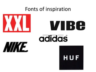
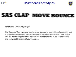
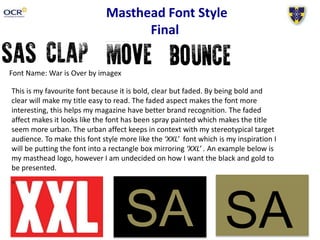
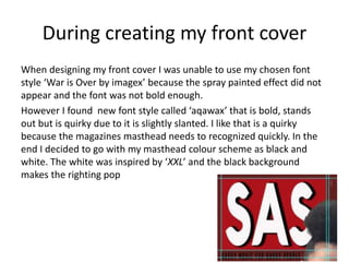
3. Masthead Font Styles
Font Name: All Rights Reserved by junkohanhero
‘All rights reserved’ font is bold white letters in black boxes which alternatively are
different sizes and overlap. This style of font mirrors XXL’s style so would be
appropriate to use. This is because XXL have white letters in a red box. The font is clear
however the letters are different sizes which makes them look more interesting and
modern.
4. Masthead Font Styles
Font Name: Cracked by Xerographer Fonts
The denotation of the front style is letters are ever so slightly
crooked and due to the random white lines across the letters makes
the font quirky. This makes the words stand out, however due to the
lines the letters are not as clear as they could be.
5. Masthead Font Styles
Font Name: ExtraBlur by imagex
The ‘Extreblur’ font involves a bold letter surrounded by blurred lines.Despite this font
is original and interesting, due to it being very blurred makes the letters hard to read.
This is a disadvantage for a title because you want the reader to be able to quickly
and easily read the name of your magazine.
6. Masthead Font Styles
Font Name: New Facebook by prask
The connotation of the font is white bold letters at an angle within a
black box. The black box slightly cuts off the edge of the letters. This
font looks interesting because the letters are at an angle and the
letters are outlined in a black box. However due to the top and
bottoms of the letters have been cut off which makes the font hard
to read.
7. Masthead Font Styles
Font Name: American Captain by Fontry
This denotation of font ‘American Captain’ is bold with square edging. This
style of font is clear and you can read the word quickly. However I think the
font is to similar to star wars which is a negative because you want clear brand
identity.
8. Masthead Font Style
Final
Font Name: War is Over by imagex
This is my favourite font because it is bold, clear but faded. By being bold and
clear will make my title easy to read. The faded aspect makes the font more
interesting, this helps my magazine have better brand recognition. The faded
affect makes it looks like the font has been spray painted which makes the title
seem more urban. The urban affect keeps in context with my stereotypical target
audience. To make this font style more like the ‘XXL’ font which is my inspiration I
will be putting the font into a rectangle box mirroring ‘XXL’ . An example below is
my masthead logo, however I am undecided on how I want the black and gold to
be presented.
SA SA
9. During creating my front cover
When designing my front cover I was unable to use my chosen font
style ‘War is Over by imagex’ because the spray painted effect did not
appear and the font was not bold enough.
However I found new font style called ‘aqawax’ that is bold, stands
out but is quirky due to it is slightly slanted. I like that is a quirky
because the magazines masthead needs to recognized quickly. In the
end I decided to go with my masthead colour scheme as black and
white. The white was inspired by ‘XXL’ and the black background
makes the righting pop