Hugv
•Download as PPTX, PDF•
0 likes•481 views
This document discusses different masthead designs for a music magazine. It evaluates each design on criteria like font, color scheme, boldness, simplicity, professionalism and whether it fits with the overall magazine style. One masthead using red text is praised for being bold and eye-catching on shelves while appealing to the target audience. Another design using a simplistic font in the magazine's color scheme is considered one of the favorite options for being modern yet readable.
Report
Share
Report
Share

Recommended
Mast head designs
The document discusses different masthead designs for a music magazine. The author analyzes the effectiveness of each design in terms of font, size, colors, professionalism, and fit with the overall magazine style. In the end, the author selects a masthead with a modern, bold font in red and black colors as their favorite choice that will stand out on shelves and appeal to their target audience.
Masthead Designs
The document evaluates 5 different fonts for a magazine masthead based on boldness, eye-catching appeal, and ability to stand out amongst other magazines. Font 1 is deemed bold and eye-catching due to the contrast between red and black colors which match the magazine's branding. Font 2 is also seen as bold and eye-catching by separating the letters in the masthead. Font 3 is assessed as too simplistic and thin to stand out effectively. Font 4 is considered bold due to color contrast and a defining white line. Font 5 again separates the letters for recognizability and a bold, eye-catching appearance.
Research into fonts
The document discusses font choices for different sections of a magazine. For the front cover title, the author chooses MikodacsPCS to stand out against a black background with white letters. Additional front cover information will use Tw Cen MT Condensed and Tw Cen MT Condensed Extra Bold. For the contents page title, Tw Cen MT Condensed Extra Bold is selected to match the regular text below, which will also use Tw Cen MT Condensed. The double page spread will employ Tw Cen MT Condensed throughout.
Masthead font styles
This document discusses four different font styles under consideration for use in a magazine masthead. It provides analysis of each font, including descriptions of their visual characteristics and how well they represent the tone and subject matter of an indie music magazine. In the end, the author selects one font as their final choice because it closely reflects the chosen magazine in terms of representing the genre of indie music through its bold visual style.
Font analysis
The document discusses font usage in pop magazines. It notes that pop magazines typically use a signature font for main headlines and sections to make the magazine easily recognizable. This font is usually featured most prominently on the front cover. The signature font is also often used for article titles and sections within the magazine to maintain brand association. Additionally, pop magazines typically use a simple, easy-to-read font for body text throughout the magazine to ensure readability. Font choices aim to appeal to the target audience and communicate the magazine's style and personality.
Contents Page Progress Slide
Martin Watts describes the process of creating the contents page for a project. He began with a photo that had blank space for page numbers and included graffiti to connect to the distorted front cover. Additional band member photos were overlapped and their opacity lowered to create a blurred effect. Titles and content listings were added in a bold font and given outer glows to stand out from the busy background. The title also matched the front cover in font and glow to clearly associate the two pages.
Task 8 research
The document analyzes and summarizes the key design elements of multiple soccer fanzines. It discusses the mastheads, fonts, layouts, pictures and writing styles used across several fanzines. For one Liverpool fanzine, it notes the faded masthead text, emblem, warning and font. It describes the bold sans-serif font and leading lines used in the main body text. It also analyzes the fonts, layout and interview format of an Arsenal fanzine, and the informal, biased writing and pictures used in another Liverpool fanzine.
Mood board
The document discusses color scheme, font, and layout choices for a magazine targeted towards 17-19 year olds. A minimalist color scheme of greys, blacks, and a hint of blue is chosen to have a classy, sophisticated feel. The main font is selected because it will stand out on the cover and be instantly identifiable. The cover lines font is bold, simple, and easy to read in a classy style. A different font is chosen for the double page spread title as that article is more relaxed in tone.
Task 10 style sheet
The document discusses color scheme, font, and layout choices for a magazine targeted towards 17-19 year olds. A minimalist color scheme of greys, blacks, and a hint of blue is chosen to have a classy, sophisticated feel. The blues will be featured prominently on the front cover to draw attention. A bold, elegant font is selected for the main masthead to stand out from other magazines. Another bold, simple font is chosen for cover lines to catch the eye when opening the magazine. A different font is used for a double page spread title since that article is more relaxed in style.
Font ideas
This document discusses several fonts being considered for use in a magazine. It describes the first font as having a collegiate American style that is fashionable and fits well with the magazine's style. It notes the second font has an urban look with a city silhouette and unique design. The third font is described as very different than typical magazine fonts, with an American look, curved yet bold lines that stand out, and ashing a less formal impression than the first font.
Magazine Stylesheet
The document evaluates four different font options for a magazine masthead:
1) Zwodrei font with a thick, rectangular border that would stand out on any page color
2) Ailerons font with a thinner style that looks cleaner than the first option
3) Manifesto font featuring only uppercase letters without a border that may be too unique and cause confusion
4) Coco Puff font with a medium thickness and border that achieves a balance between options one and two in line with the magazine's style.
The document also selects League Spartan for headlines, Droid Serif for body text, and establishes a primary color scheme of black, white, and red.
Analysis of 3 magazine covers
This document analyzes the layout and design of magazine covers featuring Adele, David Bowie, and Rihanna. It discusses the grid layout, placement of elements like the main image, masthead, and sell lines. For each cover, it examines how the design techniques like color scheme, font size, and image editing create professional-looking covers that effectively showcase the featured artist.
Music magazine contents page
The document provides guidelines for designing the contents page of a magazine. It recommends writing "contents" in bold at the top. It suggests using a consistent 3-4 color scheme and including 3-4 columns of regular and featured content. Images should dominate the page and reference the article number in bold. The issue number is usually written in a smaller font at the top or bottom of the page.
Front cover generic conventions
This document outlines various conventions for designing magazine front covers, including:
- Using a masthead that is unique, iconic, and positioned in the top third of the page.
- Including a strapline that briefly summarizes the magazine's genre or region.
- Featuring a dominant central image that represents the magazine's content and draws attention.
- Establishing a consistent color scheme that identifies the magazine's brand and appeals to its audience.
- Incorporating sell lines of varying sizes to highlight key stories and intrigue readers.
- Including essential identifying information like issue numbers and barcodes.
Font analysis
The document discusses font choices for an R&B magazine masthead and content pages. Three potential masthead fonts are presented: one in varying unique uppercase styles, one in a slanted superhero style, and one in a graffiti style. The author chooses the unique uppercase style font for the masthead and content pages because it is bold, distinctive, and reflects the cool and masculine feel of R&B.
Media studies pp comparison magazines
The magazine front cover features a large masthead at the top, with the main cover line in bold to draw attention to the headline article. It displays a celebrity image and cover lines surrounding it in different fonts and colors. There is a positioning statement at the bottom along with section headings and images to preview articles inside and encourage purchase.
Contents page analysis
The document analyzes the contents pages of two magazines - V Magazine and XXL Magazine. It discusses various design elements of the pages including images, fonts, color schemes, layouts and how information is organized and presented. The main elements that stand out are the large celebrity images in the center of the pages, the mastheads at the top, and the columns listing article titles, descriptions and page numbers to easily direct readers to content. The color palettes for both pages involve grayscale tones along with pops of bright red. Fonts are used distinctly for different types of information. Overall the pages aim to attract readers with images and clearly present what the magazines contain through structured lists.
Font analysis
The document analyzes 8 different fonts for their suitability for an album cover describing the artist's personal development and change. 4 fonts are deemed suitable: a calligraphy style font that has unique, perfectly width letters; a handwritten style font that fits well for the artist's name but not the title; a laid back, subtle font that is not perfectly even or straight showing it's realistic; and a simpler font whose simplicity makes it easily readable and able to stand out on the cover. The other 4 fonts are deemed unsuitable for reasons such as being too bold, large, basic, or having the wrong shape or background color.
Font Styles
Bethany Vaughan evaluated several fonts for the masthead of her music magazine aimed at teenagers and young adults. She considered fonts such as "Colleged", "CAUTION", "Broken Glass", "Skratch Punk", and ultimately selected "BREAK IT" due to its easy readability, realistic shattered effect that conveyed rebelliousness, and similarity to the successful magazine KERRANG! which inspired her desired tone and style.
Mast head font list and analysis
The document discusses four different font styles - "Mark my Words", "Beyond the Mountains", "Blow Brush", and "Pale Blue Eyes" - that are being considered for use as the masthead font on a magazine. For each font, a brief description is provided of what the font name denotes and how the font style appears. The final selection is "Olympic Branding" because it is different than fonts used by other rock magazines like NME and Uncut, and different than the main font that will be used, while still implying importance.
Analysing music magazine contents pages
The document summarizes key elements of a magazine contents page layout. It notes that the word "contents" is usually written in bold at the top and may include the repeated masthead. Contents pages typically feature 3-4 columns listing regular content like competitions alongside featured articles about artists/bands. Large pictures dominate the page, primarily of the cover artist, and include the article page number in bold for easy reference regardless of content details.
Magazine cover analysis - Plan B
The document summarizes the design elements of a magazine cover, including:
1. The masthead title "Q" is featured prominently in red in the primary optical area to catch readers' eyes.
2. The main image takes up most of the cover space with the model's face in the primary optical area.
3. The model credit is in red in the strong follow area so readers will see it after the masthead.
4. Cover lines are in red and black fonts for contrast and catch attention with important words in larger font.
Front cover codes and conventions
This document outlines various codes and conventions used on magazine front covers, including:
- The masthead should be unique, iconic, and the biggest font on the page.
- A strapline summarizes the magazine's genre or region.
- The main sell line is the second largest font and anchors the dominant image.
- Sub sell lines reference stories and frame the dominant image.
- The dominant image represents the genre and stands out immediately.
- Colour schemes use 2-3 primary colors that relate to the genre.
- Conventions like the masthead, dominant image, color scheme, and essential information are most important to include on a front cover, while sub images, puffs, excessive sell lines
Codes and Conventions of a Music Magazine Double Page Spread
The document discusses the codes and conventions of a double page spread in a magazine. It explains that a double page spread typically features a large main headline across the top of both pages, a main central image bleeding across both pages, and smaller supporting images. It also typically includes columns of small-font text, a stand-alone intro paragraph, drop caps, pull quotes, bylines, a limited color palette linked to the magazine's style, and date, page numbers and web address in the footer. The layout is structured to give prominence to the main image and headline while breaking up the text with visual elements and maintaining continuity across the two pages.
Current affairs magazine website research
The document summarizes key similarities and differences between the websites of several magazine publications (Teen Vogue, Vanity Fair, Newsweek) and their print magazines. Some key points of convergence include matching mastheads, fonts, and color schemes between the digital and print versions. The websites also feature things like top stories, smaller bottom stories, ads, and sign-in options similarly to the magazine layouts. Differences between the sites include their target demographics (younger for Teen Vogue vs. older for Newsweek) and amount of ads. Overall the websites mirror important design elements of their print magazines while adapting for the digital format and audience.
Masthead font styles
The document discusses different font styles considered for a magazine masthead. It evaluates four fonts: Vonique 92, Raider Crusader, True Lies, and Futurist fixed-width. Vonique 92 is deemed not bold enough and hard to read. Raider Crusader is too sharp and not plain enough. True Lies is appealing but not bold enough. Futurist fixed-width is effective but also not bold enough. The final choice is "The bold font" as its name and thickness reveals the popularity of the hip hop/rap genre and will appeal more to the intended audience.
Masthead ideas
The document discusses font options for a magazine masthead that match the magazine's tone of being relaxed and rebellious while appealing to a younger audience. It evaluates 5 fonts - CF Rebelle, Rebellion, Rebel Power, Indie Hand, and Era Bold ITC - considering how each font's messy, scratchy style aligns with the magazine's theme and how it could be positioned on the cover page. The document recommends either CF Rebelle or Indie Hand as they emphasize the untidy, rebellious theme through their irregular letter shapes and sizes.
Font analysis 2
The document discusses font choices in pop magazines. It notes that We Love Pop magazine uses a unique signature font for headlines and sell lines to clearly identify the brand. This font is also used consistently throughout article titles and the contents page to maintain brand recognition. The document recommends choosing a simple, clear font for body text to ensure readability, while also selecting a distinctive signature font from Dafont.com to represent the magazine's style and identity. It presents three font options for the magazine masthead, selecting one as most eye-catching for the target audience due to its bright pink and black colors and fun, feminine feel.
Font analysis edited
The document discusses font choices for a pop culture magazine called We Love Pop. It notes that the magazine uses a unique signature font for headlines and titles throughout the magazine to clearly identify the brand. This font stands out on the front cover but is also used consistently inside on article titles and the contents page. The body text is in a simpler, easier to read font. The document advocates choosing a signature font for a new magazine that will identify the brand and appeal to the target audience, while also using a clear font for the main text. It presents options for a new magazine's masthead font and chooses one that is bright, eye-catching, fun, and will identify the magazine's style and intended female readership.
Research into fonts
1) The document discusses font options for a new music magazine, including Arial Black, Impact, and Mikodacs PCS.
2) It decides to use Mikodacs PCS for the magazine cover because it has a unique pattern and bold style like other hip hop magazines, while still seeming professional but not too professional for the target teenage audience.
3) TW Cen MT condensed will be used for the cover lines, sell lines, contents page headings and body text to maintain consistency within the magazine using a quirky, cool font.
More Related Content
What's hot
Task 10 style sheet
The document discusses color scheme, font, and layout choices for a magazine targeted towards 17-19 year olds. A minimalist color scheme of greys, blacks, and a hint of blue is chosen to have a classy, sophisticated feel. The blues will be featured prominently on the front cover to draw attention. A bold, elegant font is selected for the main masthead to stand out from other magazines. Another bold, simple font is chosen for cover lines to catch the eye when opening the magazine. A different font is used for a double page spread title since that article is more relaxed in style.
Font ideas
This document discusses several fonts being considered for use in a magazine. It describes the first font as having a collegiate American style that is fashionable and fits well with the magazine's style. It notes the second font has an urban look with a city silhouette and unique design. The third font is described as very different than typical magazine fonts, with an American look, curved yet bold lines that stand out, and ashing a less formal impression than the first font.
Magazine Stylesheet
The document evaluates four different font options for a magazine masthead:
1) Zwodrei font with a thick, rectangular border that would stand out on any page color
2) Ailerons font with a thinner style that looks cleaner than the first option
3) Manifesto font featuring only uppercase letters without a border that may be too unique and cause confusion
4) Coco Puff font with a medium thickness and border that achieves a balance between options one and two in line with the magazine's style.
The document also selects League Spartan for headlines, Droid Serif for body text, and establishes a primary color scheme of black, white, and red.
Analysis of 3 magazine covers
This document analyzes the layout and design of magazine covers featuring Adele, David Bowie, and Rihanna. It discusses the grid layout, placement of elements like the main image, masthead, and sell lines. For each cover, it examines how the design techniques like color scheme, font size, and image editing create professional-looking covers that effectively showcase the featured artist.
Music magazine contents page
The document provides guidelines for designing the contents page of a magazine. It recommends writing "contents" in bold at the top. It suggests using a consistent 3-4 color scheme and including 3-4 columns of regular and featured content. Images should dominate the page and reference the article number in bold. The issue number is usually written in a smaller font at the top or bottom of the page.
Front cover generic conventions
This document outlines various conventions for designing magazine front covers, including:
- Using a masthead that is unique, iconic, and positioned in the top third of the page.
- Including a strapline that briefly summarizes the magazine's genre or region.
- Featuring a dominant central image that represents the magazine's content and draws attention.
- Establishing a consistent color scheme that identifies the magazine's brand and appeals to its audience.
- Incorporating sell lines of varying sizes to highlight key stories and intrigue readers.
- Including essential identifying information like issue numbers and barcodes.
Font analysis
The document discusses font choices for an R&B magazine masthead and content pages. Three potential masthead fonts are presented: one in varying unique uppercase styles, one in a slanted superhero style, and one in a graffiti style. The author chooses the unique uppercase style font for the masthead and content pages because it is bold, distinctive, and reflects the cool and masculine feel of R&B.
Media studies pp comparison magazines
The magazine front cover features a large masthead at the top, with the main cover line in bold to draw attention to the headline article. It displays a celebrity image and cover lines surrounding it in different fonts and colors. There is a positioning statement at the bottom along with section headings and images to preview articles inside and encourage purchase.
Contents page analysis
The document analyzes the contents pages of two magazines - V Magazine and XXL Magazine. It discusses various design elements of the pages including images, fonts, color schemes, layouts and how information is organized and presented. The main elements that stand out are the large celebrity images in the center of the pages, the mastheads at the top, and the columns listing article titles, descriptions and page numbers to easily direct readers to content. The color palettes for both pages involve grayscale tones along with pops of bright red. Fonts are used distinctly for different types of information. Overall the pages aim to attract readers with images and clearly present what the magazines contain through structured lists.
Font analysis
The document analyzes 8 different fonts for their suitability for an album cover describing the artist's personal development and change. 4 fonts are deemed suitable: a calligraphy style font that has unique, perfectly width letters; a handwritten style font that fits well for the artist's name but not the title; a laid back, subtle font that is not perfectly even or straight showing it's realistic; and a simpler font whose simplicity makes it easily readable and able to stand out on the cover. The other 4 fonts are deemed unsuitable for reasons such as being too bold, large, basic, or having the wrong shape or background color.
Font Styles
Bethany Vaughan evaluated several fonts for the masthead of her music magazine aimed at teenagers and young adults. She considered fonts such as "Colleged", "CAUTION", "Broken Glass", "Skratch Punk", and ultimately selected "BREAK IT" due to its easy readability, realistic shattered effect that conveyed rebelliousness, and similarity to the successful magazine KERRANG! which inspired her desired tone and style.
Mast head font list and analysis
The document discusses four different font styles - "Mark my Words", "Beyond the Mountains", "Blow Brush", and "Pale Blue Eyes" - that are being considered for use as the masthead font on a magazine. For each font, a brief description is provided of what the font name denotes and how the font style appears. The final selection is "Olympic Branding" because it is different than fonts used by other rock magazines like NME and Uncut, and different than the main font that will be used, while still implying importance.
Analysing music magazine contents pages
The document summarizes key elements of a magazine contents page layout. It notes that the word "contents" is usually written in bold at the top and may include the repeated masthead. Contents pages typically feature 3-4 columns listing regular content like competitions alongside featured articles about artists/bands. Large pictures dominate the page, primarily of the cover artist, and include the article page number in bold for easy reference regardless of content details.
Magazine cover analysis - Plan B
The document summarizes the design elements of a magazine cover, including:
1. The masthead title "Q" is featured prominently in red in the primary optical area to catch readers' eyes.
2. The main image takes up most of the cover space with the model's face in the primary optical area.
3. The model credit is in red in the strong follow area so readers will see it after the masthead.
4. Cover lines are in red and black fonts for contrast and catch attention with important words in larger font.
Front cover codes and conventions
This document outlines various codes and conventions used on magazine front covers, including:
- The masthead should be unique, iconic, and the biggest font on the page.
- A strapline summarizes the magazine's genre or region.
- The main sell line is the second largest font and anchors the dominant image.
- Sub sell lines reference stories and frame the dominant image.
- The dominant image represents the genre and stands out immediately.
- Colour schemes use 2-3 primary colors that relate to the genre.
- Conventions like the masthead, dominant image, color scheme, and essential information are most important to include on a front cover, while sub images, puffs, excessive sell lines
Codes and Conventions of a Music Magazine Double Page Spread
The document discusses the codes and conventions of a double page spread in a magazine. It explains that a double page spread typically features a large main headline across the top of both pages, a main central image bleeding across both pages, and smaller supporting images. It also typically includes columns of small-font text, a stand-alone intro paragraph, drop caps, pull quotes, bylines, a limited color palette linked to the magazine's style, and date, page numbers and web address in the footer. The layout is structured to give prominence to the main image and headline while breaking up the text with visual elements and maintaining continuity across the two pages.
Current affairs magazine website research
The document summarizes key similarities and differences between the websites of several magazine publications (Teen Vogue, Vanity Fair, Newsweek) and their print magazines. Some key points of convergence include matching mastheads, fonts, and color schemes between the digital and print versions. The websites also feature things like top stories, smaller bottom stories, ads, and sign-in options similarly to the magazine layouts. Differences between the sites include their target demographics (younger for Teen Vogue vs. older for Newsweek) and amount of ads. Overall the websites mirror important design elements of their print magazines while adapting for the digital format and audience.
What's hot (17)
Codes and Conventions of a Music Magazine Double Page Spread
Codes and Conventions of a Music Magazine Double Page Spread
Similar to Hugv
Masthead font styles
The document discusses different font styles considered for a magazine masthead. It evaluates four fonts: Vonique 92, Raider Crusader, True Lies, and Futurist fixed-width. Vonique 92 is deemed not bold enough and hard to read. Raider Crusader is too sharp and not plain enough. True Lies is appealing but not bold enough. Futurist fixed-width is effective but also not bold enough. The final choice is "The bold font" as its name and thickness reveals the popularity of the hip hop/rap genre and will appeal more to the intended audience.
Masthead ideas
The document discusses font options for a magazine masthead that match the magazine's tone of being relaxed and rebellious while appealing to a younger audience. It evaluates 5 fonts - CF Rebelle, Rebellion, Rebel Power, Indie Hand, and Era Bold ITC - considering how each font's messy, scratchy style aligns with the magazine's theme and how it could be positioned on the cover page. The document recommends either CF Rebelle or Indie Hand as they emphasize the untidy, rebellious theme through their irregular letter shapes and sizes.
Font analysis 2
The document discusses font choices in pop magazines. It notes that We Love Pop magazine uses a unique signature font for headlines and sell lines to clearly identify the brand. This font is also used consistently throughout article titles and the contents page to maintain brand recognition. The document recommends choosing a simple, clear font for body text to ensure readability, while also selecting a distinctive signature font from Dafont.com to represent the magazine's style and identity. It presents three font options for the magazine masthead, selecting one as most eye-catching for the target audience due to its bright pink and black colors and fun, feminine feel.
Font analysis edited
The document discusses font choices for a pop culture magazine called We Love Pop. It notes that the magazine uses a unique signature font for headlines and titles throughout the magazine to clearly identify the brand. This font stands out on the front cover but is also used consistently inside on article titles and the contents page. The body text is in a simpler, easier to read font. The document advocates choosing a signature font for a new magazine that will identify the brand and appeal to the target audience, while also using a clear font for the main text. It presents options for a new magazine's masthead font and chooses one that is bright, eye-catching, fun, and will identify the magazine's style and intended female readership.
Research into fonts
1) The document discusses font options for a new music magazine, including Arial Black, Impact, and Mikodacs PCS.
2) It decides to use Mikodacs PCS for the magazine cover because it has a unique pattern and bold style like other hip hop magazines, while still seeming professional but not too professional for the target teenage audience.
3) TW Cen MT condensed will be used for the cover lines, sell lines, contents page headings and body text to maintain consistency within the magazine using a quirky, cool font.
Masthead Font Styles
1) The document evaluates several font styles for use in a music magazine masthead, ultimately selecting "NEOU" for its boldness and ability to draw attention.
2) "NEOU" is described as bold and spaced out, making it suitable to draw readers' eyes to the magazine cover.
3) The author decides on an all-black monochrome color scheme based on reader survey feedback and to match the magazine's simplistic theme.
Task 5 fonts, colour,size
This document discusses font choices for different elements of a magazine, including the masthead, inside content text, and coverlines. It recommends sans serif fonts for the inside text to provide a modern and easy-to-read look. A bold, sharp motioncontrol font is chosen for the masthead to stand out from the content text. A thinner americana font is selected for the coverlines to differentiate it from the masthead but still look modern. Font size, color, and primary versus complementary colors are also addressed for maximizing masthead visibility and conveying the right message about the magazine's tone.
Style sheets (1)
The document discusses font and color scheme options for a magazine. For fonts, the author considered "Depressionist 3 Revisited", "Underworld", "Channel Tuning", and "Shank Font" but ultimately selected "By The Way" for the masthead and cover lines and "Primer Print" for headlines and subheadings as they have an aged, distressed look that fits the alternative theme. For the color scheme, the author chose a mainly monochrome scheme with red accents as it looks professional, makes the red stand out, and is a popular style for similar magazines. Other considered schemes, an analogous blue scheme and a monochrome black and white scheme, were rejected for not fitting the target audience or
Font types
The document discusses font options for a magazine masthead and cover lines. It examines fonts like Abode Fan Heiti, Georgia, Informal Roman, Imprint MT Shadow, and Lucidia Calligraph. Short summaries of each font are provided in terms of readability, sophistication, and boldness. Feedback was gathered from the target audience, and Imprint MT Shadow was selected as the preferred option since it is clear, unique, and the shadowing helps it stand out for the magazine masthead.
Fonts analysis
This document evaluates several fonts for use in an indie music magazine. It provides pros and cons for each font and analyzes their suitability for different elements like body text, headers, and mastheads. Three masthead design ideas are also presented using different font combinations. In the end, the following final font choices are made: Source Sans Pro for body text as it looks professional and is easy to read; Big John for headers and the masthead as it is bold and eye-catching; and Slim Joe for callouts and pull quotes as it complements Big John.
Masthead Font Styles
George Barnstable is deciding on a font style for the masthead of his new hip hop magazine. He considers three options: American Captain, Krinkes, and Helvetica. For his final choice, he selects American Captain. He feels this bold yet simple font will draw attention and is fitting for the daring views in hip hop music. The masthead will be in black surrounded by orange with a white background. This color scheme works well together. By placing the masthead prominently, he hopes to attract consumers' attention. Using a similar font to magazines he admires, like XXL, will help consumers recognize the magazine's hip hop focus. He also plans to name the magazine "Pablo" after Kanye West
Question 1
This document summarizes how the media product uses and develops conventions of real music magazines.
The masthead, cover image, headline, and cover lines follow conventions by using attention-grabbing fonts and colors. However, the headline is not centered. The contents page uses a neat column layout and continues the theme's fonts and colors.
The article headline stands out against the text with a different color and font. A pull quote and body text in an easy-to-read font also follow conventions. While the article image is atypical by not matching the cover, additional images provide context and make the star seem accessible. Small details like an Instagram screenshot further develop realism.
Unit 14 full
The document discusses an interview with a world-wide hip hop star about their recently released third album that reached number one on the charts, their upcoming American tour dates and plans to expand to Europe, and their goals to build upon the brand they have established over the last 10-15 years including releasing a clothing line at their first tour date. The star touches on the personal nature of the new album, their busy touring schedule over the last 18 months, and their inspiration from Kanye West's successful blending of music and fashion.
Fonts
The document discusses font choices for different elements of a regional magazine product. It considers several creative, bold fonts for the masthead to make it distinctive. The author selects a font with a creative texture for the masthead that will help the magazine stand out. They also choose a casual yet professional font called Nimbus Sans for the website to maintain consistency with the look and feel already established. The same fonts used previously will be applied to the billboard to promote the brand and connect all of the products visually.
Fonts and colours
This document discusses the importance of fonts and colors in conveying the right message to audiences. It analyzes several fonts like "Adobe Fan Heiti Std B" and "Adobe Caslon Pro Bold" and how they convey different meanings. Display fonts are recommended for mastheads as they are bold and easy to read from a distance. The document also discusses how colors should complement each other and fit the genre being portrayed. Both fonts and colors need to accurately represent the media product and attract the target audience.
Draft layouts
The document discusses potential layout designs for the front cover and contents page of a magazine.
For the front cover, two draft layouts are proposed. The first is more organized with coverlines and images arranged systematically. The second has a more energetic layout with elements positioned at angles to convey liveliness. Both aim to appeal to the target audience of young females through bright colors, shapes, and previews of fashion and competition content.
For the contents page, two contrasting drafts are also proposed. The first follows conventional rules with a logical flow of elements. The second has an unorganized, upbeat style to match the genre of pop music. Both utilize the magazine logo, artist images, and a color scheme to
Title analysis
This document analyzes the titles and designs of three magazines: Fader, V Magazine, and Clash Magazine. For Fader, the title stands out against the background due to its contrasting color and boldness. V Magazine uses the first letter of its title on the front cover to draw attention, and it frequently changes styles and makes its title transparent. Clash Magazine has a big, bold title that stands out even when placed behind a person's head on the cover. The author likes aspects of each magazine's title design.
Stylesheets
The document discusses planning the stylesheets for a new magazine, including:
1) Choosing a gender-neutral color scheme of red, white, and black to appeal to a wide audience.
2) Selecting the font "Demo" for the masthead as it closely relates to the magazine's goal of discussing new music.
3) Experimenting with different masthead colors and choosing red as it stands out and has passionate connotations fitting the magazine's theme.
Planning most recent final x2
This document provides an introduction and outline for a proposed music magazine pitch. It discusses the working title ("EMBERS"), which aims to portray that music is continuous and timeless. The magazine will cover a wide range of genres from indie to chart music to rock to appeal to a diverse audience. It will be published monthly at a cost of £4-4.50. Style sheets are included that outline font choices and layouts for the front cover, contents page, and double page spread. A reader profile, mission statement, and flat plan of magazine contents are also discussed.
Magazine Mind Map - Unit G324
This document provides a mind map and research for a TV magazine front cover as part of an A2 media studies coursework. It summarizes the inspiration, history, circulation figures, typical audience, and various design elements for the front cover such as masthead ideas, main headline ideas, needed images, language/price, puff promotions, and synergy with social media. The student concludes they will purchase an example soap opera magazine, organize a photo shoot with group members, and design the front cover in Adobe Photoshop using the researched conventions.
Similar to Hugv (20)
More from emilyallenxx
Digipack final indesign
This document provides specifications for a 4-panel CD digi tray pack including a final size of approximately 5.5" x 5" x 0.25" printed with CMYK offset printing and aqueous varnish. It lists requirements for a 0.125" bleed and provides contact information for the duplication company along with notes that any non-compliant artwork may be put on hold or modified at extra cost by the company.
Camera shot analysis
The document analyzes 10 different shot types used in music videos. It discusses each shot type, providing examples from specific music videos. It explains what each shot type shows and how it contributes to the overall style, narrative, or emotional tone of the video. The document concludes that analyzing these shot types from other videos will help in deciding what shots to use in their own music video to make it enticing and interesting for the audience.
Question 1 a
Digital technology was used throughout the author's AS coursework. All work was placed on a blog, allowing digital publication of a magazine online through a site called "Issu", giving it a wide audience. This feedback enabled improvements to be made to increase the magazine's quality. Creativity was used by taking inspiration from online ideas and images to create an original magazine. Research of previous magazines provided a visual idea of successful magazine formats and content. Planning in advance gave a starting point with a general idea of the desired magazine layout. Post-production finalized all research and planning digitally to make it accessible to the audience.
Analysis of another students blog
The student analyzed another student's blog to understand what elements led to her receiving full marks on her coursework. The analyzed blog was well organized and visually appealing. It showed extensive research into music video history and trends. Detailed planning helped ensure successful filming, using organized schedules and releases. The resulting music video told a clear story that matched the lyrics and meaning of the song through creative shots, editing, and locations. Strong acting, flexibility, and editing contributed to the video's professional quality and emotional impact on audiences. The analysis aims to apply these lessons to achieve similar success.
Equipment media
The document summarizes the key equipment used to create a photography magazine, including a Canon 600D camera, studio lights with gel covers, black and white backdrops, a Tamron lens, and Adobe InDesign software. The camera allowed for easy shooting and editing of high-quality photos. Connected studio lights provided controllable flash lighting. Multiple backdrops and gel covers added visual variety. The lens enabled close-up shots and natural depth. InDesign facilitated magazine layout and design.
Equipment
The photographer used a Canon 600D camera for its lightweight design, easy usability, and portrait mode. Key features included an 18-megapixel sensor, vari-angle screen, and built-in wireless flash control. Studio lights connected to the camera provided strong, even lighting. Gel light covers were used to change the color tone of images. Backdrops, a Tamron zoom lens, and Adobe InDesign software rounded out the equipment for a photo shoot and magazine layout.
Media kingsman
The Kingsman is an action/adventure/comedy film from 2014 about a secret spy organization that recruits a street kid into their training program just as a global threat emerges. It has a budget of $81 million and grossed $128 million worldwide. During post-production, certain violent scenes were reduced to achieve the desired 15 age rating. For marketing, the film's costume designer partnered with luxury brands to recreate outfits from the movie.
Inside out
Pete Docter directed Inside Out, which follows the emotions - Joy, Sadness, Anger, Disgust, and Fear - inside the mind of an 11-year old girl named Riley. These emotions are actual characters that control how Riley feels and reacts to moving from Minnesota to San Francisco. The film took 4 years to make and had a budget of $175 million. It was highly successful, making over $353 million globally after its release in July 2015.
Magazine creation
This very short document consists of only 5 words spread across 5 lines with no clear meaning or message. It includes the words "creation", "magazine" but does not provide enough context to form a multi-sentence summary.
Article draft
Emma Dokic is preparing to promote her new solo single in New York City after splitting from her girl band three years ago. She has found a new genre of explicit R&B/grime music that truly expresses herself. Her hotel room is messy but she feels at home there. Dokic is confident in her new single and no longer cares what people think of her more sexual and explicit style. She was inspired to pursue music by her late mother and wants to make her proud by gaining people's confidence in her abilities.
More from emilyallenxx (20)
Recently uploaded
Under Pressure : Kenneth Kruk's Strategy
Kenneth Kruk's story of transforming challenges into opportunities by leading successful medical record transitions and bridging scientific knowledge gaps during COVID-19.
TEST BANK For Accounting Information Systems, 3rd Edition by Vernon Richardso...
TEST BANK For Accounting Information Systems, 3rd Edition by Vernon Richardso...rightmanforbloodline
TEST BANK For Accounting Information Systems, 3rd Edition by Vernon Richardson, Verified Chapters 1 - 18, Complete Newest Version
TEST BANK For Accounting Information Systems, 3rd Edition by Vernon Richardson, Verified Chapters 1 - 18, Complete Newest Version
TEST BANK For Accounting Information Systems, 3rd Edition by Vernon Richardson, Verified Chapters 1 - 18, Complete Newest VersionDeep Leg Vein Thrombosis (DVT): Meaning, Causes, Symptoms, Treatment, and Mor...
Deep Leg Vein Thrombosis (DVT): Meaning, Causes, Symptoms, Treatment, and Mor...The Lifesciences Magazine
Deep Leg Vein Thrombosis occurs when a blood clot forms in one or more of the deep veins in the legs. These clots can impede blood flow, leading to severe complications.INFECTION OF THE BRAIN -ENCEPHALITIS ( PPT)
Neurological system includes brain and spinal cord. It plays an important role in functioning of our body. Encephalitis is the inflammation of the brain. Causes include viral infections, infections from insect bites or an autoimmune reaction that affects the brain. It can be life-threatening or cause long-term complications. Treatment varies, but most people require hospitalization so they can receive intensive treatment, including life support.
Let's Talk About It: Breast Cancer (What is Mindset and Does it Really Matter?)
Your mindset is the way you make sense of the world around you. This lens influences the way you think, the way you feel, and how you might behave in certain situations. Let's talk about mindset myths that can get us into trouble and ways to cultivate a mindset to support your cancer survivorship in authentic ways. Let’s Talk About It!
MBC Support Group for Black Women – Insights in Genetic Testing.pdf
Christina Spears, breast cancer genetic counselor at the Ohio State University Comprehensive Cancer Center, joined us for the MBC Support Group for Black Women to discuss the importance of genetic testing in communities of color and answer pressing questions.
Rate Controlled Drug Delivery Systems.pdf
Rate Controlled Drug Delivery Systems, Activation Modulated Drug Delivery Systems, Mechanically activated, pH activated, Enzyme activated, Osmotic activated Drug Delivery Systems, Feedback regulated Drug Delivery Systems systems are discussed here.
NEEDLE STICK INJURY - JOURNAL CLUB PRESENTATION - DR SHAMIN EABENSON
NEEDLE STICK INJURY - JOURNAL CLUB PRESENTATION - DR SHAMIN EABENSON
Unlocking the Secrets to Safe Patient Handling.pdf
Furthermore, the time constraints and workload in healthcare settings can make it challenging for caregivers to prioritise safe patient handling Australia practices, leading to shortcuts and increased risks.
Trauma Outpatient Center .
Trauma Outpatient Center is a comprehensive facility dedicated to addressing mental health challenges and providing medication-assisted treatment. We offer a diverse range of services aimed at assisting individuals in overcoming addiction, mental health disorders, and related obstacles. Our team consists of seasoned professionals who are both experienced and compassionate, committed to delivering the highest standard of care to our clients. By utilizing evidence-based treatment methods, we strive to help our clients achieve their goals and lead healthier, more fulfilling lives.
Our mission is to provide a safe and supportive environment where our clients can receive the highest quality of care. We are dedicated to assisting our clients in reaching their objectives and improving their overall well-being. We prioritize our clients' needs and individualize treatment plans to ensure they receive tailored care. Our approach is rooted in evidence-based practices proven effective in treating addiction and mental health disorders.
Can coffee help me lose weight? Yes, 25,422 users in the USA use it for that ...
The South Beach Coffee Java Diet is a variation of the popular South Beach Diet, which was developed by cardiologist Dr. Arthur Agatston. The original South Beach Diet focuses on consuming lean proteins, healthy fats, and low-glycemic index carbohydrates. The South Beach Coffee Java Diet adds the element of coffee, specifically caffeine, to enhance weight loss and improve energy levels.
Tips for Pet Care in winters How to take care of pets.
Tips for Pet Care in winters How to take care of pets.
Hypotension and role of physiotherapy in it
This particular slides consist of- what is hypotension,what are it's causes and it's effect on body, risk factors, symptoms,complications, diagnosis and role of physiotherapy in it.
This slide is very helpful for physiotherapy students and also for other medical and healthcare students.
Here is the summary of hypotension:
Hypotension, or low blood pressure, is when the pressure of blood circulating in the body is lower than normal or expected. It's only a problem if it negatively impacts the body and causes symptoms. Normal blood pressure is usually between 90/60 mmHg and 120/80 mmHg, but pressures below 90/60 are generally considered hypotensive.
Top Rated Massage Center In Ajman Chandrima Spa
The best massage spa Ajman is Chandrima Spa Ajman, which was founded in 2023 and is exclusively for men 24 hours a day. As of right now, our parent firm has been providing massage services to over 50,000+ clients in Ajman for the past 10 years. It has about 8+ branches. This demonstrates that Chandrima Spa Ajman is among the most reasonably priced spas in Ajman and the ideal place to unwind and rejuvenate. We provide a wide range of Spa massage treatments, including Indian, Pakistani, Kerala, Malayali, and body-to-body massages. Numerous massage techniques are available, including deep tissue, Swedish, Thai, Russian, and hot stone massages. Our massage therapists produce genuinely unique treatments that generate a revitalized sense of inner serenely by fusing modern techniques, the cleanest natural substances, and traditional holistic therapists.
Luxurious Spa In Ajman Chandrima Massage Center
Chandrima Spa Ajman is one of the leading Massage Center in Ajman, which is open 24 hours exclusively for men. Being one of the most affordable Spa in Ajman, we offer Body to Body massage, Kerala Massage, Malayali Massage, Indian Massage, Pakistani Massage Russian massage, Thai massage, Swedish massage, Hot Stone Massage, Deep Tissue Massage, and many more. Indulge in the ultimate massage experience and book your appointment today. We are confident that you will leave our Massage spa feeling refreshed, rejuvenated, and ready to take on the world.
Visit : https://massagespaajman.com/
Call : 052 987 1315
Champions of Health Spotlight On Leaders Shaping Germany's Healthcare.pdf
This edition features a handful of Champions of Health: Spotlight On Leaders Shaping Germany's Healthcare that are leading us into a better future.
Pneumothorax and role of Physiotherapy in it.
This particular slides consist of- what is Pneumothorax,what are it's causes and it's effect on body, risk factors, symptoms,complications, diagnosis and role of physiotherapy in it.
This slide is very helpful for physiotherapy students and also for other medical and healthcare students.
Here is a summary of Pneumothorax:
Pneumothorax, also known as a collapsed lung, is a condition that occurs when air leaks into the space between the lung and chest wall. This air buildup puts pressure on the lung, preventing it from expanding fully when you breathe. A pneumothorax can cause a complete or partial collapse of the lung.
TEST BANK FOR Health Assessment in Nursing 7th Edition by Weber Chapters 1 - ...
TEST BANK FOR Health Assessment in Nursing 7th Edition by Weber Chapters 1 - ...rightmanforbloodline
TEST BANK FOR Health Assessment in Nursing 7th Edition by Weber Chapters 1 - 34.
TEST BANK FOR Health Assessment in Nursing 7th Edition by Weber Chapters 1 - 34.
TEST BANK FOR Health Assessment in Nursing 7th Edition by Weber Chapters 1 - 34.Recently uploaded (20)
TEST BANK For Accounting Information Systems, 3rd Edition by Vernon Richardso...
TEST BANK For Accounting Information Systems, 3rd Edition by Vernon Richardso...
Deep Leg Vein Thrombosis (DVT): Meaning, Causes, Symptoms, Treatment, and Mor...
Deep Leg Vein Thrombosis (DVT): Meaning, Causes, Symptoms, Treatment, and Mor...
Let's Talk About It: Breast Cancer (What is Mindset and Does it Really Matter?)
Let's Talk About It: Breast Cancer (What is Mindset and Does it Really Matter?)
MBC Support Group for Black Women – Insights in Genetic Testing.pdf
MBC Support Group for Black Women – Insights in Genetic Testing.pdf
NEEDLE STICK INJURY - JOURNAL CLUB PRESENTATION - DR SHAMIN EABENSON
NEEDLE STICK INJURY - JOURNAL CLUB PRESENTATION - DR SHAMIN EABENSON
Unlocking the Secrets to Safe Patient Handling.pdf
Unlocking the Secrets to Safe Patient Handling.pdf
Can coffee help me lose weight? Yes, 25,422 users in the USA use it for that ...
Can coffee help me lose weight? Yes, 25,422 users in the USA use it for that ...
Tips for Pet Care in winters How to take care of pets.
Tips for Pet Care in winters How to take care of pets.
Champions of Health Spotlight On Leaders Shaping Germany's Healthcare.pdf
Champions of Health Spotlight On Leaders Shaping Germany's Healthcare.pdf
TEST BANK FOR Health Assessment in Nursing 7th Edition by Weber Chapters 1 - ...
TEST BANK FOR Health Assessment in Nursing 7th Edition by Weber Chapters 1 - ...
Hugv
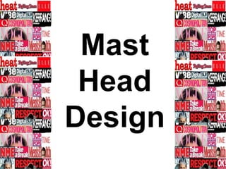
- 2. MFYFont size : 166 Font Name : Tempus Sans ITC This mast head is not that effective although it is bold, and big, the font type just wouldn’t fit in with my modern magazine style, Also I don’t like the gaps between the letters as I don’t think it looks professional, Moreover I don’t think this mast head would stand out next to other music magazine so I am not keen on this design idea.
- 3. This mast head is effective as it is bold, big and simplistic, this would make it easily recognisable on a shelf and a well known brand logo. This mast head would also fit in with the theme of my front page and keep continuity and professionalism throughout my magazine as this is similar to the text I use throughout my design. I also love the colour scheme as it is the same as the one used through out my magazine. Font size : 199 Font Name : Haettenschweiler MFY
- 4. MFYFont size : 199 Font Name : GulimChe This mast head is effective as it is bold, and simplistic, the lettering is large and easy to read which would make it noticeable on a shelf and a globally recognised logo like “NME” . I like the use of colour in this mast head design as it fits in with the colour scheme of my magazine, this mast head would be effective as it is modern and attractive.
- 5. MFYFont size : 199 Font Name : Consolas This mast head is attractive and looks professional, it incorporates the colour scheme so would make my magazine have continuity through out. However I do not like the spacing between the letters, but when creating the final design I could bring the letters closer together using in design. To finalise I like this mast head design and it could be my final choice.
- 6. MFYFont size : 199 Font Name : Franklin Gothic Medium Cond This mast head is extremely bold and would stand out on a shelf due to the bright red colour. Red has connotations of energy and passion which demonstrates the type of audience I will be appealing too. This would look great on my front cover and it also is written in a similar font to the ones I have used through out my magazine, by having the mast head as a similar font it will make my magazine look professional. Which will appeal to my audience within the social class ABC1.
- 7. MFYFont size : 166 Font Name : Rockwell This mast head is one of my favourite choices, it is modern and I can imagine this placed in the corner of my front page, The colours look simplistic and modern and the font is bold and readable. I also think this mast head design has an American feel to it which appeals to me, as in my magazine I will be including both British and American artists. This design is one of my final