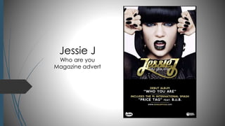
This magazine advert for Jessie J's album follows conventions to appeal to its target audience. The text is in gold and white to match the album's colors and create a consistent style. Jessie J's name is largest to identify the artist, while the album, featured artist, and singles are also prominently displayed. Serif fonts are used for the artist and album names to catch readers' attention in a fun way, while sans serif text at the bottom conveys important information. The close-up image of Jessie J links to the album cover and gold makeup to tie the elements together visually. Dark colors in the image contrast with the light text and convey the artist's aggressive persona consistently across elements.
Techniques to optimize the pagerank algorithm usually fall in two categories. One is to try reducing the work per iteration, and the other is to try reducing the number of iterations. These goals are often at odds with one another. Skipping computation on vertices which have already converged has the potential to save iteration time. Skipping in-identical vertices, with the same in-links, helps reduce duplicate computations and thus could help reduce iteration time. Road networks often have chains which can be short-circuited before pagerank computation to improve performance. Final ranks of chain nodes can be easily calculated. This could reduce both the iteration time, and the number of iterations. If a graph has no dangling nodes, pagerank of each strongly connected component can be computed in topological order. This could help reduce the iteration time, no. of iterations, and also enable multi-iteration concurrency in pagerank computation. The combination of all of the above methods is the STICD algorithm. [sticd] For dynamic graphs, unchanged components whose ranks are unaffected can be skipped altogether.
Adjusting primitives for graph : SHORT REPORT / NOTESSubhajit Sahu
Graph algorithms, like PageRank Compressed Sparse Row (CSR) is an adjacency-list based graph representation that is
Multiply with different modes (map)
1. Performance of sequential execution based vs OpenMP based vector multiply.
2. Comparing various launch configs for CUDA based vector multiply.
Sum with different storage types (reduce)
1. Performance of vector element sum using float vs bfloat16 as the storage type.
Sum with different modes (reduce)
1. Performance of sequential execution based vs OpenMP based vector element sum.
2. Performance of memcpy vs in-place based CUDA based vector element sum.
3. Comparing various launch configs for CUDA based vector element sum (memcpy).
4. Comparing various launch configs for CUDA based vector element sum (in-place).
Sum with in-place strategies of CUDA mode (reduce)
1. Comparing various launch configs for CUDA based vector element sum (in-place).
2. Typography
On this magazine advert all of the text is wrote
in a gold or white font. This is because the
colours used on the album are gold and white
and therefore this creates a house style.
The artist name is in a much larger font than
the rest of the text, this is so it is obvious to the
target audience who the artist is. By seeing the
artists name it will intrigue the target audience
and they will then be more influenced to
continue reading the rest of the text which
would then encourage them to purchase the
product which is being advertised.
The name of the album, the featuring artist
and the single are in a smaller font than the
artist name but in a larger font to the rest of
the text. This would be appealing to the target
audience, because for example the single
‘price tag’ may be the text that is eye
catching to them, they may then read the
advert and be aware that this single is being
released in an album and then be influenced
to buy the album.
The text at the bottom of the advert stating,
the album name, who it features and the top
hits the artist has had, is in a san serif font. This is
because it is informational text and using a san
serif font makes this obvious to the audience.
However for the artists name and the album name
serif fonts are used, this is because it would be eye-catching
and appealing to the target audience as
it connotes fun. A serif font would catch the eye of
the target audience, and then this would
encourage them to reads the san serif informational
text at the bottom of the advert.
3. Image
For the main image of the artist in this
advert a close up has been used, this is to
show detail. The effect of the mise-en-scene
creates a link between the gold
typography and the gold glitter on the
lipstick. The artist has jet black hair, black
fake nails, black outfit and also dark eye
make-up, this creates an aggressive
aesthetic which links to the artist persona.
This also creates contrast between the
conventions of the genre.
This is the same image as what is used on
the album cover, which enables the
audience to understand what is being
advertised. Once they have seen this
advert if they then see the album in it
would the be more eye-catching to them
as they have seen it before which may
encourage them to buy the album.
4. Colour
Gold and white has been consistently
used for the text on this advert, the
reason gold and white colours are
used for the font is because they
contrast well, the gold connotes
wealth and confidence, where the
white connotes innocence and
purity. This therefore promotes the
artist in a positive way. However for
the mise-en-scene dark colours are
used, this connotes the aggressive
nature of this artists pop music.
Therefore through the use of colours,
the artists personality and music style
is connoted in a way that is
appealing to the target audience.
A plain white background has been
used for the image, this is because it
enables the image to stand out more
and become eye catching. This is the
same reason that black is used for the
background where the text is at the
bottom of the advert, to enable the
white and gold text to stand out.
5. Layout
This layout follows the route of the
eye, this is so the most important
information is emphasised to the
audience.
This layout is appealing to the
audience as it presents the
information in a neat and
organised manner which they
can understand and follow with
ease.
6. Conventions
This advert follows many conventions, one of these is the layout. This is
because it follows the rout of the eye and as there is an image of the artist
taking up the majority of the advert which is a convention of the genre.
Also having the informational text at the bottom is conventional as it is a
way of inserting text in a manner that will be appealing to the audience.
Another convention is that the artist name and album name is in serif, this is
conventional as it connotes fun which the target audience are attracted
to. The san serif font is also conventional as it connotes that it is important
text and as it is informational it is important.
The colours used connote the artist in a positive way by, signifying her
wealth and innocence, however at the same time by using black it
connotes the artists aggressive manner in a conventional manner.