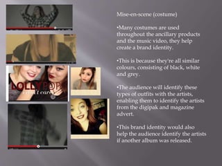
The document discusses how various elements of style were used consistently across ancillary music products and a music video to create a unified brand identity. Dark red was used for text and lipstick in the magazine advert, digipak, and music video. Close-up shots of the artists were featured in both the products and video. Sans serif fonts, similar color schemes in costumes consisting of black, white and grey, and high key lighting were also applied across platforms. The goal was to use repetitive visual elements and motifs to help the audience easily identify the artists and music brand across different materials.