This document analyzes and summarizes several music advertisement posters:
1. Posters are commonly used to promote albums, artists, films, and TV shows. They often feature the artist's name in bold text and the album title in thinner text. Many use the same image from the album cover.
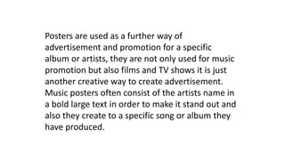
2. The Ben Howard poster analyzed promotes his debut album with his name in bold and the album title in thinner text, matching the album cover image.
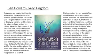
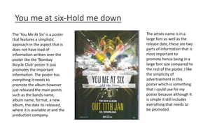
3. The Bombay Bicycle Club poster informs viewers of the band, album, and tracks in an appealing color scheme with the band name highlighted at top.
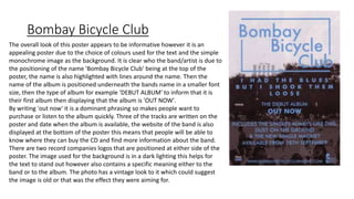
4. The Verve poster features a complex background image with text positioned centrally to