
More Related Content
What's hot
What's hot (19)
Viewers also liked
Viewers also liked (20)
Similar to Audience feedback
Similar to Audience feedback (20)
More from helkin
More from helkin (20)
Recently uploaded
Recently uploaded (20)
Audience feedback
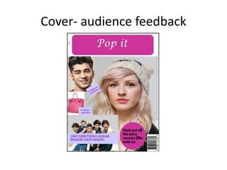
- 2. Cover- audience feedback This was my draft cover, I asked for audience feedback so I could find out how I could improve the magazine to please the target audience. I asked them about their views on the colour scheme, fonts and images. Colour scheme The responses to the colour scheme was mainly positive they said they liked the pinks and purple as they are very conventional for the genre of magazine as girls their age like these colours. They however said they think the shades of the colours should be considered more carefully. They added that the colours I have used would set a good and conventional house style and mode of address, but would prefer lighter colours as the brighter colours make the magazine look too unprofessional. They also said they would like the house style to be mainly light purple than bright pink, the reasoning for this as they feel it would help the colours contrast better which would help make the magazine look professional and appealing to them. They told me having colour on the background of my masthead made the magazine look un-finished as it does not work well with the background colour, they informed me to consider thinking about not having a background for the masthead and instead thing more carefully about the colour of the font so it contrasts well with the background, doesn’t look out of place and becomes eye-catching to the target audience. Fonts The responses to the fonts were mainly negative, they said the masthead on the cover should be the boldest font which is most eye-catching but on this draft it isn’t. Therefore they told me to consider my font more carefully and again consider the background and colour of the font to help make the masthead more appealing and eye-catching. They felt this font should also be a bigger size which would help make it more conventional and eye-catching. They also commented saying they didn’t like the black font as it doesn’t blend well with the colour scheme, they felt by using the pink on the background and then a black coloured font that the text didn’t stand out as much as it should, they also commented saying this font isn’t conventional as it looks to formal which would not be appealing for the target audience. The target audience also commented on my cover line fonts, saying the font wasn’t appealing as it is not eye-catching and not appealing, however they added if I had followed the route of the eye the cover lines may have become more eye-catching. Images The responses to the images were also negative. This was because firstly I had not taken the images myself but they said taking that out of consideration that using a close up shot type for the main image was positive as it is conventional and therefore appealing. However they didn’t like the image of the bag at the side as they said the background did not blend with the magazine. They also mentioned that they didn’t like how all of the images had completely different backgrounds which makes the magazine look un-finished. They felt I had too many images on my front cover and not enough cover lines. Layout The target audience like a cluttered layout and know that is conventional for this genre of magazine, however they said that they feel I had attempted the cluttered layout but as a result I just made the layout look unorganised and as if I had put no effort in even trying to appeal to the audience. They told me that the images on the left hand side of the page were the main reason the cover looked too messy, their advice was to remove these images and fill the left hand side with cover lines and if I wanted any more images to place them evenly along the bottom of the page as they would then find the magazine more eye- catching and intriguing. The target audience said they found it difficult to work out which parts of the cover where the most important and therefore I should put more effort into following the route of the eye and by doing this it would help them see the cover lines, mast head and main image. They feel also if I do this I will be able to get the correct information on the page and create the conventional cluttered layout which would result in the magazine looking more professional and appealing to the target audience.
- 4. Contents- audience feedback I asked for audience feedback on my content page draft so I could find out how to improve my final version so it would please the target audience. Colour scheme I asked them how they feel about the colour scheme, they said that they like the colours pink and purple however they feel it should be mainly purple as this will help give the magazine more of a professional look. They didn’t feel the purples and pink I had used contrasted each other well. My target audience also said they felt the colours I had used were too bright which made it less appealing to them as the information which they would require from this page doesn’t stand out enough. By toning down the shades of the colours used on my contents and contrasting the colours better the contents page would be more appealing to the target audience and also enable them to get the information from the contents page of which they require. Also by making the colour scheme more purple than pink the contents page would be more appealing to the target audience as it would not draw all the attention away from the information which should be on the contents page. Layout I asked them what they liked and disliked about the layout of the contents and they said they liked where I had placed the cover image however they felt it took up too much of the page and therefore meant that I would be unable to put as much information on the page which should have been there, they also said they would like more information on the page as they felt they are not given enough contents numbers to find articles throughout the magazine. The target audience of this magazine said they felt the editor’s letter was too big as well, the reasoning for this is that they felt it took up too much space and thought this may be a reason why I was unable to put in as much information as they would have liked to seen. They informed me if I made my on the cover section and my editor’s letter smaller that this would give me a much better chance of having a conventional layout which they would find much more appealing. Another issue which the target audience mentioned is that the sub titles are not evenly sized, they told me to make the contents page more conventional layout I should reduce the size of the sub titles and also add more, as this would give them a more visual way to find out information about where articles are in the magazine and also make the layout more appealing and eye-catching. They also added that by doing this it would enable me to add the extra information which is required to have a conventional contents page. The contents page should follow a cluttered layout to become conventional however the target audience said they felt that the content layout was too basic and didn’t have enough images and text on it to create the cluttered layout which they would find appealing. Fonts I asked them how they felt about the fonts, they said they feel the fonts could be bolder and stand out more to make it more appealing the target audience. The main negative comments about the fonts were about the editor’s letter they said they liked how I had used a purple serif font for the greeting and name at the end. However they understood that the text on this particular section should be formal but they said the font which I had chosen for this was too formal and not appealing to them and said I should consider improving this element of the contents page. Another negative which they mentioned is that masthead font was not appealing as they felt it was too curly which made it look too childish and would therefore put them of the magazine.
- 5. Double page spread- audience feedback
- 6. Double page spread- audience feedback Colour scheme I asked my target audience how they felt about the colour page on the double page spread, they responded by saying that pink and purple is conventional however they feel I haven’t used these colours effective and made the double page spread look un-professional. However some others responded saying that they didn’t like these colours at all and recommended me to use a light blue and white for the double page spread, they said this will still be conventional but however shows a better mode of address and blue stereotypically connotes males and this article is about a male. The felt I could have contrasted the pink box and the purple box better, either by having the same coloured box or same colour text, they said this would be more appealing as the colours would blend in better and would make the double page spread more conventional and look more professionally finished. Images One main issue which was brought up about the image is the quality of editing, they said that it made the image look messy and as if no effort had been put in, if the editing had been done to a better standard they said they think it would make a huge difference to the double page spread as it would look neat a tidy. Another negative about the image is that the target audience felt is was not big enough to be eye-catching or conventional for the genre of magazine. On a double page spread the image should be the biggest thing so it is the most eye-catching for the audience and therefore intrigues them and encourages them to read the article, however the target audience said this image is not appealing to them and would not encourage them to read the article. Another negative which was mentioned about the image is the mise-en-scene, they expressed that they liked the shirt and that it was fashionable and therefore conventional but they felt if he was wearing a dark red shirt then I should have made effort to contrast the other colours which his shirt, one of them said for example having the questions wrote in a dark red. They said this would have created a better mode of address and made the double page spread more appeal to them. They even said they think it would be useful for me to take a new image and try to make it more conventional. Another reason they wanted me to take a new image is because they felt the mid/long shot which I have used is best used on a group in this genre of magazine, they said when taking a photo of an individual for the double page spread a medium close up would be the best shot type for this image on a double page spread with this genre of magazine. Layout Not many of the people I asked liked the layout of the double page spread, they said they would much prefer the image to be placed on the left hand side and to take up the majority of the left page, this would have helped draw the attention of the target audience. They also again added at this point that taking a new image would be useful. They felt my masthead could be placed in a much more conventional position (in the middle and slightly to the left), if I had done this they feel that the mast head would be more eye-catching and therefore made the article more intriguing for them. Another part of the layout which they didn’t like is that the text boxes are not even, this makes the double page look un-professional and is off putting to the target audience. They also told me if I break the text up more the double page spread would become more apealing to them as too much text looks too informational which is unconventional. Fonts There was only one font which target audience agreed they all liked, this was the font which is used for the quote, they liked this is the quote is intended to be eye-catching as it is supposed to be gripping for the readers and they felt the font used was bold but not too in their faces. However they did not like the font I chose for the masthead this is because it looks too childish and also is too small and not bold enough, this is extreamly unconventional as it is supposed to be the most eye-catching font, if this is improved the target audience all agreed the double page spread would be more appealing to them. The fonts used for the main text got a range of comments, the majority liked how I had used a different colour for the questions than I did the answers but they also felt this purple didn’t blend well with the pink I had already used. They all agreed the main text font was too formal which is unconventional and would make them not want to read the article.