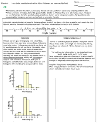
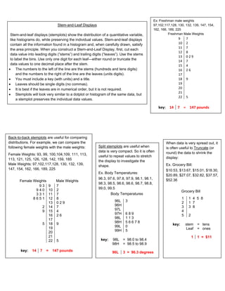
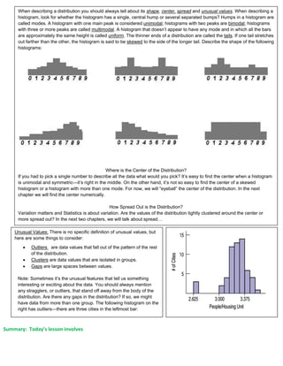
Chapter 4 I can display quantitative data with a dotplot, histogram and a stem-and-leaf plot
EQ:
When dealing with a lot of numbers, summarizing the data will help us when we look at large sets of quantitative data.
Without summaries of the data, it’s hard to grasp what the data tell us. The best thing to do is to make a picture. We can’t
use bar charts or pie charts for quantitative data, since those displays are for categorical variables. For quantitative data
we use dotplots, histograms and stem-and-leaf plots to summarize the data.
Histograms
Dotplots are very good for displaying small sets of data,
however, when there are a large number of data, histograms
are a better choice. Histograms are similar to bar charts, but
for quantitative data. As with bar charts, the possible values
of the variable are plotted on the horizontal axis and the
frequencies (bin counts) are expressed as the heights of the
bars. However, the bars in a histogram should touch,
indicating that we are not leaving out any possible values. A
relative frequency histogram displays the percentage of
cases in each bin instead of the count. Both types of
histograms are faithful to the area principle. Below are both
histograms of the monthly price changes in Enron stock:
Dotplots
A dotplot is a simple display that is used to display small sets of data. It just places a dot along an axis for each case in the data.
Dotplots are either displayed horizontally or vertically. The dotplot below displays the heights of 50 students.
Histograms (continued)
There is no perfect way to create bins for a histogram, but bins
should always be the same length and never overlap. Ideally,
you should use between 4 - 10 bins that start and end at nice
values.
You could use the following bins for the above height data:
56–60, 60-64, 64-68, 68-72, 72-76, 76-80
What happens if an observation falls exactly on a boundary? It
is customary that we put boundary values into the upper bin. For
example, a height of 60 would be placed in the 60-64 bin.
Graph the histogram for the height data above:
Make sure you label axes and scales. The vertical axis should
always start at 0 and the bars should touch.
Name:_________________
Date:________Period_____
Stem-and-Leaf Displays
Stem-and-leaf displays (stemplots) show the distribution of a quantitative variable,
like histograms do, while preserving the individual values. Stem-and-leaf displays
contain all the information found in a histogram and, when carefully drawn, satisfy
the area principle. When you construct a Stem-and-Leaf Display, first, cut each
data value into leading digits (“stems”) and trailing digits (“leaves”). Use the stems
to label the bins. Use only one digit for each leaf—either round or truncate the
data values to one decimal place after the stem.
 The numbers to the left of the line are the stems (hundreds and tens digits)
and the numbers to the right of the line are the leaves (units digits).
 You must include a key (with units) and a title.
 Leaves should be single digits (no commas).
 It is best if the leaves are in numerical order, but it is not required.
 Stemplots will look very similar to a dotplot or histogram of the same data, but
a stemplot preserves the individual data values.
Ex: Freshman male weights
97,102,117,128, 130, 132, 139, 147, 154,
162, 166, 189, 225
Freshman Male Weights
9 7
10 2
11 7
12 8
13 0 2 9
14 7
15 4
16 2 6
17
18 9
19
20
21
22 5
key: 14 7 = 147 pounds
Back-to-back stemplots are useful for comparing
distributions. For example, we can compare the
following female weights with the male weights:
Female Weights: 93, 99, 100,104,109, 111, 113,
113, 121, 125, 126, 128, 142, 159, 185
Male Weights: 97,102,117,128, 130, 132, 139,
147, 154, 162, 166, 189, 225
Female Weights Male Weights
9 3 9 7
9 4 0 10 2
3 3 1 11 7
8 6 5 1 12 8
13 0 2 9
2 14 7
9 15 4
16 2 6
17
5 18 9
19
20
21
22 5
key: 14 7 = 147 pounds
Split stemplots are useful when
data is very compact. So it is often
useful to repeat values to stretch
the display to investigate the
shape.
Ex. Body Temperatures:
96.3, 97.6, 97.8, 97.9, 98.1, 98.1,
98.3, 98.5, 98.6, 98.6, 98.7, 98.8,
99.0, 99.5
Body Temperatures
96L 3
96H
97L
97H 6 8 9
98L 1 1 3
98H 5 6 6 7 8
99L 0
99H 5
key: 98L = 98.0 to 98.4
98H = 98.5 to 98.9
96L 3 = 96.3 degrees
When data is very spread out, it
is often useful to Truncate (or
round) the data to shrink the
display:
Ex. Grocery Bill:
$10.53, $13.67, $15.01, $18.30,
$20.89, $27.07, $32.82, $37.57,
$52.36
Grocery Bill
1 1 4 5 8
2 1 7
3 3 8
4
5 2
key: stem = tens
Leaf = ones
1 1 = $11
Summary: Today’s lesson involves
When describing a distribution you should always tell about its shape, center, spread and unusual values. When describing a
histogram, look for whether the histogram has a single, central hump or several separated bumps? Humps in a histogram are
called modes. A histogram with one main peak is considered unimodal; histograms with two peaks are bimodal; histograms
with three or more peaks are called multimodal. A histogram that doesn’t appear to have any mode and in which all the bars
are approximately the same height is called uniform. The thinner ends of a distribution are called the tails. If one tail stretches
out farther than the other, the histogram is said to be skewed to the side of the longer tail. Describe the shape of the following
histograms:
 Symmetric
 Unimoda
 Symmetric
 Bimodal
 Double Peaked
 Non-Symmetric
 Bimodal
  
Where is the Center of the Distribution?
If you had to pick a single number to describe all the data what would you pick? It’s easy to find the center when a histogram
is unimodal and symmetric—it’s right in the middle. On the other hand, it’s not so easy to find the center of a skewed
histogram or a histogram with more than one mode. For now, we will “eyeball” the center of the distribution. In the next
chapter we will find the center numerically.
How Spread Out is the Distribution?
Variation matters and Statistics is about variation. Are the values of the distribution tightly clustered around the center or
more spread out? In the next two chapters, we will talk about spread…
Unusual Values: There is no specific definition of unusual values, but
here are some things to consider:
 Outliers are data values that fall out of the pattern of the rest
of the distribution.
 Clusters are data values that are isolated in groups.
 Gaps are large spaces between values.
Note: Sometimes it’s the unusual features that tell us something
interesting or exciting about the data. You should always mention
any stragglers, or outliers, that stand off away from the body of the
distribution. Are there any gaps in the distribution? If so, we might
have data from more than one group. The following histogram on the
right has outliers—there are three cities in the leftmost bar:

Ch4 notes for students

  • 1.
    Chapter 4 Ican display quantitative data with a dotplot, histogram and a stem-and-leaf plot EQ: When dealing with a lot of numbers, summarizing the data will help us when we look at large sets of quantitative data. Without summaries of the data, it’s hard to grasp what the data tell us. The best thing to do is to make a picture. We can’t use bar charts or pie charts for quantitative data, since those displays are for categorical variables. For quantitative data we use dotplots, histograms and stem-and-leaf plots to summarize the data. Histograms Dotplots are very good for displaying small sets of data, however, when there are a large number of data, histograms are a better choice. Histograms are similar to bar charts, but for quantitative data. As with bar charts, the possible values of the variable are plotted on the horizontal axis and the frequencies (bin counts) are expressed as the heights of the bars. However, the bars in a histogram should touch, indicating that we are not leaving out any possible values. A relative frequency histogram displays the percentage of cases in each bin instead of the count. Both types of histograms are faithful to the area principle. Below are both histograms of the monthly price changes in Enron stock: Dotplots A dotplot is a simple display that is used to display small sets of data. It just places a dot along an axis for each case in the data. Dotplots are either displayed horizontally or vertically. The dotplot below displays the heights of 50 students. Histograms (continued) There is no perfect way to create bins for a histogram, but bins should always be the same length and never overlap. Ideally, you should use between 4 - 10 bins that start and end at nice values. You could use the following bins for the above height data: 56–60, 60-64, 64-68, 68-72, 72-76, 76-80 What happens if an observation falls exactly on a boundary? It is customary that we put boundary values into the upper bin. For example, a height of 60 would be placed in the 60-64 bin. Graph the histogram for the height data above: Make sure you label axes and scales. The vertical axis should always start at 0 and the bars should touch. Name:_________________ Date:________Period_____
  • 2.
    Stem-and-Leaf Displays Stem-and-leaf displays(stemplots) show the distribution of a quantitative variable, like histograms do, while preserving the individual values. Stem-and-leaf displays contain all the information found in a histogram and, when carefully drawn, satisfy the area principle. When you construct a Stem-and-Leaf Display, first, cut each data value into leading digits (“stems”) and trailing digits (“leaves”). Use the stems to label the bins. Use only one digit for each leaf—either round or truncate the data values to one decimal place after the stem.  The numbers to the left of the line are the stems (hundreds and tens digits) and the numbers to the right of the line are the leaves (units digits).  You must include a key (with units) and a title.  Leaves should be single digits (no commas).  It is best if the leaves are in numerical order, but it is not required.  Stemplots will look very similar to a dotplot or histogram of the same data, but a stemplot preserves the individual data values. Ex: Freshman male weights 97,102,117,128, 130, 132, 139, 147, 154, 162, 166, 189, 225 Freshman Male Weights 9 7 10 2 11 7 12 8 13 0 2 9 14 7 15 4 16 2 6 17 18 9 19 20 21 22 5 key: 14 7 = 147 pounds Back-to-back stemplots are useful for comparing distributions. For example, we can compare the following female weights with the male weights: Female Weights: 93, 99, 100,104,109, 111, 113, 113, 121, 125, 126, 128, 142, 159, 185 Male Weights: 97,102,117,128, 130, 132, 139, 147, 154, 162, 166, 189, 225 Female Weights Male Weights 9 3 9 7 9 4 0 10 2 3 3 1 11 7 8 6 5 1 12 8 13 0 2 9 2 14 7 9 15 4 16 2 6 17 5 18 9 19 20 21 22 5 key: 14 7 = 147 pounds Split stemplots are useful when data is very compact. So it is often useful to repeat values to stretch the display to investigate the shape. Ex. Body Temperatures: 96.3, 97.6, 97.8, 97.9, 98.1, 98.1, 98.3, 98.5, 98.6, 98.6, 98.7, 98.8, 99.0, 99.5 Body Temperatures 96L 3 96H 97L 97H 6 8 9 98L 1 1 3 98H 5 6 6 7 8 99L 0 99H 5 key: 98L = 98.0 to 98.4 98H = 98.5 to 98.9 96L 3 = 96.3 degrees When data is very spread out, it is often useful to Truncate (or round) the data to shrink the display: Ex. Grocery Bill: $10.53, $13.67, $15.01, $18.30, $20.89, $27.07, $32.82, $37.57, $52.36 Grocery Bill 1 1 4 5 8 2 1 7 3 3 8 4 5 2 key: stem = tens Leaf = ones 1 1 = $11
  • 3.
    Summary: Today’s lessoninvolves When describing a distribution you should always tell about its shape, center, spread and unusual values. When describing a histogram, look for whether the histogram has a single, central hump or several separated bumps? Humps in a histogram are called modes. A histogram with one main peak is considered unimodal; histograms with two peaks are bimodal; histograms with three or more peaks are called multimodal. A histogram that doesn’t appear to have any mode and in which all the bars are approximately the same height is called uniform. The thinner ends of a distribution are called the tails. If one tail stretches out farther than the other, the histogram is said to be skewed to the side of the longer tail. Describe the shape of the following histograms:  Symmetric  Unimoda  Symmetric  Bimodal  Double Peaked  Non-Symmetric  Bimodal    Where is the Center of the Distribution? If you had to pick a single number to describe all the data what would you pick? It’s easy to find the center when a histogram is unimodal and symmetric—it’s right in the middle. On the other hand, it’s not so easy to find the center of a skewed histogram or a histogram with more than one mode. For now, we will “eyeball” the center of the distribution. In the next chapter we will find the center numerically. How Spread Out is the Distribution? Variation matters and Statistics is about variation. Are the values of the distribution tightly clustered around the center or more spread out? In the next two chapters, we will talk about spread… Unusual Values: There is no specific definition of unusual values, but here are some things to consider:  Outliers are data values that fall out of the pattern of the rest of the distribution.  Clusters are data values that are isolated in groups.  Gaps are large spaces between values. Note: Sometimes it’s the unusual features that tell us something interesting or exciting about the data. You should always mention any stragglers, or outliers, that stand off away from the body of the distribution. Are there any gaps in the distribution? If so, we might have data from more than one group. The following histogram on the right has outliers—there are three cities in the leftmost bar: