Continuous Improvement Toolkit . www.citoolkit.com
Continuous Improvement Toolkit
Graphical Analysis
Continuous Improvement Toolkit . www.citoolkit.com
Check Sheets
Data
Collection
Process MappingFlowcharting
Flow Process Charts
5S
Value Stream Mapping
Control Charts
Mistake Proofing
Tree Diagram*
Understanding
Performance
Fishbone Diagram
Design of Experiment
Implementing
Solutions**
Creating Ideas
Brainstorming Attribute Analysis
Deciding & Selecting
Decision Tree
Force Field Analysis Cost Benefit Analysis
Voting
Planning & Project Management*
Value Analysis
Kaizen Events
Quick Changeover
Managing
Risk
FMEA
PDPC
RAID Log*
Observations
Focus Groups
Understanding
Cause & Effect
Pareto Analysis
IDEF0
5 Whys
Matrix DiagramKano Analysis
KPIs
Lean Measures
Importance-Urgency Mapping
Waste Analysis
Fault Tree Analysis
Relationship Mapping*
Benchmarking**
SCAMPER**
C&E Matrix
Confidence Intervals
Pugh Matrix
SIPOC*
Prioritization Matrix
Stakeholder Analysis
Critical-to Tree
Paired Comparison
Improvement Roadmaps
Interviews
QFD
Graphical Analysis
Lateral Thinking
Hypothesis Testing
Visual Management
Ergonomics
Reliability Analysis
Cross Training
How-How Diagram**
Flow
Time Value Map
ANOVA
Gap Analysis*
Traffic Light Assessment
TPN Analysis
Decision Balance Sheet
Suggestion systems
Risk Assessment*
AutomationSimulation
Break-even Analysis
Service Blueprints
DMAIC
Process Redesign
Run Charts
TPM
Control Planning
Chi-Square
SWOT Analysis
Capability Indices
Policy Deployment
Data collection planner*
Affinity DiagramQuestionnaires
Probability Distributions
Bottleneck Analysis**
MSA
Descriptive Statistics
Cost of Quality*
Process Yield
Histograms & Boxplots
Just in Time
Pick Chart
Portfolio Matrix
Four Field Matrix
Root Cause Analysis Data Snooping
Morphological AnalysisSampling
Spaghetti Diagram
Pull
OEE
Mind Mapping*
Project Charter
PDCA
Designing & Analyzing Processes
CorrelationScatter Plots
Regression
Gantt Charts
Activity NetworksRACI Matrix
PERT/CPMDaily Planning
MOST
Standard work Document controlA3 Thinking
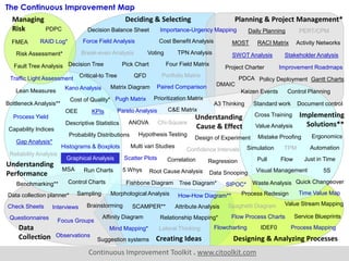
The Continuous Improvement Map
Multi vari Studies
Continuous Improvement Toolkit . www.citoolkit.com
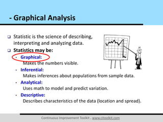
 Statistic is the science of describing,
interpreting and analyzing data.
 Statistics may be:
• Graphical:
Makes the numbers visible.
• Inferential:
Makes inferences about populations from sample data.
• Analytical:
Uses math to model and predict variation.
• Descriptive:
Describes characteristics of the data (location and spread).
- Graphical Analysis
Continuous Improvement Toolkit . www.citoolkit.com
 Graphs truly show that a picture is worth a thousand of words.
 A long list of data is usually not practical for conveying
information about a process.
 One of the best ways to analyze
any process is to plot the data.
 Many graphical tools are available
which can generate graphs quickly
and easily.
- Graphical Analysis
*
Continuous Improvement Toolkit . www.citoolkit.com
Benefits:
 Allows to learn about the nature of the process.
 Enables clarity of communication.
 Helps understanding sources of variation in the data.
 Provides focus for further analysis.
- Graphical Analysis
Continuous Improvement Toolkit . www.citoolkit.com
 Different graphs can reveal different characteristics of your
data:
• Central tendency.
• Dispersion.
• The general shape for the
distribution.
 Conclusions drawn from graphs may require verification
through advanced statistical techniques such as significance
testing and experimentation.
- Graphical Analysis
Continuous Improvement Toolkit . www.citoolkit.com
 Graphing the data can be utilized for both historical data and
live data collection activities.
 You need to pick the right graphical tool as there are a lot of
different ways to plot your data.
 If one graph fails to reveal anything
useful, try another one.
- Graphical Analysis
Continuous Improvement Toolkit . www.citoolkit.com
Line Charts:
 One of the simplest form of charts.
 Useful for showing trends in quality, cost or other process
performance measures.
 They represent the data by connecting the data points by
straight lines to highlight trends in the data.
 A standard or a goal line may also be drawn to verify actual
performance against identified targets.
 Time series plots, run charts, SPC
charts and radar charts are all line
charts.
- Graphical Analysis
Continuous Improvement Toolkit . www.citoolkit.com
Time Series Plots:
 Line charts used to evaluate behavior in data over a time
interval.
 They can be used to determine if a process is stable by visually
spotting trends, patterns or shift in the data.
 If any of these are observed, then we can say that the process is
probably unstable.
 It requires the data to be in the order which actually happened.
 More advanced charts for assessing the stability of a process
over time are run charts and SPC charts.
- Graphical Analysis
Continuous Improvement Toolkit . www.citoolkit.com
Time Series Plots:
 Time Series Analysis is the analysis of the plotted data in order
to get meaningful information.
 Different behaviors of the data can be observed such as:
• Upward and downward trends.
• Shifts in the mean.
• Changes in the amount of variation.
• Patterns and cycles
• Anything not random.
 Time Series Forecasting is the
use of a model to predict future
values based on observed values.
- Graphical Analysis
Continuous Improvement Toolkit . www.citoolkit.com
Example – The average time it needed to change a label:
- Graphical Analysis
37.5
35.0
42.9
39.8
38.6
47.2
36.6
34.3
30.8
35.2
32.7
29.0
20
25
30
35
40
45
50
55
Jan Feb Mar Apr May Jun Jul Aug Sep Oct Nov Dec
A time series plot for evaluating continuous data
Continuous Improvement Toolkit . www.citoolkit.com
Example – The number of unanswered calls in a call center:
- Graphical Analysis
A time series plot for evaluating count data
25
27 27 27
28
22
21
30
24
27
15
20
24
31
22
21
22
21
20
30
27
10
15
20
25
30
35
Wk 1 Wk 3 Wk 5 Wk 7 Wk 9 Wk 11 Wk 13 Wk 15 Wk 17 Wk 19 Wk 21
UnansweredCalls
Continuous Improvement Toolkit . www.citoolkit.com
Example – The number of scrapped products generated from
three machines:
- Graphical Analysis
0
2,000
4,000
6,000
8,000
10,000
12,000
Jan Feb Mar Apr May Jun Jul Aug Sep Oct Nov Dec
ScrappedProducts
Machine 1 Machine 2 Machine 3
Continuous Improvement Toolkit . www.citoolkit.com
Pie Charts:
 Circular charts that make it easy to compare proportions.
 Widely used in the business and media worlds for their
simplicity and ease of interpretation.
 They represent each category as a slice of the pie.
 They display the proportion of each category relative to the
whole data set.
- Graphical Analysis
Continuous Improvement Toolkit . www.citoolkit.com
Pie Charts:
 A Doughnut Chart is a variation of the pie chart with a blank
center.
 It allows for additional information to be included about the
data.
 Pie and doughnut charts work well with few categories.
 They are suitable for presenting data for around seven groups
or fewer.
- Graphical Analysis
Continuous Improvement Toolkit . www.citoolkit.com
Bar Charts:
 Used to display frequencies of attribute data.
 They focus on the absolute value of the data.
 The bars on the chart are presented horizontally or vertically.
 When a bar chart presents the categories in descending
order of frequency, this is called a Pareto Chart.
- Graphical Analysis
Continuous Improvement Toolkit . www.citoolkit.com
Bar Charts:
 Grouped Bar Charts display bars clustered in groups.
 Staked Bar Charts stack bars of each group on top of each other
to show the cumulative effect.
 A 100% Staked Bar Chart is used for demonstrating the
difference in proportion between categories.
- Graphical Analysis
Continuous Improvement Toolkit . www.citoolkit.com
Example – A grouped bar chart displaying the number of occupied
beds in a hospital in two consecutive years.
- Graphical Analysis
450
420
432
363
320
340
309
350
320
340
389
440440
426 420
380
342
359 352 360 350
325
399
480
0
100
200
300
400
500
600
Jan Feb Mar Apr May Jun Jul Aug Sep Oct Nov Dec
NumberofOccupiedBeds
Year 1 Year 2
Continuous Improvement Toolkit . www.citoolkit.com
Example – A stacked bar chart displaying the number of occupied
beds in a hospital in two consecutive years.
- Graphical Analysis
0
100
200
300
400
500
600
700
800
900
1000
Jan Feb Mar Apr May Jun Jul Aug Sep Oct Nov Dec
NumberofOccupiedBeds
Year 1 Year 2
Continuous Improvement Toolkit . www.citoolkit.com
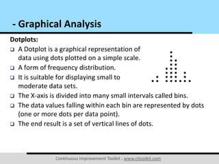
Dotplots:
 A Dotplot is a graphical representation of
data using dots plotted on a simple scale.
 A form of frequency distribution.
 It is suitable for displaying small to
moderate data sets.
 The X-axis is divided into many small intervals called bins.
 The data values falling within each bin are represented by dots
(one or more dots per data point).
 The end result is a set of vertical lines of dots.
- Graphical Analysis
Continuous Improvement Toolkit . www.citoolkit.com
Dotplots:
 It is generally used when the data is discrete.
 It can also be used to present continuous data.
 It shows where the data are clustered, where the gaps are
located and can help identify outliers.
 Dotplots are also useful for comparing distributions in terms of
their shape, location and spread.
- Graphical Analysis
Continuous Improvement Toolkit . www.citoolkit.com
Example – A dotplot that displays the number of complaints made
by customers in a given period of time.
- Graphical Analysis
262422201 81 6
Number of Complaints
A dotplot for evaluating count data
Continuous Improvement Toolkit . www.citoolkit.com
Example – A dotplot showing the GPA scores of all students in a
business college.
- Graphical Analysis
3.63.02.41 .81 .20.6
GPA
Each symbol represents up to 4 observations.
A dotplot for evaluating continuous data
Continuous Improvement Toolkit . www.citoolkit.com
Example – A dotplot is created to compare the teachers who had
been on sick leave between two types of schools.
- Graphical Analysis
100.0%80.0%60.0%40.0%20.0%0.0%
Sick %
Public
Private
School Type
Continuous Improvement Toolkit . www.citoolkit.com
Example – An analysis that was conducted for diagnosing the
presence of diabetes at a workplace.
- Graphical Analysis
Describes the shape of the data
Continuous Improvement Toolkit . www.citoolkit.com
Example – An analysis that was conducted for diagnosing the
presence of diabetes at a workplace.
- Graphical Analysis
New diagnosis
High levels
Diabetes under
control
Low
level
Continuous Improvement Toolkit . www.citoolkit.com
Individual Value Plots:
 Graphs that are useful to give an overall picture of the
individual values that make up a data set.
 Often used for comparing distributions that have small number
of data.
 They enable to see all the values of a data
set even if there are similar data points.
 They give an idea of the distribution shapes
and whether outliers are present.
- Graphical Analysis
Continuous Improvement Toolkit . www.citoolkit.com
Example – An individual value plot showing the responses of a
particular marketing campaign that uses multiple advertising
methods.
- Graphical Analysis
NewspaperMailMagazine
20
1 5
1 0
5
0
Type of Advertising
Response
Continuous Improvement Toolkit . www.citoolkit.com
Individual Value Plots:
 What can you conclude from this Individual Value Plot?
- Graphical Analysis
Continuous Improvement Toolkit . www.citoolkit.com
Radar Charts:
 Used to display and compare multiple data sets over a range of
characteristics or over a specific period of time.
 It comes in the form of a two-dimensional chart.
 It has a radial axis and an angular axis.
 After plotting the data, a point close to the center indicates a
low value and a point near the edge indicates
a high value.
 A line is normally drawn connecting
the data values for each data set.
- Graphical Analysis
Continuous Improvement Toolkit . www.citoolkit.com
Example – A radar chart that displays the daily mean temperatures
in four different cities over the year.
- Graphical Analysis
-10
0
10
20
30
40
Jan
Feb
Mar
Apr
May
Jun
Jul
Aug
Sep
Oct
Nov
Dec Abu Dhabi
Istanbul
Helsinki
Cape Town
Continuous Improvement Toolkit . www.citoolkit.com
Multi-Vari Charts:
 Variation in the data may come from multiple sources.
 A Multi-Vari Chart is a graphical tool that allows to visually
show where the major variation is coming from.
 Multiple variables are plotted together on a single chart.
 Often used when studying the variation within:
• A subgroup.
• Between subgroups.
• Over time.
- Graphical Analysis
Continuous Improvement Toolkit . www.citoolkit.com
Example – A multi-vari chart showing how the type and
composition affect the durability of a carpet.
- Graphical Analysis
Continuous Improvement Toolkit . www.citoolkit.com
Scatter Plots:
 Many problems require the
estimation of the relationship
between two or more variables.
 Scatter plots are used to study the
relationship between two variables.
 They are used to determine what
happens to one variable when
another variable changes value.
- Graphical Analysis
Continuous Improvement Toolkit . www.citoolkit.com
Probability Plots:
 Graphical techniques that provide a more decisive approach for
determining if your data follows a particular distribution.
 Constructed in a way that the points
will fall in a straight line if they fit the
distribution in question.
 They are an improvement from just
assessing visually.
- Graphical Analysis
Normal Probability Plots
Continuous Improvement Toolkit . www.citoolkit.com
Graph Selection:
 The graphs you choose depends on:
• The type of data you have.
• The objective you are trying to achieve.
 There are graphs for continuous data and
graphs for count and attribute data.
 Remember that you need to perform additional
statistical analysis before drawing any conclusion.
- Graphical Analysis
Continuous Improvement Toolkit . www.citoolkit.com
Graph Selection:
- Graphical Analysis
Continuous Data
Dotplots
Histograms*
Individual Value Plots
Boxplots*
Time Series Plots
Determine the
shape of the data
Scatter Plot
Multi-Vari Charts
Understanding the
source of variation
Study relationships
between variables
Understanding
process stability
Understanding
the differences
between groups
* Larger amount of data
Count/Attribute Data
Bar Charts
Pareto Charts
Pie Charts
Dotplots
Comparing
between
groups
Determine the
shape of the data
Time Series Plots
Understanding
process stability
Scatter Plot
Study relationships
between variables

Graphical Analysis

  • 1.
    Continuous Improvement Toolkit. www.citoolkit.com Continuous Improvement Toolkit Graphical Analysis
  • 2.
    Continuous Improvement Toolkit. www.citoolkit.com Check Sheets Data Collection Process MappingFlowcharting Flow Process Charts 5S Value Stream Mapping Control Charts Mistake Proofing Tree Diagram* Understanding Performance Fishbone Diagram Design of Experiment Implementing Solutions** Creating Ideas Brainstorming Attribute Analysis Deciding & Selecting Decision Tree Force Field Analysis Cost Benefit Analysis Voting Planning & Project Management* Value Analysis Kaizen Events Quick Changeover Managing Risk FMEA PDPC RAID Log* Observations Focus Groups Understanding Cause & Effect Pareto Analysis IDEF0 5 Whys Matrix DiagramKano Analysis KPIs Lean Measures Importance-Urgency Mapping Waste Analysis Fault Tree Analysis Relationship Mapping* Benchmarking** SCAMPER** C&E Matrix Confidence Intervals Pugh Matrix SIPOC* Prioritization Matrix Stakeholder Analysis Critical-to Tree Paired Comparison Improvement Roadmaps Interviews QFD Graphical Analysis Lateral Thinking Hypothesis Testing Visual Management Ergonomics Reliability Analysis Cross Training How-How Diagram** Flow Time Value Map ANOVA Gap Analysis* Traffic Light Assessment TPN Analysis Decision Balance Sheet Suggestion systems Risk Assessment* AutomationSimulation Break-even Analysis Service Blueprints DMAIC Process Redesign Run Charts TPM Control Planning Chi-Square SWOT Analysis Capability Indices Policy Deployment Data collection planner* Affinity DiagramQuestionnaires Probability Distributions Bottleneck Analysis** MSA Descriptive Statistics Cost of Quality* Process Yield Histograms & Boxplots Just in Time Pick Chart Portfolio Matrix Four Field Matrix Root Cause Analysis Data Snooping Morphological AnalysisSampling Spaghetti Diagram Pull OEE Mind Mapping* Project Charter PDCA Designing & Analyzing Processes CorrelationScatter Plots Regression Gantt Charts Activity NetworksRACI Matrix PERT/CPMDaily Planning MOST Standard work Document controlA3 Thinking The Continuous Improvement Map Multi vari Studies
  • 3.
    Continuous Improvement Toolkit. www.citoolkit.com  Statistic is the science of describing, interpreting and analyzing data.  Statistics may be: • Graphical: Makes the numbers visible. • Inferential: Makes inferences about populations from sample data. • Analytical: Uses math to model and predict variation. • Descriptive: Describes characteristics of the data (location and spread). - Graphical Analysis
  • 4.
    Continuous Improvement Toolkit. www.citoolkit.com  Graphs truly show that a picture is worth a thousand of words.  A long list of data is usually not practical for conveying information about a process.  One of the best ways to analyze any process is to plot the data.  Many graphical tools are available which can generate graphs quickly and easily. - Graphical Analysis *
  • 5.
    Continuous Improvement Toolkit. www.citoolkit.com Benefits:  Allows to learn about the nature of the process.  Enables clarity of communication.  Helps understanding sources of variation in the data.  Provides focus for further analysis. - Graphical Analysis
  • 6.
    Continuous Improvement Toolkit. www.citoolkit.com  Different graphs can reveal different characteristics of your data: • Central tendency. • Dispersion. • The general shape for the distribution.  Conclusions drawn from graphs may require verification through advanced statistical techniques such as significance testing and experimentation. - Graphical Analysis
  • 7.
    Continuous Improvement Toolkit. www.citoolkit.com  Graphing the data can be utilized for both historical data and live data collection activities.  You need to pick the right graphical tool as there are a lot of different ways to plot your data.  If one graph fails to reveal anything useful, try another one. - Graphical Analysis
  • 8.
    Continuous Improvement Toolkit. www.citoolkit.com Line Charts:  One of the simplest form of charts.  Useful for showing trends in quality, cost or other process performance measures.  They represent the data by connecting the data points by straight lines to highlight trends in the data.  A standard or a goal line may also be drawn to verify actual performance against identified targets.  Time series plots, run charts, SPC charts and radar charts are all line charts. - Graphical Analysis
  • 9.
    Continuous Improvement Toolkit. www.citoolkit.com Time Series Plots:  Line charts used to evaluate behavior in data over a time interval.  They can be used to determine if a process is stable by visually spotting trends, patterns or shift in the data.  If any of these are observed, then we can say that the process is probably unstable.  It requires the data to be in the order which actually happened.  More advanced charts for assessing the stability of a process over time are run charts and SPC charts. - Graphical Analysis
  • 10.
    Continuous Improvement Toolkit. www.citoolkit.com Time Series Plots:  Time Series Analysis is the analysis of the plotted data in order to get meaningful information.  Different behaviors of the data can be observed such as: • Upward and downward trends. • Shifts in the mean. • Changes in the amount of variation. • Patterns and cycles • Anything not random.  Time Series Forecasting is the use of a model to predict future values based on observed values. - Graphical Analysis
  • 11.
    Continuous Improvement Toolkit. www.citoolkit.com Example – The average time it needed to change a label: - Graphical Analysis 37.5 35.0 42.9 39.8 38.6 47.2 36.6 34.3 30.8 35.2 32.7 29.0 20 25 30 35 40 45 50 55 Jan Feb Mar Apr May Jun Jul Aug Sep Oct Nov Dec A time series plot for evaluating continuous data
  • 12.
    Continuous Improvement Toolkit. www.citoolkit.com Example – The number of unanswered calls in a call center: - Graphical Analysis A time series plot for evaluating count data 25 27 27 27 28 22 21 30 24 27 15 20 24 31 22 21 22 21 20 30 27 10 15 20 25 30 35 Wk 1 Wk 3 Wk 5 Wk 7 Wk 9 Wk 11 Wk 13 Wk 15 Wk 17 Wk 19 Wk 21 UnansweredCalls
  • 13.
    Continuous Improvement Toolkit. www.citoolkit.com Example – The number of scrapped products generated from three machines: - Graphical Analysis 0 2,000 4,000 6,000 8,000 10,000 12,000 Jan Feb Mar Apr May Jun Jul Aug Sep Oct Nov Dec ScrappedProducts Machine 1 Machine 2 Machine 3
  • 14.
    Continuous Improvement Toolkit. www.citoolkit.com Pie Charts:  Circular charts that make it easy to compare proportions.  Widely used in the business and media worlds for their simplicity and ease of interpretation.  They represent each category as a slice of the pie.  They display the proportion of each category relative to the whole data set. - Graphical Analysis
  • 15.
    Continuous Improvement Toolkit. www.citoolkit.com Pie Charts:  A Doughnut Chart is a variation of the pie chart with a blank center.  It allows for additional information to be included about the data.  Pie and doughnut charts work well with few categories.  They are suitable for presenting data for around seven groups or fewer. - Graphical Analysis
  • 16.
    Continuous Improvement Toolkit. www.citoolkit.com Bar Charts:  Used to display frequencies of attribute data.  They focus on the absolute value of the data.  The bars on the chart are presented horizontally or vertically.  When a bar chart presents the categories in descending order of frequency, this is called a Pareto Chart. - Graphical Analysis
  • 17.
    Continuous Improvement Toolkit. www.citoolkit.com Bar Charts:  Grouped Bar Charts display bars clustered in groups.  Staked Bar Charts stack bars of each group on top of each other to show the cumulative effect.  A 100% Staked Bar Chart is used for demonstrating the difference in proportion between categories. - Graphical Analysis
  • 18.
    Continuous Improvement Toolkit. www.citoolkit.com Example – A grouped bar chart displaying the number of occupied beds in a hospital in two consecutive years. - Graphical Analysis 450 420 432 363 320 340 309 350 320 340 389 440440 426 420 380 342 359 352 360 350 325 399 480 0 100 200 300 400 500 600 Jan Feb Mar Apr May Jun Jul Aug Sep Oct Nov Dec NumberofOccupiedBeds Year 1 Year 2
  • 19.
    Continuous Improvement Toolkit. www.citoolkit.com Example – A stacked bar chart displaying the number of occupied beds in a hospital in two consecutive years. - Graphical Analysis 0 100 200 300 400 500 600 700 800 900 1000 Jan Feb Mar Apr May Jun Jul Aug Sep Oct Nov Dec NumberofOccupiedBeds Year 1 Year 2
  • 20.
    Continuous Improvement Toolkit. www.citoolkit.com Dotplots:  A Dotplot is a graphical representation of data using dots plotted on a simple scale.  A form of frequency distribution.  It is suitable for displaying small to moderate data sets.  The X-axis is divided into many small intervals called bins.  The data values falling within each bin are represented by dots (one or more dots per data point).  The end result is a set of vertical lines of dots. - Graphical Analysis
  • 21.
    Continuous Improvement Toolkit. www.citoolkit.com Dotplots:  It is generally used when the data is discrete.  It can also be used to present continuous data.  It shows where the data are clustered, where the gaps are located and can help identify outliers.  Dotplots are also useful for comparing distributions in terms of their shape, location and spread. - Graphical Analysis
  • 22.
    Continuous Improvement Toolkit. www.citoolkit.com Example – A dotplot that displays the number of complaints made by customers in a given period of time. - Graphical Analysis 262422201 81 6 Number of Complaints A dotplot for evaluating count data
  • 23.
    Continuous Improvement Toolkit. www.citoolkit.com Example – A dotplot showing the GPA scores of all students in a business college. - Graphical Analysis 3.63.02.41 .81 .20.6 GPA Each symbol represents up to 4 observations. A dotplot for evaluating continuous data
  • 24.
    Continuous Improvement Toolkit. www.citoolkit.com Example – A dotplot is created to compare the teachers who had been on sick leave between two types of schools. - Graphical Analysis 100.0%80.0%60.0%40.0%20.0%0.0% Sick % Public Private School Type
  • 25.
    Continuous Improvement Toolkit. www.citoolkit.com Example – An analysis that was conducted for diagnosing the presence of diabetes at a workplace. - Graphical Analysis Describes the shape of the data
  • 26.
    Continuous Improvement Toolkit. www.citoolkit.com Example – An analysis that was conducted for diagnosing the presence of diabetes at a workplace. - Graphical Analysis New diagnosis High levels Diabetes under control Low level
  • 27.
    Continuous Improvement Toolkit. www.citoolkit.com Individual Value Plots:  Graphs that are useful to give an overall picture of the individual values that make up a data set.  Often used for comparing distributions that have small number of data.  They enable to see all the values of a data set even if there are similar data points.  They give an idea of the distribution shapes and whether outliers are present. - Graphical Analysis
  • 28.
    Continuous Improvement Toolkit. www.citoolkit.com Example – An individual value plot showing the responses of a particular marketing campaign that uses multiple advertising methods. - Graphical Analysis NewspaperMailMagazine 20 1 5 1 0 5 0 Type of Advertising Response
  • 29.
    Continuous Improvement Toolkit. www.citoolkit.com Individual Value Plots:  What can you conclude from this Individual Value Plot? - Graphical Analysis
  • 30.
    Continuous Improvement Toolkit. www.citoolkit.com Radar Charts:  Used to display and compare multiple data sets over a range of characteristics or over a specific period of time.  It comes in the form of a two-dimensional chart.  It has a radial axis and an angular axis.  After plotting the data, a point close to the center indicates a low value and a point near the edge indicates a high value.  A line is normally drawn connecting the data values for each data set. - Graphical Analysis
  • 31.
    Continuous Improvement Toolkit. www.citoolkit.com Example – A radar chart that displays the daily mean temperatures in four different cities over the year. - Graphical Analysis -10 0 10 20 30 40 Jan Feb Mar Apr May Jun Jul Aug Sep Oct Nov Dec Abu Dhabi Istanbul Helsinki Cape Town
  • 32.
    Continuous Improvement Toolkit. www.citoolkit.com Multi-Vari Charts:  Variation in the data may come from multiple sources.  A Multi-Vari Chart is a graphical tool that allows to visually show where the major variation is coming from.  Multiple variables are plotted together on a single chart.  Often used when studying the variation within: • A subgroup. • Between subgroups. • Over time. - Graphical Analysis
  • 33.
    Continuous Improvement Toolkit. www.citoolkit.com Example – A multi-vari chart showing how the type and composition affect the durability of a carpet. - Graphical Analysis
  • 34.
    Continuous Improvement Toolkit. www.citoolkit.com Scatter Plots:  Many problems require the estimation of the relationship between two or more variables.  Scatter plots are used to study the relationship between two variables.  They are used to determine what happens to one variable when another variable changes value. - Graphical Analysis
  • 35.
    Continuous Improvement Toolkit. www.citoolkit.com Probability Plots:  Graphical techniques that provide a more decisive approach for determining if your data follows a particular distribution.  Constructed in a way that the points will fall in a straight line if they fit the distribution in question.  They are an improvement from just assessing visually. - Graphical Analysis Normal Probability Plots
  • 36.
    Continuous Improvement Toolkit. www.citoolkit.com Graph Selection:  The graphs you choose depends on: • The type of data you have. • The objective you are trying to achieve.  There are graphs for continuous data and graphs for count and attribute data.  Remember that you need to perform additional statistical analysis before drawing any conclusion. - Graphical Analysis
  • 37.
    Continuous Improvement Toolkit. www.citoolkit.com Graph Selection: - Graphical Analysis Continuous Data Dotplots Histograms* Individual Value Plots Boxplots* Time Series Plots Determine the shape of the data Scatter Plot Multi-Vari Charts Understanding the source of variation Study relationships between variables Understanding process stability Understanding the differences between groups * Larger amount of data Count/Attribute Data Bar Charts Pareto Charts Pie Charts Dotplots Comparing between groups Determine the shape of the data Time Series Plots Understanding process stability Scatter Plot Study relationships between variables