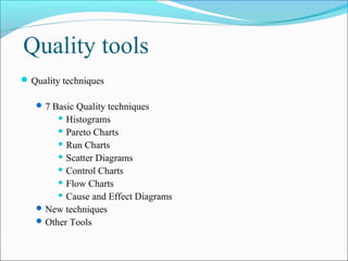
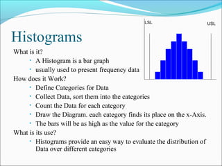
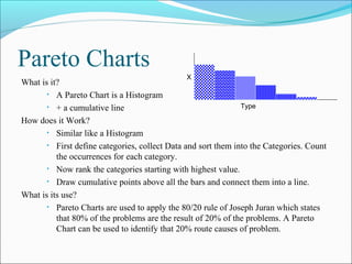
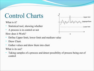
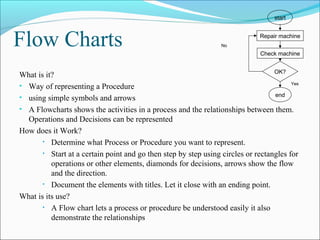
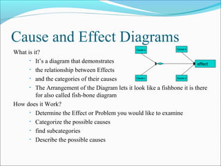
Introduction
In the following we will Examine the Techniques and Tools
  that Support Quality Management within a company. There are
  for the 7 Basic Tools which we are going to define. Generally
  they can be subdivided into:
      mathematical statistical Tools
      logical tools
Quality tools
 Quality techniques

    7 Basic Quality techniques
         Histograms

         Pareto Charts
         Run Charts

         Scatter Diagrams

         Control Charts

         Flow Charts

         Cause and Effect Diagrams

    New techniques
    Other Tools
LSL                       USL


Histograms
What is it?
     • A Histogram is a bar graph
     • usually used to present frequency data

How does it Work?
     • Define Categories for Data
     • Collect Data, sort them into the categories
     • Count the Data for each category
     • Draw the Diagram. each category finds its place on the x-Axis.
     • The bars will be as high as the value for the category

What is its use?
     • Histograms provide an easy way to evaluate the distribution of
        Data over different categories
Pareto Charts
                                               X
What is it?
       • A Pareto Chart is a Histogram

       • + a cumulative line                                   Type

How does it Work?
       • Similar like a Histogram

       • First define categories, collect Data and sort them into the Categories. Count
          the occurrences for each category.
       • Now rank the categories starting with highest value.

       • Draw cumulative points above all the bars and connect them into a line.

What is its use?
       • Pareto Charts are used to apply the 80/20 rule of Joseph Juran which states
          that 80% of the problems are the result of 20% of the problems. A Pareto
          Chart can be used to identify that 20% route causes of problem.
Run Charts


                                                Measurement
What is it?
      • Run Charts are representing change

      • in measurement over a sequence or time

How does it Work?                                        Time

      • Gather Data

      • Organize Data

             » Measurements (y) must be confronted with time or sequence of

               the events.
      • Chart Data

      • Interpreting Data

What is its use?
      • Determining Cyclic Events and there average character
Scatter Diagrams
What is it?
      • Statistical tool showing a trend in a series of values.

How does it Work?
      • Gain values series

      • Draw graph with value points
                                                     Y
      • Draw trend line: m*x+a

             » Calculate m value

             » Calculate a value

             » Calculate points for trend line.                 X
What is its use?
      • Demonstrating correlations between values and showing trends for
         value changes.
Control Charts                                     Y
                                                                             Upper limit


                                                                        Average/Spec
What is it?
• Statistical tool, showing whether                                       Lower limit

• A process is in control or not
How does it Work?                                            X

• Define Upper limit, lower limit and medium value
• Draw Chart.
• Gather values and draw them into chart
What is its use?
• Taking samples of a process and detect possibility of process being out of
  control
start


Flow Charts                                                      No
                                                                              Repair machine


                                                                              Check machine


                                                                                  OK?
What is it?
                                                                                        Yes
• Way of representing a Procedure
                                                                                  end
• using simple symbols and arrows
• A Flowcharts shows the activities in a process and the relationships between them.
  Operations and Decisions can be represented
How does it Work?
       • Determine what Process or Procedure you want to represent.

       • Start at a certain point and go then step by step using circles or rectangles for
          operations or other elements, diamonds for decisions, arrows show the flow
          and the direction.
       • Document the elements with titles. Let it close with an ending point.

What is its use?
       • A Flow chart lets a process or procedure be understood easily it also
          demonstrate the relationships
Cause and Effect Diagrams
                                                   Cause a          Cause b
What is it?
      • It’s a diagram that demonstrates
                                                                           effect
      • the relationship between Effects

      • and the categories of their causes         Cause c          Cause d


      • The Arrangement of the Diagram lets it look like a fishbone it is there
         for also called fish-bone diagram
How does it Work?
      • Determine the Effect or Problem you would like to examine

      • Categorize the possible causes

      • find subcategories

      • Describe the possible causes

9 quality-tools(2)

  • 2.
    Introduction In the followingwe will Examine the Techniques and Tools that Support Quality Management within a company. There are for the 7 Basic Tools which we are going to define. Generally they can be subdivided into:  mathematical statistical Tools  logical tools
  • 3.
    Quality tools  Qualitytechniques  7 Basic Quality techniques  Histograms  Pareto Charts  Run Charts  Scatter Diagrams  Control Charts  Flow Charts  Cause and Effect Diagrams  New techniques  Other Tools
  • 4.
    LSL USL Histograms What is it? • A Histogram is a bar graph • usually used to present frequency data How does it Work? • Define Categories for Data • Collect Data, sort them into the categories • Count the Data for each category • Draw the Diagram. each category finds its place on the x-Axis. • The bars will be as high as the value for the category What is its use? • Histograms provide an easy way to evaluate the distribution of Data over different categories
  • 5.
    Pareto Charts X What is it? • A Pareto Chart is a Histogram • + a cumulative line Type How does it Work? • Similar like a Histogram • First define categories, collect Data and sort them into the Categories. Count the occurrences for each category. • Now rank the categories starting with highest value. • Draw cumulative points above all the bars and connect them into a line. What is its use? • Pareto Charts are used to apply the 80/20 rule of Joseph Juran which states that 80% of the problems are the result of 20% of the problems. A Pareto Chart can be used to identify that 20% route causes of problem.
  • 6.
    Run Charts Measurement What is it? • Run Charts are representing change • in measurement over a sequence or time How does it Work? Time • Gather Data • Organize Data » Measurements (y) must be confronted with time or sequence of the events. • Chart Data • Interpreting Data What is its use? • Determining Cyclic Events and there average character
  • 7.
    Scatter Diagrams What isit? • Statistical tool showing a trend in a series of values. How does it Work? • Gain values series • Draw graph with value points Y • Draw trend line: m*x+a » Calculate m value » Calculate a value » Calculate points for trend line. X What is its use? • Demonstrating correlations between values and showing trends for value changes.
  • 8.
    Control Charts Y Upper limit Average/Spec What is it? • Statistical tool, showing whether Lower limit • A process is in control or not How does it Work? X • Define Upper limit, lower limit and medium value • Draw Chart. • Gather values and draw them into chart What is its use? • Taking samples of a process and detect possibility of process being out of control
  • 9.
    start Flow Charts No Repair machine Check machine OK? What is it? Yes • Way of representing a Procedure end • using simple symbols and arrows • A Flowcharts shows the activities in a process and the relationships between them. Operations and Decisions can be represented How does it Work? • Determine what Process or Procedure you want to represent. • Start at a certain point and go then step by step using circles or rectangles for operations or other elements, diamonds for decisions, arrows show the flow and the direction. • Document the elements with titles. Let it close with an ending point. What is its use? • A Flow chart lets a process or procedure be understood easily it also demonstrate the relationships
  • 10.
    Cause and EffectDiagrams Cause a Cause b What is it? • It’s a diagram that demonstrates effect • the relationship between Effects • and the categories of their causes Cause c Cause d • The Arrangement of the Diagram lets it look like a fishbone it is there for also called fish-bone diagram How does it Work? • Determine the Effect or Problem you would like to examine • Categorize the possible causes • find subcategories • Describe the possible causes