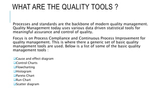
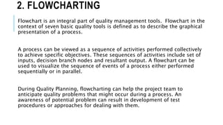
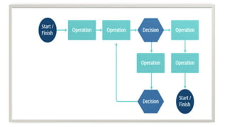
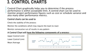
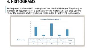
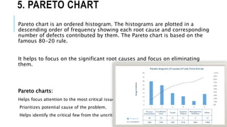
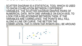
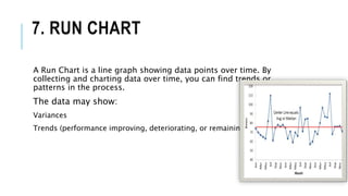
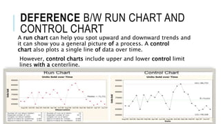
QUALITY TOOLS For Data Analysis
WHAT ARE THE QUALITY TOOLS ?
Processes and standards are the backbone of modern quality management.
Quality Management today uses various data driven statistical tools for
meaningful assurance and control of quality.
Focus is on Process Compliance and Continuous Process Improvement for
quality management. This is where there a generic set of basic quality
management tools are used. Below is a list of some of the basic quality
management tools :
Cause and effect diagram
Control Charts
Flowcharting
Histogram
Pareto Chart
Run Chart
Scatter diagram
1. CAUSE AND EFFECT DIAGRAM
Root cause Analysis (RCA) is an integral part of Quality Management. This is done
to prevent similar defects from happening in future. Cause and Effect diagram is
used to do root cause analysis. This is also known as Fish-bone Diagram and
Ishikawa Diagram. This tool helps stimulate good brainstorming within the team
doing root cause analysis and helps organize their thoughts. The team asks “why”
multiple times for a given problem and tries to find the root causes. Below is a
sample fishbone diagram.
2. FLOWCHARTING
Flowchart is an integral part of quality management tools. Flowchart in the
context of seven basic quality tools is defined as to describe the graphical
presentation of a process.
A process can be viewed as a sequence of activities performed collectively
to achieve specific objectives. These sequences of activities include set of
inputs, decision branch nodes and resultant output. A flowchart can be
used to visualize the sequence of events of a process either performed
sequentially or in parallel.
During Quality Planning, flowcharting can help the project team to
anticipate quality problems that might occur during a process. An
awareness of potential problem can result in development of test
procedures or approaches for dealing with them.
3. CONTROL CHARTS
Control Chart graphically helps you to determine if the process
performance is within acceptable limit. A control chart can be used to
monitor project performance figures such as cost or schedule variance and
also many other performance metrics.
Control charts can be used to
Check the stability of the process
Monitor the conditions which may require the team to react
Monitor consecutive run of results in any pattern
A Control Chart will have the following components of a process:
Upper Control Limit
Lower Control Limit
Mean/Average
4. HISTOGRAMS
Histograms are bar charts. Histograms are used to show the frequency or
number of occurrences of a particular event. Histograms are also used to
show the number of defects being contributed by different root causes.
5. PARETO CHART
Pareto chart is an ordered histogram. The histograms are plotted in a
descending order of frequency showing each root cause and corresponding
number of defects contributed by them. The Pareto chart is based on the
famous 80-20 rule.
It helps to focus on the significant root causes and focus on eliminating
them.
Pareto charts:
Helps focus attention to the most critical issues.
Prioritizes potential cause of the problem.
Helps identify the critical few from the uncritical many.
6. SCATTER DIAGRAM
SCATTER DIAGRAM IS A STATISTICAL TOOL WHICH IS USED
TO SHOW CO-RELATION BETWEEN 2 DIFFERENT
VARIABLES. THE SCATTER DIAGRAM GRAPHS PAIRS OF
NUMERICAL DATA, WITH ONE VARIABLE ON EACH AXIS, TO
LOOK FOR A RELATIONSHIP BETWEEN THEM. IF THE
VARIABLES ARE CORRELATED, THE POINTS WILL FALL
ALONG A LINE OR CURVE. THE BETTER THE
CORRELATION, THE CLOSER THE POINTS WILL BE AROUND
THE LINE.
7. RUN CHART
A Run Chart is a line graph showing data points over time. By
collecting and charting data over time, you can find trends or
patterns in the process.
The data may show:
Variances
Trends (performance improving, deteriorating, or remaining constant)
DEFERENCE B/W RUN CHART AND
CONTROL CHART
A run chart can help you spot upward and downward trends and
it can show you a general picture of a process. A control
chart also plots a single line of data over time.
However, control charts include upper and lower control limit
lines with a centerline.
Quality tools by Er. Manish Dwivedi

Quality tools by Er. Manish Dwivedi

  • 1.
    QUALITY TOOLS ForData Analysis
  • 2.
    WHAT ARE THEQUALITY TOOLS ? Processes and standards are the backbone of modern quality management. Quality Management today uses various data driven statistical tools for meaningful assurance and control of quality. Focus is on Process Compliance and Continuous Process Improvement for quality management. This is where there a generic set of basic quality management tools are used. Below is a list of some of the basic quality management tools : Cause and effect diagram Control Charts Flowcharting Histogram Pareto Chart Run Chart Scatter diagram
  • 3.
    1. CAUSE ANDEFFECT DIAGRAM Root cause Analysis (RCA) is an integral part of Quality Management. This is done to prevent similar defects from happening in future. Cause and Effect diagram is used to do root cause analysis. This is also known as Fish-bone Diagram and Ishikawa Diagram. This tool helps stimulate good brainstorming within the team doing root cause analysis and helps organize their thoughts. The team asks “why” multiple times for a given problem and tries to find the root causes. Below is a sample fishbone diagram.
  • 4.
    2. FLOWCHARTING Flowchart isan integral part of quality management tools. Flowchart in the context of seven basic quality tools is defined as to describe the graphical presentation of a process. A process can be viewed as a sequence of activities performed collectively to achieve specific objectives. These sequences of activities include set of inputs, decision branch nodes and resultant output. A flowchart can be used to visualize the sequence of events of a process either performed sequentially or in parallel. During Quality Planning, flowcharting can help the project team to anticipate quality problems that might occur during a process. An awareness of potential problem can result in development of test procedures or approaches for dealing with them.
  • 6.
    3. CONTROL CHARTS ControlChart graphically helps you to determine if the process performance is within acceptable limit. A control chart can be used to monitor project performance figures such as cost or schedule variance and also many other performance metrics. Control charts can be used to Check the stability of the process Monitor the conditions which may require the team to react Monitor consecutive run of results in any pattern A Control Chart will have the following components of a process: Upper Control Limit Lower Control Limit Mean/Average
  • 7.
    4. HISTOGRAMS Histograms arebar charts. Histograms are used to show the frequency or number of occurrences of a particular event. Histograms are also used to show the number of defects being contributed by different root causes.
  • 8.
    5. PARETO CHART Paretochart is an ordered histogram. The histograms are plotted in a descending order of frequency showing each root cause and corresponding number of defects contributed by them. The Pareto chart is based on the famous 80-20 rule. It helps to focus on the significant root causes and focus on eliminating them. Pareto charts: Helps focus attention to the most critical issues. Prioritizes potential cause of the problem. Helps identify the critical few from the uncritical many.
  • 9.
    6. SCATTER DIAGRAM SCATTERDIAGRAM IS A STATISTICAL TOOL WHICH IS USED TO SHOW CO-RELATION BETWEEN 2 DIFFERENT VARIABLES. THE SCATTER DIAGRAM GRAPHS PAIRS OF NUMERICAL DATA, WITH ONE VARIABLE ON EACH AXIS, TO LOOK FOR A RELATIONSHIP BETWEEN THEM. IF THE VARIABLES ARE CORRELATED, THE POINTS WILL FALL ALONG A LINE OR CURVE. THE BETTER THE CORRELATION, THE CLOSER THE POINTS WILL BE AROUND THE LINE.
  • 10.
    7. RUN CHART ARun Chart is a line graph showing data points over time. By collecting and charting data over time, you can find trends or patterns in the process. The data may show: Variances Trends (performance improving, deteriorating, or remaining constant)
  • 11.
    DEFERENCE B/W RUNCHART AND CONTROL CHART A run chart can help you spot upward and downward trends and it can show you a general picture of a process. A control chart also plots a single line of data over time. However, control charts include upper and lower control limit lines with a centerline.