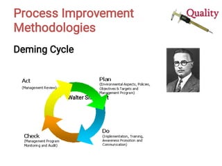
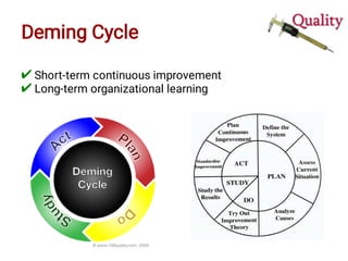
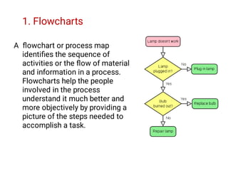
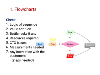
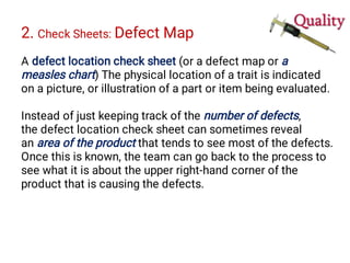
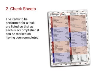
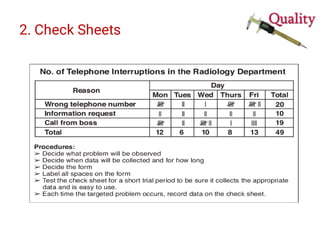
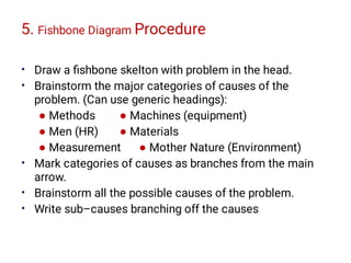
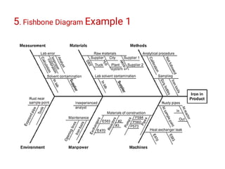
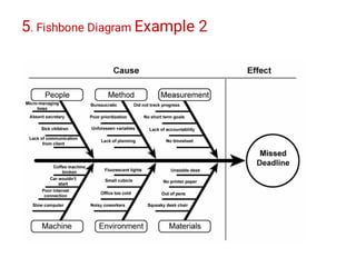
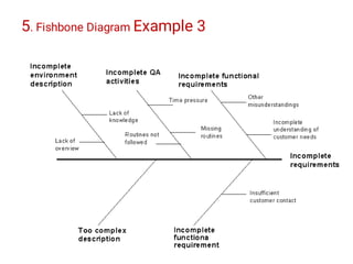
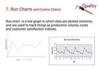
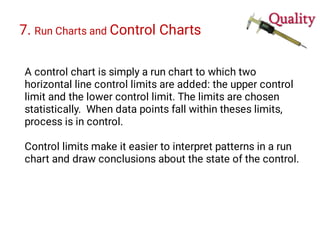
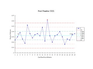
This document discusses various tools and methodologies for process improvement, including the Deming Cycle (Plan-Do-Study-Act), flowcharts, check sheets, histograms, Pareto diagrams, cause-and-effect diagrams, scatter diagrams, run charts, control charts, Kaizen blitz, poka-yoke, process simulation, and skills for team leaders and members. It provides descriptions and examples of how each tool is used to define problems, measure processes, analyze data, improve processes, and ensure changes are standardized and monitored.


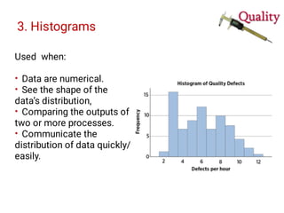
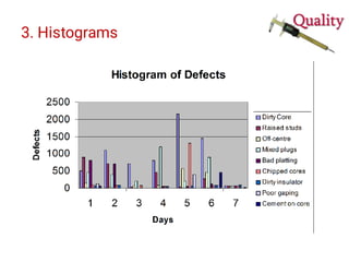
![3. Histograms
Graphical frequency distribution
Provides clues about the characteristics of the parent
population from which a sample is taken. Patterns that
would be difficult to see in an ordinary table of numbers
become apparent.
[Condition of data collection should ne mentioned]](https://image.slidesharecdn.com/cksewr45s86iq5jcgou9-tqm-13-tools-for-process-improvement-221114024316-a4cb0e4d/85/Process-Improvement-Tools-Daniel-Pirzada-21-320.jpg)


![7 qc tools[1] to print](https://cdn.slidesharecdn.com/ss_thumbnails/7qctools1toprint-191017092858-thumbnail.jpg?width=640&height=640&fit=bounds)


