As part of my Media Studies A Level, I have analysed the 'Cabin in the Woods' trailer. I have also analysed 'Chernobyl Diaries' and 'The Woman in Black' - these will also be uploaded to slideshare!
As part of my Media Studies A Level, I have analysed the 'Cabin in the Woods' trailer. I have also analysed 'Chernobyl Diaries' and 'The Woman in Black' - these will also be uploaded to slideshare!
How to Make a Field invisible in Odoo 17Celine George
It is possible to hide or invisible some fields in odoo. Commonly using “invisible” attribute in the field definition to invisible the fields. This slide will show how to make a field invisible in odoo 17.
2024.06.01 Introducing a competency framework for languag learning materials ...Sandy Millin
http://sandymillin.wordpress.com/iateflwebinar2024
Published classroom materials form the basis of syllabuses, drive teacher professional development, and have a potentially huge influence on learners, teachers and education systems. All teachers also create their own materials, whether a few sentences on a blackboard, a highly-structured fully-realised online course, or anything in between. Despite this, the knowledge and skills needed to create effective language learning materials are rarely part of teacher training, and are mostly learnt by trial and error.
Knowledge and skills frameworks, generally called competency frameworks, for ELT teachers, trainers and managers have existed for a few years now. However, until I created one for my MA dissertation, there wasn’t one drawing together what we need to know and do to be able to effectively produce language learning materials.
This webinar will introduce you to my framework, highlighting the key competencies I identified from my research. It will also show how anybody involved in language teaching (any language, not just English!), teacher training, managing schools or developing language learning materials can benefit from using the framework.
A Strategic Approach: GenAI in EducationPeter Windle
Artificial Intelligence (AI) technologies such as Generative AI, Image Generators and Large Language Models have had a dramatic impact on teaching, learning and assessment over the past 18 months. The most immediate threat AI posed was to Academic Integrity with Higher Education Institutes (HEIs) focusing their efforts on combating the use of GenAI in assessment. Guidelines were developed for staff and students, policies put in place too. Innovative educators have forged paths in the use of Generative AI for teaching, learning and assessments leading to pockets of transformation springing up across HEIs, often with little or no top-down guidance, support or direction.
This Gasta posits a strategic approach to integrating AI into HEIs to prepare staff, students and the curriculum for an evolving world and workplace. We will highlight the advantages of working with these technologies beyond the realm of teaching, learning and assessment by considering prompt engineering skills, industry impact, curriculum changes, and the need for staff upskilling. In contrast, not engaging strategically with Generative AI poses risks, including falling behind peers, missed opportunities and failing to ensure our graduates remain employable. The rapid evolution of AI technologies necessitates a proactive and strategic approach if we are to remain relevant.
Unit 8 - Information and Communication Technology (Paper I).pdfThiyagu K
This slides describes the basic concepts of ICT, basics of Email, Emerging Technology and Digital Initiatives in Education. This presentations aligns with the UGC Paper I syllabus.
Palestine last event orientationfvgnh .pptxRaedMohamed3
An EFL lesson about the current events in Palestine. It is intended to be for intermediate students who wish to increase their listening skills through a short lesson in power point.
Instructions for Submissions thorugh G- Classroom.pptxJheel Barad
This presentation provides a briefing on how to upload submissions and documents in Google Classroom. It was prepared as part of an orientation for new Sainik School in-service teacher trainees. As a training officer, my goal is to ensure that you are comfortable and proficient with this essential tool for managing assignments and fostering student engagement.
The Roman Empire A Historical Colossus.pdfkaushalkr1407
The Roman Empire, a vast and enduring power, stands as one of history's most remarkable civilizations, leaving an indelible imprint on the world. It emerged from the Roman Republic, transitioning into an imperial powerhouse under the leadership of Augustus Caesar in 27 BCE. This transformation marked the beginning of an era defined by unprecedented territorial expansion, architectural marvels, and profound cultural influence.
The empire's roots lie in the city of Rome, founded, according to legend, by Romulus in 753 BCE. Over centuries, Rome evolved from a small settlement to a formidable republic, characterized by a complex political system with elected officials and checks on power. However, internal strife, class conflicts, and military ambitions paved the way for the end of the Republic. Julius Caesar’s dictatorship and subsequent assassination in 44 BCE created a power vacuum, leading to a civil war. Octavian, later Augustus, emerged victorious, heralding the Roman Empire’s birth.
Under Augustus, the empire experienced the Pax Romana, a 200-year period of relative peace and stability. Augustus reformed the military, established efficient administrative systems, and initiated grand construction projects. The empire's borders expanded, encompassing territories from Britain to Egypt and from Spain to the Euphrates. Roman legions, renowned for their discipline and engineering prowess, secured and maintained these vast territories, building roads, fortifications, and cities that facilitated control and integration.
The Roman Empire’s society was hierarchical, with a rigid class system. At the top were the patricians, wealthy elites who held significant political power. Below them were the plebeians, free citizens with limited political influence, and the vast numbers of slaves who formed the backbone of the economy. The family unit was central, governed by the paterfamilias, the male head who held absolute authority.
Culturally, the Romans were eclectic, absorbing and adapting elements from the civilizations they encountered, particularly the Greeks. Roman art, literature, and philosophy reflected this synthesis, creating a rich cultural tapestry. Latin, the Roman language, became the lingua franca of the Western world, influencing numerous modern languages.
Roman architecture and engineering achievements were monumental. They perfected the arch, vault, and dome, constructing enduring structures like the Colosseum, Pantheon, and aqueducts. These engineering marvels not only showcased Roman ingenuity but also served practical purposes, from public entertainment to water supply.
Macroeconomics- Movie Location
This will be used as part of your Personal Professional Portfolio once graded.
Objective:
Prepare a presentation or a paper using research, basic comparative analysis, data organization and application of economic information. You will make an informed assessment of an economic climate outside of the United States to accomplish an entertainment industry objective.
Biological screening of herbal drugs: Introduction and Need for
Phyto-Pharmacological Screening, New Strategies for evaluating
Natural Products, In vitro evaluation techniques for Antioxidants, Antimicrobial and Anticancer drugs. In vivo evaluation techniques
for Anti-inflammatory, Antiulcer, Anticancer, Wound healing, Antidiabetic, Hepatoprotective, Cardio protective, Diuretics and
Antifertility, Toxicity studies as per OECD guidelines
Read| The latest issue of The Challenger is here! We are thrilled to announce that our school paper has qualified for the NATIONAL SCHOOLS PRESS CONFERENCE (NSPC) 2024. Thank you for your unwavering support and trust. Dive into the stories that made us stand out!
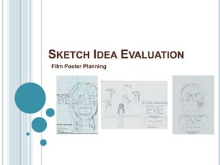
2. Idea 1
Composition
The layout uses the rule of thirds, in which
the page is split into a grid and the leading
details of the piece are placed within the
central grid area. This is effective in
directing the viewers attention to the
central image and to the film’s title, these
being the leading areas of importance
within the piece.
Central Image
The placement of the central
image draws inspiration from ‘The
grudge film poster , and presents
an effective Medium close up shot
of the film’s leading protagonist.
The character’s fearful expression
is effective in conveying the
vulnerability of the protagonist
and the surrounding emptiness f
the background (of which shall be
coloured in a solid black), is
effective in emphasising the
isolated state of this character as
well as foreshadowing the demise
at the hands of the antagonist.
The bloodied wrist, in which the
message ‘It's you’ can be read,
reflects the concluding scene
within my teaser trailer, thus
forming synergy between the two
products.
The appearance of the bloodied
message is also effective in
signalling the form of the
antagonist (this being sinister
messages) as well as conveys the
strong theme of threat and danger
within the film; conveyed through
the portrayal of a rather sinister
injury.
Text
The title of the film is important in
informing the audience of the name that
they should associate with the film. Above
this title is the name of the leading actor,
useful in corresponding with the central
focus of the image.
Within the lower left corner of the piece,
the presence of the tagline “Her future is
written in blood” is effective in teasing the
audience and producing informative hints
regarding the narrative. The word “future”
suggests that something of significance
shall await this character, in which through
the word “blood”, possessing dark
connotations of violence and danger, it
can be inferred that this “future” shall likely
be a dark and unwelcomed one.
The piece also includes the film’s release
date, allowing audience’s to anticipate the
films upcoming release and a social
media link (allowing the audience to
interact with further promotive additions to
the film.
The billing block shall be used to credit
the leading creators and actors within the
film.
3. EVALUATION
Strengths
-The piece includes conventional text elements of which are frequently applied within film
posters; thus forming a media text that is identifiable as a film poster.
-The tag-line is effective in foreshadowing both the dark themes within the narrative, as well
as hinting towards the form that the antagonist will take (these being darkly “written”
messages).
-The use of the rule of thirds has resulted in a good balance of poster content throughout
the composition of the piece, as each gird area shall be filled. Allowing for no areas to
feel incomplete.
-The use of a medium close up is effective in creating a visual impact as the character
appear close to the viewer, effective in inciting a sense of unease within the audience as
the protagonist’s terrified expression suggests that danger is near (effective in hinting
towards the dark and eerie intent of the antagonist).
-The text ‘It’s You’ upon the protagonist's forearm links directly to the concluding frame
within the film’s teaser trailer (creating synergy between the products).
4. EVALUATION
Weaknesses
-The margins of this design lack consistency, and will
thus need to be lined up correctly regarding each
element of text if this is to be the final design choice.
-A large proportion of this design shall consist of a solid
black background, thus making the piece seem slightly
empty in places.
5. Idea 2Composition
The layout has taken inspiration from ‘The Woman In
Black: Angel of Death’ poster in which the piece
adopts a less frequently used landscape orientation;
effective in providing a composition that is somewhat
new and fresh for viewers.
Central Image
The central image features the protagonist in this characters acts as the
leading focal point of the piece. This central position is effective in
conveying their importance to the narrative and their lone presence is
also effective in conveying their isolated and vulnerable state.
The use of wide shot is effective in making the protagonist seem rather
small in which this is effective in conveying their lacking strength in the
face of the film’s antagonist.
This antagonistic presence has been conveyed through a range of
sinister texts written upon the walls of Eve’s home, and the presence of
these scrawling's throughout the composition is effective in connoting a
sense of restless energy as well the dominance of the dark presence
within the film.
The frightened expression of the protagonist is effective in conveying
their vulnerable state in which by placing their hands upon their face,
this is effective in conveying the pain that the antagonist inflicts upon
the character's mind (reflective of their intent to torment the
protagonist).
Text
Similar to ideas 1 and 3, this piece includes the film title
(allowing the audience to associate the film with a
name), social media links (allowing audiences to interact
more deeply with media texts promoting the film’s
release), release date (allowing audience’s to anticipate
the film’s oncoming release), billing block (crediting
leading creators and actors) and the tag-line “Her future
is written in blood” (the effects of which are stated in
idea 1).
In addition to this, this design also includes the
production logo and name of our group, effective in
providing further credit for the creators of the piece.
Also, within the central image, further pieces of text
include a range of messages written upon a wall, this is
effective in conveying the form that the antagonistic
presence within the film shall take. The sinister style of
these messages is effective in conveying their dark
intent towards the protagonist.
The language used within these messages includes
declaratives, such as “They’re Near” and imperatives,
such as “Look up”. The simplicity of these phrases is
effective in inciting a sense of enigma into the piece and
the intent of the messages is uncertain. The use of
declaratives is effective in conveying a rather cold
atmosphere in which the words are void of opinion and
thus lack a sense of warmth or humanity.
The use of imperatives are effective in exerting a sense
of authority in which the dominance of the antagonist is
conveyed through their issuing of orders for the
protagonist to follow.
6. EVALUATION
Strengths
-The piece includes conventional text elements of which are
frequently applied within film posters; thus forming a media text
that is identifiable as a film poster.
-The tag-line is effective in foreshadowing both the dark themes
within the narrative, as well as hinting towards the form that the
antagonist will take (these being darkly “written” messages).
-The use of a wide shot effectively emphasises the dominance of the
antagonistic presence over the vulnerable protagonist ; effectively
foreshadowing the protagonist's dark and unfortunate end.
7. EVALUATION
Weaknesses
-The composition of the piece lacks balance in which some
areas of the piece appear rather empty and lacking a
purpose within the poster (i.e. The upper right corner, of
which is void of content).
-The central image, although effective in presenting the
protagonist as small and vulnerable, lacks impact , in which
the wide shot instead conveys a sense of emptiness, slightly
decreasing the overall excitement of the piece; in which the
terrified expression of the protagonist lacks impact as the
viewer seems to be at a rather safe distance away from the
dark happenings within the piece.
8. Idea 3
Composition
This layout uses the rule of thirds,
in which this piece is split into a
grid and each area filled evenly
with content. This is effective in
creating for a poster in which the
visuals are equally distributed
throughout the piece, effective in
establishing a satisfying balance of
components within the poster.
Regarding the placement of each
element this has taken inspiration
from the film poster for ‘Insidious’.
Central Image
The central image of this piece
features the leading protagonist of
the film, in which their lone
presence conveys their
significance to the narrative as well
as conveys a sense of loneliness
(connotative to the isolation that
this character succumbs to after
falling prey to the antagonist).
Regarding the character's facial
expression this conveys a
concerned demeanour in which the
character's direct gaze is effective
in riling a sense of sympathy within
the audience in response,
emphasised by the character’s
injured cheek.
Regarding this injury this takes the
form of the message ‘They're
Near’;, of which the message is
effective in inciting a sense of
eeriness within the piece as this
suggests that the protagonist is not
truly alone.
Regarding the rather hostile
expression of the protagonist, this
is effective in conveying the
paranoia that sets within this
character as they begin to fall
victim to the word of the antagonist.
Text
This design also conforms to the conventions
specified within ideas 1 and 2.
Regarding text unique to this design, this
includes the engraving of ‘They’re Near’ upon
the cheek of the protagonist. This use of a
declarative is effective in conveying a rather
cold and emotionless phrase, in which the
words convey a factual tone, void of
expression. This is effective in conveying a
sense of eeriness, in which the words used
lack any sense of human opinion or warmth.
This cold tone is effective in reflecting the dark
will of the antagonistic messages, of which the
danger this presence is conveyed through the
bloodied form in which this text has been
presented (in which blood possess rather
negative connotations of violence, threat and
pain; foreshadowing the protagonist’s fate).
9. EVALUATION
Strengths
-The piece includes conventional text elements of which are frequently applied
within film posters; thus forming a media text that is identifiable as a film
poster.
-The central, rue of thirds layout is effective in providing a sense of equilibrium
upon the page in which each area of space has been used equally; allowing
for no unsatisfying areas of emptiness.
-The tag-line is effective in foreshadowing both the dark themes within the
narrative, as well as hinting towards the form that the antagonist will take
(these being darkly “written” messages).
-The focal point upon the protagonist, directly corresponds with the film title (this
being the character's name) and conveys the significance of this character
within the film’s narrative.
10. EVALUATION
Weaknesses
-The hostile expression of the protagonist, although effective
in conveying their distrust/paranoia towards others,
presents that character as misleadingly strong, in which
their true vulnerability as a character lacks a coherent
portrayal.
-The message ‘They’re Near’ was not featured as a blood
wound within the film’s teaser trailer but was instead written
in blood upon paper, thus presenting a lacking consistency
in reflecting the content of the film’s other promotive
products.
11. IN CONCLUSION
Within each design idea conventional text elements have be used, in which the
creators/actors are credited, the film release date is granted, the title of the film is
present, social media links granted and a tag line; providing a teasing hint towards
the narrative's dark end and the form of the antagonistic presence within the piece
has successfully been portrayed.
However, regarding my choice of the most effective poster I believe this to be idea
1. This is because idea 1 possesses a strong composition, in which the rule of
thirds has been conformed to in order to allow each action of the piece to be
dominated with some form of poster significant content. Also the central image is
the most impactful of the three, in which the medium close up is effective in inciting
a sense of unease within the viewer as they are brought into close proximity of the
danger of which the protagonist evidently fears.
When re-creating his design however, I shall need to made sure that the margins,
in which the text is placed are maintained with consistency (presenting a slight
change that should be made to the design).
Regarding the reasons as to why 2 and 3 were not chosen. The composition of 2
seems to be the most weak in which the landscape format resulted in a large
amount of unused space resulting in a poster that appeared incomplete.
Regarding idea 3, although the composition was effectively distributed with
balance of the rather hostile expression of the protagonist made for a rather
misleading representation of this character, in which they could be mistaken as the
film’s antagonist rather than simply distrusting and paranoid (as was the intent).
Thus, for these reasons idea 1 shall be the design that my horror film poster is
based upon.