2. MISE-EN-SCENE
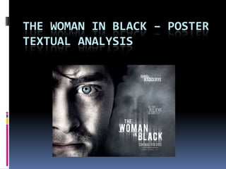
The poster shows a close up of what we would assume to be the main
protagonist in the film. This picture in the foreground allows the audience know
that the genre of the film is going to be horror because it shows the feared
expression shown on his face. The face shown in the fog also supports that the
genre is going to be of a horror genre. The fog is known to be a film and a real
life convention of a ghost encounter. As there is very little text on the poster
this shifts the main focus onto the image of the male character showing that he
will play a significant role within the film.
3. TEXT AND FONT
The poster does not contain that much text on it, only the crucial and needed
information is included to provide some detail for the audience. The title of the
film, the name of the main actor in the film, the tag line ‘Do you believe in
ghosts?’ and the release date. The tag line is placed next to the face seen in the
fog suggesting that this is in fact a ghost or ‘The Woman in Black’. As there is
hardly any detail on the poster this also emphasises the fact that there is
something spooky about the film as it is not wanting to let the audience know
too much about the film. By using the same font for all of the text, which looks
like it has been scratched on, it adds continuity throughout the poster and a
brand identity for the film itself.
4. COLOUR SCHEME
The colour scheme for the poster is very basic , different shades of grey, blacks
and white. The colour scheme fits in with 1800’s which is the time period in
which the film was set. For example at the time that the film was set the clothes
would have been these colours. If people were to wear brighter colours than
these it connotated wealth, which was very rare at that time.