Download to read offline

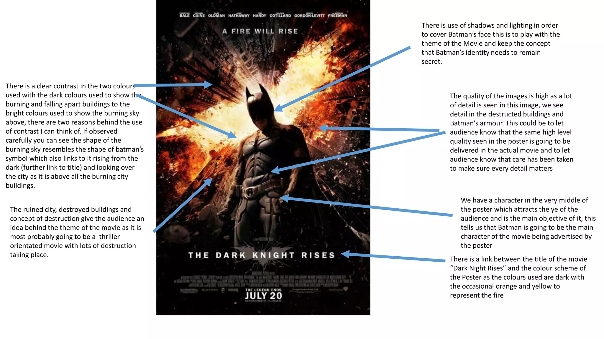

The poster advertises the movie "The Dark Knight Rises" and provides key information about the plot and themes. It depicts a ruined city with Batman as the central figure rising above the destruction. The color scheme contrasts dark, burning buildings with a bright sky in the shape of Batman's symbol. This links the movie's title to Batman overlooking the city amid the ruins and fires. The poster aims to attract audience attention with its high image quality and hints that the movie will also have meticulous detail.


