The document analyzes and summarizes several soap opera posters:
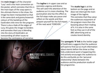
1. An EastEnders poster featuring the character "Lucy" is analyzed for its dark tones, faded edges on the character, and urgent uppercase tagline to catch attention.
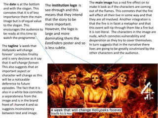
2. A Hollyoaks poster with a fire effect and nude characters is said to connote vulnerability and scrutiny. The large logo is less subtle than the EastEnders poster.
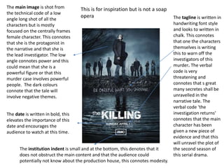
3. A poster for crime drama The Killing uses a low-angle shot of the protagonist to denote power and intrigue. The tagline and fonts are meant to be threatening and hint at secrets.
The document recommends repeating effective techniques like subtle logos, impactful