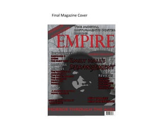
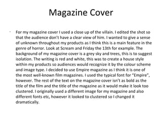
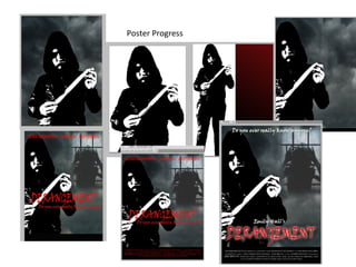
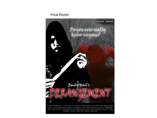
Call Girl in Bur Dubai O5286O4116 Indian Call Girls in Bur Dubai By VIP Bur D...
Evalutaion 2
1. How effective is the combination
between your main product and
ancillary texts?
The three parts of my project are the trailer, the magazine
cover, and a poster. This was to create a promotional package
for the film.
2. Audience
•
I used the same image for my magazine cover
and my poster so the audience would
recognize it and associate it with the film.
However, the image on my magazine cover is
cropped so it is a close up of the villain.
Whereas, on the poster is it a medium shot
showing the villain holding a knife. I edited
both images so that the villains face is
unrecognizable as I wanted it to give a sense
of a 'masked villain'.
3. Poster
•
For my poster I used a dark colour palette as this is typical for
horror films and I want to make it clear what genre of film it is
by the poster. I used colours such as grey and black for the
images and background and red for the title which
connotates blood and danger. The font of the title also
suggests it is a horror film as it is sharp. I also used a tag line
which was placed at the top of the poster, the title was at the
bottom. However, the tag line is in white. The image of the
villain is a medium shot and he is holding a knife, this
suggests again, what genre of film it is, as does the smaller
image of an unknown person peering through a window. It
suggests someone is being watched, which symbolizes what
happens in the film. This image is edited so it has a red tone
to it, this again conotates blood.
4. How my ancillary tasks worked
well.•
My ancillary tasks worked well together as I used the same
colour schemes and images within both of them. I used the
dark and red colours to tell the audience what kind of film it is
as it connotates blood and danger repeatedly.
5. Editing
•
When editing my trailer I used slow music to begin
with, it was a very simply track, however, it starts to
build up and layer with other tracks as the shots get
quicker. I used a heartbeat sound effect which builds
up and gets louder as the shots get more intense. I
also used slow edits at the beginning of my trailer
which slower everything down, whereas, as the
trailer was getting to its climax I used quicker and
less edits to speed up the pace.
6. Overall
•
I think my main task and ancillary texts have
worked well together and are effective as they
all show that the film is in the genre of horror
as they use the typical conventions of it. They
also all follow the house style so it can be
recognized.
9. Magazine Cover
•
For my magazine cover I used a close up of the villain. I edited the shot so
that the audience don’t have a clear view of him. I wanted to give a sense
of unknown throughout my products as I think this is a main feature in the
genre of horror. Look at Scream and Friday the 13th for example. The
background of my magazine cover is a grey sky and trees, this is to suggest
isolation. The writing is red and white, this was to create a house style
within my products so audiences would recognize it by the colour scheme
and image type. I decided to use Empire magazine as I think it is one of
the most well-known film magazines. I used the typical font for “Empire”,
however. The rest of the text on the magazine cover isn’t as bold as the
title of the film and the title of the magazine as it would make it look too
clustered. I originally used a different image for my magazine and also
different fonts etc, however it looked to clustered so I changed it
dramatically.