
Recommended
More Related Content
What's hot
What's hot (20)
Similar to Poster Analysis Three
Similar to Poster Analysis Three (20)
More from StephanieAlabi
More from StephanieAlabi (20)
Recently uploaded
Recently uploaded (20)
Poster Analysis Three
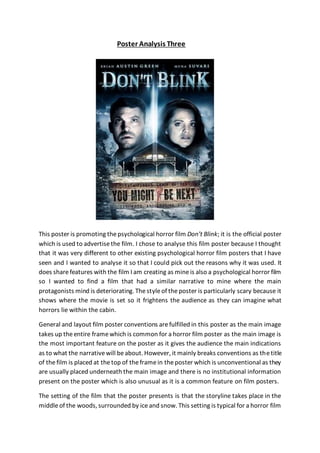
- 1. Poster Analysis Three This poster is promoting thepsychological horror film Don’t Blink; it is the official poster which is used to advertisethe film. I chose to analyse this film poster because I thought that it was very different to other existing psychological horror film posters that I have seen and I wanted to analyse it so that I could pick out the reasons why it was used. It does sharefeatures with the film I am creating as mineis also a psychological horror film so I wanted to find a film that had a similar narrative to mine where the main protagonists mind is deteriorating. Thestyleof theposter is particularly scary because it shows where the movie is set so it frightens the audience as they can imagine what horrors lie within the cabin. General and layout film poster conventions arefulfilled in this poster as the main image takes up theentire framewhich is common for a horror film poster as the main image is the most important feature on the poster as it gives the audience the main indications as to what the narrativewill beabout. However, it mainly breaks conventions as thetitle of thefilm is placed at thetop of theframein theposter which is unconventional as they are usually placed underneath the main image and there is no institutional information present on the poster which is also unusual as it is a common feature on film posters. The setting of the film that the poster presents is that the storyline takes place in the middleof the woods, surrounded by iceand snow. This setting is typical for a horror film
- 2. and follows horror conventions as thereis usually a lonely, isolated setting which makes it scarier for the audience as they are all alone and there is no one they can go to for help when theantagonist strikes. It also means for the audience that there is no escape because they are in the middle of the woods and it would be very difficult to find the way out. The setting causes theaudienceto form expectations about thefilm’s narrative as they would assume that one of the main characters is going to go through some psychological torture that will cause them to begin murdering the inhabitants of the cabin which in turn makes it morefrightening. Natural lighting is used on this poster as it is coming from thesun behind theclouds and is shining down on thebackground setting which also gives the impression of the characters being surrounded by nature and all alone. But also, availablelighting is seen coming from inside the cabin which showcases that someone is inside the cabin maybe putting on all the lights to protect themselves against the dark evil that wants to harm them. There are two characters featured in the main image of the poster who seem to be the main protagonists. The mise-en-scene matches the setting as their costumes appear to be coats which would make sense for them to wear if they were surrounded by cold weather and snow. It could also signify how they are trying to protect themselves against the villain by covering up and wearing many layers as it may make them feel moresecure. Their facial expressions connect very well with the title of the film as they are both staring with wideeyes at something not in the frame which links with the title Don’t Blink as maybe they believe that if they blink, they will die because they will not see whatever is coming for them. The colours shown in themain image mostly are white, blue and black. The white could represent the snowy weather but also the fact that the protagonists are innocent and good; which may be the only things in that area that is not evil. The blue could give the atmosphere of cold and sinister to reference the eerie feel around the cabin and that the villain could be waiting for them. The colour black signifies death and evil lurking around the cabin which automatically links to the antagonist who is either waiting for them outside of the cabin or within the characters themselves in their mental states. The characters themselves are positioned at the top-centre of the poster which draws theaudience’s attention to them and signals to the audience immediately that they are important to thestoryline. Thebloody handprint on thesign at thebottom of the poster in the main image signals genre to the audience as blood is a clear piece of horror iconography which indicates that it is a horror film which should attract horror film fans to go watch it. Don’t Blink is thetitleof film being promoted in the poster and the meaning behind this could be that the characters shouldn’t blink if they are at the cabin because one false movecould lead to them being dead. This is slightly typical of a horror film as it links well
- 3. to the narrativeof thefilm and gives the audience a hint as to what it is about. The font of the title is a large, bold, serif font which is positioned at the top of the film poster. It also has a ghostly effect on it which could show that there is a supernatural element to the film on top of the psychological one which could be used to draw in a wider audience. The sizeof the titleis very largeand compared to theother text on the page it is the largest which could beso it stands out moreand the audience are instantly drawn to it. The serif font could represent the seriousness of the situation that the characters are in and that it shouldn’t betaken lightly; thisis one of the factors that would be used to frighten the audience. The colour whiteis used for thetitlewhich could link too many things; such as the snow which covers theground in the main imageor thefact that thecharacters shown are the purevictims in thestoryline. Thewhitetitleis placed on top of a black background which could also hint to thefight of good versus evil in the film and that in the end of the film, one of them would have triumphed over the other. The title is positioned at the top of the frame, above the main image. This is not a typical layout as on most horror film posters the title is placed towards the bottom of the poster, underneath the main image. The title may have broken conventions and been placed here to make it stand out more so the audience pay more attention to it as it is clearly a piece of advice to those in the film if they want to remain alive. “You might be next…” is the tagline on this poster promoting the film Don’t Blink. The meaning suggested through this taglineis that there is clearly a serial killer on the loose and anyone could be next to be killed by them. The tagline is made more effective by theuse of ellipsis at theend of thestatement as it means that there could be more that isn’t said in thetaglinethat may beused to help them stay alive. The tagline anchors the main image as it adds to the fear factor created behind the cabin shown in the setting and it reveals more about the narrative than the image did which should help the audience in being persuaded to watch the film. It also maintains a sense of intrigue as theaudience may bewondering if indeed they are next to be killed by the antagonist so it could make them want to watch the film more to find out. The tagline’s font is an uppercase, bold, black, sans serif font which straight away means it is important to thestorylineas they madeit so theaudiencewould bedrawn to it. It is displayed in a medium size so it is bigger than most of the text in the frame but not morethan thetitlewhich suggests that the title is more important than the tagline and theaudience should pay less attention to thetaglineand moreto the title as it may give away more about the narrative. The tagline is positioned towards the bottom of the poster underneath themain image. This is a typical layout for a tagline as they want you to pay moreattention to themain image rather than the tagline but enough so you still read it and get more of a feel for what the storyline is about.
- 4. Other text that is featured on the poster is the names of the actors who star in the film e.g. ‘Brian Austin Green’ and ‘Mena Suvari’. They are shown on the poster to lure a wider audience in to watch the film as theaudience would recognisetheactors who star in the movie and if they are well-known they could attract more people to watch the film that maybe aren’t fans of horror films but just enjoy the actors’ work. This could also suggest genreas maybethat actor only works in horror films so the audience would instantly know what genre the film was if they saw the actor on the poster. The poster doesn’t feature institutional information which is not conventional of a film poster as most of them do show institutional information at the bottom of the frame. The colours that mostly dominatetheposter arewhite, blueand black. They each create a similar atmosphere of the unnatural and they create an eerie mood. The colour schemeis used to signal genre and sub-genreas the colours areconventional of a horror film poster so fans of horror films would quickly takenote of this and recognise that the film is of the horror genre and one that they would most likely enjoy. Overall, in my opinion this poster is very effective in promoting the film Don’t Blink as it showcases everything the audience need to know in order for them to decide whether or not they want to go watch the film. I think the poster will be very successful in luring in its target audienceas it is obviously advertising a horror film and I’m sure horror film fans would be inclined to watch thefilm after seeing the poster which clearly shows the horror and torment the characters will have to go through. It is also very successful in suggesting thefilm’s narrativewhilst also not giving too much away as the main image, title and tagline all give the audience hints to what the narrative will include but not enough for them to know how it ends which would be enough to persuade them to watch the film to find out for themselves.