The document analyzes a poster for the soap opera EastEnders. It discusses several design elements of the poster and their intended meanings and effects:
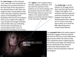
1) The main image of the character Lucy blends into the backdrop to suggest she is becoming the central focus of the show's narrative.
2) The tagline uses all capital letters and punctuation to draw attention and create a sense of urgency and drama.
3) A link to the show's Twitter page encourages audience engagement and builds a personal relationship between viewers and producers.
4) The BBC logo is subtly placed and does not interrupt the image, showing the priority is audience enjoyment over self-promotion.