Download to read offline
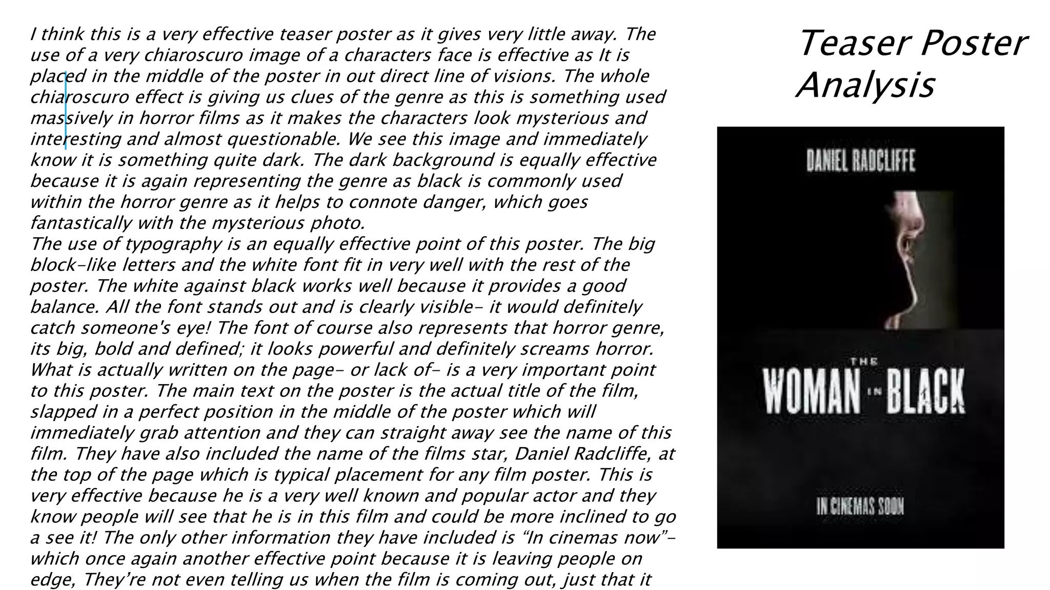


The document analyzes various elements of the trailer, poster, and magazine cover for the film The Woman in Black. The trailer uses long shots to make the main character seem vulnerable and alone. Shots of a creepy, abandoned house establish the film's setting. The poster features a mysterious close-up image and minimal text to intrigue audiences. The magazine cover maintains consistency with the trailer by featuring the main character and creepy house setting, further establishing the film's horror genre elements and mystery sub-genre.


