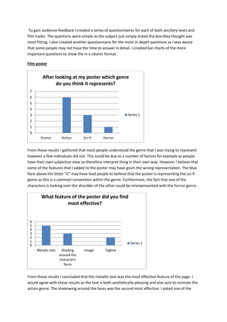
The document discusses the ways in which the media products created by the author use and develop conventions of existing real media products within the action genre. It provides details on the film poster, magazine front cover, and film trailer created by the author. For each product, it identifies conventions found in existing similar products that were utilized, such as a close-up character image with shading on the poster, large masthead and single dominant image on the magazine cover, and fast pacing and cliffhangers in the trailer. The document also discusses how audience feedback was gathered through questionnaires to evaluate how well the genre and purpose were conveyed.
The document discusses conventions used in different media products related to action films, including film posters, magazine covers, and film trailers. For film posters, common conventions mentioned include a close-up shot of the main character's face, dark shading around the face, a bold title, and a short tagline. For magazine covers, conventions include a large masthead, a dominant main image, a bold main cover line, and smaller cover lines around the image. For film trailers, fast pacing, short dialogue, voice over narration, intertitles, on-screen graphics, climactic endings, and dark lighting are mentioned as common conventions. The document also discusses how the student's own media products follow these conventions to be
The document discusses conventions used in the creator's media products, including a film poster, magazine front cover, and film trailer promoting the film "CAGED."
For the poster, conventions included a close-up shot of a character's face with shading, a bold title, and a short tagline. Feedback found the metallic title and character shading most effective.
The magazine cover followed conventions like a large masthead, single dominant image, and progressively smaller cover lines. Feedback found the cover lines worked well.
The trailer used fast pacing, assertive dialogue, narration, graphics, and a climactic ending to follow action film trailer conventions. Flash transitions were seen as most effective. Audience research
The document discusses how the creator achieved synergy between a film trailer, poster, and magazine. Specifically:
1) The same font was used for the title across all three to provide continuity. White text was chosen to stand out despite going against horror conventions.
2) Similar content like the production company name and "Coming Soon" text linked the trailer and poster. The magazine and poster also shared stylistic text.
3) A dark color palette unified the imagery, though lights and flashes featured in the trailer. Dark backgrounds with some white text did the same for the poster and magazine.
4) Elements like similar colors, fonts, mis-en-scene, characters, and title presentation across
The document discusses conventions used in psychological thriller films, trailers, posters, and magazines. It analyzes examples like the film Shutter Island and describes recurring themes (death, mental illness), plot elements (government mind control), and production techniques (camera angles, editing, sound design). Specific conventions highlighted include using music to build tension, low angles to assert dominance, and minimal color palettes in marketing materials to set a dark, unsettling tone.
The document discusses the conventions of horror genre media products and how the student's projects followed or challenged these conventions. It analyzes the conventions of horror posters, magazine covers, and teaser trailers in terms of format, genre, and institutional norms. For each media product, it explains how the student's work adhered to typical conventions such as using dark colors, mysterious images, and unsettling sounds to create fear while hiding full details and building intrigue.
The document summarizes how the media product (teaser trailer for "The Girl in Red") uses and challenges conventions of real media products such as trailers, posters, and magazines. It discusses how the teaser follows conventions like using montage editing, building soundtrack pace, and including company logos. However, it also challenges conventions by having a longer teaser, marketing based on genre rather than actors, and subverting typical thriller character types. Frames from the teaser and other media are analyzed in terms of camerawork, mise-en-scene, sound and how they develop genre while also comparing to examples from real media like "Gone Girl".
The document discusses the media products created by the author - a horror film trailer, poster, and magazine cover.
For the trailer, the author researched horror film conventions like including a happy beginning, storyline of friendship turning tragic, and lack of dialogue. They also included realistic elements like ratings screens and production logos.
The poster follows conventions like centering the image, and placing the title, tagline, billing, and other information at the bottom. It uses a color scheme typical of horror.
The magazine cover includes a masthead, tagline, coverlines, plug, website, lead image, date/issue number, price and barcode - all common magazine cover elements. It focuses on one main
This document identifies conventions across different media types, including film trailers, magazine covers, and film posters. For film trailers, common conventions include beginning with a production logo, showing the title at the end, and including social media links. For magazine covers, main images that make eye contact, mastheads, coverlines, and sidebars with additional information are typical. Film posters usually have the title and release date at the bottom, include main character names, and provide limited details about the plot through images or facial expressions. Romantic comedy works in particular genres tend to follow conventions like portraying the main characters' relationship or using feminine colors to appeal to female audiences.
- The document discusses feedback received from test audiences on a film trailer created by the author.
- Audiences felt the trailer successfully portrayed a typical romantic drama through the development of the relationship between the two main characters and inclusion of typical genre conventions.
- The soundtracks used in the trailer were well received as they effectively conveyed different emotions throughout the ups and downs of the relationship.
- Some areas for improvement included making the ending clearer and adding more context to transitions between scenes with the dog. Audio quality also needed strengthening in some areas.
- Overall the trailer was an effective representation of the romantic drama genre, with only minor weaknesses identified from audience
The document discusses key elements of effective horror film posters, including:
1) The main image should intrigue viewers without giving away the storyline.
2) The tagline gives something away about the film to enhance interest, but shouldn't distract from the main image.
3) Fine print with credits is placed at the bottom center for a clear layout.
The author analyzes example posters and plans to apply lessons to their own poster, focusing on a single character as the main image, an intriguing tagline near the bottom, fine print also at the bottom, a bold title near the bottom, and using contrast between the main image and background.
This front cover analysis of the film magazine 'Empire' promotes the sequel to the film 'The Dark Knight'. The cover uses horror conventions through its dark colors and typography. The main image of the Joker is dark and mysterious, highlighting his importance to the narrative. Sell lines about the director and other films attract the target audience of film enthusiasts. Overall the cover employs simple yet effective layout and design conventions to promote the featured film through its unsettling visuals and relevant information.
The masthead at the top of the magazine cover catches readers' attention. The main image overlaps the masthead, drawing attention to itself while still allowing recognition of the magazine brand. Below the image is the title of the featured film in prominent text. Additional text provides context and intrigue about the film's plot and characters. Smaller text at the bottom lists other articles and information to entice readers without distracting from the central marketing of the main story. Consistent colors, fonts and design elements throughout tie the cover together in an aesthetically pleasing way focused on promoting the featured content.
The poster is promoting the psychological horror film "Don't Blink". It shows two characters staring wide-eyed at something outside of the frame in front of an isolated cabin surrounded by snowy woods. This sets up frightening expectations for the audience about what horrors might be encountered. While breaking some conventions like placing the title at the top, the poster effectively draws attention to the title and tagline "You might be next..." to intrigue audiences about the film's narrative without giving too much away. The isolated setting, colors, and facial expressions of the characters work well to promote the psychological horror genre and persuade potential viewers to watch the film.
Sketch Idea Evaluation- Magazine Front Coverkanda11821
This document evaluates three ideas for the front cover design of a horror film magazine. All three ideas incorporate common magazine design conventions such as a masthead, cover lines, and images. Idea 1 uses a central layout and focuses on conveying fear through the protagonist's expression and bloody messages. Idea 2 also has a central layout and uses exclamatory language and offers of collectible posters to attract readers. Idea 3 takes a less common off-center approach to challenge expectations, with an unbalanced composition reflecting the film's dark themes. Each idea is assessed for strengths such as conveying genre and themes effectively, and weaknesses like repetitive character poses. The document aims to select the best idea for capturing readers' interest in the featured horror film
The poster promotes a horror film by featuring a bloody image of a woman dragging her hand along a wall, implying a demonic presence. It includes the film's title in a sinister font and the tagline "Once you see him, nothing can save you", creating intrigue around the demon face drawn on the wall. The desaturated colors, emphasis on blood, and minimalist style amplify the horror elements to attract audiences to the gruesome yet mysterious film.
The document analyzes the ways in which a film trailer uses and develops conventions of real media products in the horror genre. It finds that the trailer uses many established horror conventions, including nightmares, characters being followed, jump scares, ominous music, research into evil antagonists, bloody violence, and cliffhanger endings. Some conventions are challenged through minor changes to layout and placement of elements, but overall the trailer firmly adheres to genre conventions to effectively convey a horror story and appeal to audiences familiar with the style.
The document discusses conventions of film posters and how the author's media product adheres to or challenges these conventions. Typical conventions include a dominant central image, large title, actors' names, and tagline. The author's horror poster features a gloomy central image off-center, a title below center in bold font, and uses colors like red, black, and green common in horror posters. While adhering to conventions like the dominant image and release date, the author's poster challenges conventions by having an off-center title and emotionally blank central character image.
The magazine cover summarizes information about films in four key areas:
1) The central image features the main character from the film Inception to represent the main topic of the magazine.
2) Headlines around the edges advertise other films being released at a similar time.
3) Graphics relating to the design of Inception are used in the title layout.
4) The font and lighting of the central image aim to convey the mysterious nature of the film.
The document discusses how the media product uses, develops, and challenges conventions of real media. It examines the genres used in the trailer, which is a hybrid of crime thriller and romance. Conventions of crime thriller trailers like editing, mise-en-scene, and sound are employed. However, some conventions may not fully reflect the thriller genre due to the mixed genres. The trailer also uses conventions through its plot, setting, and props, while also challenging conventions by combining genres and having a strong female lead rather than male. The magazine cover and poster similarly use conventions of real products in their design but challenge conventions through their images and layouts.
The document discusses how the media products created for a school assignment used and challenged conventions of real horror movies and print media. For the poster, conventions like a sinister tagline, actor names and ratings were followed, while the font challenged conventions by using an unprofessional childish style. The magazine masthead followed conventions but the puff steering the magazine solely to horror challenged conventions. Overall, the projects balanced following real conventions while also innovating to better fit the intended horror genre and story.
The document provides an in-depth analysis of the front cover of a film magazine. It examines various design elements and how they are used to attract the target audience. These include positioning the website address discreetly, including the date to indicate monthly publication, and using a tagline and headlines in bold colors. Images are also analyzed, such as a photo of Harry Potter making eye contact to engage readers and preview stills of characters in costume from upcoming films. The document discusses how these visual elements are purposefully designed and positioned to draw in audiences.
Magazine Front Cover, Emma's assignment 18/10/2018PatchCarter
This magazine cover is aimed at film lovers. It features a large dominant image of characters from the upcoming Avengers film Infinity War. The main characters Thanos and Iron Man are featured most prominently. Text on the cover provides information on stories inside about other upcoming films like Jurassic World 2 and Solo: A Star Wars Story. The bold masthead, use of red text for certain words, and prominent imagery work together to attract readers and promote anticipated films.
The document describes conventions commonly found in film magazine reviews and movie posters. Magazine reviews typically include the magazine title, page number, title of the article in a large font, images from the film, and columns of text. Movie posters usually have the film title at the bottom, an image of a character close-up or scene, a short tagline, and release date in small font. Both utilize color schemes, images, and text features to effectively promote films.
The document discusses codes and conventions used in film posters. It provides examples of several film posters and analyzes their visual elements and text. Key aspects included are the use of images reflecting the film's narrative, large title text for visibility, inclusion of actors' names to attract audiences, and placement of credits and other information in standardized locations. The posters are examined to understand how they relate genre, tone, and plot details to potential viewers according to typical poster design conventions.
The poster uses several horror film conventions to attract audiences. It features a close-up image showing physical possession in progress that is visually striking yet scary. The tagline "Darkness lives inside" and the image provide clues about the film's concept of possession. Standard horror color schemes like dark tones are used to create an unsettling mood. The date is placed below the main image to draw more attention to it, while credits use smaller fonts to take less attention away. Overall visual and textual elements work together to intrigue audiences and imply a frightening story centered around the theme of possession.
This document provides information about promoting short films through various avenues such as film festivals, posters, and magazine articles and reviews. It discusses the conventions of short film posters which typically include the title, image of protagonists, and small print for production details. Magazine reviews usually have a large main image, title, director/production details, and star rating. The document also analyzes examples of posters and reviews, noting features like use of color, layout, and font. Specifically, it examines the Animation magazine as an ideal outlet for an animated short film given its focus on animation industry news and reviews.
The document discusses the ways in which the media products (a film poster, magazine cover, and trailer) use conventions of existing real media products in the action genre. For each product, the document analyzes conventions found in existing examples that were used, such as a close-up shot of a character's face on the poster with shading, large bold title, and tagline. Feedback was gathered through questionnaires to understand how effective the combination of the main products and ancillary texts were at promoting the film. The feedback showed most people understood the intended genre but some did not, which could be for various reasons like personal taste.
Global Consumers React to Rising Payment FraudACI Worldwide
The document summarizes the results of a global survey conducted in 17 countries on consumer fraud. Some key findings include:
- 1 in 4 cardholders experienced fraud in the past 5 years globally. Fraud rates varied significantly by country.
- Speed of response, reimbursement, and card replacement were the biggest factors in customers' satisfaction with how financial institutions handled fraud cases.
- After fraud incidents, many consumers exhibited "back of wallet" behavior like using cash instead of cards, or using replacement cards less than original cards.
- Risky consumer behaviors like writing down PINs or throwing out statements were still common in some regions.
This document defines and provides examples of different shot types used in film including medium close up, extreme close up, establishing shot, and close up. A medium close up shows facial expressions and the top half of the body. An extreme close up focuses on the eyes to show emotion. An establishing shot establishes the setting. A close up expresses emotions and atmosphere and allows the audience to feel present in the scene.
This document discusses the forms and conventions of real pop music magazines and how the author's media product challenges or adheres to them. It provides examples of typical conventions like charts, genres, glossy paper formats. It then shows examples from the author's magazine cover, contents page, and double page spread, noting how some conventions are followed (masthead, colors) while others are challenged (fewer thumbnails, atypical images). The goal is to experiment with conventions while still appealing to the target audience.
ACI and Aite discuss results of a global study and share how current global and regional smartphone use is predicting the future shape of the mobile economy. Learn more: http://www.aciworldwide.com
The document discusses how the media producer's magazine, poster, and trailer for a horror film called "We Need to Talk About Robert" use and challenge conventions of real media products in similar and different ways. Specifically, the magazine, poster, and trailer all use conventions like incorporating the film's title and villain/protagonist. However, they also challenge conventions, like putting the villain instead of protagonist on the magazine cover and using ambiguous language for the film's release date on the poster. The document also discusses how the color schemes, fonts, camera angles, and photography are effectively combined across the products to maintain consistency with horror genre conventions.
The document discusses conventions used in various ancillary products for a horror film, including a magazine cover, poster, trailer, and compares them to professional examples. It analyzes conventions in areas like mastheads, headlines, images, slogans, and finds that while some elements follow conventions of the genre and form, others could be improved. For example, the magazine cover masthead is too long, the trailer could use more music variation, and the poster slogan would work better in the top third like the professional example. In general, it evaluates how well the ancillary pieces adhere to or diverge from typical conventions for horror film marketing collateral.
The document discusses conventions used in horror film posters, magazines, and trailers. Horror film posters typically feature the main villain or possessed character prominently and place institutional information like the film title at the bottom. Horror magazines commonly use multiple dramatic images on the cover and include little information about the magazine's contents. Horror trailers employ techniques like establishing equilibrium with a happy scene before inserting fear, using fast-paced montages set to heightening music, and ending with a frightening sting to effectively scare audiences.
The document discusses conventions of real media products and whether the student's own media products followed or challenged these conventions. It analyzes conventions of magazine covers, film posters, and film trailers. For each media type, it identifies conventions from real examples and indicates whether the student's work followed or challenged each convention. It provides explanations for conventions that were challenged, such as not using a red masthead on the magazine cover for visibility reasons. Overall, the student aimed to follow conventions but also challenged some, such as featuring a person of color on the magazine cover.
This is the first evaluation question I am required to answer as part of my A2 Media Studies coursework. This answer looks at the ways my media products (magazine cover, film poster and film trailer) resemble real products out there
The main image, film title, tagline, credits, and release date are key generic conventions of horror film posters. The large dominant main image in the center is usually of the antagonist to intrigue and scare audiences. The bold film title appears at the top to identify the film. Below is the smaller tagline that hints at the plot without revealing too much. Credits are kept small at the bottom. The release date is prominently displayed at the bottom to inform audiences when they can watch the film. Together, these visual elements aim to attract and unsettle viewers with hints of danger and thrills to come.
The document provides an evaluation of a candidate's media studies advanced portfolio, which includes a psychological thriller teaser trailer as the main product, along with a film magazine cover and poster as ancillary tasks.
The summary evaluates how the candidate's media products used and challenged conventions of real media, focusing on thriller and horror genres. Feedback was gathered from audiences throughout the process.
Various media technologies were used in the construction, research, planning and evaluation stages, including iMovie, Photoshop, YouTube and blogs to produce, analyze and gather feedback on the media products.
The document discusses conventions of film marketing materials like trailers, posters, and magazine covers. It analyzes how the student's media product compares to conventions. The student's trailer incorporates many conventions of horror trailers, such as fast cuts, minimal dialogue, menacing music, and violent imagery. However, it also challenges some conventions by including classical music, longer shots, and lacking a clear hero. Posters and magazine covers typically feature stars, reviews, genres, and bright colors to attract audiences. The student analyzes how their poster incorporates and adjusts some of these standard elements and layouts.
Codes and conventions of film posters and magazinespelmes11
Film posters and magazine covers use similar conventions to advertise movies. Posters typically feature the movie title at the bottom, a central image showing main characters, and a dark background to make the image stand out. Magazines often place the title over main character images and use puffs to promote other films. Both aim to be memorable by highlighting stars and repeating consistent branding across formats. While posters provide more context about the plot, magazines focus close-ups of characters to attract readers.
The document provides information about designing the front cover of a film magazine focused on post-apocalyptic genre films. It discusses key elements of magazine covers including the masthead, primary image, and cover lines. It also includes research on conventions for composition, colors schemes, and inspiration images. The draft magazine covers receive feedback to make adjustments such as reducing the primary image size and making the text more prominent.
The document provides information about designing the front cover of a film magazine focused on post-apocalyptic genre films. It discusses key elements of magazine covers including the masthead, buzz words, taglines, primary images, and cover lines. It also provides examples of institutional distributors of film magazines. The document then outlines the creative process for designing a mock cover, including researching conventions, developing ideas for images, colors, composition, and text placement. It incorporates feedback from audiences on two draft designs to create a final poster draft.
The document summarizes a student's media project creating a film trailer, poster, and magazine cover. The student researched conventions of real media products and incorporated them into their work. For the trailer, they followed Todorov's theory of narrative structure and included disruption, an attempt to repair it, and reinstatement of equilibrium. The poster and magazine cover used consistent color schemes, fonts, and images to link the products together through intertextuality while maintaining unique designs.
This document discusses how the marketing strategy for the film "Fantastic Beasts: The Crimes of Grindelwald" was effectively planned and executed. It promoted the film across multiple platforms like posters, trailers, and social media in a coordinated way. The marketing emphasized the connection to the popular Harry Potter franchise to attract existing fans. Teasers were released to build anticipation for the film. Due to the large studio backing it, the film benefited from extensive promotion. The overarching theme of the marketing was to expand the Harry Potter world and appeal to both existing and new audiences.
The document provides information about designing the front cover of a film magazine. It discusses key elements of magazine covers like the masthead, buzz words, taglines, primary images, and cover lines. It also discusses institutions that distribute film magazines. The rest of the document includes mood boards and inspiration for designing a post-apocalyptic themed magazine cover, including proposed images, color schemes, compositions, and text placements. Feedback is provided on two draft designs.
The document discusses conventions of genres and real media products like films, trailers, posters and magazines. It examines how the author's media products use and develop conventions or challenge norms. The author analyzes thriller and action film conventions they employ in their gangster film trailer, such as tense music, whip pans during fights and a lack of clear hero/villain. For their poster and magazine cover, the author studies real examples like The Godfather poster and magazine covers, then develops conventions like character positioning and advertising additional content. The document also notes how omitting norms like verbal exchanges and using film noir techniques develops expectations for the media.
The document discusses the effectiveness of a magazine cover the author has designed. They believe it is effective due to the chosen cover image showing the main character in a scary way, conveying insight into her character. Fonts are varied and conventionally placed. Small additional images are included without overcrowding. The layout clearly features the film and guides the eye. Improvements could include more varied fonts and adding something to the bottom right corner to complete the visual route.
The document discusses how the media product uses and develops conventions of real media products. It analyzes a movie poster and website created by the author for a horror film. The poster and website use conventions commonly found in real horror media such as: placing the title at the top in an exaggerated font, including a tagline, credits, and release date, using dark colors and low key lighting, and including an image that implies violence. The one way the media product challenges conventions is by not including actors' names. Overall, the document examines how the author's created media sticks closely to genre conventions to seem professional and advertise the film effectively.
The document summarizes how a media product reviewing a short film adheres to conventions of film magazine layout and design. Specifically, it analyzes how the review page was styled to resemble reviews in Total Film magazine for a young audience. Key points:
1. The review page uses bright colors, informal tone, images, and short catchy text to match Total Film's style and appeal to young readers.
2. Layout follows conventions like main image, pull quotes, captions, and page numbers. Font, positioning, and colors were chosen carefully.
3. The review addresses readers casually with humor and opinion to keep them engaged, without revealing too much of the plot.
The document discusses Ella Duncan's media products and how they use conventions of real media. For her movie poster, she followed conventions of real action thriller posters such as using red and lighting to distinguish the victim and antagonist. Her magazine cover was inspired by a 2009 issue of Fashion magazine and used similar colors, fonts, and actor pose. Her movie trailer included elements like a green band and jump cuts between scenes that are conventional for action thriller trailers. She researched examples like the movie The Box and Taken to inform the design of her media products.
The document analyzes posters for three psychological thriller films - Black Swan, Inception, and Side Effects. It identifies several key themes in poster design that are common across the films. These include the use of intriguing main images, memorable slogans, credits in a standard font and size, and release dates to generate audience interest. The document concludes by outlining how these poster conventions can be applied to the design of a psychological thriller film poster.
Orpah Winfrey Dwayne Johnson: Titans of Influence and Inspirationgreendigital
Introduction
In the realm of entertainment, few names resonate as Orpah Winfrey Dwayne Johnson. Both figures have carved unique paths in the industry. achieving unparalleled success and becoming iconic symbols of perseverance, resilience, and inspiration. This article delves into the lives, careers. and enduring legacies of Orpah Winfrey Dwayne Johnson. exploring how their journeys intersect and what we can learn from their remarkable stories.
Follow us on: Pinterest
Early Life and Backgrounds
Orpah Winfrey: From Humble Beginnings to Media Mogul
Orpah Winfrey, often known as Oprah due to a misspelling on her birth certificate. was born on January 29, 1954, in Kosciusko, Mississippi. Raised in poverty by her grandmother, Winfrey's early life was marked by hardship and adversity. Despite these challenges. she demonstrated a keen intellect and an early talent for public speaking.
Winfrey's journey to success began with a scholarship to Tennessee State University. where she studied communication. Her first job in media was as a co-anchor for the local evening news in Nashville. This role paved the way for her eventual transition to talk show hosting. where she found her true calling.
Dwayne Johnson: From Wrestling Royalty to Hollywood Superstar
Dwayne Johnson, also known by his ring name "The Rock," was born on May 2, 1972, in Hayward, California. He comes from a family of professional wrestlers, with both his father, Rocky Johnson. and his grandfather, Peter Maivia, being notable figures in the wrestling world. Johnson's early life was spent moving between New Zealand and the United States. experiencing a variety of cultural influences.
Before entering the world of professional wrestling. Johnson had aspirations of becoming a professional football player. He played college football at the University of Miami. where he was part of a national championship team. But, injuries curtailed his football career, leading him to follow in his family's footsteps and enter the wrestling ring.
Career Milestones
Orpah Winfrey: The Queen of All Media
Winfrey's career breakthrough came in 1986 when she launched "The Oprah Winfrey Show." The show became a cultural phenomenon. drawing millions of viewers daily and earning many awards. Winfrey's empathetic and candid interviewing style resonated with audiences. helping her tackle diverse and often challenging topics.
Beyond her talk show, Winfrey expanded her empire to include the creation of Harpo Productions. a multimedia production company. She also launched "O, The Oprah Magazine" and OWN: Oprah Winfrey Network, further solidifying her status as a media mogul.
Dwayne Johnson: From The Ring to The Big Screen
Dwayne Johnson's wrestling career took off in the late 1990s. when he became one of the most charismatic and popular figures in WWE. His larger-than-life persona and catchphrases endeared him to fans. making him a household name. But, Johnson had ambitions beyond the wrestling ring.
In the early 20
Leonardo DiCaprio House: A Journey Through His Extravagant Real Estate Portfoliogreendigital
Introduction
Leonardo DiCaprio, A name synonymous with Hollywood excellence. is not only known for his stellar acting career but also for his impressive real estate investments. The "Leonardo DiCaprio house" is a topic that piques the interest of many. as the Oscar-winning actor has amassed a diverse portfolio of luxurious properties. DiCaprio's homes reflect his varied tastes and commitment to sustainability. from retreats to historic mansions. This article will delve into the fascinating world of Leonardo DiCaprio's real estate. Exploring the details of his most notable residences. and the unique aspects that make them stand out.
Follow us on: Pinterest
Leonardo DiCaprio House: Malibu Beachfront Retreat
A Prime Location
His Malibu beachfront house is one of the most famous properties in Leonardo DiCaprio's real estate portfolio. Situated in the exclusive Carbon Beach. also known as "Billionaire's Beach," this property boasts stunning ocean views and private beach access. The "Leonardo DiCaprio house" in Malibu is a testament to the actor's love for the sea and his penchant for luxurious living.
Architectural Highlights
The Malibu house features a modern design with clean lines, large windows. and open spaces blending indoor and outdoor living. The expansive deck and patio areas provide ample space for entertaining guests or enjoying a quiet sunset. The house has state-of-the-art amenities. including a gourmet kitchen, a home theatre, and many guest suites.
Sustainable Features
Leonardo DiCaprio is a well-known environmental activist. whose Malibu house reflects his commitment to sustainability. The property incorporates solar panels, energy-efficient appliances, and sustainable building materials. The landscaping around the house is also designed to be water-efficient. featuring drought-resistant plants and intelligent irrigation systems.
Leonardo DiCaprio House: Hollywood Hills Hideaway
Privacy and Seclusion
Another remarkable property in Leonardo DiCaprio's collection is his Hollywood Hills house. This secluded retreat offers privacy and tranquility. making it an ideal escape from the hustle and bustle of Los Angeles. The "Leonardo DiCaprio house" in Hollywood Hills nestled among lush greenery. and offers panoramic views of the city and surrounding landscapes.
Design and Amenities
The Hollywood Hills house is a mid-century modern gem characterized by its sleek design and floor-to-ceiling windows. The open-concept living space is perfect for entertaining. while the cozy bedrooms provide a comfortable retreat. The property also features a swimming pool, and outdoor dining area. and a spacious deck that overlooks the cityscape.
Environmental Initiatives
The Hollywood Hills house incorporates several green features that are in line with DiCaprio's environmental values. The home has solar panels, energy-efficient lighting, and a rainwater harvesting system. Additionally, the landscaping designed to support local wildlife and promote
At Digidev, we are working to be the leader in interactive streaming platforms of choice by smart device users worldwide.
Our goal is to become the ultimate distribution service of entertainment content. The Digidev application will offer the next generation television highway for users to discover and engage in a variety of content. While also providing a fresh and
innovative approach towards advertainment with vast revenue opportunities. Designed and developed by Joe Q. Bretz
Christian Louboutin: Innovating with Red Solesget joys
Christian Louboutin is celebrated for his innovative approach to footwear design, marked by his trademark red soles. This in-depth look at his life and career explores the origins of his creativity, the milestones in his journey, and the impact of his work on the fashion industry. Learn how Louboutin's bold vision and dedication to excellence have made his brand synonymous with luxury and style.
Top IPTV UK Providers of A Comprehensive Review.pdfXtreame HDTV
The television landscape in the UK has evolved significantly with the rise of Internet Protocol Television (IPTV). IPTV offers a modern alternative to traditional cable and satellite TV, allowing viewers to stream live TV, on-demand videos, and other multimedia content directly to their devices over the internet. This review provides an in-depth look at the top IPTV UK providers, their features, pricing, and what sets them apart.
The Unbelievable Tale of Dwayne Johnson Kidnapping: A Riveting Sagagreendigital
Introduction
The notion of Dwayne Johnson kidnapping seems straight out of a Hollywood thriller. Dwayne "The Rock" Johnson, known for his larger-than-life persona, immense popularity. and action-packed filmography, is the last person anyone would envision being a victim of kidnapping. Yet, the bizarre and riveting tale of such an incident, filled with twists and turns. has captured the imagination of many. In this article, we delve into the intricate details of this astonishing event. exploring every aspect, from the dramatic rescue operation to the aftermath and the lessons learned.
Follow us on: Pinterest
The Origins of the Dwayne Johnson Kidnapping Saga
Dwayne Johnson: A Brief Background
Before discussing the specifics of the kidnapping. it is crucial to understand who Dwayne Johnson is and why his kidnapping would be so significant. Born May 2, 1972, Dwayne Douglas Johnson is an American actor, producer, businessman. and former professional wrestler. Known by his ring name, "The Rock," he gained fame in the World Wrestling Federation (WWF, now WWE) before transitioning to a successful career in Hollywood.
Johnson's filmography includes blockbuster hits such as "The Fast and the Furious" series, "Jumanji," "Moana," and "San Andreas." His charismatic personality, impressive physique. and action-star status have made him a beloved figure worldwide. Thus, the news of his kidnapping would send shockwaves across the globe.
Setting the Scene: The Day of the Kidnapping
The incident of Dwayne Johnson's kidnapping began on an ordinary day. Johnson was filming his latest high-octane action film set to break box office records. The location was a remote yet scenic area. chosen for its rugged terrain and breathtaking vistas. perfect for the film's climactic scenes.
But, beneath the veneer of normalcy, a sinister plot was unfolding. Unbeknownst to Johnson and his team, a group of criminals had planned his abduction. hoping to leverage his celebrity status for a hefty ransom. The stage was set for an event that would soon dominate worldwide headlines and social media feeds.
The Abduction: Unfolding the Dwayne Johnson Kidnapping
The Moment of Capture
On the day of the kidnapping, everything seemed to be proceeding as usual on set. Johnson and his co-stars and crew were engrossed in shooting a particularly demanding scene. As the day wore on, the production team took a short break. providing the kidnappers with the perfect opportunity to strike.
The abduction was executed with military precision. A group of masked men, armed and organized, infiltrated the set. They created chaos, taking advantage of the confusion to isolate Johnson. Johnson was outnumbered and caught off guard despite his formidable strength and fighting skills. The kidnappers overpowered him, bundled him into a waiting vehicle. and sped away, leaving everyone on set in a state of shock and disbelief.
The Immediate Aftermath
The immediate aftermath of the Dwayne Johnson kidnappin
Everything You Need to Know About IPTV Ireland.pdfXtreame HDTV
The way we consume television has evolved dramatically over the past decade. Internet Protocol Television (IPTV) has emerged as a popular alternative to traditional cable and satellite TV, offering a wide range of channels and on-demand content via the internet. In Ireland, IPTV is rapidly gaining traction, with Xtreame HDTV being one of the prominent providers in the market. This comprehensive guide will delve into everything you need to know about IPTV Ireland, focusing on Xtreame HDTV, its features, benefits, and how it is revolutionizing TV viewing for Irish audiences.
From Teacher to OnlyFans: Brianna Coppage's Story at 28get joys
At 28, Brianna Coppage left her teaching career to become an OnlyFans content creator. This bold move into digital entrepreneurship allowed her to harness her creativity and build a new identity. Brianna's experience highlights the intersection of technology and personal branding in today's economy.
Unveiling Paul Haggis Shaping Cinema Through Diversity. .pdfkenid14983
Paul Haggis is undoubtedly a visionary filmmaker whose work has not only shaped cinema but has also pushed boundaries when it comes to diversity and representation within the industry. From his thought-provoking scripts to his engaging directorial style, Haggis has become a prominent figure in the world of film.
Modern Radio Frequency Access Control Systems: The Key to Efficiency and SafetyAITIX LLC
Today's fast-paced environment worries companies of all sizes about efficiency and security. Businesses are constantly looking for new and better solutions to solve their problems, whether it's data security or facility access. RFID for access control technologies have revolutionized this.
Modern Radio Frequency Access Control Systems: The Key to Efficiency and Safety
Evaluation
1. 1. in what ways does your media product use, develop or challenge forms and conventions of real
media products?
1) Film poster
2) Film magazine front cover
3) Film trailer
Film poster
The film poster that I have created relates well to the action genre as it features many common
conventions that are within other action film posters. I used the search engine google to find
example of similar existing products. This allowed me to identify the common conventions of the
genre. I found that a close up shot of the characters face is common place throughout action film
posters, in particular fight film posters. This is used to connote the characters emotions for example
anger. I also found that lighting around the characters face tended to be dark and often shaded the
side of their face. This is effective as it gives the characters a sense of mystery as you can’t see their
full picture. Furthermore it gives them a sense of danger as they are lurking in the shadows. In most
film posters the movie title is bold and stands out from the rest of the page. I believe this is even
more so in the action genre. In many similar existing products that I have researched I noticed that
the title test seems to almost jump out at you, this is an extremely effective as it grabs the
audience’s attention. To follow this convention I made me made my text metallic and also added a
blue flare to make the text stand out more. The tagline on the top of my film poster is a short
statement which relates well to the action genre as it is to the point and decisive.
Convention of existing action film posters
Bold title which stands out from the rest of the background
The Tagline is short and to the point, it is usually located on the top of the poster
There is often shading around the characters faces indicating a sense of danger.
The background tends to be dark or black creating a more menacing environment
The release date is often of a large font size and located in at the bottom of the poster
The actors names a tend to be located above the film title and have either the same or
similar font type
2. Film magazine front cover
The magazine front cover that I have created follows many common conventions of the genre and
media type. I used the search engine google to research into existing products and find the common
features. I found out that the masthead of the magazine is the largest size text on the page and
takes up around a ¼ of the page. The font type used for the masthead is the same throughout all the
magazines. This is used to reinforce the magazines image/name. Furthermore it may result in people
recognising the name and therefore they may purchase the magazine as it has a sense of history and
credibility. The main image takes up either all or the majority of the page. This is important as it
directly shows the audience what the magazine if focused on, it reinforces the main cover line. The
main cover line tends to be the second largest piece of text on the page, which reinforces its
importance. Furthermore the font type tends to have something different for example a different
font style or a shattering affects this acts to grab the audience’s attention. The cover lines are
generally much smaller than the main cover line and are spread around the main image. This focuses
the audience’s attention of the main cover line which is important as it is the main feature. Most
magazines have to use two main colours in their colour scheme I have chosen to use black and white
as this creates a simple and aesthetically pleasing image.
Tagline: the tagline is short and to
the point which relates well to the
genre furthermore the statement
which is said is strong and assertive
further relating to the genre. The
space between each individual letter
has been spread out.
Title: the title has a metallic
texture which contrasts well
with the background. I also
added a blue flare above the
letter “C” which acts to draw
attention to the text
furthermore; it makes the text
more aesthetically appealing.
The text is typed in Xirod font
which is a bold dominant text
font. All these features act to
draw the audience’s attention
towards the text.
Shading: The shading around the
characters faces is used to create a
sense of mystery about the
characters as you don’t get their full
picture. Furthermore, it also acts to
create a sense of danger.
Metallic background: the
metallic background which is
visible in the top right is used
to reinforce the action genre. It
relates well to the genre as it
quite masculine. It is also used
to resemble a cage like
environment relating to the
film itself.
Image: the photo used was taken in
a portrait which matches the
conventions of other existing
products. This allows my product to
be relatable to the audience.
3. The positioning of the characters within the shot is effective as it shows the characters roles within
the diagesis. The character at a lower at a lower angle appears submissive and venerable whereas,
the character at a higher angle appears stronger and more dominant. This indicates to the audience
the characters roles within the plot. This also relates to Levi Strauss’s (1958) binary opposites theory
as the ‘Hero’ and ‘Villain’ are clearly distinguishable.
Conventions of existing action film magazine front covers
The magazine masthead is clearly visible at the top of the page and it also tends to be in a
different front from the rest of the page. It has a large font size and often around a ¼ of the
page.
There is always one dominant picture which takes up the majority of the page however
House colours are used extensively for example black and green, yellow and white etc.
The main cover line stands out clearly from the rest of the page it is always larger in size and
is often in a different font type
The cover lines are positioned around the main image and tend to be in a small font size
The barcode is usually positioned in either the bottom left or right corner
4. Film trailer
The film trailer that I have created features many common conventions of other existing products. I
used the well-known video streaming site YouTube to research other existing film trailers. I found
several examples that related to the idea that I had in mind such as blood and bone, district 13 and
unleashed. I found the trailer for the film unleashed to be particularly useful as it also related to my
films storyline. I discovered that action film trailers consist of fast paced edits, which acts to grab the
audience’s attention and gives an exhilarating experience. I also found that during the end of the
trailer there is a build up to a climatic ending or a cliff hanger to keep the audiences wanting to know
what is going to happen. The dialogue within the trailers of this genre is short and to the point. This
is effective as it imprints a message to the audience for example in the trailer of unleashed we hear
the main antagonist shout “kill him” this is dominant and assertive message which grabs the
audience’s attention. Voice over narration is used extensively within this genre as it helps inform the
audience on what is going on. Inter titles are used throughout the film trailers and often consist of
short statement which reinforce the plot and ideas associated with the film. On screen graphics are
commonly used within trailers of this genre in particular 3D text. This is effective as the text is
actually within the footage rather than being overlaid. This creates a greater impression on the
audience.
Masthead: I have positioned the
masthead in the top centre of the
page which matches the
convention of existing products. I
also greatly increased the font size
to ensure it filled up good
percentage of the page. The font
type that I used was called
“Hunger games” which is a fairly
unique font type. Furthermore it is
easily recognisable as it is quite
bold. The text can also be related
to the film hunger games further
reinforcing the action stereotype.
Image: I have only used one
image in the front cover as I
believe it will fully focus the
audience’s attention on the
main cover line. The image
itself takes up around ¾ of
the page which reinforces
its importance.
Cover lines: I have positioned the
cover lines around the main image
to keep the attention focused on
the main cover line. Furthermore,
it creates a more well organised
and structured appearance. The
cover line text becomes
progressively smaller with each
sentence this is a common feature
within most magazines.
Background: I chose to use
a metallic texture as the
background as this relates
well to the action genre in
particular the fighting
aspect of the genre. The
metallic texture connotes
masculinity and danger. The
metallic texture also relates
to the title of the film
CAGED.
Barcode: The barcode is featured on
the front cover of almost every
magazine. Therefore, this is an
essential convention to have on my
magazine as it makes it more
relatable to existing products.
5. I used YouTube to upload both my drafts and final trailer. This was beneficial as it allowed me to
show my progress to my teachers and peers. However, in promoting my product YouTube is
extremely beneficial, as it allows me to freely share my product with a large audience. The people
viewing my product will be more open to it as they are viewing through their own choice.
Furthermore, if they like it they may link the video to friends and family resulting in greater spread of
my product. This relates to Lazarsfeld’s (1940) two step flow theory as people are more influenced
by people they know and opinion leaders.
Another theorist that applies to my film trailer is Todorov’s (1969) narrative theory. Todorov’s
theory states that there are 5 stages of a story. Which I believe partly applies to my plot. At the
beginning of the trailer Katayo is the dominant character as he says “I own you” this shows a state of
equilibrium. Towards the end of the trailer we see Katayo and his men chasing Zekrim, this shows an
attempt to repair the damage. At the end of the trailer we see Katayo punch Zekrim this shows a
return of equilibrium.
Vladimir Props character theory is also applicable to my plot. Props theory suggests that there are 8
different types of characters within a story. I believe that some of his character types relate to the
characters within my film trailer. The Hero is Zekrim as he is fighting evil in some way. The Villain is
Katayo as he is fighting the Hero and preventing him from succeeding. The character Lucas fills 2
roles as both the helper and donor as he assists the hero in accomplishing his goal. And finally the
princess or prize is Zekrim’s freedom as this is his reason for in barking on this challenge. The use of
this theory has been beneficial as it has allowed me to build the narrative structure of my film trailer.
Conventions of existing action film trailers
The duration is under 3 minutes
The lighting is dark and gloomy reinforcing the sense of danger and mystery
Fast paced edits usually between 1-2 seconds
Flash, fade and cut-off transitions are primarily used
Many different shots are used from various angles
Each shot has a lot of action within it and relates to a key point within the films plot
Stock phrases used throughout such as “coming soon”
The dialogue is short and assertive for example “Kill him”
The music is often fast paced and relates to the epic genre
Sound effects are used throughout in particular in scenes were fighting or action is carried
out
Film trailer
6. The trailer opens with the main antagonist “Katayo” saying “I own you” this is extremely effective as
it is a strong assertive statement and therefore grabs the audience’s attention, Furthermore it gives
the audience and idea of what the film is about.
Including the main producer at the beginning of the trailer is a common convention throughout film
trailers. I therefore decided to incorporate this feature within my trailer to keep it conventional and
therefore relatable to the audience. I used the metallic background within all of my inter titles to
keep continuity and a matching image throughout.
The title of the film is shown 24 seconds into the trailer. This is useful as the clips before this build up
an idea in the audiences head about the plot and also whether or not it appeals to them. The title
allows people to remember the film as they may want to watch it later or once it is released.
Furthermore, the font type is the same as my ancillary texts which creates a house style and
therefore a relatable image. When the title appears I added a locking sound effect this is effective as
it relates to the title for example they are locked in.
7. This clip depicts a character about to be shot in the head. However I decided to black out the screen
when the gunshot is heard. I believe this is effective as the audience do not know whether the
character has actually been shot, instead they make their own assumptions of what happened. This
allows the audience to have their own subjective view and therefore becoming a more active
audience.
During the ending of the trailer I have added 3 inter titles, the first of which is above. The use of this
common convention is very effective as it implies ideas about the plot and also characteristics of the
characters. For example the above inter title suggests that the character is violent, not sociable and
has had a hard life. The text has also been narrated in a deep voice which is a common convention
other relating trailers. As the narrator speaks the words are appear, this is effective as it helps
imprint the message into the audiences mind. The text also increases in size with the beat of the
song. This is effective as the text seems to jump at the audience and therefore reinforces its
importance.
During this scene I have added a sound effect that is common within many action movie trailers. The
fog horn sound effect is used extensively in film trailers. Its use reinforces the importance of a
moment for example a death or a key point in the plot. In my trailer I have used this before the
deaths of “Zekrim’s” enemies. In addition, I used a black and white effect just before the knife
enters the victim as this connotes death.
8. The final inter title uses the common stock phrase “Coming soon” this is effective as it allows the
audience to relate the trailer to other existing example and therefore may be more likely to watch it.
The release date below informs the audience on when the film will be available at cinemas. This acts
as both informative and also builds up hype. The website link and face book links allows people to
stay tuned with recent information regarding the movie and therefore keep active. The institutions
at the bottom left and right allow the audience to see who were involved in the making of the film.
This is beneficial as these names have a lot of credibility and history associated with them making
people more likely to watch.
2. How effective is the combination of your main product and ancillary text.
The two ancillary texts that I have created along with my main product work well together to create
a realistic image that audiences may associate with existing products. The action genre conventions
that are present within my media products reflect those of other relating products. The two
products that I created in conjunction with my film trailer are a film poster and magazine front
cover. The title of the film “CAGED” is typed in the same text “Xirod” within all of my media
products. This is effective as it keeps continuity throughout the products and also acts to create an
iconic symbol which can be related immediately to my product. The same two characters are used
on both ancillary texts. This is effective as it reinforces the roles of the characters within the diagesis.
Furthermore, it also indicates to the audience who’s playing who and also what their role is within
the plot. I have noticed this convention being used within many relating products that I have
researched.
The background of all 3 of my media products is the same metallic texture. This is effective as it
creates continuity between the products and also acts to create a relatable image that the audience
can use to relate all 3 of my products with one another. The clothing that is worn in all 3 products
relates to the present day style furthermore, the setting is in an urban environment which relates to
my target audience. This applies to Bulmer and Katz (1974) uses and gratification theory as people
are using my products to gratify their need for surveillance and personal identity. The purpose of all
3 of my products is to promote my film and I believe they have done this to good effect.
3. What have you learned from your audience feedback?
The target audience for product is males between the ages of 15 and 30 as I believe the genre of my
film appeals to this group more so than others. I also found information to support this through
researching other existing products and finding out who they aim their products at.
9. To gain audience feedback I created a series of questionnaires for each of both ancillary texts and
film trailer. The questions were simple as the subject just simply ticked the box they thought was
most fitting. I also created another questionnaire for the more in-depth questions as I was aware
that some people may not have the time to answer in detail. I created bar charts of the more
important questions to show the in a clearer format.
Film poster
From these results I gathered that most people understood the genre that I was trying to represent
however a few individuals did not. This could be due to a number of factors for example as people
have their own subjective view so therefore interpret thing in their own way. However I believe that
some of the features that I added to the poster may have given the wrong representation. The blue
flare above the letter “C” may have lead people to believe that the poster is representing the sci-fi
genre as this is a common convention within the genre. Furthermore, the fact that one of the
characters is looking over the shoulder of the other could be misrepresented with the horror genre.
From these results I concluded that the metallic text was the most effective feature of the page. I
would agree with these results as the text is both aesthetically pleasing and also acts to connote the
action genre. The shadowing around the faces was the second most effective. I asked one of the
0
1
2
3
4
5
6
7
Drama Action Sci-Fi Horror
After looking at my poster which genre
do you think it represents?
Series 1
0
1
2
3
4
5
6
Metalic text Shading
around the
characters
faces
Image Tagline
What feature of the poster did you find
most effective?
Series 1
10. participants why they thought this was the most effective. They told me it gave the characters a
sense of mystery and made them intrigued and wanting to watch the film. However the image was
the least effective. I believe this was a result due to the lighting of the shot. Adding a colour
correction would benefit the image by giving it a more conventional appearance.
Film magazine front cover
From the results on the bar chart I believe that my cover lines were effective as 80% of participant
believed that they worked well. However, 2 individuals thought that the cover lines were okay which
are still positive results but, not the best outcome that could have been achieved. I am greatly
pleased with these results as it shows they were effective in my product.
As we can see from the chart above the target age group of my product is clear to the audience as
100% of participants got the age group right. This shows that my planning and research was
beneficial as it created a product which was easily relatable to the target audience.
Film trailer
0
2
4
6
8
10
They work
well
They do
not work
well
They
overpower
the main
cover line
They are
okay
Do the cover lines work well
together or do they take away
attention from the main cover line?
Series 1
0
2
4
6
8
10
12
0-15 15-30 30-45 45+
Which age group do you think the
magazine is aimed at?
Column1
11. As expected the flash transitions were seen as the most effective as they are common place within
the action genre as they keep up a fast paced and exhilarating atmosphere. However, I used the
flash transition in a more tranquil part of my trailer along with the cross fade. This goes against
conventions however, from the evidence above it seems to be effective. The cut-off transition is
second this is also expected as it keeps the edit dramatic. This is effective to the audience as it
reinforces the action genre.
The chart indicates that 50% of the participants felt the lighting was effective however, 30% did not.
This could be due to the fact the lighting was quite dark I intended this to connote a sense of
mystery and criminality as it is difficult to gather the full picture. However, some people may have
misrepresented this with the horror genre as this is a common feature within that genre. This may
have led them to seeing the dark lighting as in effective for my genre. This is down to the audiences
subjective view point and therefore I do not have control over it however 70% of people felt it was
effective in some way and therefore it is partly successful.
0
2
4
6
8
Cut-off Fade Flash Cross- fade
Which editing transition did you
find most effective?
Series 1
0
1
2
3
4
5
6
Yes it did Somewhat Not at all
Did the lighting of the trailer match
the genre of the film?
Series 1
12. Teacher’s feedback
Benefits of the feedback
The feedback has allowed me to determine whether or not my products were successful as media
products. From the information that has been gathered I believe that my products were successful
as the audience easily related them to existing products. Most people understood the messages I
was trying to portray and chose the answer that I wanted. However the ones who didn’t allowed me
to look back on my work and reassess what needs improving. Overall I believe that I received mostly
positive feedback which leads me to believe my products were successful.
4. How did you use media technologies in the construction and research, planning and evaluation
stages?
Throughout all of my coursework I have used technologies in creation, communication and editing
and evaluation of my work. All the work that I have done both draft and complete has been posted
on the well-known blogging site blogger. I have posted work from initial research to final evaluation.
This site has been very beneficial as it has allowed both my teachers and I to keep track of my
progress. Furthermore, it allows the public and more specifically other students to view my work.
Research and planning
I used the well-known streaming site YouTube to research other existing products. I found many
examples which related to my product. This was beneficial as it gave me a wide range of examples to
work from and also to pick conventions that I found most effective. The three main trailers that I
found to be most effective were District 13, Blood and Bone and Unleashed. The use of YouTube
allowed me to print screen shots that I found particularly effective. I then analysed the shots to
create a textual analysis. I did this for all three of the examples above. The benefit creating this in-
depth analysis is that it allowed me to gain a greater knowledge of how to create an effective trailer.
I used the search engine Google to research other existing products relating to my ancillary texts. I
found existing example and picked out the convention that I deemed most fitting and effective for
my product. I also used Wikipedia to research into the history of film trailers. In the planning of my
product I used Microsoft office extensively as it was readily available, easy to use and also reliable. In
particular I found Microsoft word to be most effective as it allowed me to easily transfer text directly
13. to blogger. I used the site Prezi to create online presentations of my work as it made my work more
presentable and organised. Finally I used the site slide share to present my evaluation in a more
accessible format.
Production
To capture the images needed for both my ancillary texts I used a 10.2 megapixel Samsung camera.
The main reason for me using this camera was that it was always available for me to use and also it a
allowed for great mobility which is important in the particular genre I was filming. The downside
however is the image quality isn’t great as there is only 10.2 mega pixels to work with. However, I
believe the camera performed well in this task as it produced images that had sufficient lighting and
clarity. Professional movie producers use top-end video equipment to record their footage however
this is extremely expensive.
To capture the footage for my film trailer I used the same 10.2 megapixel Samsung camera. I found
that the camera did not perform as well when recording moving images as it did with still images. I
found that the footage was at times blurry. This resulted in me having to retake some footage. I also
found that preventing shaky cam was difficult as the camera was fairly small and light meaning that
it was hard to keep stable. To counter act this I could have used a tripod to fix the camera into
position resulting in less shakiness. On the other hand, there were some benefits of using this
camera. The footage that was recorded was darker and gloomier then what was actually seen. This is
beneficial as it matches the conventions of the genre as the action genre in particular fight genre is
known to have quite dark and gloomy lighting. Furthermore the mobility of the camera allows me to
keep up with the actor’s movement which in a fight films are fast and therefore hard to track.
Post-production
The graphics editing programme Adobe Photoshop cs6 was used to edit both my ancillary texts. I
found this software to be very effective as is had a wide range of tools to choose from allowing me
to create and effective product. The range of tools also allowed me to experiment with different
techniques and through the process of trial and error I was able to find the ones best effective for
my product. I also used Photoshop during the production of my Foundation Portfolio coursework.
This was beneficial as it gave me background knowledge on the software and also a few basic skills.
However, to produce my ancillary texts I needed to learn more advanced techniques. YouTube was
beneficial for this as it allowed me to search for editing technique tutorials. For example how to add
textures onto texts, as seen on the title of my film poster and how to add shadow to the sides of the
characters face also seen within the film poster.
During the editing process I used a variety of adobe Photoshop’s features:
Importing JPEG images
Adding textures to text
Resizing image to scale
Lasso tool to crop images
increasing the opacity of images to blend them into the background
Film Poster and Film magazine front cover
14. Film trailer
As you can see here I used a
wide range of effects on my
title. The Pattern overlay
allowed me to add the
metallic texture to the text.
Whereas both the outer glow
and drop shadow helped the
texts stand out from the rest
of the page. I used the Xirod
font type to create a house
style
I added the drop shadow effect
to all the text within the page as
it helped them stand out from
the background. I also reduced
the font size with every line of
text which is a common
convention within magazines. I
used the font type Xirod to
create house style.
I softened the edge of the image by first
clicking the brush icon and then reducing its
hardness to 0%. I then reduced the opacity
to 20%. I then brushed around the edge of
the image.
I created the shadow effect on the
image by first clicking the brush icon
and then reducing its hardness to 0%. I
then reduced the opacity to 20% and
chose a black foreground.
15. The video editing software Sony Vegas Pro 11 was used to edit the film trailer. I have prior
experience with this software as I have been using it for around 2 years to edit gaming related
videos. This is beneficial as I was fairly experienced with the software and its tools allowing me to get
strait into editing rather than having to learn the basics. When I imported the footage I noticed that
there were black bars around the video. This was because my camera did not record in 1280x720
which is the standard YouTube resolution. To fix this problem I right clicked on the clip and went to
properties I then unchecked maintain aspect ratio which automatically fit the footage to the
1280x720 resolution. I also found that the clips were slightly blurry once imported into Vegas. To
increase clarity I returned to the clips properties and unchecked disable resample. The reason I
chose this software over others such as after effects cs6 or final cut pro is because I have prior
experience with the software and also because I find the layout to be clear and easily accessible.
During the editing process I used a variety of Sony Vegas’s features:
Importing AVI videos
Importing mp3 music and sound effects
Creating Inter title texts
Transitions: fade, flash and cut off
Editing the length of the clips
Pan and cropping the footage
Editing the speed of the clips using velocity
Adding effects such as flash and bump map
To reduce blurriness and remove
the black bars from the clips I did
the following. Right clicked the clip,
clicked properties. I then checked
disable resample and unchecked
maintain aspect ratio.
The entire editing process
took place within the time
line below. Using layers
allowed me to add and alter
both sound and video
separately. Key framing
allowed me to animate the
effects that I had added to
the clips.
I used (Legacy)
text to create the
inter titles that are
present within the
trailer
I used the orange marker
to mark key point within
both the clips and songs.
This allowed me to sync
both the clips and sound.
The audio track has a
volume slider which
allows me to either
increase or decrease
the intensity of the
sound (decibels)
16. Conclusion
From the evaluation of both my ancillary texts and main product, I believe that my products both
use and develop features and conventions from real media products. I gathered these conventions
through extensive research and planning through the use of new technologies. The use of
professional editing software’s and techniques helped me create effective products which related to
existing examples. The use of audience feedback allowed me to determine whether or not my
products were successful and also whether improvements were needed. I believe the 3 products I
have created work well together to create an effective and realistic combined image. The purpose of
my 3 products was to promote an upcoming film, and I believe they have done this to good effect.
I used the Track FX to add
an effect to entire layer
and therefore affecting all
the clips within the layer.
This was effective when I
added the Bump
map/spotlight -up effect as
I wanted this to affect all
the clips.