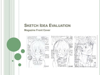
SlideShare a Scribd company logo
SKETCH IDEA EVALUATION
Magazine Front Cover
IDEA 1- CONVENTION ANNOTATION
Masthead
Flash
Cover lines +
anchorage text
Pull Quote
Additional
Information
Tag-line
Main Cover
Line Anchorage Text
Thumbnail
ImagesMain Image
Barcode
Strip
IDEA 1
Composition
The composition of this idea is based upon the central
layout that TotalFilm incorporate upon their magazine
front covers. By conforming to a similar layout, my piece
is able to reflect already established popular film
magazine brands; thus allowing for my own piece to
reflect the competing market (making for a conventional
and identifiable format).
The use of a central layout is also effective in forming a
sense of balance within the piece, in which magazine
content is spread in equilibrium upon the page. This
forms a satisfying visual appeal, in which the central main
image acts appropriately as the leading visual focus of
the piece, accompanied by text.
Text
In meeting with magazine conventions the following
textual features have been included: masthead, cover
lines, pull quote, main cover line, flash, tag-line, strip,
anchorage text and additional information.
In providing these features, this idea successfully meets
with the most commonly used conventions of a magazine
front cover, thus making for a piece reflective of already
established products within this market (and thus a
recognisable product to potential viewers).
Regarding language, the application of exclamatives
such as “SNEAK PEEK!” and “EXTRA!” reflect some of
the phrases applied within my inspired magazine
examples, in which such punctuation is effective in
emphasising a phrase, forming an appealing sense of
excitement, effective in capturing the interest of the
reader.
Also, the use of words such as “CREEPY!” and
“TERRIFYING” are effective in reflecting the horror genre
of my magazine’s featured film. In which these words
possess fearful connotations. This is effective in
enhancing the overall eeriness of the featured film image
as these unnerving words lead to influencing the way in
which the viewer interprets the featured film image. This
thrill of fear is an emotion that the horror genre seeks to
incite within its audience, thus these words allow the film
genre to be more coherently conveyed. These words,
associated with fear, are effective in communicating the
dark themes within the featured film and are thus
effective in sparking the interest of my target audience,
this being those with a love of horror and the thrill of fear;
thus addressing their targeted interests.
Main Image
The central image draws inspiration from the effective mid shots that Total Films often incorporate into their
own magazines. By applying this shot, my main image is able to possess a framing reflective of already
established magazines, thus creating for a more conventional visual-element of the piece.
However, this shot is also effective in granting the audience a clear viewing of some of the protagonist’s
costume, this being a long sleeved jumper (reflective of the winter season in which the film is set, as well as
reflecting Eve’s introverted nature, through the concealing, visually-simplistic, long sleeved item) as well as
providing a clear sight of the protagonist’s facial expression.
Regarding expression, protagonist, Eve’s frightened gaze, directed towards the viewer, is effective in
unnerving the reader, as the reader feels as through the character is aware of the viewer’s presence, and
through their fearful stare, seems to be silently pleading for their help. This gaze is effective in forming a
greater connection between character and reader, in which the audience are more likely to feel a sense of
care regarding the fate of the fearful character.
This frightened expression is also effective in conveying the vulnerability of the protagonist in the face of
the antagonist, in which the appearance of bloodied messages across the character’s face, emphasises
further the protagonist’s lacking ability to escape the antagonist’s dark intent.
The presence of blood portrays the dark themes within my film, in which this is effective in appealing to my
targeted psychographic group, this being explorer. Explorers enjoy new, exciting and challenging themes,
thus by portraying some of the more gruesome messages that the antagonist inflicts upon Eve within the
narrative, the audience are provided with a teasing taster of the film’s eerie content.
Secondary Images
The inclusion of 2 thumbnail
images, are effective in conveying
to the reader other films that are
featured within the piece.
The shots used within these two
images are wide shots, effective in
featuring a large amount of film
content within the frame. These
being the leading characters within
each film and the main settings of
their respective narratives
(providing a high enough level of
film contextual detail to spark the
interest of the reader).
This feature is useful in attracting
lovers of film of whom perhaps are
not highly passionate towards the
horror genre, in which, although
less interested by the main image,
they can still be persuaded to
purchase the piece if the other
secondary image covering the
piece’s featured films are revealed.
(this feature is the same for ideas 2
and 3).
EVALUATION- STRENGTHS
-Conventional central layout; satisfying balance of features upon the page.
-All necessary text conventions included.
-The bloodied messages upon the protagonist’s face are effective in conveying the mysterious form that
the antagonistic possesses within the featured film (providing a teasing piece of narrative
information).
-The fearful expression of the protagonist coherently conveys their vulnerable character role within the
film.
-No areas of emptiness exist within the idea’s composition.
-The closeness of the character’s facial expression and the character's directed gaze upon the
audience is effective in unnerving the viewer as their fearful expression would suggest that danger
is near (conforming to the horror's intent of scaring the audience).
-The messages of ‘It’s You’ and ‘They’re Near’ reflect those featured within the teaser trailer, as well as
reflecting the film poster tag-line “Her future is written in blood”, forming a clear link between these
three promotive film products.
EVALUATION- WEAKNESSES
- The featured character possesses little body
language other than their frightened facial
expression; making for a somewhat still shot; void
of energy.
- The margins of the sketch lack consistency; thus
should be adjusted if chosen as the final design.
IDEA 1- CONVENTION ANNOTATION
Masthead
Flash
Cover lines +
anchorage text
Pull Quote
Additional
Information
Tag-line
Main Cover
Line
Anchorage Text
Thumbnail
Images
Main Image
Barcode
Strip
IDEA 2
Composition
Like that of idea 1, this piece adopts a conventional central composition, in
which the content is equally spread upon the page (relating also to the rule
of thirds; in which each third of the page is in use). This application of
content forms a visually satisfying sense of balance and also creates for a
conventionally applied format; of which can be identified as the leading
composition used within Empire and Total Film magazines. Thus, allowing
for a conventional composition.
Text
In meeting with magazine conventions the following textual
features have been included: masthead, cover lines, pull quote,
main cover line, flash, tag-line, strip, anchorage text and additional
information. Equal to the effect of the text featured within idea 1,
these features are effective in providing for an appropriately
informative piece, of which conforms to the common textual
conventions of a film magazine.
Regarding language, this again incorporates exclamatives,
effective in creating a sense of energy throughout the piece, in
which a sense of excitement is formed.
This is effective in increasing the overall entertain value of the
piece, effective in drawing in the reader through the enthusiastic
tone formed.
The use of a flash conveying the page to be a “COLLECTABLE
COVER!” is effective in highlighting the additional elements that
this magazine provides, effective in persuading the audience that
this product is good value for money due to the “additional”
elements featured within the piece, such as “ 2… posters”. As my
target audience are mostly teenage to young adults, those of
whom are students in particular may not have a large amount of
disposable income (as they are likely situated within part time
employment or rely upon the wealth of their parents), thus by
including such offers my audience are more likely to feel a greater
willingness to purchase this product.
Regarding the portrayal of genre, again, words with fearful
connotations have been applied in order to emphasise the
unnerving intent of the main image, enhancing the impact upon
the audience.
These words are likely to help attract those with an interest in
horror. Of which my film is targeted towards, as my target
audience seek excitement through fear, thus through the words
“CREEPY!” and “TERRIFYING” the reader is more likely to be
persuaded of the impactful effect of the featured film.
Main Image
By featuring the protagonist alone within the main image, this is effective in
reflecting their isolated and vulnerability within the featured film, in which they lack
the support/ protection of any accompanying/secondary characters. This
lonesome state is emphasised by the character’s frightened expression, in which
their expressed fear conveys the character’s inability to remove the threat that
they face.
This threat is highlighted by the presence of blood upon the character’s skin,
spelling out eerie messages such as ‘It’s You’ and ‘They’re Near’. These
messages reflect those included within my film’s teaser trailer, thus forming an
effective bond between these two promotive products.
Regarding audience appeal, through the use of a mid close up shot, this is
effective in forming a sense of closeness between the character and reader, in
which the character's direct gaze is effective in drawing in the viewer as they feel
almost noticed and relied upon by the character within the piece (causing the
viewer to feel compelled to explore the product further).
The presence of blood connotes the film’s themes of danger and threat and is
effective in highlighting the dark themes within the film. These themes are
somewhat negative and conform to the horror genre’s intent of exciting an
audience through the dominance of antagonism and fear.
Through this representation, this image is effective in conforming to the interests
of my target audience. This being an interest within horror films (of which my
piece can be identified as such through this conventional genre representation.
Also, through the inclusion of challenging themes (such as threat; conveyed
through injury) this appeal to my targeted psychographic group of explorer. This is
because members of this group find appeal in consuming content that is
challenging to view, exciting and differs to conventionally mainstream ideas (e.g.
the prevalence of good over evil, which this image goes against).
EVALUATION- STRENGTHS
- The body language and facial expression of the protagonist is dynamic; effective in
forming a sense of energy and excitement within the piece (connotative to the
action and danger within the film).
- The bloodied messages upon the protagonist’s face are reflective of the form of the
film’s antagonistic presence (alerting the audience to the force of danger within the
film).
- The character’s fearful expression emphasises their vulnerability and the danger
that the antagonist presents.
- The use of offers are effective in persuading the audience that the piece is good
value for money.
- Exclamations and phrases with connotations of fear are effective in enhancing the
unnerving intent of the main image as well as forming an emphasised sense of
excitement.
- The composition is well balanced and leaves no unsatisfying areas of emptiness
upon the page.
EVALUATION- WEAKNESSES
- The protagonist’s pose is very similar to that used
within my previously created ‘Eve’ film poster,
forming synergy between the two products,
however, also conveying a rather repetitive and
already seen example of body language.
IDEA 1- CONVENTION ANNOTATION
Masthead
Flash
Cover lines +
anchorage text
Additional
Information
Tag-line
Main Cover
Line
Anchorage Text
Thumbnail
Images
Main Image
Barcode
Strip
IDEA 3
Composition
The composition of this piece takes inspiration from
Empire’s more unique/rarely used layout methods.
Within this composition, the commonly applied
central layout is challenged, in which the main
image is instead placed off centre, with text largely
dominating the unused side of the piece.
This layout was adopted as a form of
experimentation in which I find this layout to be
rather dynamic, due to the lacking balance upon the
page, in regards to aiming for a symmetrical visual
style.
This disequilibrium is effective in reflecting the
rather dark themes of the film that my magazine is
promoting, as this conveys the antagonistic
presence that poses a high threat to the equilibrium
of the protagonist.
This unconventional dominance of the antagonistic
force within the piece is reflective of my targeted
audience. For example, my targeted psychographic
group of explorer consists of members of whom
appreciate new and exciting media content that
challenges mainstream ideas. Thus by challenging
the expected convention of the prevalence of good
over evil, this is effective in tapping into the interest
of my audience, of whom seek out such challenging
ideas.
Thus, although unconventional, this links highly to
my film’s narrative and audience.
Text
In meeting with magazine conventions the following textual features have been included: masthead, cover lines, main cover
line, flash, tag-line, strip, anchorage text and additional information. Equal to the effects of the text featured within ideas 1 and
2, these features are effective in providing for an appropriately informative piece, of which conforms to the common textual
conventions of a film magazine.
By possessing conventional text elements potential audience members are more likely to be persuaded of the products quality
and legitimacy, as this piece’s content reflects that of trusted and highly established film magazines, such as Empire and
TotalFilm.
Regarding language, the masthead ‘FRONTIER’ possesses connotations of adventure and exploration. This is effective in
exerting a sense of excitement to the reader, in which the largest piece of text acts as an enthusiastic reflection of the content
within the rest of the piece; helping to persuade the viewer of the overall entertainment value of the piece.
The use of exclamatives also enforce a sense of energy, granting greater interest to the text as well as an enhanced visual
appeal through the ranged punctuation applied.
Elements, such as the strip running along the lower-end of the piece, are effective in also appealing to the more mainstream
members of my target audience, in which by stating films other than that conveyed through the main image, audience members
of whom perhaps are less interested in the horror genre, yet remain to possess a passion for film, can be catered for by gaining
a viewing incentive through the additional films the magazines states to be featured (despite not featuring visually upon the
page). Thus, also appealing to overall lovers of film.
Main Image
The fearful and panicked
expression of the protagonist
reflects their vulnerable role within
the film, in which their distressed
body language and blood stained
skin is effective in communicating
to the reader that this character's
life is under threat from a force
that is not visually present.
This representation is effective in
conveying the opposing forces
within the piece, this being the
weak and fearful protagonist in
contrast to a enigmatic and
sinister antagonist. By conveying
the antagonist as the dominant
force, the audience are more likely
to feel unease when viewing the
piece, as they are likely to lack
faith in the ability of the
protagonist to overcome the threat
that this force presents.
This is effective in appealing to my
audience as this creates a sense
of enigma in which the reader may
feel sympathetic towards the
frightened protagonist as well as
intrigued to find out whether or not
the protagonist can survive the
threats faced. These unanswered
questions are effective in inciting
lingering curiosity within the
viewer, persuading them to
purchase the piece.
By having the character appear as
though they are turning towards
the viewer this exerts a sense of
motion, creating for a rather
dynamic shot. This contrasts with
the conventionality of a still pose,
however is effetciev in enhancing
the panicked state of the
character.
EVALUATION- STRENGTHS
- The slightly side-on view of the main image is
effective in providing a dynamic shot, in which the
protagonist’s direct and distressed gaze is effective
in unnerving the viewer.
- The uncommon layout challenges the commonly
applied central layout, this may be effective in
appealing to audience members of the explorer
psychographic group (of which my film targets) as
this group enjoy experiencing new and exciting
media products that go against mainstream
expectations.
EVALUATION- WEAKNESSES
- The protagonist’s pose is very similar to that used within my
previously created ‘Eve’ film poster, forming synergy between the
two products, however, also conveying a rather repetitive
example of body language.
- Although, inspired from an established, highly revered UK film
magazine, the layout of this idea is not very conventional or
frequently applied upon most magazine front covers.
- Due to the nature of the composition, areas of empty space
remain unfulfilled upon the page.
- This idea is void of a pull quote, thus lacks any teasing
information regarding text from the inner main featured article;
making the piece less likely to captivate its audience through the
applied text when compared with ideas 1 and 2.
IN CONCLUSION
 Within each design, conventions have been applied, possessing a layout guided by the findings of my research into
established film magazines. Each design possesses an appropriate main image that coherently conveys the dark
themes and horror genre of the featured film. Each idea establishes the dominance of my film’s antagonistic presence
and also possesses text that informs the audience of the magazine's brand identity, coverage of films, inner articles
and its intent to both inform and entertain readers with a passion for film.
 Regarding the idea that I shall select as my final magazine front cover design, this shall be idea 1. This is because
idea 1 possesses a conventional format, in which by placing the content within central orientation, this creates an
effectively balanced piece, reflective of the commonly applied layout of already established magazine publishers.
 Also, although similar to idea 2, the body language of this design is more reflective of the conventionally still poses
applied within film magazines, in which characters are often staring intently at the audience with a sense of stillness.
This still focus is something that ideas 2 and 3 fail to capture, thus hindering the overall conventionality of their
portrayal (despite presenting a more dynamic shot).
 The character’s fearful expression and the bloodied messages upon their face directly correspond with the messages
used within the film’s teaser trailer and although are similar to the central image applied to my film’s poster, does differ
in pose. Thus making for a more varied range of visual representations throughout my film’s promotional products,
thus avoiding the over repetition of body language, unlike that of idea 2 and 3 which mirror the hand gestures applied
to my film poster image.
 Regarding the weaknesses of idea 3, although dynamic and intriguing, the overall layout and main image are limited in
their conformity to the conventional aspects of a magazine. This lacking conformity results in a potentially confusing
product that reader’s may hesitate to purchase, due to the difference in style when compared with trusted leading film
magazine brands.
 Thus, idea 1 shall act as my final design idea, however, when shooting the image for this piece, I may experiment with
a range of fearful expressions and perhaps incorporate inspiration from the character pose of idea 2 in order to
experiment with how my piece can retain as great a dynamic visual appeal as possible, whilst also retaining its
conventional magazine aspects.
 Regarding idea 1’s placement of a pull quote, this may be changed to feature above the main cover-line, in order
present a clearer correlation between the featured film and this quote from the film narrative’s leading actor.

More Related Content

What's hot

Conventions in my ancillary products
Conventions in my ancillary productsConventions in my ancillary products
Conventions in my ancillary productsemilykingers
 
Evaluation question 1
Evaluation question 1Evaluation question 1
Evaluation question 1
JessicaLouiseJ8
 
Poster analysis
Poster analysisPoster analysis
Poster analysis
NT160371
 
Evaluation Question 2
Evaluation Question 2Evaluation Question 2
Evaluation Question 2
Will Kearse
 
Gone girl titles
Gone girl titlesGone girl titles
Gone girl titles
NT160371
 
Film magazine analysis
Film magazine analysisFilm magazine analysis
Film magazine analysis
shakelamayxo
 
Evaluation
EvaluationEvaluation
Film poster analysis
Film poster analysisFilm poster analysis
Film poster analysis
shakelamayxo
 
Evaluation 1
Evaluation 1Evaluation 1
Evaluation 1
Alex-gerhard
 
Poster analysis
Poster analysisPoster analysis
Poster analysis
NT160371
 
Further Evaluation Question 1
Further Evaluation Question 1Further Evaluation Question 1
Further Evaluation Question 1
katarina1997
 
Magazine cover analysis horror
Magazine cover analysis horrorMagazine cover analysis horror
Magazine cover analysis horror
rebeccadahl98
 
Cc movie posters updated 24 wed
Cc movie posters updated 24 wedCc movie posters updated 24 wed
Cc movie posters updated 24 wed
Jpobee08
 
Ancillary task 2
Ancillary task 2Ancillary task 2
Ancillary task 2
Elliott Wigmore
 

What's hot (20)

Conventions in my ancillary products
Conventions in my ancillary productsConventions in my ancillary products
Conventions in my ancillary products
 
Horror posters
Horror postersHorror posters
Horror posters
 
Evaluation question 1
Evaluation question 1Evaluation question 1
Evaluation question 1
 
Magazine analysis 2
Magazine analysis 2Magazine analysis 2
Magazine analysis 2
 
Poster analysis
Poster analysisPoster analysis
Poster analysis
 
Evaluation Question 2
Evaluation Question 2Evaluation Question 2
Evaluation Question 2
 
Gone girl titles
Gone girl titlesGone girl titles
Gone girl titles
 
Film magazine analysis
Film magazine analysisFilm magazine analysis
Film magazine analysis
 
3
33
3
 
Evaluation
EvaluationEvaluation
Evaluation
 
Film poster analysis
Film poster analysisFilm poster analysis
Film poster analysis
 
Evaluation 1
Evaluation 1Evaluation 1
Evaluation 1
 
Media photos
Media photosMedia photos
Media photos
 
Question 2
Question 2Question 2
Question 2
 
Poster analysis
Poster analysisPoster analysis
Poster analysis
 
Evaluation
EvaluationEvaluation
Evaluation
 
Further Evaluation Question 1
Further Evaluation Question 1Further Evaluation Question 1
Further Evaluation Question 1
 
Magazine cover analysis horror
Magazine cover analysis horrorMagazine cover analysis horror
Magazine cover analysis horror
 
Cc movie posters updated 24 wed
Cc movie posters updated 24 wedCc movie posters updated 24 wed
Cc movie posters updated 24 wed
 
Ancillary task 2
Ancillary task 2Ancillary task 2
Ancillary task 2
 

Viewers also liked

Production Diary- Film Magazine Front Cover
Production Diary- Film Magazine Front CoverProduction Diary- Film Magazine Front Cover
Production Diary- Film Magazine Front Cover
kanda11821
 
Image Evaluation- Magazine
Image Evaluation- Magazine Image Evaluation- Magazine
Image Evaluation- Magazine
kanda11821
 
A2 Magazine Front Cover Conventions
A2 Magazine Front Cover ConventionsA2 Magazine Front Cover Conventions
A2 Magazine Front Cover Conventions
kanda11821
 
Film poster- Conventions
Film poster- Conventions Film poster- Conventions
Film poster- Conventions
kanda11821
 
Survey Key Findings- Film Poster
Survey Key Findings- Film PosterSurvey Key Findings- Film Poster
Survey Key Findings- Film Poster
kanda11821
 
Feedback- Film Poster
Feedback- Film PosterFeedback- Film Poster
Feedback- Film Poster
kanda11821
 
Film Poster Sketch Idea Evaluation
Film Poster Sketch Idea EvaluationFilm Poster Sketch Idea Evaluation
Film Poster Sketch Idea Evaluation
kanda11821
 
Film Poster- Production Diary
Film Poster- Production Diary  Film Poster- Production Diary
Film Poster- Production Diary
kanda11821
 
Film Poster- Post-Production Diary
Film Poster- Post-Production DiaryFilm Poster- Post-Production Diary
Film Poster- Post-Production Diary
kanda11821
 
Key Findings- A2 Media Audience Feedback
Key Findings- A2 Media Audience FeedbackKey Findings- A2 Media Audience Feedback
Key Findings- A2 Media Audience Feedback
kanda11821
 
Shot Log- Caddington Location
Shot Log- Caddington LocationShot Log- Caddington Location
Shot Log- Caddington Location
kanda11821
 
Shot log filming day two
Shot log filming day twoShot log filming day two
Shot log filming day two
Grace Crawford
 
Shot Log: School location
Shot Log: School locationShot Log: School location
Shot Log: School location
Danielle
 
Shot Log- House Location
Shot Log- House LocationShot Log- House Location
Shot Log- House Location
kanda11821
 
Production Diary- House Location
Production Diary- House LocationProduction Diary- House Location
Production Diary- House Location
kanda11821
 
Production Diary- Caddington Park/ Alleyway
Production Diary- Caddington Park/ AlleywayProduction Diary- Caddington Park/ Alleyway
Production Diary- Caddington Park/ Alleyway
kanda11821
 
Production Diary- Entry 4
Production Diary- Entry 4Production Diary- Entry 4
Production Diary- Entry 4
kanda11821
 
A2 Media Production Diary- Entry 3
A2 Media Production Diary- Entry 3A2 Media Production Diary- Entry 3
A2 Media Production Diary- Entry 3
kanda11821
 
Audience Feedback
Audience FeedbackAudience Feedback
Audience Feedback
lexibenson123
 
Analysis of 3 Similar Texts
Analysis of 3 Similar TextsAnalysis of 3 Similar Texts
Analysis of 3 Similar Texts
lexibenson123
 

Viewers also liked (20)

Production Diary- Film Magazine Front Cover
Production Diary- Film Magazine Front CoverProduction Diary- Film Magazine Front Cover
Production Diary- Film Magazine Front Cover
 
Image Evaluation- Magazine
Image Evaluation- Magazine Image Evaluation- Magazine
Image Evaluation- Magazine
 
A2 Magazine Front Cover Conventions
A2 Magazine Front Cover ConventionsA2 Magazine Front Cover Conventions
A2 Magazine Front Cover Conventions
 
Film poster- Conventions
Film poster- Conventions Film poster- Conventions
Film poster- Conventions
 
Survey Key Findings- Film Poster
Survey Key Findings- Film PosterSurvey Key Findings- Film Poster
Survey Key Findings- Film Poster
 
Feedback- Film Poster
Feedback- Film PosterFeedback- Film Poster
Feedback- Film Poster
 
Film Poster Sketch Idea Evaluation
Film Poster Sketch Idea EvaluationFilm Poster Sketch Idea Evaluation
Film Poster Sketch Idea Evaluation
 
Film Poster- Production Diary
Film Poster- Production Diary  Film Poster- Production Diary
Film Poster- Production Diary
 
Film Poster- Post-Production Diary
Film Poster- Post-Production DiaryFilm Poster- Post-Production Diary
Film Poster- Post-Production Diary
 
Key Findings- A2 Media Audience Feedback
Key Findings- A2 Media Audience FeedbackKey Findings- A2 Media Audience Feedback
Key Findings- A2 Media Audience Feedback
 
Shot Log- Caddington Location
Shot Log- Caddington LocationShot Log- Caddington Location
Shot Log- Caddington Location
 
Shot log filming day two
Shot log filming day twoShot log filming day two
Shot log filming day two
 
Shot Log: School location
Shot Log: School locationShot Log: School location
Shot Log: School location
 
Shot Log- House Location
Shot Log- House LocationShot Log- House Location
Shot Log- House Location
 
Production Diary- House Location
Production Diary- House LocationProduction Diary- House Location
Production Diary- House Location
 
Production Diary- Caddington Park/ Alleyway
Production Diary- Caddington Park/ AlleywayProduction Diary- Caddington Park/ Alleyway
Production Diary- Caddington Park/ Alleyway
 
Production Diary- Entry 4
Production Diary- Entry 4Production Diary- Entry 4
Production Diary- Entry 4
 
A2 Media Production Diary- Entry 3
A2 Media Production Diary- Entry 3A2 Media Production Diary- Entry 3
A2 Media Production Diary- Entry 3
 
Audience Feedback
Audience FeedbackAudience Feedback
Audience Feedback
 
Analysis of 3 Similar Texts
Analysis of 3 Similar TextsAnalysis of 3 Similar Texts
Analysis of 3 Similar Texts
 

Similar to Sketch Idea Evaluation- Magazine Front Cover

Link of products
Link of productsLink of products
Link of productsGussssssy1
 
Link of products
Link of productsLink of products
Link of productsGussssssy1
 
Question 2 evaluation
Question 2 evaluationQuestion 2 evaluation
Question 2 evaluationjasmin_goody
 
How effective is the combination of your main Product and the Ancillary Tasks
How effective is the combination of your main Product and the Ancillary TasksHow effective is the combination of your main Product and the Ancillary Tasks
How effective is the combination of your main Product and the Ancillary Taskscourtfew5
 
Evaluation 2
Evaluation 2Evaluation 2
Evaluation 2
romarab3
 
How effective is the combination of your main product and ancillary texts?
How effective is the combination of your main product and ancillary texts?How effective is the combination of your main product and ancillary texts?
How effective is the combination of your main product and ancillary texts?
Sohail Qureshi
 
How effective is the combination of your main product and ancillary texts?
How effective is the combination of your main product and ancillary texts?How effective is the combination of your main product and ancillary texts?
How effective is the combination of your main product and ancillary texts?
Sohail Qureshi
 
Evaluation one
Evaluation oneEvaluation one
Evaluation oneJenW19
 
Media studies evaluation question 1 of poster and magazine cover
Media studies evaluation question 1 of poster and magazine coverMedia studies evaluation question 1 of poster and magazine cover
Media studies evaluation question 1 of poster and magazine cover
Jacque Pearce
 
Evaluation
EvaluationEvaluation
Evaluationzahyidur
 
Evaluation
EvaluationEvaluation
Evaluationzahyidur
 
Magazine front cover analysis two
Magazine front cover analysis twoMagazine front cover analysis two
Magazine front cover analysis two
rebeccadahl98
 
Evaluation 2 (1)
Evaluation 2 (1)Evaluation 2 (1)
Evaluation 2 (1)
Jake Shelvey
 
Evaluation of ancillary tasks
Evaluation of ancillary tasksEvaluation of ancillary tasks
Evaluation of ancillary tasksannaloynsasmedia
 
Horror film poster
Horror film poster Horror film poster
Horror film poster lalaland_xo
 
Evaluation Question 2
Evaluation Question 2Evaluation Question 2
Evaluation Question 2
steryts
 
The girl with the dragon tattoo magazine cover analysis
The girl with the dragon tattoo magazine cover analysisThe girl with the dragon tattoo magazine cover analysis
The girl with the dragon tattoo magazine cover analysisGussssssy1
 
Evaluation Question 2
Evaluation Question 2Evaluation Question 2
Evaluation Question 2
Georgiefrost
 
Evaluation Question 2
Evaluation Question 2Evaluation Question 2
Evaluation Question 2
Georgiefrost
 
Geoffrey Eze, Media A2 - Case Study
Geoffrey Eze, Media A2 - Case StudyGeoffrey Eze, Media A2 - Case Study
Geoffrey Eze, Media A2 - Case Study
Geoffrey Eze
 

Similar to Sketch Idea Evaluation- Magazine Front Cover (20)

Link of products
Link of productsLink of products
Link of products
 
Link of products
Link of productsLink of products
Link of products
 
Question 2 evaluation
Question 2 evaluationQuestion 2 evaluation
Question 2 evaluation
 
How effective is the combination of your main Product and the Ancillary Tasks
How effective is the combination of your main Product and the Ancillary TasksHow effective is the combination of your main Product and the Ancillary Tasks
How effective is the combination of your main Product and the Ancillary Tasks
 
Evaluation 2
Evaluation 2Evaluation 2
Evaluation 2
 
How effective is the combination of your main product and ancillary texts?
How effective is the combination of your main product and ancillary texts?How effective is the combination of your main product and ancillary texts?
How effective is the combination of your main product and ancillary texts?
 
How effective is the combination of your main product and ancillary texts?
How effective is the combination of your main product and ancillary texts?How effective is the combination of your main product and ancillary texts?
How effective is the combination of your main product and ancillary texts?
 
Evaluation one
Evaluation oneEvaluation one
Evaluation one
 
Media studies evaluation question 1 of poster and magazine cover
Media studies evaluation question 1 of poster and magazine coverMedia studies evaluation question 1 of poster and magazine cover
Media studies evaluation question 1 of poster and magazine cover
 
Evaluation
EvaluationEvaluation
Evaluation
 
Evaluation
EvaluationEvaluation
Evaluation
 
Magazine front cover analysis two
Magazine front cover analysis twoMagazine front cover analysis two
Magazine front cover analysis two
 
Evaluation 2 (1)
Evaluation 2 (1)Evaluation 2 (1)
Evaluation 2 (1)
 
Evaluation of ancillary tasks
Evaluation of ancillary tasksEvaluation of ancillary tasks
Evaluation of ancillary tasks
 
Horror film poster
Horror film poster Horror film poster
Horror film poster
 
Evaluation Question 2
Evaluation Question 2Evaluation Question 2
Evaluation Question 2
 
The girl with the dragon tattoo magazine cover analysis
The girl with the dragon tattoo magazine cover analysisThe girl with the dragon tattoo magazine cover analysis
The girl with the dragon tattoo magazine cover analysis
 
Evaluation Question 2
Evaluation Question 2Evaluation Question 2
Evaluation Question 2
 
Evaluation Question 2
Evaluation Question 2Evaluation Question 2
Evaluation Question 2
 
Geoffrey Eze, Media A2 - Case Study
Geoffrey Eze, Media A2 - Case StudyGeoffrey Eze, Media A2 - Case Study
Geoffrey Eze, Media A2 - Case Study
 

Recently uploaded

How to Create Map Views in the Odoo 17 ERP
How to Create Map Views in the Odoo 17 ERPHow to Create Map Views in the Odoo 17 ERP
How to Create Map Views in the Odoo 17 ERP
Celine George
 
Mule 4.6 & Java 17 Upgrade | MuleSoft Mysore Meetup #46
Mule 4.6 & Java 17 Upgrade | MuleSoft Mysore Meetup #46Mule 4.6 & Java 17 Upgrade | MuleSoft Mysore Meetup #46
Mule 4.6 & Java 17 Upgrade | MuleSoft Mysore Meetup #46
MysoreMuleSoftMeetup
 
The French Revolution Class 9 Study Material pdf free download
The French Revolution Class 9 Study Material pdf free downloadThe French Revolution Class 9 Study Material pdf free download
The French Revolution Class 9 Study Material pdf free download
Vivekanand Anglo Vedic Academy
 
The Challenger.pdf DNHS Official Publication
The Challenger.pdf DNHS Official PublicationThe Challenger.pdf DNHS Official Publication
The Challenger.pdf DNHS Official Publication
Delapenabediema
 
PART A. Introduction to Costumer Service
PART A. Introduction to Costumer ServicePART A. Introduction to Costumer Service
PART A. Introduction to Costumer Service
PedroFerreira53928
 
Digital Tools and AI for Teaching Learning and Research
Digital Tools and AI for Teaching Learning and ResearchDigital Tools and AI for Teaching Learning and Research
Digital Tools and AI for Teaching Learning and Research
Vikramjit Singh
 
Fish and Chips - have they had their chips
Fish and Chips - have they had their chipsFish and Chips - have they had their chips
Fish and Chips - have they had their chips
GeoBlogs
 
special B.ed 2nd year old paper_20240531.pdf
special B.ed 2nd year old paper_20240531.pdfspecial B.ed 2nd year old paper_20240531.pdf
special B.ed 2nd year old paper_20240531.pdf
Special education needs
 
Polish students' mobility in the Czech Republic
Polish students' mobility in the Czech RepublicPolish students' mobility in the Czech Republic
Polish students' mobility in the Czech Republic
Anna Sz.
 
CLASS 11 CBSE B.St Project AIDS TO TRADE - INSURANCE
CLASS 11 CBSE B.St Project AIDS TO TRADE - INSURANCECLASS 11 CBSE B.St Project AIDS TO TRADE - INSURANCE
CLASS 11 CBSE B.St Project AIDS TO TRADE - INSURANCE
BhavyaRajput3
 
The Art Pastor's Guide to Sabbath | Steve Thomason
The Art Pastor's Guide to Sabbath | Steve ThomasonThe Art Pastor's Guide to Sabbath | Steve Thomason
The Art Pastor's Guide to Sabbath | Steve Thomason
Steve Thomason
 
TESDA TM1 REVIEWER FOR NATIONAL ASSESSMENT WRITTEN AND ORAL QUESTIONS WITH A...
TESDA TM1 REVIEWER  FOR NATIONAL ASSESSMENT WRITTEN AND ORAL QUESTIONS WITH A...TESDA TM1 REVIEWER  FOR NATIONAL ASSESSMENT WRITTEN AND ORAL QUESTIONS WITH A...
TESDA TM1 REVIEWER FOR NATIONAL ASSESSMENT WRITTEN AND ORAL QUESTIONS WITH A...
EugeneSaldivar
 
aaaaaaaaaaaaaaaaaaaaaaaaaaaaaaaaaaaaaaaaa
aaaaaaaaaaaaaaaaaaaaaaaaaaaaaaaaaaaaaaaaaaaaaaaaaaaaaaaaaaaaaaaaaaaaaaaaaaaaaaaaaa
aaaaaaaaaaaaaaaaaaaaaaaaaaaaaaaaaaaaaaaaa
siemaillard
 
Basic phrases for greeting and assisting costumers
Basic phrases for greeting and assisting costumersBasic phrases for greeting and assisting costumers
Basic phrases for greeting and assisting costumers
PedroFerreira53928
 
Instructions for Submissions thorugh G- Classroom.pptx
Instructions for Submissions thorugh G- Classroom.pptxInstructions for Submissions thorugh G- Classroom.pptx
Instructions for Submissions thorugh G- Classroom.pptx
Jheel Barad
 
1.4 modern child centered education - mahatma gandhi-2.pptx
1.4 modern child centered education - mahatma gandhi-2.pptx1.4 modern child centered education - mahatma gandhi-2.pptx
1.4 modern child centered education - mahatma gandhi-2.pptx
JosvitaDsouza2
 
How to Split Bills in the Odoo 17 POS Module
How to Split Bills in the Odoo 17 POS ModuleHow to Split Bills in the Odoo 17 POS Module
How to Split Bills in the Odoo 17 POS Module
Celine George
 
The approach at University of Liverpool.pptx
The approach at University of Liverpool.pptxThe approach at University of Liverpool.pptx
The approach at University of Liverpool.pptx
Jisc
 
How libraries can support authors with open access requirements for UKRI fund...
How libraries can support authors with open access requirements for UKRI fund...How libraries can support authors with open access requirements for UKRI fund...
How libraries can support authors with open access requirements for UKRI fund...
Jisc
 
ESC Beyond Borders _From EU to You_ InfoPack general.pdf
ESC Beyond Borders _From EU to You_ InfoPack general.pdfESC Beyond Borders _From EU to You_ InfoPack general.pdf
ESC Beyond Borders _From EU to You_ InfoPack general.pdf
Fundacja Rozwoju Społeczeństwa Przedsiębiorczego
 

Recently uploaded (20)

How to Create Map Views in the Odoo 17 ERP
How to Create Map Views in the Odoo 17 ERPHow to Create Map Views in the Odoo 17 ERP
How to Create Map Views in the Odoo 17 ERP
 
Mule 4.6 & Java 17 Upgrade | MuleSoft Mysore Meetup #46
Mule 4.6 & Java 17 Upgrade | MuleSoft Mysore Meetup #46Mule 4.6 & Java 17 Upgrade | MuleSoft Mysore Meetup #46
Mule 4.6 & Java 17 Upgrade | MuleSoft Mysore Meetup #46
 
The French Revolution Class 9 Study Material pdf free download
The French Revolution Class 9 Study Material pdf free downloadThe French Revolution Class 9 Study Material pdf free download
The French Revolution Class 9 Study Material pdf free download
 
The Challenger.pdf DNHS Official Publication
The Challenger.pdf DNHS Official PublicationThe Challenger.pdf DNHS Official Publication
The Challenger.pdf DNHS Official Publication
 
PART A. Introduction to Costumer Service
PART A. Introduction to Costumer ServicePART A. Introduction to Costumer Service
PART A. Introduction to Costumer Service
 
Digital Tools and AI for Teaching Learning and Research
Digital Tools and AI for Teaching Learning and ResearchDigital Tools and AI for Teaching Learning and Research
Digital Tools and AI for Teaching Learning and Research
 
Fish and Chips - have they had their chips
Fish and Chips - have they had their chipsFish and Chips - have they had their chips
Fish and Chips - have they had their chips
 
special B.ed 2nd year old paper_20240531.pdf
special B.ed 2nd year old paper_20240531.pdfspecial B.ed 2nd year old paper_20240531.pdf
special B.ed 2nd year old paper_20240531.pdf
 
Polish students' mobility in the Czech Republic
Polish students' mobility in the Czech RepublicPolish students' mobility in the Czech Republic
Polish students' mobility in the Czech Republic
 
CLASS 11 CBSE B.St Project AIDS TO TRADE - INSURANCE
CLASS 11 CBSE B.St Project AIDS TO TRADE - INSURANCECLASS 11 CBSE B.St Project AIDS TO TRADE - INSURANCE
CLASS 11 CBSE B.St Project AIDS TO TRADE - INSURANCE
 
The Art Pastor's Guide to Sabbath | Steve Thomason
The Art Pastor's Guide to Sabbath | Steve ThomasonThe Art Pastor's Guide to Sabbath | Steve Thomason
The Art Pastor's Guide to Sabbath | Steve Thomason
 
TESDA TM1 REVIEWER FOR NATIONAL ASSESSMENT WRITTEN AND ORAL QUESTIONS WITH A...
TESDA TM1 REVIEWER  FOR NATIONAL ASSESSMENT WRITTEN AND ORAL QUESTIONS WITH A...TESDA TM1 REVIEWER  FOR NATIONAL ASSESSMENT WRITTEN AND ORAL QUESTIONS WITH A...
TESDA TM1 REVIEWER FOR NATIONAL ASSESSMENT WRITTEN AND ORAL QUESTIONS WITH A...
 
aaaaaaaaaaaaaaaaaaaaaaaaaaaaaaaaaaaaaaaaa
aaaaaaaaaaaaaaaaaaaaaaaaaaaaaaaaaaaaaaaaaaaaaaaaaaaaaaaaaaaaaaaaaaaaaaaaaaaaaaaaaa
aaaaaaaaaaaaaaaaaaaaaaaaaaaaaaaaaaaaaaaaa
 
Basic phrases for greeting and assisting costumers
Basic phrases for greeting and assisting costumersBasic phrases for greeting and assisting costumers
Basic phrases for greeting and assisting costumers
 
Instructions for Submissions thorugh G- Classroom.pptx
Instructions for Submissions thorugh G- Classroom.pptxInstructions for Submissions thorugh G- Classroom.pptx
Instructions for Submissions thorugh G- Classroom.pptx
 
1.4 modern child centered education - mahatma gandhi-2.pptx
1.4 modern child centered education - mahatma gandhi-2.pptx1.4 modern child centered education - mahatma gandhi-2.pptx
1.4 modern child centered education - mahatma gandhi-2.pptx
 
How to Split Bills in the Odoo 17 POS Module
How to Split Bills in the Odoo 17 POS ModuleHow to Split Bills in the Odoo 17 POS Module
How to Split Bills in the Odoo 17 POS Module
 
The approach at University of Liverpool.pptx
The approach at University of Liverpool.pptxThe approach at University of Liverpool.pptx
The approach at University of Liverpool.pptx
 
How libraries can support authors with open access requirements for UKRI fund...
How libraries can support authors with open access requirements for UKRI fund...How libraries can support authors with open access requirements for UKRI fund...
How libraries can support authors with open access requirements for UKRI fund...
 
ESC Beyond Borders _From EU to You_ InfoPack general.pdf
ESC Beyond Borders _From EU to You_ InfoPack general.pdfESC Beyond Borders _From EU to You_ InfoPack general.pdf
ESC Beyond Borders _From EU to You_ InfoPack general.pdf
 

Sketch Idea Evaluation- Magazine Front Cover

  • 2. IDEA 1- CONVENTION ANNOTATION Masthead Flash Cover lines + anchorage text Pull Quote Additional Information Tag-line Main Cover Line Anchorage Text Thumbnail ImagesMain Image Barcode Strip
  • 3. IDEA 1 Composition The composition of this idea is based upon the central layout that TotalFilm incorporate upon their magazine front covers. By conforming to a similar layout, my piece is able to reflect already established popular film magazine brands; thus allowing for my own piece to reflect the competing market (making for a conventional and identifiable format). The use of a central layout is also effective in forming a sense of balance within the piece, in which magazine content is spread in equilibrium upon the page. This forms a satisfying visual appeal, in which the central main image acts appropriately as the leading visual focus of the piece, accompanied by text. Text In meeting with magazine conventions the following textual features have been included: masthead, cover lines, pull quote, main cover line, flash, tag-line, strip, anchorage text and additional information. In providing these features, this idea successfully meets with the most commonly used conventions of a magazine front cover, thus making for a piece reflective of already established products within this market (and thus a recognisable product to potential viewers). Regarding language, the application of exclamatives such as “SNEAK PEEK!” and “EXTRA!” reflect some of the phrases applied within my inspired magazine examples, in which such punctuation is effective in emphasising a phrase, forming an appealing sense of excitement, effective in capturing the interest of the reader. Also, the use of words such as “CREEPY!” and “TERRIFYING” are effective in reflecting the horror genre of my magazine’s featured film. In which these words possess fearful connotations. This is effective in enhancing the overall eeriness of the featured film image as these unnerving words lead to influencing the way in which the viewer interprets the featured film image. This thrill of fear is an emotion that the horror genre seeks to incite within its audience, thus these words allow the film genre to be more coherently conveyed. These words, associated with fear, are effective in communicating the dark themes within the featured film and are thus effective in sparking the interest of my target audience, this being those with a love of horror and the thrill of fear; thus addressing their targeted interests. Main Image The central image draws inspiration from the effective mid shots that Total Films often incorporate into their own magazines. By applying this shot, my main image is able to possess a framing reflective of already established magazines, thus creating for a more conventional visual-element of the piece. However, this shot is also effective in granting the audience a clear viewing of some of the protagonist’s costume, this being a long sleeved jumper (reflective of the winter season in which the film is set, as well as reflecting Eve’s introverted nature, through the concealing, visually-simplistic, long sleeved item) as well as providing a clear sight of the protagonist’s facial expression. Regarding expression, protagonist, Eve’s frightened gaze, directed towards the viewer, is effective in unnerving the reader, as the reader feels as through the character is aware of the viewer’s presence, and through their fearful stare, seems to be silently pleading for their help. This gaze is effective in forming a greater connection between character and reader, in which the audience are more likely to feel a sense of care regarding the fate of the fearful character. This frightened expression is also effective in conveying the vulnerability of the protagonist in the face of the antagonist, in which the appearance of bloodied messages across the character’s face, emphasises further the protagonist’s lacking ability to escape the antagonist’s dark intent. The presence of blood portrays the dark themes within my film, in which this is effective in appealing to my targeted psychographic group, this being explorer. Explorers enjoy new, exciting and challenging themes, thus by portraying some of the more gruesome messages that the antagonist inflicts upon Eve within the narrative, the audience are provided with a teasing taster of the film’s eerie content. Secondary Images The inclusion of 2 thumbnail images, are effective in conveying to the reader other films that are featured within the piece. The shots used within these two images are wide shots, effective in featuring a large amount of film content within the frame. These being the leading characters within each film and the main settings of their respective narratives (providing a high enough level of film contextual detail to spark the interest of the reader). This feature is useful in attracting lovers of film of whom perhaps are not highly passionate towards the horror genre, in which, although less interested by the main image, they can still be persuaded to purchase the piece if the other secondary image covering the piece’s featured films are revealed. (this feature is the same for ideas 2 and 3).
  • 4. EVALUATION- STRENGTHS -Conventional central layout; satisfying balance of features upon the page. -All necessary text conventions included. -The bloodied messages upon the protagonist’s face are effective in conveying the mysterious form that the antagonistic possesses within the featured film (providing a teasing piece of narrative information). -The fearful expression of the protagonist coherently conveys their vulnerable character role within the film. -No areas of emptiness exist within the idea’s composition. -The closeness of the character’s facial expression and the character's directed gaze upon the audience is effective in unnerving the viewer as their fearful expression would suggest that danger is near (conforming to the horror's intent of scaring the audience). -The messages of ‘It’s You’ and ‘They’re Near’ reflect those featured within the teaser trailer, as well as reflecting the film poster tag-line “Her future is written in blood”, forming a clear link between these three promotive film products.
  • 5. EVALUATION- WEAKNESSES - The featured character possesses little body language other than their frightened facial expression; making for a somewhat still shot; void of energy. - The margins of the sketch lack consistency; thus should be adjusted if chosen as the final design.
  • 6. IDEA 1- CONVENTION ANNOTATION Masthead Flash Cover lines + anchorage text Pull Quote Additional Information Tag-line Main Cover Line Anchorage Text Thumbnail Images Main Image Barcode Strip
  • 7. IDEA 2 Composition Like that of idea 1, this piece adopts a conventional central composition, in which the content is equally spread upon the page (relating also to the rule of thirds; in which each third of the page is in use). This application of content forms a visually satisfying sense of balance and also creates for a conventionally applied format; of which can be identified as the leading composition used within Empire and Total Film magazines. Thus, allowing for a conventional composition. Text In meeting with magazine conventions the following textual features have been included: masthead, cover lines, pull quote, main cover line, flash, tag-line, strip, anchorage text and additional information. Equal to the effect of the text featured within idea 1, these features are effective in providing for an appropriately informative piece, of which conforms to the common textual conventions of a film magazine. Regarding language, this again incorporates exclamatives, effective in creating a sense of energy throughout the piece, in which a sense of excitement is formed. This is effective in increasing the overall entertain value of the piece, effective in drawing in the reader through the enthusiastic tone formed. The use of a flash conveying the page to be a “COLLECTABLE COVER!” is effective in highlighting the additional elements that this magazine provides, effective in persuading the audience that this product is good value for money due to the “additional” elements featured within the piece, such as “ 2… posters”. As my target audience are mostly teenage to young adults, those of whom are students in particular may not have a large amount of disposable income (as they are likely situated within part time employment or rely upon the wealth of their parents), thus by including such offers my audience are more likely to feel a greater willingness to purchase this product. Regarding the portrayal of genre, again, words with fearful connotations have been applied in order to emphasise the unnerving intent of the main image, enhancing the impact upon the audience. These words are likely to help attract those with an interest in horror. Of which my film is targeted towards, as my target audience seek excitement through fear, thus through the words “CREEPY!” and “TERRIFYING” the reader is more likely to be persuaded of the impactful effect of the featured film. Main Image By featuring the protagonist alone within the main image, this is effective in reflecting their isolated and vulnerability within the featured film, in which they lack the support/ protection of any accompanying/secondary characters. This lonesome state is emphasised by the character’s frightened expression, in which their expressed fear conveys the character’s inability to remove the threat that they face. This threat is highlighted by the presence of blood upon the character’s skin, spelling out eerie messages such as ‘It’s You’ and ‘They’re Near’. These messages reflect those included within my film’s teaser trailer, thus forming an effective bond between these two promotive products. Regarding audience appeal, through the use of a mid close up shot, this is effective in forming a sense of closeness between the character and reader, in which the character's direct gaze is effective in drawing in the viewer as they feel almost noticed and relied upon by the character within the piece (causing the viewer to feel compelled to explore the product further). The presence of blood connotes the film’s themes of danger and threat and is effective in highlighting the dark themes within the film. These themes are somewhat negative and conform to the horror genre’s intent of exciting an audience through the dominance of antagonism and fear. Through this representation, this image is effective in conforming to the interests of my target audience. This being an interest within horror films (of which my piece can be identified as such through this conventional genre representation. Also, through the inclusion of challenging themes (such as threat; conveyed through injury) this appeal to my targeted psychographic group of explorer. This is because members of this group find appeal in consuming content that is challenging to view, exciting and differs to conventionally mainstream ideas (e.g. the prevalence of good over evil, which this image goes against).
  • 8. EVALUATION- STRENGTHS - The body language and facial expression of the protagonist is dynamic; effective in forming a sense of energy and excitement within the piece (connotative to the action and danger within the film). - The bloodied messages upon the protagonist’s face are reflective of the form of the film’s antagonistic presence (alerting the audience to the force of danger within the film). - The character’s fearful expression emphasises their vulnerability and the danger that the antagonist presents. - The use of offers are effective in persuading the audience that the piece is good value for money. - Exclamations and phrases with connotations of fear are effective in enhancing the unnerving intent of the main image as well as forming an emphasised sense of excitement. - The composition is well balanced and leaves no unsatisfying areas of emptiness upon the page.
  • 9. EVALUATION- WEAKNESSES - The protagonist’s pose is very similar to that used within my previously created ‘Eve’ film poster, forming synergy between the two products, however, also conveying a rather repetitive and already seen example of body language.
  • 10. IDEA 1- CONVENTION ANNOTATION Masthead Flash Cover lines + anchorage text Additional Information Tag-line Main Cover Line Anchorage Text Thumbnail Images Main Image Barcode Strip
  • 11. IDEA 3 Composition The composition of this piece takes inspiration from Empire’s more unique/rarely used layout methods. Within this composition, the commonly applied central layout is challenged, in which the main image is instead placed off centre, with text largely dominating the unused side of the piece. This layout was adopted as a form of experimentation in which I find this layout to be rather dynamic, due to the lacking balance upon the page, in regards to aiming for a symmetrical visual style. This disequilibrium is effective in reflecting the rather dark themes of the film that my magazine is promoting, as this conveys the antagonistic presence that poses a high threat to the equilibrium of the protagonist. This unconventional dominance of the antagonistic force within the piece is reflective of my targeted audience. For example, my targeted psychographic group of explorer consists of members of whom appreciate new and exciting media content that challenges mainstream ideas. Thus by challenging the expected convention of the prevalence of good over evil, this is effective in tapping into the interest of my audience, of whom seek out such challenging ideas. Thus, although unconventional, this links highly to my film’s narrative and audience. Text In meeting with magazine conventions the following textual features have been included: masthead, cover lines, main cover line, flash, tag-line, strip, anchorage text and additional information. Equal to the effects of the text featured within ideas 1 and 2, these features are effective in providing for an appropriately informative piece, of which conforms to the common textual conventions of a film magazine. By possessing conventional text elements potential audience members are more likely to be persuaded of the products quality and legitimacy, as this piece’s content reflects that of trusted and highly established film magazines, such as Empire and TotalFilm. Regarding language, the masthead ‘FRONTIER’ possesses connotations of adventure and exploration. This is effective in exerting a sense of excitement to the reader, in which the largest piece of text acts as an enthusiastic reflection of the content within the rest of the piece; helping to persuade the viewer of the overall entertainment value of the piece. The use of exclamatives also enforce a sense of energy, granting greater interest to the text as well as an enhanced visual appeal through the ranged punctuation applied. Elements, such as the strip running along the lower-end of the piece, are effective in also appealing to the more mainstream members of my target audience, in which by stating films other than that conveyed through the main image, audience members of whom perhaps are less interested in the horror genre, yet remain to possess a passion for film, can be catered for by gaining a viewing incentive through the additional films the magazines states to be featured (despite not featuring visually upon the page). Thus, also appealing to overall lovers of film. Main Image The fearful and panicked expression of the protagonist reflects their vulnerable role within the film, in which their distressed body language and blood stained skin is effective in communicating to the reader that this character's life is under threat from a force that is not visually present. This representation is effective in conveying the opposing forces within the piece, this being the weak and fearful protagonist in contrast to a enigmatic and sinister antagonist. By conveying the antagonist as the dominant force, the audience are more likely to feel unease when viewing the piece, as they are likely to lack faith in the ability of the protagonist to overcome the threat that this force presents. This is effective in appealing to my audience as this creates a sense of enigma in which the reader may feel sympathetic towards the frightened protagonist as well as intrigued to find out whether or not the protagonist can survive the threats faced. These unanswered questions are effective in inciting lingering curiosity within the viewer, persuading them to purchase the piece. By having the character appear as though they are turning towards the viewer this exerts a sense of motion, creating for a rather dynamic shot. This contrasts with the conventionality of a still pose, however is effetciev in enhancing the panicked state of the character.
  • 12. EVALUATION- STRENGTHS - The slightly side-on view of the main image is effective in providing a dynamic shot, in which the protagonist’s direct and distressed gaze is effective in unnerving the viewer. - The uncommon layout challenges the commonly applied central layout, this may be effective in appealing to audience members of the explorer psychographic group (of which my film targets) as this group enjoy experiencing new and exciting media products that go against mainstream expectations.
  • 13. EVALUATION- WEAKNESSES - The protagonist’s pose is very similar to that used within my previously created ‘Eve’ film poster, forming synergy between the two products, however, also conveying a rather repetitive example of body language. - Although, inspired from an established, highly revered UK film magazine, the layout of this idea is not very conventional or frequently applied upon most magazine front covers. - Due to the nature of the composition, areas of empty space remain unfulfilled upon the page. - This idea is void of a pull quote, thus lacks any teasing information regarding text from the inner main featured article; making the piece less likely to captivate its audience through the applied text when compared with ideas 1 and 2.
  • 14. IN CONCLUSION  Within each design, conventions have been applied, possessing a layout guided by the findings of my research into established film magazines. Each design possesses an appropriate main image that coherently conveys the dark themes and horror genre of the featured film. Each idea establishes the dominance of my film’s antagonistic presence and also possesses text that informs the audience of the magazine's brand identity, coverage of films, inner articles and its intent to both inform and entertain readers with a passion for film.  Regarding the idea that I shall select as my final magazine front cover design, this shall be idea 1. This is because idea 1 possesses a conventional format, in which by placing the content within central orientation, this creates an effectively balanced piece, reflective of the commonly applied layout of already established magazine publishers.  Also, although similar to idea 2, the body language of this design is more reflective of the conventionally still poses applied within film magazines, in which characters are often staring intently at the audience with a sense of stillness. This still focus is something that ideas 2 and 3 fail to capture, thus hindering the overall conventionality of their portrayal (despite presenting a more dynamic shot).  The character’s fearful expression and the bloodied messages upon their face directly correspond with the messages used within the film’s teaser trailer and although are similar to the central image applied to my film’s poster, does differ in pose. Thus making for a more varied range of visual representations throughout my film’s promotional products, thus avoiding the over repetition of body language, unlike that of idea 2 and 3 which mirror the hand gestures applied to my film poster image.  Regarding the weaknesses of idea 3, although dynamic and intriguing, the overall layout and main image are limited in their conformity to the conventional aspects of a magazine. This lacking conformity results in a potentially confusing product that reader’s may hesitate to purchase, due to the difference in style when compared with trusted leading film magazine brands.  Thus, idea 1 shall act as my final design idea, however, when shooting the image for this piece, I may experiment with a range of fearful expressions and perhaps incorporate inspiration from the character pose of idea 2 in order to experiment with how my piece can retain as great a dynamic visual appeal as possible, whilst also retaining its conventional magazine aspects.  Regarding idea 1’s placement of a pull quote, this may be changed to feature above the main cover-line, in order present a clearer correlation between the featured film and this quote from the film narrative’s leading actor.