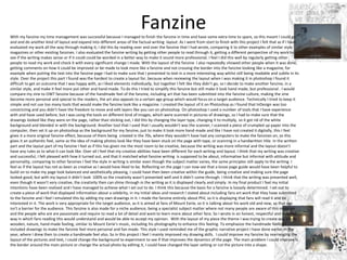
The student created two factual writing pieces: a fanzine and magazine/interview. For the fanzine, the student felt their time management and evaluation of the work during creation was successful. They received feedback from others and made changes. The student found the layout challenging to get right. For the magazine, the student again felt they managed their time well. They reviewed the writing and got feedback. The student found the magazine layout easier than the fanzine layout using InDesign. Overall, the student felt they achieved their goals for both pieces.
Oliver Keppie evaluated his work on a fashion magazine project. He felt his research went well since he was already familiar with the subject of fashion. His planning was detailed and helped guide his production. He managed his time efficiently and felt he could have improved certain elements if given more time. Regarding technical and aesthetic qualities, Oliver aimed to achieve a fantasy style and used techniques like cutouts and reflections to create depth and realism. He believed the magazine would appeal to his target audience of 16+ males interested in fashion through its serious tone and focus on high-end brands.
The student provides a detailed self-reflection on creating a broadsheet, tabloid, and fanzine for a class project. They received feedback that helped improve their work, such as removing a black outline around a box and making the title larger to fill white space. The student discusses the tools and techniques used in InDesign and Photoshop to lay out pages and edit images, including grids, fonts, adjusting image sizes, and adding shapes in Photoshop. They reflect on time management challenges and lessons learned about taking progress photos to improve their work.
The document provides a summary and evaluation of the author's work on their FMP (Final Major Project) which involved creating a magazine. For their designer research section, the author analyzed various graphic designers and their styles, finding Peter Saville the most interesting. They struggled to find enough information on each designer. For their research section, the author analyzed magazine covers, contents pages and spreads, finding Mixmag the most useful to reference. They could have analyzed production techniques and target demographics more. For problem solving, listing issues and exploring solutions prepared them for production. They practiced photo editing and article writing. Overall, the author found the project sections straightforward but could have planned more and explored topics in more depth.
The student felt they managed their time well on the project, completing tasks in a reasonable amount of time. The tabloid article took the least amount of time as they had a clear idea, while the magazine article took the longest due to challenges developing the idea. The student reviewed their work with their tutor through multiple drafts, which helped improve their writing. They used InDesign and Photoshop for the magazine layout, learning new skills in InDesign. The student felt their work showed creative abilities through inspiration taken from existing magazines and developing original content for the fanzine.
This document contains the writer's reflections on two pieces of work: a fanzine article about Liverpool Football Club and an interview with Liverpool fans.
For the fanzine article, the writer felt it was their strongest work as they were able to draw from their experience writing about Liverpool as a blogger. They received positive feedback on social media and from peers. However, for the interview, the writer struggled with layout and time management, feeling they could have improved it with a second draft. They learned they need to pace themselves better and not assume tasks will be easy. Overall, the document evaluates the creative process, feedback, and lessons learned for both pieces.
This document summarizes Savannah Hardwick's evaluation of her final project where she created three print products - a broadsheet front cover, tabloid front cover, and fanzine. Savannah feels she managed her time well to complete all tasks on schedule. She reviewed her work in progress to ensure it met the briefs and looked like real products. Savannah learned new skills using InDesign and tailored each product to its target audience. Overall, she believes the finished products met her goals and showed the development of her technical, creative, and time management skills.
This document is a reflection by the author on several writing assignments they completed for a factual writing course, including a fanzine article, interview, and obituary about Liverpool footballer Steven Gerrard. For the fanzine article, the author felt they worked hardest on the product and found it easy to write in a chatty style for fans. The interview was quicker to complete but harder to layout, and reviewing work helped improve it. While the obituary was an interesting challenge to write in a formal style about a living person, time management was an issue and it was not fully completed. Overall the author felt they learned from the experience and could improve planning and reviewing their work in the future.
The document provides an evaluation of the author's FMP (Final Major Project) pre-production work. It summarizes the key sections of pre-production research and planning that were completed, including researching graphic designers, analyzing magazine layouts and techniques, identifying potential problems and solutions, planning photos, locations and the overall magazine format. The author reflects on what worked well and areas that could be improved if doing the project again, such as including more sources than just online for research, further exploring production techniques and target demographics.
The document provides an evaluation of the research, planning, and time management stages of a production process for a fashion magazine.
For research, strengths included thorough planning and considering target audiences. Weaknesses were limited mood board images. For planning, strengths were mind maps and audience considerations, while weaknesses included risk of forgetting ideas.
Time management was mixed - the production was completed on time but PowerPoints needed more detail and time. Technical qualities showed similarities between the author's magazine cover and an existing magazine in layout, bold titles, and centered models, but differences in backgrounds and color schemes. Layout of sketches and text on a spread was also similar to an existing magazine.
The document discusses Nicola Kilgallon's time management and review process for three factual layout projects: a broadsheet newspaper, tabloid newspaper article, and fanzine article. Nicola managed their time well by completing each project within a three day timeframe. They made plans on day one of each week for fonts and images. Nicola reviewed their work in progress by taking screenshots and asking peers for feedback. They could have improved the fanzine article by spending more time on it. Overall, Nicola felt they managed their time well and completed the projects on schedule by the deadlines.
This document summarizes Chloe Ross' evaluation of her magazine project. For her research, she analyzed different magazines' content, styles, and audiences to inform her own magazine design. Her planning process helped her choose a movie magazine topic and develop mood boards. She managed her time well to complete several pages but would have added more with more time. For technical qualities, she compared her magazine's cover design to another magazine. She believes her work appeals to its target teenage and young adult male audience through its movie-focused content and images.
The document provides an overview and evaluation of Leon Boyce's process for creating a magazine focused on Volkswagen cars. Key points:
- Leon researched modern and vintage magazines to inform his design choices, ultimately choosing a modern, clean style. He examined photography techniques, layouts, and color schemes.
- Leon conducted surveys and interviews to understand his target audience of middle-aged men interested in Volkswagens. The research helped determine the magazine's title and content.
- In planning, Leon experimented with fonts before choosing two to use consistently. He created layout mockups and planned color schemes.
- Leon struggled with time management and spent too long on one page spread, falling behind schedule
The document discusses the evaluation of a magazine project. It covers the strengths and weaknesses of the student's research, planning, and time management. It also discusses the technical qualities, aesthetic qualities, and audience appeal of the magazine design. The student believes their research helped them choose the best magazine style but notes information was not as easy to find as expected. Their planning focused on one style rather than exploring variety. They managed time well but got distracted easily. Technical qualities differ from examples in images used and layout. The background design is identified as an area for improvement. Audience feedback was positive but the student sees room for enhanced visual design.
The document provides details about Alisha Harrison's planning and preparation process for creating a fanzine about the TV show Friends. Some key aspects of the planning included looking at fonts, creating a mood board with images, considering color schemes, doing pagination to plan out each page, and creating a timeline. While creating the fanzine, Alisha reviewed her work for errors and made minor changes, such as updating the title. She felt her timeline helped her manage her time effectively to complete the fanzine on deadline. Areas for potential improvement included making the biography pages less text-heavy. Overall, the planning process helped ensure the finished fanzine matched Alisha's vision and goals.
The document discusses the research process for a student's fanzine project. It describes researching existing fanzines to better understand the format. The student initially wanted to do a punk fanzine but realized a rap fanzine would be better since they knew more about rap culture. They developed ideas through mood boards and a pagination plan. Idea development included interview questions, article topics, and design inspiration from a rapper's aesthetic. The student wrote articles and was happy with the controversial topics covered. The fanzine's design channeled the rapper's punk style with pink colors, tattoos, and a typewriter font. Overall, the research and idea development helped the student create a fanzine on a
The document provides an evaluation of Emma Garthwaite's production process for creating a fashion magazine. It discusses her research of existing magazines for inspiration, audience research to understand reader preferences, planning activities, time management, technical and aesthetic qualities of her work. Key findings from her research informed her goal of a minimalist style and using a variety of healthy models. While her planning and time management went well, she could have adhered more closely to her plans. Her editing focused on natural photos without heavy manipulation.
Amy Foster completed a magazine cover design project and evaluated her work. She found her research process was thorough but could have benefited from examining a wider variety of magazines. Her planning ensured consideration of design details but she wishes she had taken more creative photos. Time management was an issue as she ran short on production tasks like photo editing. While her design had eye-catching colors and style, readability could be improved for a magazine intended to convey information. Overall, she learned lessons that could strengthen future projects.
The document describes the process of editing photos, creating magazine elements like the cover, masthead, headlines, and double page spread. Key steps included:
- Editing model photos in Photoshop by clearing skin and adjusting exposure and saturation.
- Creating a magazine cover in Photoshop with the main edited photo, cutting out the model and placing behind text for the masthead and headlines.
- Designing merchandise like t-shirts with logos and experimenting with colors and layouts.
- Building a double page spread in InDesign with columns, imported article, main photo, and additional elements like headlines and reviews.
This document summarizes the evaluation of a student's magazine project. The student conducted research on different magazine styles including food, fashion, and teen magazines. Their research helped with inspiration but they should have also researched a nature magazine for their topic. Their planning included a mind map and mood board, but the mood board lacked details. The student managed their time well but struggled with the software and could have used more time on their double page spread. The student feels their magazine has an aesthetically pleasing style and colors suited to their nature topic. They included professional-looking photos they took themselves.
- The document is a reflective diary of a student's 4-week process of creating a fanzine in Photoshop.
- In week 1, the student designed the front and back covers, struggling with layout and fonts but improving with practice.
- In week 2, the student created hashtag pages and continued improving speed and layout skills.
- In week 3, the student added interview pages and illustrations, struggling with fitting text but making progress.
- In the 4th and final week, the student completed the fanzine by adding final articles and pages, then compiling it online.
- Overall the student was pleased with completing the fanzine but noted areas for further improvement and practice.
The document discusses the progression of skills from the author's preliminary college magazine task to their final music magazine product. Specifically:
- The author learned important software skills like Photoshop and InDesign which allowed for more professional design. Experimenting helped identify effective and pleasing design elements.
- Researching design conventions of different music magazine genres helped focus on a more realistic look. Planning through audience profiles and blog posts also improved quality.
- Comparisons of covers and contents pages show improved composition, fonts, cover lines and overall professionalism in the final music magazine versus the initial college magazine task. Valuable lessons were learned around magazine design conventions.
Evaluation Question 7: Looking back at your preliminary task, what do you fee...Sandra Palpuchowska
The document discusses the progression of skills from the author's preliminary college magazine task to their final music magazine product. Specifically:
- The author learned important software skills like Photoshop and InDesign which allowed them to design and create more accurately and professionally.
- Researching design conventions of different music magazine genres helped the author focus on making their magazine look more realistic and professional.
- Increased research and planning, like developing an audience profile, helped the author better understand what they aimed to achieve with the final product compared to the preliminary task.
- Comparisons of elements like cover lines, fonts, composition show improvements in making the final magazine look more organized, balanced and appealing to the target audience.
The document discusses how the author's research influenced their fanzine project. They began by researching other fanzines to get ideas but found few related to their topic of Friends. They analyzed 3 fanzines and discovered setting their fanzine apart by having a "dead-end" topic about a finished TV show. Their front cover was influenced by one fanzine's use of a hazy, retro effect and subtle title placement. Through the project, the author improved skills like Photoshop, interviewing, and printing fanzines, which will benefit future work.
The document provides a self-evaluation of a magazine project. It discusses strengths and weaknesses in the areas of research, planning, time management, technical qualities, aesthetic qualities, and audience appeal. Peer feedback is also summarized. The key strengths included helpful research materials and initial planning. Weaknesses were a lack of details in planning and changing the target audience. Peer feedback focused on improving the blurry text and formatting on the cover and spreads. The creator agreed improvements could be made to text clarity and professionalism.
Holly evaluated their college magazine photography and use of design software. The photography could have been improved with better angles, lighting and focus. Photos were often cut off or too dark. Learning software like Photoshop and InDesign was challenging but helped advance the magazine. Editing photos and designing pages was difficult at first due to unfamiliar tools. Overall, Holly was pleased with their first attempt but felt the photography, design, and use of space could be improved for a more professional magazine.
1. The document outlines a coursework assignment to produce elements of a print magazine, including a front cover, contents page, and double-page article spread.
2. Research was conducted on existing music magazines to inform design choices. Elements like consistent branding and a balance of images and text were noted.
3. A mock music magazine was produced following the researched conventions, including a front cover featuring an original band photo, a contents page with photos and article previews, and a double-page interview article spread. Original photos were taken and image editing software was used to prepare the elements.
The document provides an evaluation of the production process for a research project. It discusses each stage of the process, including research, planning, and time management. For the research, the author conducted a survey, interview, subject research on a photographer, and a photography experiment. They found the survey and interview helpful but feel they could have improved some questions. For planning, they created initial plans and pre-production presentations. They felt the pre-production most influenced the final product but note they lacked attention to detail. For time management, the author acknowledges they fell behind schedule and had to rush parts, feeling more time would have improved the work.
This document provides daily reflections from April 13th to May 12th about the progress made on a magazine project. Over the weeks, the writer worked on layouts, took photos, wrote articles and interviews, designed spreads, and finished other elements like the contents page and an advert. They summarized research, described challenges faced and solutions found, and reflected on successes each day. The project involved iterative design, editing, and improvements to create a cohesive magazine.
The document summarizes Madeleine Ross's evaluation of her research, planning, time management, technical qualities, aesthetic qualities, and audience appeal for her magazine project. Some key points:
- She collected many images from different magazines to inform her project but could have analyzed them more in-depth.
- Mind mapping helped her plan her magazine concept and organize her ideas. She found her color schemes changed during production.
- Shooting her own photos took longer than planned but she finished production on time and added an extra page.
- Her magazine layout includes text over images instead of just in banners like other magazines.
- She uses multiple photos of her model but could have varied the images more.
Throughout the project, the student created designs for punk fanzines and tabloids. To develop the designs, the student took screenshots of the design process, researched existing fanzines, and tested different software. Feedback from peers suggested improving readability and making the designs look more professionally produced while retaining punk characteristics. The student overcame challenges like mixing up tasks and found room to improve fonts, layouts, and considering broader audiences.
- The document discusses improvements made from the preliminary magazine draft to the final draft.
- Styling of the model, camerawork techniques, directing poses, font choices, and page layout showed better understanding of conventions and targeting the intended audience.
- Smaller details like page numbers and placement of ads were also improved based on research of other magazines.
The document provides guidance for critically evaluating a completed work project in the context of professional practice. It lists several areas for self-evaluation, including whether intentions were realized, the appropriateness for the audience, content, style, skills used, skill development, and areas for improvement. Sources for evaluation should include self-evaluation and feedback from others such as the audience, peers, or tutors.
This document provides a self-evaluation by Ellie Marsh of a factual writing project. Ellie discusses her planning process, time management, reviewing work in progress, technical skills used, and areas for improvement. For planning, Ellie created a production schedule and sample booklet. She mostly stuck to her schedule but underestimated some tasks. Ellie reviewed pages as she worked and made minor changes. She learned new software like InDesign and Photoshop. Areas for improvement include shortening sentences in her article and choosing a color scheme more appealing to her target female audience.
The author reflects on improvements made from their preliminary magazine task to the actual magazine task. For the preliminary task, the author lacked knowledge of typical magazine conventions and layout. The actual magazine shows more professional presentation with careful font and color selection to achieve consistency. Additional skills were learned using InDesign versus Publisher, including better photo editing techniques. The cover was also improved by incorporating persuasive devices to attract readers.
The student managed their time reasonably well on the project overall due to planning. They spent too much time on their tabloid newspaper and don't think it looks very good compared to professional pieces. Their fanzine was completed in better time and they like the look of it more. They learned how to use InDesign and Photoshop on the project. Their broadsheet looks somewhat professional but could be more creative. Their fanzine allowed the most creative freedom. They reviewed their work as they went by comparing to existing products, but this didn't help much with their tabloid.
Through the process of creating her final magazine product, the author feels she has improved in several key areas from her preliminary task:
1) Her research and planning skills are stronger - she understands what to look for in professional magazines and how to plan her own magazine accordingly.
2) Her technical skills using software like Photoshop have grown - she is more comfortable with the tools and understands layout and design principles better.
3) While the contents page layout remained similar, she enhanced it by adding social media details, based on research of what appeals to target audiences.
Overall her work reflects incorporating research insights, technical skills, and focus on target audiences - showing progression from her earlier preliminary task.
Lily created a film magazine called "Director's Cut" for a school project. She did research on magazine formats and created a production schedule. Her final magazine included a front cover, contents page, and double page article spread. Throughout the magazine she maintained a consistent black and white color scheme and logo. While she was happy with how the magazine turned out overall, she notes some areas for improvement like using a bolder font for titles and adding page numbers.
The document summarizes the creative process behind developing a draft magazine cover. Key decisions included choosing an A4 size with white background to appeal to the target audience. The main image was cropped and edited to draw attention, and positioned within the margins with space left for the masthead and headings. Various fonts and styles were tested for the masthead, subheadings, and artist headings before final selections. Overall the creator was happy with the draft but identified areas for improvement, such as repositioning the barcode and recentering the main image, based on feedback.
This document provides a self-evaluation and reflection of the student's work on creating an independent music magazine. It discusses the research, planning, time management, technical, aesthetic, and audience appeal qualities of the final product. The student identifies strengths such as using style sheets for planning colors and fonts. Areas for improvement include doing more advance planning, collecting images sooner, and adding more graphics and editing to pages. Peer feedback praises the minimalist design but suggests clarifying the house style and adding more color to article backgrounds. The student agrees improvements could make the genre more apparent to attract more interest.
The document discusses the evaluation of a magazine design project. It describes how the designer aimed to create continuity across pages while making each page visually unique through different techniques and effects. Their favorite part was the front cover which used a glitch effect that complemented the image colors. Feedback praised the minimalist yet clean and professional design, though suggested adding more pages and detail. The designer learned new editing skills and mostly enjoyed the project, but had some issues with image quality and timing due to illness.
The document discusses the evaluation of a magazine design project. It describes how the designer aimed to create continuity across pages while making each page visually unique through varied techniques and effects. Their favorite part was the front cover which used a glitch effect matching the image colors. Feedback praised the clean, minimal design while noting room for adding more text content and completing remaining pages. The designer learned new editing skills and mostly found the project enjoyable, though struggled with image quality and timing at points.
Katie Scruton completed a project to design pages in the styles of broadsheet newspapers, tabloid newspapers, and fanzines. She is pleased with her time management and productivity during the project. By revising her work multiple times and saving JPEG versions of each revision, she saw clear improvements in quality. Her favorite pieces were the fanzine pages, which looked like real publications. She gained skills in Adobe InDesign and Photoshop by completing technical elements like a collage background. Overall, she feels this was her best project as it allowed creative expression and application of skills learned over her course.
The student has learned that planning and time management are important for organizing work and avoiding rushing. Research helped with planning their magazine concept and content. Drafting skills improved from gaining a clear vision. Photographic skills like using plain backgrounds and varied shot types improved. Editing skills in Photoshop and layout skills in InDesign developed. The student thinks they improved from the preliminary task by applying learned skills and addressing prior issues.
This document provides an evaluation template for a student to evaluate their year two projects at L3 Creative Media Production & Technology. The template guides the student through an overview of their project, development process, outcomes, personal response, evaluation, analysis, and action plan. It prompts the student to concisely describe various aspects of their project, critically reflect on strengths and weaknesses, and identify skills gained and areas for future improvement.
The document provides an evaluation of the author's production process for creating a magazine. Some key points:
- The author researched magazine covers, contents pages, websites, and video lookbooks for inspiration on design. A strength was finding a magazine cover they liked from LOOK Magazine that informed their design.
- Surveys for audience research were a weakness as most responses came from teen males, not the intended female audience.
- Photos taken outside had lighting issues. Better photos could have been taken in a studio.
- More time was needed to complete all planned elements (magazine, website, lookbook). The magazine wasn't as polished as intended.
- Layout design and color scheme choices
The document outlines the process of creating two layouts for a fanzine article. For the first layout, the creator used earthy tones and offset/angled images and text to achieve a scrapbook feel appealing to older hippies. Handwritten fonts made the copy seem casual. The second layout targeted younger hippies with brighter colors, stylish images, and a bold title font coordinating with the psychedelic background. Both layouts broke conventions to achieve a rebellious fanzine style fitting the counterculture theme.
Cesca Haig conducted research for a magazine design project by distributing a questionnaire to gather information on preferences. Results showed people were more likely to buy magazines that offered free items and had more photos than text. For her product, Cesca compared magazine covers and elements like cover lines, title formatting, double page spreads, and contents pages. She designed a magazine targeted at ages 14-35 featuring different film genres. Cesca created designs for the cover, contents page, and a double page interview spread, and gathered feedback through an online survey.
This document contains initial ideas and development work for an energy drink brand and packaging design. It includes ideas for four different drink themes based on popular video games: a sports drink theme inspired by Grand Theft Auto, a music festival drink inspired by Call of Duty, a natural drink inspired by Fez, and a protein drink. Color schemes, fonts, and packaging layouts are tested to match each gaming theme. Market research on existing brands is also referenced to inform the design process. The goal is to create a line of energy drinks targeted towards gamers with unique designs drawing inspiration from different video game genres.
This document contains initial ideas and development work for an energy drink brand and packaging design. It includes ideas for four different drink concepts focused on sports, music, natural/eco-friendly ingredients, and protein. It also explores font, color scheme, and packaging designs inspired by popular video games like Grand Theft Auto, Call of Duty, and Fez to appeal to the target gaming audience. Mood boards and mind maps were created to develop themes and aesthetics for the brand identity.
This document discusses different types of photography and their purposes. Advertising and promotional photography aim to sell products and raise awareness, using controlled shoots and post-production editing. Photojournalism documents real events to accompany news stories, but can also manipulate images to influence viewers. Fashion photography sells clothing through idealized images of thin models, often heavily edited. Portraiture captures subjects' emotions and details through posed or candid shots. Architecture photography styles vary from artistic to realistic depending on the intended use of the image.
The document discusses various camera settings and techniques that can be used to manipulate photographs, including:
- Aperture, which controls depth of field and amount of light. A wider aperture means less depth of field and more light.
- Shutter speed, measured in fractions of seconds. A faster shutter speed freezes motion while a slower shutter allows blur.
- ISO, which controls the light sensitivity of the camera sensor. A higher ISO means more noise but allows shooting in darker conditions.
- White balance, which shifts the color tone to compensate for lighting conditions like daylight, shade, or tungsten.
- Editing techniques like dodging and burning, levels, cropping and color adjustments
1. Fashion photography aims to sell and advertise clothes by portraying attractive, slim models wearing the outfits in a very controlled setting with artificial lighting. The goal is to make the clothes look desirable so consumers will want to purchase them.
2. Fashion photography is highly manipulated, with nearly all images edited in some way, such as enhancing skin or changing body shapes. While editing can make photos more aesthetically pleasing, overly thinning models' bodies sets unrealistic standards that can harm self-esteem and mental health.
3. Portraiture captures subjects' emotions, details, and colors in both black and white and color photos. Photographers instruct posed models on facial expressions and positions against plain backgrounds to focus
This document provides initial ideas and development for the design of an advertising campaign and product packaging for an energy drink. It includes four potential energy drink ideas focused on sports, music, being natural/eco-friendly, and protein. It also details the development of font, color scheme, and packaging ideas inspired by video games like Grand Theft Auto, Call of Duty, and Fez. Mockups of potential can designs and branding incorporate pixelated graphics and fonts to match different game aesthetics.
This document provides initial ideas and development for four potential energy drink concepts:
1. A sports drink targeting people who like to exercise aged 30-40 focusing on energy from plants in a bottle with a sports cap.
2. A music-themed drink targeting teens and people aged 16-20s into music in a colorful can.
3. A natural and eco-friendly drink targeting people aged 18-29 in fun packaging focusing on a healthy boost.
4. A protein-focused drink targeting bodybuilders and gym-goers in a familiar protein shake bottle shape with milk-based flavors.
This document discusses several types of audience responses to media:
- Preferred responses occur when the audience agrees with and is willing to change their behavior based on the media.
- Negotiated responses mean the audience understands the message but will not change their behavior.
- Oppositional responses mean the audience does not believe or agree with the message and will ignore it.
- Participatory responses encourage the audience to engage with the media by giving opinions and participating in discussions and voting.
- Cultural competence means tailoring media like advertisements to different cultures' understandings and languages.
- Fan culture refers to passionate fans who form online communities called "fandoms" to discuss their favorite shows, bands, and books.
1) A close-up shot of gamers' intense faces and hands gripping controllers, with the drink can in focus. The text "Stay Wired" hints that the drink provides energy to keep gaming.
2) A split screen shows gamers in intense online battles, with one screen fading to a can of the drink and the text "Fuel Your Game".
3) Esports athletes are shown celebrating a victory, holding up cans of the drink. The text "The Official Drink of Champions" promotes the drink's endorsement of elite gamers.
The strengths of the final images are:
- Clear theme/subject matter - They are all based on The Smiths band which connects them.
- Attention to detail - The rotoscoping is done very neatly which shows skill.
- Variety - Different poses, compositions and styles were explored rather than just repeating one idea.
- Audience focus - Consideration was given to targeting specific demographics like younger fans.
What could be developed if the image was repeated?
Some things that could be further developed if the images were repeated include:
- Additional band members - Adding designs featuring Johnny Marr or Andy Rourke.
- Product options - Creating versions without backgrounds for more printing/color flexibility
The document discusses different types of digital graphics file formats including raster graphics, vector graphics, JPEG, TIFF, PSD, AI, and 3DS.
Raster graphics use pixels and have a fixed resolution, so they can lose quality when resized. Vector graphics use paths and shapes so they maintain quality at different scales but have larger file sizes.
JPEG is best for web use due to its small file size but loses quality with multiple edits. TIFF has better quality than JPEG but much larger file sizes. PSD saves layers and supports transparency but has large file sizes. Vector formats like AI can scale without pixelation but have limited software compatibility. 3DS is used for 3D modeling and animation and has universal viewing but also
The document provides details on the development process of branding assets for a social action organization. It describes creating a logo by drawing a crab mascot and scanning it digitally. Further logo iterations experiment with style and color variations. Posters are designed to educate children on litter cleanup in a fun, game-like way. Merchandise designs include t-shirts, hats and bodyboards featuring the logo and messaging. Membership forms are given underwater themes through rotoscoped illustrations of crabs, turtles and seals to appeal to children while still including necessary legal information. The branding assets were created to be cohesive in style and message across different mediums.
The document describes the process of designing logos and posters for a children's environmental organization called Seas for Life. The designer created a cartoon crab character logo to appeal to children while incorporating subtle elements of the existing Surfers Against Sewage logo. They refined the logo design through several iterations to make it distinct from the original yet flexible enough to work in different contexts. Three educational posters were also created with simple, clear messaging about litter and how it affects beach animals, tailored to be understood by and engage children. The techniques used, like hand drawing and Photoshop, helped make the logo and posters visually appealing yet understandable for their intended young audience.
The document provides details on the development process of logos, posters, and merchandise for a social action campaign. It includes sketches, digital designs, and explanations of design choices. For the logos, the designer experimented with different styles and characters before settling on a crab mascot. Posters were created to educate children about litter in an engaging way. Merchandise included t-shirt, hat, and bodyboard designs building on the established logo. Membership forms were also designed, incorporating the mascot character into underwater scenes.
The document provides details on the development of branding and promotional materials for the organization Surfers Against Sewage. It describes creating a logo featuring a crab mascot with pastel colors. Posters were made to educate children about litter, using illustrations and facts. Merchandise with the logo was designed, including t-shirts and bodyboards. A membership form was created with an underwater scene and characters from the logo to engage both children and parents. Consistency was maintained across materials through repeated use of themes, colors, fonts and characters.
The document outlines a 4-week schedule and lists resources needed to create a marketing campaign. In week 1, the schedule details plans to design a logo by experimenting with shapes, developing characters, and refining a final design. Week 2 involves creating a poster through mind mapping, mood boarding, rough designs, and finishing a chosen design. Week 3 focuses on designing merchandise through mind mapping, creating artwork concepts, and finishing a design. Week 4 has plans to design a membership form by experimenting with layouts and creating the final professional form. The resources section lists a computer, design software, paper/pencils, scanner, camera, transport, and fonts needed for the different tasks.
The document provides initial ideas for three different campaigns to raise awareness about ocean conservation.
The first idea is aimed at children and involves creating cartoon animal mascots to educate them about healthy sea life through books, games and posters.
The second targets adults interested in fitness with an event combining a beach run with litter collection. Merchandise and minimalist posters would promote the fun run for charity.
The third addresses fishing enthusiasts by using shocking imagery and facts on posters to illustrate the harmful effects of abandoned fishing equipment on wildlife.
Surfers Against Sewage (SAS) is an environmental charity established in 1990 by surfers in Cornwall to improve water quality at UK beaches. SAS campaigns on issues related to the sea and coastlines like litter, sewage waste pumped into the sea, and toxic chemicals. They have achieved awards and influenced companies but still hope to make all UK beaches litter-free and increase public awareness of threats like climate change. SAS also campaigns against threats from shipping like oil spills and flags of convenience that can pollute the sea. They provide key facts and figures on marine litter and pollution to support their campaigns and awareness efforts.
Surfers Against Sewage (SAS) uses graphic designs and logos to promote their mission of protecting oceans and waves. Their logo features a wave that is also an eye, representing surfers. They use shocking imagery like a surfboard in a grave to emphasize how pollution threatens surfing. SAS merchandise targets different audiences, like a feminine shirt promoting beach conservation and a darker shirt for men. SAS also produces educational materials and campaigns to teach children about ocean stewardship. Overall, SAS crafts consistent yet versatile branding to engage various supporters.
Boudoir photography, a genre that captures intimate and sensual images of individuals, has experienced significant transformation over the years, particularly in New York City (NYC). Known for its diversity and vibrant arts scene, NYC has been a hub for the evolution of various art forms, including boudoir photography. This article delves into the historical background, cultural significance, technological advancements, and the contemporary landscape of boudoir photography in NYC.
The cherry: beauty, softness, its heart-shaped plastic has inspired artists since Antiquity. Cherries and strawberries were considered the fruits of paradise and thus represented the souls of men.
❼❷⓿❺❻❷❽❷❼❽ Dpboss Matka ! Fix Satta Matka ! Matka Result ! Matka Guessing ! Final Matka ! Matka Result ! Dpboss Matka ! Matka Guessing ! Satta Matta Matka 143 ! Kalyan Matka ! Satta Matka Fast Result ! Kalyan Matka Guessing ! Dpboss Matka Guessing ! Satta 143 ! Kalyan Chart ! Kalyan final ! Satta guessing ! Matka tips ! Matka 143 ! India Matka ! Matka 420 ! matka Mumbai ! Satta chart ! Indian Satta ! Satta King ! Satta 143 ! Satta batta ! Satta मटका ! Satta chart ! Matka 143 ! Matka Satta ! India Matka ! Indian Satta Matka ! Final ank
This document announces the winners of the 2024 Youth Poster Contest organized by MATFORCE. It lists the grand prize and age category winners for grades K-6, 7-12, and individual age groups from 5 years old to 18 years old.
2. Fanzine
With my fanzine my time management was successful because I managed to finish the fanzine in time and have some extra time to spare, so this meant I could go
and and do another kind of layout and expand into different areas of the factual writing layout. As I went from start to finish with this project I felt that as if I have
evaluated my work all the way through making it, I did this by reading over and over the fanzine that I had wrote, comparing it to other examples of similar style
magazines or other existing fanzines. I also evaluated the fanzine writing by getting other people to read through it, getting a different perspective of my work to
see if the writing makes sense or if it could could be worded in a better way to make it sound more professional. I feel I did this well by regularly getting other
people to read my work and check it with every significant change I made. With the layout of the fanzine I also repeatedly showed other people when it was done,
getting comments on how it could be improved or be made to look more like a fanzine and not crossing the border into the fanzine looking like a magazine, for
example when putting the text into the fanzine page I had to make sure that I presented to text in a more interesting way whilst still being readable and subtle in its
style. Over the project this part I found was the hardest to create a layout for, because when reviewing the layout when I was making it in photoshop I found it
difficult to get an outcome that I was happy with, as I liked elements individually, but together I felt like they didn’t go, so I decide to make another fanzine, in a
similar style, and make it feel more put other and hand-made. To do this I tried to simplify this fanzine but still make it look hand made, but professional . I would
compare my zine to OWT fanzine because of the handmade feel of the fanzine, including art that has been submitted into the fanzine culture, making the zine
become more personal and special to the readers, the art also appeals to a certain age group which would focus on a target audience. Technically I tried to keep it
simple and not use too many tools that would make the fanzine look like a magazine. I created the layout of it on Photoshop as I found that InDesign was too
constricting and you didn’t have the freedom to move and edit layers like you can on photoshop. On photoshop I used a number of tools that I have experience
with and have used before, but I was using the tools on different kind of images, which were scanned in pictures of drawings, so I had to make sure that the
drawings looked like they were on the page, rather than sticking out, I did this by changing the layer type, changing it to multiply, so it got rid of the white
background and blended in with the background. Another tool that I used that I usually wouldn’t was the scanner, I scanned a piece of crumpled up paper into the
computer, then set it up on photoshop as the background for my fanzine, just to make it look more hand-made and like I have not created it digitally, this I feel
gives it a more original fanzine effect, because of them being created in the 70s, where they wouldn’t have had any computers to make the fanzines on, so this
gives it an authentic feel, same as the idea of making photos look like they have been stuck on the page with tape, or scanning in a handwritten title. In the written
part and the layout part of my fanzine I feel as if this has given me the most room to be creative, because the writing was more informal and the layout doesn’t
have any rules as to what it can look like. Over all I feel that my creative abilities have been different for each writing and layout. I think that my writing was creative
and successful, I felt pleased with how it turned out, and that it matched what fanzine writing is supposed to be about, informative but informal with attitude and
personality, comparing to other fanzines I feel the style in writing is similar even though the subject matter varies, the same principles still apply to the writing. I
feel as if the layout has not as been as creative as I would have liked to be. Reflecting on the page I can now see that a loose page guide would have been helpful to
build on to make my page look balanced and aesthetically pleasing, I could have then been creative within the guide, being creative and making sure the page
looked good, but with my layout it didn’t look 100% so the creativity wasn’t presented well and it didn’t come through. I think that the writing was presented well,
even though it wasn’t very creative, the creativity then can shine through in the writing as it is displayed clearly and simply. In my final product I feel my initial
intentions have been realised and I have managed to achieve what I set out to do. I think this because the basis for a fanzine is loosely determined. I set out to
create a piece of work that displayed information about a celebrity, in my initial ideas and research I stated about including fans art work that they have submitted
to the fanzine and I feel I emulated this by adding my own drawings in it. I made the fanzine entirely about Phil, so it is displaying that fans will read it and be
interested in it. The work is very appropriate for the target audience, as it is aimed at fans of Mount Eerie, so it is talking about his work old and new, so that age
isn't a barrier for the audience. This fanzine is also made for a niche audience, being a specialist subject matter where not many people are aware of this musician
and the people who are are passionate and require to read a lot of detail and want to learn more about other fans. So I wrote in an honest, respectful and detailed
way in which fans reading this would understand and would be able to accept my opinion. With the layout of my piece the theme I was trying to create was a lo-fi,
wooden, nature, hand-made feeling, similar to Mount Eerie’s music, including his photography to enhance this feeling. To emphasize the handmade feeling I
included drawings to make the fanzine feel more personal and fan-made. This style I used reminded me of the graphic narrative project I have done earlier in the
year, where I drew then to create a handmade feel also. So in this project I feel I mainly improved my drawing skills. I could improve my fanzine by rearranging the
layout of the pictures and text, I could change the background to experiment to see if that improves the dynamics of the page. The main problem I could improve is
the border around the main picture or change the actual photo by editing it, I could have changed the layer setting or cut the picture into a shape.
3. Here is where I improved the shape
of the text and edited the photo by
making it lighter and also making the
warmth of the photo colder, also
putting a drawing over the face so it
fits.
Here are the bones of
the layout of my
fanzine, showing the
simple guides and how
I placed the pictures
and text.
4. Magazine/Interview
For this part of my project the time management was really good, I completed this piece with plenty of time to do different drafts and perfect the layout and lining up of the text and pull
quotes. I even had contingency time so I had extra time to work on different drafts because I completed this in plenty of time. Here in this project I feel like my time management
has been used better, as I have been quicker in this project because I have been more aware of how long each task will take and I prepared things in my own time so I would have
more class time to get on with the main tasks. As I went along and created my interview I think that I reviewed my work and got my tutor to keep looking and suggest
improvements for my writing. To start with I started with a basic interview which my musician answered in detail, then I wrote the interview around it, including it in a piece of
writing which was informative and related to the basic interview. With constantly reviewing my writing I felt I knew where I was, and where I needed to be and how I could reach
the right quality of work for it to come to a professional standard, so I think it had a positive effect on my work. I feel this piece of writing has been one of my strongest pieces
throughout the course. When creating the magazine layout I used Indesign, which I have not used properly in a long time, so I had forgotten how everything works on it. From this
standpoint I felt that I worked it out with some help and managed to display the magazine in the way I wanted to without any restrictions because of technical difficulties. I
managed to end up with the main image in a very good quality which makes my magazine layout look very professional, I did this by saving the image in photoshop then placing it
in Indesign in a square then I made sure the displaying quality was high so the picture didn’t come out pixilated. Comparing to using photoshop getting images into Indesign was
difficult and that you can’t scale them larger without them losing their quality, where as in photoshop the quality holds up a bit more. The only problems I had was with the pull
quotes and the restrictions that the boxes around the text left so not all the pull quote area is even in space. For the magazine the most creative part I feel was the writing part as
the layout is very uniform and appropriate for a magazine. I feel the writing is creative because of how much time I spent on it and making sure it fit in with the interview with the
subject matters and how each question subject followed each other. I reviewed this a lot to make sure it was worded right and made sure it made sense. I think the most creative
part of my layout is the style of the side bar/shortened down interview, where I incorporated a shortened down version of the interview next to the real interview, to start with I
didn’t have a line to separate the two interviews, but when I was given feedback on it I was told that it looks like the two pieces of text are one, so I decided to make it more clear
that they were not connected. I was influenced in the clean style that music magazines take on some of their articles, as I felt it was important for the audience to want to read it,
even if they didn’t know the artist, they would still be attracted to read it. I think that my intentions have been realised and I have managed to achieve what I set out to do, which
was to create a magazine that was aesthetically pleasing and delivered the interview that was easy to read. Commercial practice will help me do this by using editors to double
check that everything is in order and that everything is okay. I think for my audience it is aimed at them in the layout especially, the colours, red and black are gender neutral and
this is complimented by the white, I feel it also may appeal more towards the younger fans because of the short sidebar, because younger people may not have the time or
attention span to read all of the interview , it is also a non-traditional way of writing out an article, which older audience members may be confused about, but the set out of the
magazine is simple and easy to read, so this doesn’t mean older audience members wouldn’t be able to read it, but it just might not appeal to them as much as a traditional set
out. I feel as if the layout and the choice of fonts and colours from a socio-economic point of view would appeal to the higher end of the scale, appealing to more wealthy people
level B to C1 as I have set it out like it would be in a magazine that is higher end and would cost more. The content of my writing is very informative and has some style to it, I
wrote an article around the interview to make it more interesting, rather than just sticking the plain interview in there, I made it into more of an article with quotes telling the
reader first hand information. In my layout I wanted to keep the design simple and clean, with a white background and bold colours to go with it, but still keeping it sophisticated.
The font is a classic style that is serif, so that it is easier to read and looks less modern to contrast with the side bar. The photo I used was from the internet, a photo that Phil had
posted on his website giving permission to use this for any press releases, with this photo I edited it slightly to make it lighter and cleaner so that it would match the theme of my
overall layout. I decided to use this photo mainly because of the quality of the photo and the colour, the quality was really good so this meant I could make it large so the page
would look like a professional magazine, the colour of the photo also helped me decide on a colour scheme for my fonts, which was black and red, and it made the page look
professional because everything matched so well. Skills I used were mainly on Indesign, adding text, lining up the boxes and adding pull quotes, I learnt how to add pull quotes by
adding some text in a separate box then making sure the text surrounds the quote. The photo I used I went on to saving it in photoshop at the right size, then placing it into
Indesign making sure that the photo had kept its quality. So here I felt as if I have developed my skills in Indesign because I started out not knowing anything and I learned how to
simply construct a magazine layout without my lack of knowledge hindering me in any way. But areas that could be improved on is the fact that I could have learnt more
complicated skills on Indesign then I would have been able to experiment more with my layout to see what looks the best, to compare and contrast, adding more photos, cropping
them, cutting them out into a shape or silhouette. With my writing, because I had a lot of feedback from my tutor and peers I feel that there wasn’t much to be improved on in
this section.
5. Here I was experimenting with different
shapes of pull quotes, to see which would
look best in the block of text, I found that this
square pull quote looked too bulky and messy,
so I decided to go with all the pull quotes to
be in one straight line, so the quotes would
look uniform and neat.
Here are some things that were in my
early draft of my magazine, but wasn’t
fond of because of the messiness, or
that it just didn’t go and match with
the theme of my layout. The ‘A CHAT
WITH’ after getting feedback I realised
that this didn’t match my theme and
looked out of place on the page. When
polishing of my layout I made sure that
all the text was in line and that it was
squared off and looked neat.
6. Press release
For this writing task (writing a press release) my time management was really good, I finished this task on time,
and maybe even with a bit of extra contingency time, so I could could back to it if I felt that the feedback I
got on it wasn’t as good as I’d have liked it to be. To gather information about this press release I used some
of my own knowledge as the basis, then I went on to searching the internet looking at different press
releases, how there were written, what kind of information they contained. I also looked at some
informative articles and even Phil’s website to gather truthful information that I could add into my press
release, like how many albums has he made or when he started making music. I also refereed back to my
own interview to get information, because this was from Phil what he had written so I knew the information
was true and not twisted. Throughout my time working on this press release I relied a lot on having
feedback from my tutor, my peers and other fans. This helped me a lot to improve what I have in my
release, what order it was in and the choice of words I used. It also helped me to sound more professional,
not including any grammar mistakes, spelling errors or even just making sure the sentences were worded
correctly. Technically the writing was new to me as I have never written a press release before, and by
looking into research and referring back to existing and professional press releases I learnt what was the
right way to present and word the writing, what kind of tone it had, formal but also informative with some
hint of passion, these were things I was learning as I researched looking at music magazines such as NME
and Q, looking at differences between them. Comparing this piece of writing to previous ones in my course I
feel my writing has improved tremendously, being able to write in a different tone with different intentions,
rather than just writing information down. Because Of the task set there was little room to be ‘creative’,
because you had a duty to perform and information to deliver to fans, that being when a new album is
coming out and also promoting the artist in their best light, making sure they sound perfect, so there wasn’t
really any room to be creative in a controversial sense, but I could be creative in my skills to describing my
musician in a good light, without it sounding cliché and over the top. I believe that my writing has realised
its original intentions and that it does its job and I have achieved what I set out to do, I think that it
represents Phil in a good light and that it encourages fans to buy his new album and also encourage non-fans
to start listening to his music, it tells them where to start in his discography. I feel that this piece of
writing would appeal to all age of my audience because of the way it is written everyone would understand
it, but not get bored of it because it is quite descriptive, more so than other press releases I have read. I
think because of some words that class would be a C1-B just because some of the words may only
understood by the majority of wealthier people with a higher education and reader level, which higher class
people tend to have, as the majority of these classes do attend higher education like university and college.
The content of my writing it quite simple, it is basically a informative piece about when Mount Eerie’s new
album will be released and how exciting and good it will be, it then also adds more information about past
albums, where to start in his discography if you have never listened to him before. The skills are writing
based and I have taught myself how to write in a certain way to sound excited about this new album and to
hype it up, whilst also maintaining a professional edge which is calm and informative. I also exercised the
skill of using persuasive writing, to persuade the reader to listen and buy Mount Eerie’s new album. In
previous projects I have never really had the opportunity to write in the style and obtain this skill. Obviously
because this is my first time writing in this style for a long time there could be some improvements, I think
especially in the tone of my writing which I feel could do with a bit more enthusiasm, with more practice
and writing exercise I feel that this would improve. In my project I did get a lot of feedback about the
placement of my paragraphs was was told that the press release didn’t finish on a final sentence but mid. So
I moved the paragraphs around and changed the order to make the press release make more sense.
7. Obituary
For this part of the writing task I had to write an obituary for Phil, including the reason for his death and how
much he achieved in his life, explaining what a great person he was and what a great lost it is. For this
part of the project, like the rest of it, my time management was really good and I got the task
completed in time, with contingency time, so that I had time to improve on this piece of writing even
more if I wanted to. As I went along writing this I feel that I reviewed it well all along, referring back to
other people’s opinions, especially my tutor’s, emailing back and forward to iron out any creases with
wording and grammar, making sure the piece celebrated the celebrities life, making sure to focus on
the positive rather than negative. I think this reviewing of my own work helped me to improve it a
significant amount, helping me see the own fault in my work and helping me to become a better
writer over all. Because I finished this early it then gave me time to work on the next piece of writing,
thus starting and finishing that early, setting myself up to finish every piece of writing early.
Technically for this part of the project it was very writing based, so I had to write in a different style for
each section, for the obituary I had to write in a very sensitive and positive way, making up a fictional
death for Phil, and make it seem as if it true. I had to show remorse, loss but also happiness and
celebrate his achievements. I think over all comparing it to real newspaper’s obituaries it is similar, and
has been written to a professional standard. In this piece of writing there was a small chance to be
creative, making up the death of the celeb, but I felt that to maintain a professional standard the
death story should be kept short and believable. I think I managed to be creative in my writing talking
about Phil’s achievements but I feel I could have been more creative with the story about how he died,
but I think that the was I wrote it was more appropriate rather than making up a ridiculous story and
concentrating more on the death, which is not what professional newspapers obituaries do. I feel as if
my intentions have been realised to as best I can, I think this because I had to make up a way for my
celebrity to die in a tragic way, but not draw too much attention to it because this piece of writing has
to be respectful. I feel that this piece of writing would be appropriate for the audience, because they
are fans and already have an understanding of what Phil had achieved in his life so will be able to
resonate with this piece of writing. The writing will match all ages of Phil's fans as it is pretty basic
language. I talked about his past work and made a big deal about the glow pt 2 because this is what
fans want to hear about as this is what the majorities favourite album of his is. I have made the
obituary formal because a lot of Phil’s fans tend to be older, so they wouldn’t understand some slang
or informal language that is used with younger people or just wouldn’t appeal to older people. The
content of my obituary I talk about the life and death of Phil, I start of with how he died, and how sad
it is he is gone. I then go on to talk about how good his life was and how much he achieved, putting
him in a good light. Throughout the project I have been writing and gaining skills and because this
writing task was further on in the project I feel in this writing I was developing my skills even further,
especially in my skill to write in a correct way which would not offend anyone. I feel that there could
be some improvement with the amount of times it was proofread and also the amount of feedback I
received on each section of this writing, it could have been improved by getting my tutor and peers to
review my piece more.
8. Tabloid
The time management for this part of the project was done really well, as I got the whole piece of writing written in
one session, then used the rest of the day to review my own work and read through it and check everything
was okay, out of the project this was the quickest time I completed a piece. When I was writing my work I
found that even though I was reading through it myself, I actual needed to get it checked by my tutor or
other peers to get a second opinion about it, or even reviewing it against other professional press releases in
tabloids, I just feel like I didn’t make enough drafts of this and that the style of the tabloid was a bit mixed up
and sometimes sounded more like a fanzine than a tabloid. I feel like this piece I had more scope to be
creative in writing, in the sense of, twisting a story to make it sound worse or better than it actually was, I
could even add bits to the story or take some away, but at the same time I had to make sure that this story
didn’t turn into 100% fiction or that it became one massive lie. For example in my tabloid I made out lie Phil
was cheating on his wife, but I never mentioned the other side of the story where his wife had been cheating
on him for a longer period of time, so this shows I am twisting information to fit my story and point of view,
which is pretty typical of a tabloid. I feel technically it isn't my best piece of writing because my style of
writing got mixed up especially at the start, where it sounded a bit to amateur and informal, like a fanzine,
rather than a professional tabloid. So because of this it isn’t a professional piece of work and doesn’t have as
high quality as I’d like it to, for example “From a recent interview he admitted that he had cheated on his
wife, not once, no! An uncountable amount of times starting from 2011 and in fact he couldn’t even
remember how many times”. In this tabloid there was a bit of scope to be creative with the writing, with the
chance to be able to exaggerate or make little bits up in the stories. I feel like I maybe could have been more
creative in the amount of detail I explained my story in, as I feel maybe what I have written is not enough
and I could improve on it. In other parts of this project I feel my writing was a lot better and that compared
to them the tabloid doesn’t match up and it looks out of place. I think for this piece my intentions have not
been realised 100%. I think the basics are covered, but this piece of writing is not consistent and doesn’t
show a solid kind of style, it is just a bit flimsy. Where as in real tabloid newspapers they have a specific way
in which they have to write, so initially I should have done more research to really be clear about how tabloid
writers present their pieces of writing so then I could get a clear idea on how to write. In this piece of writing
I feel that my skills have developed for the stance of this was an unsuccessful piece and that now I have
reflected and learnt what I need to improve on and to keep my style of writing correct and consistent all the
way through a piece, but I think that has helped me and I will be more aware of writing a piece in the correct
style all the way through and not wandering into a different style. So now the areas to improve on my
tabloid piece will be to produce more drafts, do some research into how tabloid writers go about setting a
tone for their piece of writing, depending on what the subject matter is, in order for me to make my piece
more professional.