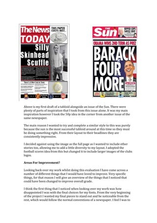
For this project I was set the task of creating a number of different pieces of
media. A Front covers for a tabloid, broadsheet and a double page spread for a
fanzine. While creating these products I had to research and reference large
amounts of pre existing media products this allowed me learn what was the
norm and acceptable things that I could then use for my own work. Using these
guidelines I set out creating my own pieces of work trying to be as creative as
possible creating a piece that looked like current products and one that was
different to current conventions. Using feedback from my tutors and my peers I
created my pieces of work and am happy with the result. In this evaluation I will
discuss a number of things such as the feedback that I received. How well I kept
to my time schedule and how creative I was with the final products that I
created.
Time Management
How well did you manage your time?
For this project I didn’t specifically set myself a very strict time schedule and
basically just went with the majority of the people in the class. We were set
deadlines for each piece of media and I stuck to those. I actually felt like I had
more time than I needed for the pieces. I put a lot of time into each of my first
drafts doing the correct research and trying to use existing media products to
influence my work.
After my first piece of work, in some cases I could use my template from my first
draft and edit it making my second drafts much quicker to produce. I tried to
change my second drafts significantly so that you could see the variety in my
abilities and show off the diversity of my ideas. The main reason for my massive
differences between my works was to allow a significant option for which one I
picked as my final piece. If I had created two pieces that were similar it would
have made choosing simpler as they would have been similar.
I felt so comfortable with the time scale that I was given that I actually managed
to create extra pieces of work to give me a stronger chance of receiving a better
grade.
I felt that I allotted more of my time to creating my tabloid and my broadsheet
than I did to creating my fanzine, as I felt most comfortable creating a fanzine
having worked with similar things in the past. Tabloid and broadsheet are two
areas where I have little to no experience in creating so I felt that the research
and work that I had to put into those areas had to be a little more extensive than
for the fanzine.
Overall for one of the first times I can say that I’m happy with how I handled my
allotted time for this project. In the past I feel that I leave little bits unfinished or
I rush my work to ensure that I finish before the end of the schedule, this often
causes issues for me as I end up with bits of backlogged work or work that
doesn’t actually reflect my ability. This project was the opposite and I feel that I
have created three pieces that I can be proud of and was able to produce more
than the amount of work that I needed in the time that I was provided.
Reviewing Work In Progress
I feel that in this project I was quite good at reviewing my work as I was going
through it, which is the exact opposite of most of my other projects. I was
constantly attempting to compare my own work to existing products and making
changes to my work to improve it and keep it as professional as possible.
Whilst I did want my work to mirror already existing products I also had to
ensure that my work had enough of my own personal touch to show that I was
able to creatively use the tools that I was given to create a product that could
stand out from other pieces of media.
I feel that there were probably aspects of this that I could have done better but
overall I was happy with it, I feel that I had the time to make sure that I was
doing this properly as I was managing my time well through the project.
I also pursued and obtained feedback from my tutors and those around me
which allowed me to make slight tweaks to aspects of my work which meant that
I could create the best piece of work that I possibly could.
I think that the best example of this was with my fanzine. Due to the freedom
that is given with a fanzine project I felt that I could constantly change the pieces
of work that I was creating as I felt fit. I started out with a basic idea but the flat
plans that I had for the fanzine went out of the window when I actually started to
create it. I realised quickly that there really was no set guideline for this style.
The first thing that I thought about was how creative I could get with it which is
what led to my first draft showing a chalkboard with a chalk style font on it.
Covered in little British things like the union jack, queen’s head and tea. The way
that I placed the text on the page wasn’t traditional either as it went in a diagonal
style as opposed to being straight across. This was a big change from what my
original plan was and I was constantly editing and adding bits onto the work as I
was going.
Technical Competencies
This project was my first real experience using the InDesign program. At first I
was very wary as in the past I have done everything to do with the course
through things like PowerPoint. After a brief lesson covering the basic features of
InDesign I was excited to attempt to get to grips with the possibilities that the
program offered.
I feel that I picked up the technical side of things very quickly and was able to
competently use the program to a suitable level within a few hours. It was at that
point that I began experimenting with text and image placement.
By the time we had actually moved onto doing the projects I was relatively
comfortable with the program and was excited to see what I could create using
the features that were provided. The things that I think were really useful on
there was the ability to be able to create an image box of differing sizes to add
your pictures accurately to the piece of work that you were creating. The ability
to add a grid over your work with the amount of columns and rows that you
decide means that each piece of work can be completely different. You can even
change the grids mid way through to allow your work to be completely creative.
The other great thing about InDesign is the text box creation tool, which allows
you to create a number of text boxes on the page and then easily drag text from
box to box allowing great consistency and flow between columns.
These features proved most helpful when creating my tabloid and my
broadsheet front pages. The use of the image boxes and text boxes together
meant that I could creatively place things around the page and experiment with
numerous different page layouts before settling on the ones that I did.
The ability to place a text box over an image box meant that I could easily create
large images and layer text for headlines of the newspapers. This allowed me
again to experiment with a number of different things with placements and
layering.
I think that the images that I used were of a good quality, any time I found one
which wasn’t of an acceptable quality I looked down other avenues to try and
replace it as quickly as possible. There may be a couple of images that were left
in the final pieces of work that were slightly warped or distorted but that was
due to the slight changes I have made to my work. If I have enough time I may try
to fix those issues, sadly the subculture I wrote about had very few suitable
images of a suitable size so a lot of it was left up to me to try and fix size related
issues. This may have lead to some warping in images that were used however I
tried to do that as infrequently as possible.
I feel that overall to say it was my first time really using the program that I got to
grips with it quite quickly and managed to achieve a good level of work from it.
There were times when certain things were confusing but with a little guidance I
quickly got myself back on track. I enjoyed using the new program as its now
something that I can take with me in the future and will be able to use it with
little trouble for certain projects.
Creative Abilities
I really enjoyed the fanzine element of the project, as it really was the first piece
of the project that allowed almost full creative control. Whilst this was a good
thing it was also a bad thing. For the tabloid and the broadsheet there were
already some conventions that were basically set out that I should have been
trying to mimic and stick to, to ensure that the work came out looking like it was
at a professional standard.
The fanzine however is exactly what it says it is an article written by a fan of the
topic of the magazine, this means that it can be written as that person wants. It
can be as formal or informal as you like, involve slang words and get away with
words and images that would not be allowed in mainstream media.
This was the main problem for me I feel, I had too many conflicting ideas and it
took a while for me to actually settle down on one idea. I went through many
different starting points before deciding that I wanted to put my first draft up on
a chalkboard style double page spread. This idea came to me as my fanzine
article was written as a lesson in skinhead fashion. I got the pages setup and then
had to decide how I best wanted to layout my text and images.
I felt that the best way was to go against the regular convention of columns and
experiment with different ways of displaying my text. I decided to fill the top
right and bottom left corners with examples of good and bad skinhead fashion. I
started the text in the top left and finished it down in the bottom right of the
page. I wanted it to feel as if the entire thing were kind of sporadic like a school
chalkboard would be, I even included a few chalkboard drawings that I managed
to find dotted around the edges to fill gaps.
I was very happy with the chalkboard design and how it all turned out and
enjoyed having total creative control over the project, it let me use my own ideas
with no restraints and come out with the best piece of work that I could possibly
create.
The other designs that I came up with for my fanzine I wasn’t as pleased with
however I wanted to get more drafts done to give me more to talk about in my
evaluation. My second design I originally set out to look like an old school gig
poster but that idea was changed when I couldn’t actually think of ways to make
it look the way that I wanted it to.
Instead I changed it round but a wanted sign on the front page and used a font
that I felt was suitable for a skinhead magazine. I wanted something that
reflected the edgy, rough and tough lifestyle that skinheads in their prime time
used to have. I settled on a couple of different ones after some changing around
whilst working.
Overall I wasn’t as happy with the second draft as I was with the first draft
however I still thought that it was a credible piece of work which showed
creativity and my ability of working within a new program and combining my
previous talents in Photoshop and transferring them over to InDesign.
Finished Product
To what extent have your intentions been realised?
I feel that overall I managed to achieve what I wanted to however it wasn’t a very
easy task. I feel I had a mountain of difficult things to overcome such as using
new programs and features and actually putting my creative ideas down onto the
program.
The tabloid and the broadsheet were definitely the two that I felt most
comfortable with as in a way it was kind of mimicking a style that had already
been set out by others, not directly but there were some guidelines that you kind
of had to stick to. This made it easier as it kind of restricted the amount of ideas
that you could have making it quicker and easier to make a final decision.
You can easily tell which is the broadsheet and which is the tabloid just from the
layout of the pages. Again you can tell the difference between the drafts just
because of the way they are laid out but would still be able to tell whether they
are a tabloid paper or a broadsheet.
One way to see that I achieved what I wanted in some cases is to see the
similarity between the layout design that I had before hand and whether or not I
used it for the finished product. In this case its almost perfect with only slight
variations. The layout I created was based on an idea I had seen in a local paper
in the past. I wanted to try and mimic something from current commercial
practice in the hopes that the layout would look professional.
As you can see here, the masthead is in the correct place however I reduced the
size slightly so that I could fit an “Editors Picks” bar on there to showcase some
other stories and to be able to add some colours. Column one and the related
image correct, instead of adding the second column I decided to add another
story on the right hand side of the page. This meant that I could fit more content
on and keep the newspaper looking as professional as I could. Everything else is
the same as the layout. There were a couple of finished products which looked
nothing like the layout however with a task like this I don’t think the correct way
of doing things is to restrict yourself to the layouts you pre create. Having the
freedom to be able to change as you go allowed me to come up with much more
creative ideas, which was what I enjoyed most about this project.
Appropriateness Of Your Work For The Audience
Overall, I am very happy with the work that I created and how professional the
final pieces appear to be. My main intention with this project was to ensure that
the pieces looked like they could already be out and stocked on the shelves. I
tried to provide a final piece that reflected the guidelines that most newspapers
follow but still had my own personal twist to it.
Each of my final pieces had a very different kind of audience, after doing some
research I have found out that the different kinds of newspapers have very
different readership figures.
These figures were taken from The Guardian’s official website and give some
insight into the people who read the broadsheet newspaper.
These figures show that the majority of readers of the guardian are in the upper
band of the NRS Social grades (ABC1) and that the majority of the readers are
over the age of 65. The readers are primarily female and that 42% of their
readers are working full time.
This means that the newspaper will primarily target these people and that these
are the type of people that I should be targeting with my broadsheet. With a
target audience like this there will be a very specific way of speaking. It will
likely be very formal and informative. Stories will be put across in different ways
based on the newspaper you are reading. Using my own story as an example,
some broadsheets would take the story about skinhead violence and would talk
about it in great detail and would explore all the reasoning behind the violence,
all the possible consequences that could come from it and why the things that
are happening are happening. A more right wing newspaper may however just
write about the story discuss that the skinheads are thugs and paint all
skinheads in a terrible light for the sake of their story.
When I originally wrote my article I wrote it for a broadsheet so I didn’t really
need to edit it at all to use it for the broadsheet. I did however have to edit
certain parts of it when using it for my tabloid. This is due to the difference in
writing styles and style layouts of Tabloids vs. Broadsheets.
The sun was my main inspiration when looking at style ideas for my tabloid
newspaper, the way that they layout their page was the most appealing for me
and left me with the most room for my own creativity within it.
Here are some statistics about the sun newspaper, not laid out in the same way
that the details for the broadsheet was but they primarily cover the same thing!
“The Sun reaches 7.3m readers, more than any other UK newspaper
and delivers a daily multiplatform audience of over 8.8m people across
its print and online titles1
It has an average daily circulation of over 2.5m and is the most popular
daily newspaper in the UK, selling more copies than The Daily Mirror,
The Daily Star and The Daily Express combined2
The Sun reaches over 2.6m ABC1 readers3
The Sun reaches more males under 35 than The Daily Mail, Daily
Mirror and Daily Star combined and is read by 1.3 million female
shoppers with kids per day, more than any other newspaper3
A Sun reader spends £1 in every £7 spent on groceries4
There were over 26.5m visitors to the Sun website in September 2012
spending on average over 12 minutes browsing the site5 “
From this information we can see the dramatic difference between the two
different audiences. Even just the way that the sun approach their readership
profile cleverly writing things that are going to interest people (This information
was taken from The Sun’s Rate card for advertising) They instantly brag about
having the largest readership of any other UK newspaper and talk about how
appealing their newspaper would be to people looking to advertise to females
with kids. Even the use of kids instead of children shows the difference in writing
styles in comparison to a broadsheet.
The first major difference that you will notice is the massive difference in NRS
Social grade readers. The sun has 7.3 million readers and 2.6 million of those are
ABC1 grade. That means around about 28% of the readers are of that social
grade meaning the rest are in the lower half of C2DE this is a large difference
from the 54% of The Guardian readers who are from the ABC1 grade bracket.
The writing styles will be different, the tabloid papers get away with writing a lot
more informally and usually focus on an eye-catching title using things like puns
and alliterations to grab attention where as broadsheets are more likely to just
state a headline based around the story, a more no nonsense approach. For my
article there wasn’t actually that much to change.
For my Fanzine I had the freedom to write as I pleased as I was writing about
skinheads, which meant I could write in a style that people who appreciate the
culture would enjoy. This meant there was no need to change some of the slang
words I had used or have to write in a formal matter that upper class readers
would enjoy, the only people interested in the fanzine article would be those who
are interested in the skinheads.
Content, The Style and the skills you have used.
The content that I used was half my and half sourced from the Internet.
All the pieces of writing that I used for the project was created by me. This was
one of the first projects where I was actually able to use work that I had created
in the past in another project. This had both positive and negative effects.
On the positive sides, it was rewarding to be able to use my own work for this
and see it within another piece of work, especially such as a newspaper or a
fanzine. One of the main negatives that I took from this was how disappointed I
was in the piece of writing that I had actually created. I feel that even in the short
time since writing it that there are already large amounts of improving that I
could do to it. For the most part the writing was ok as I didn’t need an overly
long article to actually fill the space that was needed however it did make me
want to go back and improve so really overall the whole situation was positive.
See attached PowerPoint for more details on the new skills that I have learned
and how I used them.
Working with both tabloid and broadsheet newspapers I got to work with a large
variety of content and ways that things can be laid out.
For example with my tabloid I opted for a picture which took up the majority of
the front page, leaving only small sections for the other stories and a little box for
some text based around the image that I used for the main story. This was due to
the general conventions of other tabloids. As you can see from one of my draft
pieces I tried to closely mimic a popular tabloid “The Sun”
Above is my first draft of a tabloid alongside an issue of the Sun. There were
plenty of parts of inspiration that I took from this issue alone. It was my main
inspiration however I took the 50p idea in the corner from another issue of the
same newspaper.
The main reason I wanted to try and complete a similar style to this was purely
because the sun is the most successful tabloid around at this time so they must
be doing something right. From their layout to their headlines they are
consistently impressive.
I decided against using the image as the full page as I wanted to include other
stories too, allowing me to add a little diversity to my layout. I adopted the
football scores idea from this but changed it to include larger images of the clubs
logos.
Areas For Improvement?
Looking back over my work whilst doing this evaluation I have come across a
number of different things that I would have loved to improve. Very specific
things, for that reason I will give an overview of the things that I noticed that
could have been changed to improve overall grade.
I think the first thing that I noticed when looking over my work was how
disappointed I was with the final choices for my fonts. From the very beginning
of the project I wanted my final pieces to stand out and be noticeable from the
rest, which would follow the normal conventions of a newspaper. I feel I was to
similar to existing newspapers with my fonts. Whilst I realised quickly that I
couldn’t be quite as experimental with the fonts as I wanted to I still wanted to
attempt to push the boundaries which I don’t feel I have done with my work.
Secondly I feel like there are some of the images that were not as suitable as they
could have been. Some of the final images that I had decided on actually needed
to be warped to ensure that they fit correctly into the box that had been allocated
to them, this left some of the pictures looking stretched out. This definitely
wasn’t my intention but I felt surprisingly restricted by the images that were
available to me on the web, there were very few which actually stood out to me.
A final issue that I feel could have been improved was definitely the overall
layouts of both my tabloid and my broadsheet. Whilst I am happier with the
broadsheet than I was with the tabloid. I thought it would be the other way
around as I figured the tabloid would be more fun but I felt that the broadsheet
seemed to have stricter guidelines than the tabloid did which meant it was easier
to lock onto an idea and go through with it.
Whilst I am happy with the work that I produced I cant help but feel that the
work could look more professional, especially my tabloid, there are numerous
things that I look at and wish I could change. With all that being said I am proud
of the work that I have created especially since it was all done using a program
that I had no experience working with in the past. The project overall was one of
my favourite to do which was surprising as I thought I had little to no interest in
a project like this.

Evaluationfinal

  • 1.
    For this projectI was set the task of creating a number of different pieces of media. A Front covers for a tabloid, broadsheet and a double page spread for a fanzine. While creating these products I had to research and reference large amounts of pre existing media products this allowed me learn what was the norm and acceptable things that I could then use for my own work. Using these guidelines I set out creating my own pieces of work trying to be as creative as possible creating a piece that looked like current products and one that was different to current conventions. Using feedback from my tutors and my peers I created my pieces of work and am happy with the result. In this evaluation I will discuss a number of things such as the feedback that I received. How well I kept to my time schedule and how creative I was with the final products that I created. Time Management How well did you manage your time? For this project I didn’t specifically set myself a very strict time schedule and basically just went with the majority of the people in the class. We were set deadlines for each piece of media and I stuck to those. I actually felt like I had more time than I needed for the pieces. I put a lot of time into each of my first drafts doing the correct research and trying to use existing media products to influence my work. After my first piece of work, in some cases I could use my template from my first draft and edit it making my second drafts much quicker to produce. I tried to change my second drafts significantly so that you could see the variety in my abilities and show off the diversity of my ideas. The main reason for my massive differences between my works was to allow a significant option for which one I picked as my final piece. If I had created two pieces that were similar it would have made choosing simpler as they would have been similar. I felt so comfortable with the time scale that I was given that I actually managed to create extra pieces of work to give me a stronger chance of receiving a better grade. I felt that I allotted more of my time to creating my tabloid and my broadsheet than I did to creating my fanzine, as I felt most comfortable creating a fanzine having worked with similar things in the past. Tabloid and broadsheet are two areas where I have little to no experience in creating so I felt that the research and work that I had to put into those areas had to be a little more extensive than for the fanzine. Overall for one of the first times I can say that I’m happy with how I handled my allotted time for this project. In the past I feel that I leave little bits unfinished or I rush my work to ensure that I finish before the end of the schedule, this often causes issues for me as I end up with bits of backlogged work or work that doesn’t actually reflect my ability. This project was the opposite and I feel that I
  • 2.
    have created threepieces that I can be proud of and was able to produce more than the amount of work that I needed in the time that I was provided. Reviewing Work In Progress I feel that in this project I was quite good at reviewing my work as I was going through it, which is the exact opposite of most of my other projects. I was constantly attempting to compare my own work to existing products and making changes to my work to improve it and keep it as professional as possible. Whilst I did want my work to mirror already existing products I also had to ensure that my work had enough of my own personal touch to show that I was able to creatively use the tools that I was given to create a product that could stand out from other pieces of media. I feel that there were probably aspects of this that I could have done better but overall I was happy with it, I feel that I had the time to make sure that I was doing this properly as I was managing my time well through the project. I also pursued and obtained feedback from my tutors and those around me which allowed me to make slight tweaks to aspects of my work which meant that I could create the best piece of work that I possibly could. I think that the best example of this was with my fanzine. Due to the freedom that is given with a fanzine project I felt that I could constantly change the pieces of work that I was creating as I felt fit. I started out with a basic idea but the flat plans that I had for the fanzine went out of the window when I actually started to create it. I realised quickly that there really was no set guideline for this style. The first thing that I thought about was how creative I could get with it which is what led to my first draft showing a chalkboard with a chalk style font on it. Covered in little British things like the union jack, queen’s head and tea. The way that I placed the text on the page wasn’t traditional either as it went in a diagonal style as opposed to being straight across. This was a big change from what my original plan was and I was constantly editing and adding bits onto the work as I was going. Technical Competencies This project was my first real experience using the InDesign program. At first I was very wary as in the past I have done everything to do with the course through things like PowerPoint. After a brief lesson covering the basic features of InDesign I was excited to attempt to get to grips with the possibilities that the program offered. I feel that I picked up the technical side of things very quickly and was able to competently use the program to a suitable level within a few hours. It was at that point that I began experimenting with text and image placement.
  • 3.
    By the timewe had actually moved onto doing the projects I was relatively comfortable with the program and was excited to see what I could create using the features that were provided. The things that I think were really useful on there was the ability to be able to create an image box of differing sizes to add your pictures accurately to the piece of work that you were creating. The ability to add a grid over your work with the amount of columns and rows that you decide means that each piece of work can be completely different. You can even change the grids mid way through to allow your work to be completely creative. The other great thing about InDesign is the text box creation tool, which allows you to create a number of text boxes on the page and then easily drag text from box to box allowing great consistency and flow between columns. These features proved most helpful when creating my tabloid and my broadsheet front pages. The use of the image boxes and text boxes together meant that I could creatively place things around the page and experiment with numerous different page layouts before settling on the ones that I did. The ability to place a text box over an image box meant that I could easily create large images and layer text for headlines of the newspapers. This allowed me again to experiment with a number of different things with placements and layering. I think that the images that I used were of a good quality, any time I found one which wasn’t of an acceptable quality I looked down other avenues to try and replace it as quickly as possible. There may be a couple of images that were left in the final pieces of work that were slightly warped or distorted but that was due to the slight changes I have made to my work. If I have enough time I may try to fix those issues, sadly the subculture I wrote about had very few suitable images of a suitable size so a lot of it was left up to me to try and fix size related issues. This may have lead to some warping in images that were used however I tried to do that as infrequently as possible. I feel that overall to say it was my first time really using the program that I got to grips with it quite quickly and managed to achieve a good level of work from it. There were times when certain things were confusing but with a little guidance I quickly got myself back on track. I enjoyed using the new program as its now something that I can take with me in the future and will be able to use it with little trouble for certain projects. Creative Abilities I really enjoyed the fanzine element of the project, as it really was the first piece of the project that allowed almost full creative control. Whilst this was a good thing it was also a bad thing. For the tabloid and the broadsheet there were already some conventions that were basically set out that I should have been trying to mimic and stick to, to ensure that the work came out looking like it was at a professional standard.
  • 4.
    The fanzine howeveris exactly what it says it is an article written by a fan of the topic of the magazine, this means that it can be written as that person wants. It can be as formal or informal as you like, involve slang words and get away with words and images that would not be allowed in mainstream media. This was the main problem for me I feel, I had too many conflicting ideas and it took a while for me to actually settle down on one idea. I went through many different starting points before deciding that I wanted to put my first draft up on a chalkboard style double page spread. This idea came to me as my fanzine article was written as a lesson in skinhead fashion. I got the pages setup and then had to decide how I best wanted to layout my text and images. I felt that the best way was to go against the regular convention of columns and experiment with different ways of displaying my text. I decided to fill the top right and bottom left corners with examples of good and bad skinhead fashion. I started the text in the top left and finished it down in the bottom right of the page. I wanted it to feel as if the entire thing were kind of sporadic like a school chalkboard would be, I even included a few chalkboard drawings that I managed to find dotted around the edges to fill gaps. I was very happy with the chalkboard design and how it all turned out and enjoyed having total creative control over the project, it let me use my own ideas with no restraints and come out with the best piece of work that I could possibly create. The other designs that I came up with for my fanzine I wasn’t as pleased with however I wanted to get more drafts done to give me more to talk about in my evaluation. My second design I originally set out to look like an old school gig poster but that idea was changed when I couldn’t actually think of ways to make it look the way that I wanted it to. Instead I changed it round but a wanted sign on the front page and used a font that I felt was suitable for a skinhead magazine. I wanted something that reflected the edgy, rough and tough lifestyle that skinheads in their prime time used to have. I settled on a couple of different ones after some changing around whilst working. Overall I wasn’t as happy with the second draft as I was with the first draft however I still thought that it was a credible piece of work which showed creativity and my ability of working within a new program and combining my previous talents in Photoshop and transferring them over to InDesign. Finished Product To what extent have your intentions been realised? I feel that overall I managed to achieve what I wanted to however it wasn’t a very easy task. I feel I had a mountain of difficult things to overcome such as using new programs and features and actually putting my creative ideas down onto the program.
  • 5.
    The tabloid andthe broadsheet were definitely the two that I felt most comfortable with as in a way it was kind of mimicking a style that had already been set out by others, not directly but there were some guidelines that you kind of had to stick to. This made it easier as it kind of restricted the amount of ideas that you could have making it quicker and easier to make a final decision. You can easily tell which is the broadsheet and which is the tabloid just from the layout of the pages. Again you can tell the difference between the drafts just because of the way they are laid out but would still be able to tell whether they are a tabloid paper or a broadsheet. One way to see that I achieved what I wanted in some cases is to see the similarity between the layout design that I had before hand and whether or not I used it for the finished product. In this case its almost perfect with only slight variations. The layout I created was based on an idea I had seen in a local paper in the past. I wanted to try and mimic something from current commercial practice in the hopes that the layout would look professional. As you can see here, the masthead is in the correct place however I reduced the size slightly so that I could fit an “Editors Picks” bar on there to showcase some other stories and to be able to add some colours. Column one and the related image correct, instead of adding the second column I decided to add another story on the right hand side of the page. This meant that I could fit more content on and keep the newspaper looking as professional as I could. Everything else is the same as the layout. There were a couple of finished products which looked nothing like the layout however with a task like this I don’t think the correct way of doing things is to restrict yourself to the layouts you pre create. Having the freedom to be able to change as you go allowed me to come up with much more creative ideas, which was what I enjoyed most about this project.
  • 6.
    Appropriateness Of YourWork For The Audience Overall, I am very happy with the work that I created and how professional the final pieces appear to be. My main intention with this project was to ensure that the pieces looked like they could already be out and stocked on the shelves. I tried to provide a final piece that reflected the guidelines that most newspapers follow but still had my own personal twist to it. Each of my final pieces had a very different kind of audience, after doing some research I have found out that the different kinds of newspapers have very different readership figures. These figures were taken from The Guardian’s official website and give some insight into the people who read the broadsheet newspaper. These figures show that the majority of readers of the guardian are in the upper band of the NRS Social grades (ABC1) and that the majority of the readers are over the age of 65. The readers are primarily female and that 42% of their readers are working full time. This means that the newspaper will primarily target these people and that these are the type of people that I should be targeting with my broadsheet. With a target audience like this there will be a very specific way of speaking. It will likely be very formal and informative. Stories will be put across in different ways
  • 7.
    based on thenewspaper you are reading. Using my own story as an example, some broadsheets would take the story about skinhead violence and would talk about it in great detail and would explore all the reasoning behind the violence, all the possible consequences that could come from it and why the things that are happening are happening. A more right wing newspaper may however just write about the story discuss that the skinheads are thugs and paint all skinheads in a terrible light for the sake of their story. When I originally wrote my article I wrote it for a broadsheet so I didn’t really need to edit it at all to use it for the broadsheet. I did however have to edit certain parts of it when using it for my tabloid. This is due to the difference in writing styles and style layouts of Tabloids vs. Broadsheets. The sun was my main inspiration when looking at style ideas for my tabloid newspaper, the way that they layout their page was the most appealing for me and left me with the most room for my own creativity within it. Here are some statistics about the sun newspaper, not laid out in the same way that the details for the broadsheet was but they primarily cover the same thing! “The Sun reaches 7.3m readers, more than any other UK newspaper and delivers a daily multiplatform audience of over 8.8m people across its print and online titles1 It has an average daily circulation of over 2.5m and is the most popular daily newspaper in the UK, selling more copies than The Daily Mirror, The Daily Star and The Daily Express combined2 The Sun reaches over 2.6m ABC1 readers3 The Sun reaches more males under 35 than The Daily Mail, Daily Mirror and Daily Star combined and is read by 1.3 million female shoppers with kids per day, more than any other newspaper3 A Sun reader spends £1 in every £7 spent on groceries4 There were over 26.5m visitors to the Sun website in September 2012 spending on average over 12 minutes browsing the site5 “ From this information we can see the dramatic difference between the two different audiences. Even just the way that the sun approach their readership profile cleverly writing things that are going to interest people (This information was taken from The Sun’s Rate card for advertising) They instantly brag about having the largest readership of any other UK newspaper and talk about how appealing their newspaper would be to people looking to advertise to females with kids. Even the use of kids instead of children shows the difference in writing styles in comparison to a broadsheet. The first major difference that you will notice is the massive difference in NRS Social grade readers. The sun has 7.3 million readers and 2.6 million of those are ABC1 grade. That means around about 28% of the readers are of that social grade meaning the rest are in the lower half of C2DE this is a large difference from the 54% of The Guardian readers who are from the ABC1 grade bracket.
  • 8.
    The writing styleswill be different, the tabloid papers get away with writing a lot more informally and usually focus on an eye-catching title using things like puns and alliterations to grab attention where as broadsheets are more likely to just state a headline based around the story, a more no nonsense approach. For my article there wasn’t actually that much to change. For my Fanzine I had the freedom to write as I pleased as I was writing about skinheads, which meant I could write in a style that people who appreciate the culture would enjoy. This meant there was no need to change some of the slang words I had used or have to write in a formal matter that upper class readers would enjoy, the only people interested in the fanzine article would be those who are interested in the skinheads. Content, The Style and the skills you have used. The content that I used was half my and half sourced from the Internet. All the pieces of writing that I used for the project was created by me. This was one of the first projects where I was actually able to use work that I had created in the past in another project. This had both positive and negative effects. On the positive sides, it was rewarding to be able to use my own work for this and see it within another piece of work, especially such as a newspaper or a fanzine. One of the main negatives that I took from this was how disappointed I was in the piece of writing that I had actually created. I feel that even in the short time since writing it that there are already large amounts of improving that I could do to it. For the most part the writing was ok as I didn’t need an overly long article to actually fill the space that was needed however it did make me want to go back and improve so really overall the whole situation was positive. See attached PowerPoint for more details on the new skills that I have learned and how I used them. Working with both tabloid and broadsheet newspapers I got to work with a large variety of content and ways that things can be laid out. For example with my tabloid I opted for a picture which took up the majority of the front page, leaving only small sections for the other stories and a little box for some text based around the image that I used for the main story. This was due to the general conventions of other tabloids. As you can see from one of my draft pieces I tried to closely mimic a popular tabloid “The Sun”
  • 9.
    Above is myfirst draft of a tabloid alongside an issue of the Sun. There were plenty of parts of inspiration that I took from this issue alone. It was my main inspiration however I took the 50p idea in the corner from another issue of the same newspaper. The main reason I wanted to try and complete a similar style to this was purely because the sun is the most successful tabloid around at this time so they must be doing something right. From their layout to their headlines they are consistently impressive. I decided against using the image as the full page as I wanted to include other stories too, allowing me to add a little diversity to my layout. I adopted the football scores idea from this but changed it to include larger images of the clubs logos. Areas For Improvement? Looking back over my work whilst doing this evaluation I have come across a number of different things that I would have loved to improve. Very specific things, for that reason I will give an overview of the things that I noticed that could have been changed to improve overall grade. I think the first thing that I noticed when looking over my work was how disappointed I was with the final choices for my fonts. From the very beginning of the project I wanted my final pieces to stand out and be noticeable from the rest, which would follow the normal conventions of a newspaper. I feel I was to
  • 10.
    similar to existingnewspapers with my fonts. Whilst I realised quickly that I couldn’t be quite as experimental with the fonts as I wanted to I still wanted to attempt to push the boundaries which I don’t feel I have done with my work. Secondly I feel like there are some of the images that were not as suitable as they could have been. Some of the final images that I had decided on actually needed to be warped to ensure that they fit correctly into the box that had been allocated to them, this left some of the pictures looking stretched out. This definitely wasn’t my intention but I felt surprisingly restricted by the images that were available to me on the web, there were very few which actually stood out to me. A final issue that I feel could have been improved was definitely the overall layouts of both my tabloid and my broadsheet. Whilst I am happier with the broadsheet than I was with the tabloid. I thought it would be the other way around as I figured the tabloid would be more fun but I felt that the broadsheet seemed to have stricter guidelines than the tabloid did which meant it was easier to lock onto an idea and go through with it. Whilst I am happy with the work that I produced I cant help but feel that the work could look more professional, especially my tabloid, there are numerous things that I look at and wish I could change. With all that being said I am proud of the work that I have created especially since it was all done using a program that I had no experience working with in the past. The project overall was one of my favourite to do which was surprising as I thought I had little to no interest in a project like this.