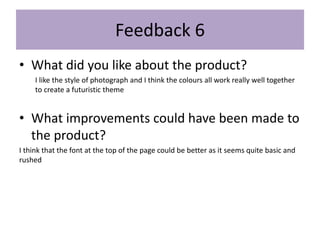
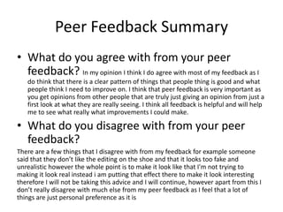
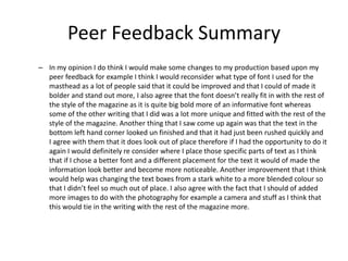
Evaluation
Your name
Production Process Evaluation
Research
I started of research by deciding what I was going to do for each of the different subject
inside the research PowerPoint and I decided to complete an interview for my primary
research , a survey for my secondary research , a biography of an existing photographer
for my subject research and the an experimentation for my practical research. Initially I
found research hard as it is a lot more work than the other PowerPoints, I started off by
creating my survey using surveymonkey.com and I found this really easy and helpful to use
as it lets you pick a layout for what style of survey you wanted to create and then it gave
you different types of answers that you wanted to allow the reader to give for example I
wrote a question asking about age and it came up with a tick box question and it predicts
what type of answer you are looking for which I found really helpful. To create the perfect
survey questions I decided to write out loads of questions then decide which ones would
give me the most beneficial answers. I think the survey worked well however I still think
that there is always room for improvements for example my last question at the time
seemed great until I got the answers back and I really thought about it and it was the
question about if they would prefer a male or female on the front cover however I got a
range of answers because it really is personal preference therefore I would definitely
rethink these types of questions again and swap them for a more specific question. I also
would expand some of the questions and give them abit more context as some answers
are saying depends what style magazine whereas if I had explained this in the question it
would of meant that they would have been able to give a more detailed and specific
answer leaving me with better feedback. For my primary research I created an interview I
thought that by doing this I could ask more specific and detailed questions that you cant
really ask in a survey therefore I didn’t want to ask too many questions so I only used 4
good ones in the end, however saying this I think doing more would of just become more
time consuming for me and the interviewees. To decide what questions I wanted to ask I
made a list and compare what questions I think would actually benefit my work and would
actually make a difference.
• When I had come to a good set of 4 questions I decided to choose my interviewees and at first I wanted to
ask a similar group of people as I thought then I would get a set of solid answers however I don’t just want
a single group to buy my magazine I want it to be able to be read and bought by anyone therefore this
lead me to the decision to ask a group of different people so that I could get a set of different answers
from different types of people that would be buying my magazine therefore I decided to ask someone who
is very much interested in the art and photography world, someone who enjoys writing and literature and
someone who likes the technicalities of photography as I still think that these are similar types of people
however it will give me types of diversity in my work and really show me maybe parts that only 1 select
person really knowns about. To create my interview I simply asked them via email which definitely wasn’t
the most professional idea but because it was just a simple question and answer structure I didn’t really
think that it mattered too much. Overall I think that my interview worked well and gave me a good set of
answers that really helped develop my work and make it appeal to many different audiences. For my
subject research I decided to research about a famous photographer who was interested in the same
medium as me as I thought this would be helpful to get some inspiration for when it comes to writing a
biography myself for my own magazine. I decided to research about Annie Leibovitz as since I got into
photography I have seen a lot of her work around and in a few galleries. I used many different resources to
do my research however the main one was using YouTube where I found lots of interviews with her and I
found this very helpful as I knew that it is more likely to be trust worthy coming for her saying it herself. I
found out a lot out her background and her photography career and plans she had for the future I also
analysed a very iconic and well known photo that she took of Kendrick Lamar and this gave me a lot of
inspiration for my own magazine and her photos are very unique and gave me a lot of new ideas which I
think worked well as you can really see that this section of the research helped me to get in the spirit for
when it came to writing like a photographer, however I think I could of maybe researched multiple
different famous photographers so that it would give me more inspiration about what I wanted to do and
how to write a good realistic biography myself rather than just looking at one. For my last section of
research I decided to try to have a good at slow exposure photography as I have seen a lot of big
photographers using this and talking about it a lot but I have never got round to trying it myself, I really
took this opportunity to experiment with different camera settings and try new things out with the
photography and editing, although I think that doing this has gained me more knowledge of different
photography styles I kind of wish that I really went extreme and did something completely different as I
think I still played it safe therefore my work seems all very basic and similar and I wish I took this
opportunity to have a go with maybe different types of cameras or backgrounds.
Planning
For my planning I completed two different PowerPoints that I think you could class as
planning as they helped to plan towards my final production, I completed an initial
plans PowerPoint which consists of many different things ranging from mind
maps/existing products and target audiences I also completed the pre-production
PowerPoint which included fonts/colours/patterns and layouts, overall I think both
these PowerPoints and research had a big impact on my final production as I think
that the planning really comes out in my work and you can see how different things
have been developed. In terms on helping my final production I think that the main
influence that my production had from the planning was definitely the pre production
as I really chose all the layouts, fonts and colour schemes as these really made it a lot
easier when it came to the production to just go in and use my pre production
PowerPoint to help guide me what I picked earlier, I think this also helped as it meant
that I kept a nice well thought out theme as I couldn’t really change it as it was
already planned out. I think a clear weakness of my planning was definitely the
attention to detail as looking back I thought I had everything planned however as
soon as something had to change I was very unprepared for example throughout my
planning I talked about going to the beach and I really planned the shoot down to a
tea however on the day of the shoot I had planned the weather was awful and it was
pouring rain and foggy meaning that I couldn’t really get the photos I wanted and had
to improvise however I still think I tried to make it work but I think in the future I need
to make several different approach's as things aren’t always going to run smoothly
from planning. In the future I think I will definitely take more time and consideration
into the planning as in my opinion it is one of the most important parts of any type of
production therefore if I had the opportunity to do this again I would make sure to
keep up to date as well as put in as much work as possible into the planning as I think
a well planned out product realty shows and you can really tell the difference
whether something has been planned effectively.
Planning
• . I decided to write up all my magazine text before hand as it would of saved me a
lot of time however I found out that I really wanted to change my writing to make
it fi t in more with the magazine for example prior to making the front cover I
wrote out all the words and sentences that I was going to put on magazine front
cover however when it came to it I decided i didn’t like the look of the words as I
hadn’t really trailed runed the words to see how they actually looked on the page
therefore I decided to change what words and sentences I was going to put on my
magazine when I was doing my production therefore this was a big weakness of
my planning as even though planned the words I hadn’t actually trailed them out
and compared the look and style of them on my magazine cover. In my opinion I
think that I could of spent a lot more time on the planning as it is one of the most
important parts and even though plan a lot of sections I don’t think I really stuck to
it and certain things changed that I didn’t plan very well. If I had the opportunity to
do this again I would definitely plan certain things in more detail foe example the
location and shoot props I would really go in depth so that when it came to the
shoot I would be all set and ready for when it came to my shoot I would be even
more prepared and this would definitely benefit my production.
Time Management
• In my opinion I do not think that I managed my time well at all. Starting from the beginning of the project I initially
started off managing my time well however I became very focused on just the production itself which meant that I
started to fall very behind on written work quickly and began to have to rush it. I think from first appearances you
can really start to tell that I fell behind and really had to rush certain parts and I defiantly think that all of my work
would of improved with additional time. Going into initial plans I was really excited and put a lot of effort and time
however as the PowerPoints went on I really didn’t get to do my best work in them, I think especially with the
pressure of the fact that this is out FMP didn’t help alongside everything. In my production although I did spend
the most time I do think that in the end I still had to rush it as I was more concerned about just getting everything
really done that taking my time and putting in s much effort as possible, and I think that this really shows. I started
to become more concerned of the idea that this was my FMP therefore when it came to the production I would
finish something and I just wouldn’t be happy with it and I would make myself start all over again. If I did get the
opportunity to get more time I would definitely focus more on the planning parts of my project as well as the
actual production. I would of liked to think as we have completed many other projects on time scales that by this
one I would of just tried to keep up to date however I ran into many different issues that I just didn’t think about
for example when I wanted to do my photography shoot and after I had planned the days my model had something
come up and then we had to leave it another week and although I tried to do a lot of other things in the mean time
while waiting until I had the photographs, it still makes a big difference as you cant 100% confirm what images you
are going to get so I had to try and keep an open mind when I was doing other production work, another problem
that I ran into was that 3 weeks before we had to finish the FMP project I lost my memory pen, with my research
PowerPoint on which set me back quite far especially as I was already quite behind, however I did try to catch up
as soon as possible. I think that I really need to work on my time management in the future as it plays a big role not
only now but in the working world and I do feel the conciseness' of not keeping up to work with good time
management.
Technical QualitiesIn both my magazine and the existing one we have
both used big bold mastheads that are behind the
model making it look like the model is actually in
front of the masthead
A difference between my work and
the already existing work is that here
they have used writing at a different
angle and I think that this works well
whereas in my work all the writing is
facing the same way
We have both used a model sitting
down and facing towards the
camera, making the reader feel that
the magazine is more personal
In this magazine they have put
blocks of writing down the side of
the page however in mine I have
only really got the writing down at
the bottom of the page
Here they have used a barcode
and played it slanted which ties
in well with the writing near the
masthead which is also slanted
In this magazine they have
added a white box for the
text whereas on my work I
just put it on top of the image
In both magazines we have used the
bottom left hand corner of the masthead
to place a small line of information,
making the reader feel that this is less
important
I have decided to add a theme of
the colour into the masthead and
other parts of the magazine
however in the existing magazine
they have just kept the suit as the
one source of colour and kept
everything else quite minimalist
A similarity of both the
magazines is that we
both have used a
grey/white background
where you can see the
shadow from the model,
this keeps the
background very
minimalist for the colour
to be the main focus
In both magazines
there is a similar
colour scheme of
black,whites and
greys with a bold
pop of colour on
the model
I have used a very basic
and dark font to blend in
whereas all the writing
on the other magazine is
in a bold white
From this we can tell that there are actually quite a lot of similarities between my work and the already existing work with a few minor differences however I
think that main similarity that they share is definitely the way that the model is positioned, sat down to a slant facing the camera and I think this is because
this works well and really address the reader more. Another common theme is the colour scheme as they both are using a very monochromatic theme that
seems very clean, simple and mature but with just one pop of colour which really gives the magazine a continues theme and works well against the black and
white theme. The main difference is probably just the amount of writing that the existing product has on it compared to my work which only has 3 sentences
at the bottom of the page, I think that the sub headers of the magazine work really well as they really grab your attention and are laid out well.
Technical QualitiesIn both these magazines we
have used a bold masthead on
one of the pages of the double
page spread, this draws a lot of
attention to the words,
especially as they are bold
names that could be
recognized by fans
A similarity in both is that we
have both used a white
border/text box around the
text to make it easier to read.
In this existing product
they have used a range
of different colours that
aren’t that bright or pop
out too much
A difference here is that the existing
magazine they have used columns but
put headliners in the middle and wrote
columns of writing around it.
Here the model is sitting down
facing the camera, using direct eye
contact that I think works well with
the fact that it is just one large
photo with the other page with
writing
A difference between my work
and the already existing product
is that my background is a very
edited photo whereas they have
used a very basic white back
drop, I think that they are both
different styles therefore they
are wanting different background
colours
A difference between them is that in the writing in
the existing product they have used larger bolder
letters at the beginning of the sentences and this
breaks the writing up so that it is easier to read
The model in my magazine is
very edited and very unrealistic
whereas in the existing product
they haven’t edited it too much
and kept it very simple
The layout in both
magazines is very
similar in the fact
that they both have
a main image on
one page and the
writing on the other
which separates the
pages up
There are quite a lot of differences in each of these magazines however they are set out to be different style magazines therefore there is going to be
obvious differences for example my background and editing is very strong and bold whereas in the existing one they have just edited the person very
naturally, I think that this is because normally magazines don’t use overly edited photos however my magazine is specific for that. A similarity of my
work and the existing one is the layout is very similar as we both have a main focus image on one page and the large bold name/masthead on the other
with the rest of the writing on. I think that this works well as it separates all my work up and makes it easier on the readers eye.
Technical QualitiesA difference between these two double
page spreads is that mine has a large bold
header/masthead at the top of the image
and I think that this could take some
attention away from the actual image in
the existing product.
In my work I have used
a model which ties in a
human whereas in the
magazine they haven’t
used any people and
have just used one
photo
I used many different
photos to mix up from
just one main image
however in the existing
product they have just
kept the one main image
the focus
They have used a small
masthead to keep the
main focus on the image
A similarity that we both
have used is that we
have both got a border
around the image to
separate it up from the
page
There are so many different similarities and differences from my work and the already existing products and I think that they are different
styles of images and magazines however a similarity is that we have both used a border around the image to separate the image from the
edge of the page I think that it looks good as in the existing one they have used a small white border however for my work I have used a
pattern that I made myself. A difference between my work and the existing product is that I have made the masthead and the writing quite
large and bold whereas in the existing product they have used a small box masthead to keep the majority of the focus on the actual image
itself, they have only put text and information around the edge of the magazine to keep the middle just focused purely on the image itself.
Aesthetic Qualities
In my opinion I think that my work does look good and does look creative however I do think there is a lot of room for
improvements. I think that visually the magazine cover looks simple but interesting, I really like how I have tied the one colour into
lots of different parts of the magazine as well as the rest of the magazine there is a clear theme when it comes to the editing of it
and I think that this works well as I think you can tell that they all link in together. The different fonts that I used I think work well
especially the name on the front as it is very different to all the other fonts which makes it stand out more and makes it more
diverse, I would of liked to do more with the writing down in the left hand corner however I think that the positioning is good as it
tells the reader that it is information but it isn’t vitally important as it isn’t that bold and clear however still readable and still blends
in well with the rest of the magazine. I think that a strong visual aspect is the actual front cover image itself as the way that the
model is sitting really draws the reader in as well as the fact that I don’t see a lot of magazines that get the shoes in and I think this
works well in all the different angle positions for example there is quite a lot of triangle shapes around the model and this breaks
up from just having a straight sat down picture. For the first double page spread again I like the fact that the colour scheme still
runs through the magazine however here I have used a more basic picture with quite a lot of editing. If I were to redo this I would
definitely tone down the editing on the model as I think overall it is just too much for a double page spread especially. I think all the
drop shadows and strokes I have added to the text boxes and fonts works well as it makes it clear to read while adding in a subtle
pop of colour especially in the masthead. For my third double page spread I really enjoy the images that are here and the way that I
have edited them and I think it is an interesting image with a lot going on, a big factor that I really like is the background which I
made as I think it is creative and I don’t usually see a lot of magazines using patterns as backgrounds but I think it works well with
the nature theme. I also enjoy the smaller pictures down the side of the image as I think that it gives it something extra to look at
while trying not to take too much attention away from the main big image. For my last double page spread I am not a big fan of the
way that this turned out as in my opinion I just think it looks boring and abit pointless, If I had extra time I would definitely have a
go at maybe adding in some more pictures or just trying something different with the text as I just don’t think it looks very pleasing
to look at and I think it looks rushed and unprofessional. If I did get the opportunity to improve my production I would focus mostly
on the writing double page spread to try and make it look better and just overall try add somethings special into it , I would like to
try to separate the writing so that they have different headers and into better columns that make the reader actually want to read
it. Overall I think my work looks aesthically pleasing and does have a creative and unique approach however there is always room
for improvement.
Aesthetic QualitiesBig, bold masthead with an
overlay of colour seeping
through, a consistent colour
theme throughout
A bright
clear
backgrou
nd that
doesn’t
take
attention
away
from the
main
image
A unique
iridescent
pop of
colour that
looks
creative
and
interesting
Small writing that is very
minimalist and out of the
way
The background has a blurry iridescent
edit on the trees, which gives of a theme
of a halogenic, futuristic appeal which I
think appeals to my audience
Model has a broken edit effect with lots
of different dark and light lines, which
looks like a broken screen edit
Have used a white text box behind the
black writing which makes it clearer and
easier to read, I also used columns to
separate the text
A green drop shadow behind the masthead which ties
it in from the colour in the nature, this also makes it
stand out more
A lot of different small images that
give the reader more to look at, this
also keeps in the theme as they are all
the same types of photos.
A patterned background has been used as
the border around the outside of the images
and this breaks up the images to give the
reader more to look at
Bold spaced out sentence that draws the readers
attention to make them look at that and then the
image below, the writing meets the size of the
image which makes it a part of the picture
Simplistic font and
bold writing that
draws readers
attention
Bold white text boxes
that breaks up the text
and makes it easier to
read and breaks up from
the picture
Keeping the theme with the holographic/purple
effect on the background image with nature,
looks blurry and almost like the person is seeing
things that aren’t there.
Audience Appeal
In my opinion I think that I appealed my work to my audience well and used things from my planning and research to help
me do so, starting with my magazine front cover I think that the colour scheme works well for my target audience of 16-
21year old's as it is monochromatic but with a consistent theme of colour popping through and from my research I know
that my teenage audience prefer a more simplistic look on a magazine so I think keeping it minimalist worked well and this
would appeal to my target audience. I think that the image and model relates more so towards my target audience as I did
use a model in this age range as I think them seeing someone that they could relate to age wise would make them more
comfortable buying the magazine rather than if I used an older person. I think that the clothes also play a big role as the
clothes are kept quite basic so that this wouldn’t be a reason for the buyer to not want to buy the magazine because they
don’t like the outfit however saying this I still think that the outfit works and could be classed as quite trendy with the high
end jumper and shoes on show. I think that the edit on the shoe is quite trendy and is very related to different genres of
music at the minute as a lot of big artists have unique picture and edits with this type of print, therefore I think that this
appeals to my audience more than if I just kept a simple edit. For my double page spread I think that I have appealed to my
target audience by making each page interesting and not just a blank page with writing one, I think using lots of images and
fonts has really helped me to appeal for example I think that my double page there is a lot going one which keeps the reader
interested and entertained but at the same time I don’t think there is too much going on as everything is related and in the
same category so it is all in the same theme, I like this as it means that there is a lot to look out without the reader feeling
overwhelmed. In my other double page spread I appealed to my audience by the model wearing on brand expensive clothes
however the t-shirt isn't fully showing which is a subtle way of showing the brand off, again I think clothing is a big part of
trying to appeal to an audience as it will make them feel that they are involved if they know the brand or have something
similar themselves. I also think that here I have appealed to my audience with the biography of the photographer as it isn’t
too long however it’s a decent amount of information and especially for people that are interested in the photography world
they are more likely to want to read it. Using a big bold masthead of a name makes the audience wonder who they are and
why they are featured in this magazine which makes them want to read the text.
Audience Appeal A unique background pattern that
could be related to arts and fine
details. The grey colour makes the
other bright colours pop more and
seem more unrealistic
Small similar photos that are relating
to the main image to give more
context. This suits younger audiences
as they prefer more images to look
at
Clear, bold writing that is easy to
read and is targeted towards my
audience more as they are more
likely to read something that is short
and simple
A similar age range model attracts my age
range more if they see someone that they can
relate with
Wide spread words and recognizable
names that would attract my age range
more as if they know the person they are
more likely to read something that they
know
big bold masthead that
draws people in more
as they will see the
bold names and are
more likely to read on
Long columns of writing with white text
boxes around the side as it makes it easier
and clearer to read, this will appeal to my
target audience as they are more likely to
read if it is easier to see
model looking straight
into the camera makes
the reader feel more
personal and as if it is
targeting them
Colour theme that
is a bold colour that
runs throughout
the whole magazine
cover and is a clear
theme
High brand
jumper
appeals to
the audience
as if they
know the
brand they
are more
likely to read
the
magazine
Holographic, blurry
coloured effect on the
shoes and this appeals
to my audience as it is
quite a unique look on
the shoes and works
well against the
monochromatic
background
High brand
top appeals
to the
audience as
if they know
the brand
they are
more likely
to read the
magazine
The effect on the model is a clear line
broken effect on the model, appeals to my
audience as is inspired by music artists
Peer
Feedback
Feedback 1
• What did you like about the product?
– I really like how the front cover has distinct colour choices that really pop off
the page. The person’s pose is dynamic, as opposed to just standing normally,
which could appear more interesting to the reader. The different fonts and
how they are layered against the model is really effective, as their colours
allow the simple design to be a lot more interesting.
– As for the double page spread, the effect used is really nice to look at, with an
almost retro feel to it. The large words draw the reader to the main focus
while the small paragraph stands out in its simplicity to the background.
• What improvements could have been made to the product?
– To improve, for the front cover I would perhaps make the words at the bottom
left a bit more prominent, whether that be making it larger or bolder, so it
could catch the reader’s eye more.
– For the double page spread, I may have included a the person holding a
camera, since the paragraph talks of Oliver’s photography skills so would give
the image a closer relationship to the description given. As for the description,
there are a few spelling mistakes, with things like commas and capital letters,
but also perhaps to make certain parts stand out to a reader, they could be
bolder or done in a different style to make the overall writing have a more
interesting look at a glance.
Feedback 2
• What did you like about the product?
– I like the continued use of the colour purple throughout both pieces it keeps them connected
and they look like they are found in the same or similar place
– The fonts on the title page work well together even though they are different
– The double page background is edited really well to and has a really nice pleasing colour
contrast to white and the green that shows up in their fits really well with the titles colour
– The purple added in the boys eyes on the front page fits in really well with the style.
• What improvements could have been made to the product?
• The font on the bottom on the title page looks a little out of place while all the
other fonts are straight forward
The one at the bottom is slanted witch to me doesn't look that athletically pleasing
The boy on the double page looks a bit to dark in contrast to all the white making him
stand out a bit to much.
The trainer on the front page looks a little fake I think if their where more shadings
added a darker tone of purple in some areas it would look more real
Feedback 3
• What did you like about the product?
– The purple and black colour scheme on the front cover looks really good, and I like how the
shoes and eyes of the person have these neon colours on them. Smaller details like the edition
number help to make the piece feel authentic. The monochrome person and background help
to focus the viewer’s eyes on the titles and, as mentioned before, the shoes and eyes. The
‘Exclusive Interview’ makes the magazine feel more real, and would work to intrigue the
reader to read further.
– The font and size of the ‘Oliver Jones’ text really makes it stand out and allows it to act as the
main attention grabber of the cover, as a real magazine would have it.
– I like how the purple tone is maintained on the inside page, making it feel like it belongs in the
same magazine as the cover. The white text helps to emphasise these colours whilst still
making the text stand out.
• What improvements could have been made to the product?
• The white text box on the inside page feels quite out of place. A way to possibly
improve this would be to incorporate images into this area. Additionally, some of
the text seems a bit cluttered with some words being forced to have hyphens
splitting them between two lines. Increasing the area that the text can cover or
moving some text to elsewhere on the page could help to fix this.
• What did you like about the product?
In my opinion I think that there is a really distinct colour theme that really shows up well against the
monochromatic background and edit on the image itself
I like the fonts that have been used especially the one in the middle of the page as it looks 3D and is coming of
the page, I also like the position of the text as it is right in the middle but it doesn’t take attention away from
the actual main image as well.
I think that the way that the model is sitting showing his shoes off works well and gives you something extra to
look at
• What improvements could have been made to
the product?
I think that some of the improvements that could be used is that the writing in the bottom left hand corner
could be bolder and positioned better and have more focus on it
I also think that there could be more advertising techniques and more information about what is actually inside
the magazine and what to expect as it isn’t very clear what the magazine is really about.
Feedback 4
• What did you like about the product?
I like the way all the colours match and the background is grey so it makes the vibrant
colours stand out
The font matches the style of the masthead matches the style of the magazine
• What improvements could have been made to
the product?
I think that the masthead font could be improved because I don’t think it fits the style
of magazine
Feedback 5
• What did you like about the product?
I like the style of photograph and I think the colours all work really well together
to create a futuristic theme
• What improvements could have been made to
the product?
I think that the font at the top of the page could be better as it seems quite basic and
rushed
Feedback 6
Peer Feedback Summary
• What do you agree with from your peer
feedback? In my opinion I think I do agree with most of my feedback as I
do think that there is a clear pattern of things that people thing is good and what
people think I need to improve on. I think that peer feedback is very important as
you get opinions from other people that are truly just giving an opinion from just a
first look at what they are really seeing. I think all feedback is helpful and will help
me to see what really what improvements I could make.
• What do you disagree with from your peer
feedback?
There are a few things that I disagree with from my feedback for example someone
said that they don’t like the editing on the shoe and that it looks too fake and
unrealistic however the whole point is to make it look like that I'm not trying to
making it look real instead i am putting that effect there to make it look interesting
therefore I will not be taking this advice and I will continue, however apart from this I
don’t really disagree with much else from my peer feedback as I feel that a lot of
things are just personal preference as it is
Peer Feedback Summary
– In my opinion I do think I would make some changes to my production based upon my
peer feedback for example I think I would reconsider what type of font I used for the
masthead as a lot of people said that it could be improved and that I could of made it
bolder and stand out more, I also agree that the font doesn’t really fit in with the rest of
the style of the magazine as it is quite big bold more of an informative font whereas
some of the other writing that I did was a lot more unique and fitted with the rest of the
style of the magazine. Another thing that I saw come up again was that the text in the
bottom left hand corner looked un finished and that it had just been rushed quickly and
I agree with them that it does look out of place therefore if I had the opportunity to do it
again I would definitely re consider where I place those specific parts of text as I think
that if I chose a better font and a different placement for the text it would of made the
information look better and become more noticeable. Another improvement that I think
would help was changing the text boxes from a stark white to a more blended colour so
that I didn’t feel so much out of place. I also agree with the fact that I should of added
more images to do with the photography for example a camera and stuff as I think that
this would tie in the writing with the rest of the magazine more.

5. evaluation(1) fin

  • 1.
  • 2.
  • 3.
    Research I started ofresearch by deciding what I was going to do for each of the different subject inside the research PowerPoint and I decided to complete an interview for my primary research , a survey for my secondary research , a biography of an existing photographer for my subject research and the an experimentation for my practical research. Initially I found research hard as it is a lot more work than the other PowerPoints, I started off by creating my survey using surveymonkey.com and I found this really easy and helpful to use as it lets you pick a layout for what style of survey you wanted to create and then it gave you different types of answers that you wanted to allow the reader to give for example I wrote a question asking about age and it came up with a tick box question and it predicts what type of answer you are looking for which I found really helpful. To create the perfect survey questions I decided to write out loads of questions then decide which ones would give me the most beneficial answers. I think the survey worked well however I still think that there is always room for improvements for example my last question at the time seemed great until I got the answers back and I really thought about it and it was the question about if they would prefer a male or female on the front cover however I got a range of answers because it really is personal preference therefore I would definitely rethink these types of questions again and swap them for a more specific question. I also would expand some of the questions and give them abit more context as some answers are saying depends what style magazine whereas if I had explained this in the question it would of meant that they would have been able to give a more detailed and specific answer leaving me with better feedback. For my primary research I created an interview I thought that by doing this I could ask more specific and detailed questions that you cant really ask in a survey therefore I didn’t want to ask too many questions so I only used 4 good ones in the end, however saying this I think doing more would of just become more time consuming for me and the interviewees. To decide what questions I wanted to ask I made a list and compare what questions I think would actually benefit my work and would actually make a difference.
  • 4.
    • When Ihad come to a good set of 4 questions I decided to choose my interviewees and at first I wanted to ask a similar group of people as I thought then I would get a set of solid answers however I don’t just want a single group to buy my magazine I want it to be able to be read and bought by anyone therefore this lead me to the decision to ask a group of different people so that I could get a set of different answers from different types of people that would be buying my magazine therefore I decided to ask someone who is very much interested in the art and photography world, someone who enjoys writing and literature and someone who likes the technicalities of photography as I still think that these are similar types of people however it will give me types of diversity in my work and really show me maybe parts that only 1 select person really knowns about. To create my interview I simply asked them via email which definitely wasn’t the most professional idea but because it was just a simple question and answer structure I didn’t really think that it mattered too much. Overall I think that my interview worked well and gave me a good set of answers that really helped develop my work and make it appeal to many different audiences. For my subject research I decided to research about a famous photographer who was interested in the same medium as me as I thought this would be helpful to get some inspiration for when it comes to writing a biography myself for my own magazine. I decided to research about Annie Leibovitz as since I got into photography I have seen a lot of her work around and in a few galleries. I used many different resources to do my research however the main one was using YouTube where I found lots of interviews with her and I found this very helpful as I knew that it is more likely to be trust worthy coming for her saying it herself. I found out a lot out her background and her photography career and plans she had for the future I also analysed a very iconic and well known photo that she took of Kendrick Lamar and this gave me a lot of inspiration for my own magazine and her photos are very unique and gave me a lot of new ideas which I think worked well as you can really see that this section of the research helped me to get in the spirit for when it came to writing like a photographer, however I think I could of maybe researched multiple different famous photographers so that it would give me more inspiration about what I wanted to do and how to write a good realistic biography myself rather than just looking at one. For my last section of research I decided to try to have a good at slow exposure photography as I have seen a lot of big photographers using this and talking about it a lot but I have never got round to trying it myself, I really took this opportunity to experiment with different camera settings and try new things out with the photography and editing, although I think that doing this has gained me more knowledge of different photography styles I kind of wish that I really went extreme and did something completely different as I think I still played it safe therefore my work seems all very basic and similar and I wish I took this opportunity to have a go with maybe different types of cameras or backgrounds.
  • 5.
    Planning For my planningI completed two different PowerPoints that I think you could class as planning as they helped to plan towards my final production, I completed an initial plans PowerPoint which consists of many different things ranging from mind maps/existing products and target audiences I also completed the pre-production PowerPoint which included fonts/colours/patterns and layouts, overall I think both these PowerPoints and research had a big impact on my final production as I think that the planning really comes out in my work and you can see how different things have been developed. In terms on helping my final production I think that the main influence that my production had from the planning was definitely the pre production as I really chose all the layouts, fonts and colour schemes as these really made it a lot easier when it came to the production to just go in and use my pre production PowerPoint to help guide me what I picked earlier, I think this also helped as it meant that I kept a nice well thought out theme as I couldn’t really change it as it was already planned out. I think a clear weakness of my planning was definitely the attention to detail as looking back I thought I had everything planned however as soon as something had to change I was very unprepared for example throughout my planning I talked about going to the beach and I really planned the shoot down to a tea however on the day of the shoot I had planned the weather was awful and it was pouring rain and foggy meaning that I couldn’t really get the photos I wanted and had to improvise however I still think I tried to make it work but I think in the future I need to make several different approach's as things aren’t always going to run smoothly from planning. In the future I think I will definitely take more time and consideration into the planning as in my opinion it is one of the most important parts of any type of production therefore if I had the opportunity to do this again I would make sure to keep up to date as well as put in as much work as possible into the planning as I think a well planned out product realty shows and you can really tell the difference whether something has been planned effectively.
  • 6.
    Planning • . Idecided to write up all my magazine text before hand as it would of saved me a lot of time however I found out that I really wanted to change my writing to make it fi t in more with the magazine for example prior to making the front cover I wrote out all the words and sentences that I was going to put on magazine front cover however when it came to it I decided i didn’t like the look of the words as I hadn’t really trailed runed the words to see how they actually looked on the page therefore I decided to change what words and sentences I was going to put on my magazine when I was doing my production therefore this was a big weakness of my planning as even though planned the words I hadn’t actually trailed them out and compared the look and style of them on my magazine cover. In my opinion I think that I could of spent a lot more time on the planning as it is one of the most important parts and even though plan a lot of sections I don’t think I really stuck to it and certain things changed that I didn’t plan very well. If I had the opportunity to do this again I would definitely plan certain things in more detail foe example the location and shoot props I would really go in depth so that when it came to the shoot I would be all set and ready for when it came to my shoot I would be even more prepared and this would definitely benefit my production.
  • 7.
    Time Management • Inmy opinion I do not think that I managed my time well at all. Starting from the beginning of the project I initially started off managing my time well however I became very focused on just the production itself which meant that I started to fall very behind on written work quickly and began to have to rush it. I think from first appearances you can really start to tell that I fell behind and really had to rush certain parts and I defiantly think that all of my work would of improved with additional time. Going into initial plans I was really excited and put a lot of effort and time however as the PowerPoints went on I really didn’t get to do my best work in them, I think especially with the pressure of the fact that this is out FMP didn’t help alongside everything. In my production although I did spend the most time I do think that in the end I still had to rush it as I was more concerned about just getting everything really done that taking my time and putting in s much effort as possible, and I think that this really shows. I started to become more concerned of the idea that this was my FMP therefore when it came to the production I would finish something and I just wouldn’t be happy with it and I would make myself start all over again. If I did get the opportunity to get more time I would definitely focus more on the planning parts of my project as well as the actual production. I would of liked to think as we have completed many other projects on time scales that by this one I would of just tried to keep up to date however I ran into many different issues that I just didn’t think about for example when I wanted to do my photography shoot and after I had planned the days my model had something come up and then we had to leave it another week and although I tried to do a lot of other things in the mean time while waiting until I had the photographs, it still makes a big difference as you cant 100% confirm what images you are going to get so I had to try and keep an open mind when I was doing other production work, another problem that I ran into was that 3 weeks before we had to finish the FMP project I lost my memory pen, with my research PowerPoint on which set me back quite far especially as I was already quite behind, however I did try to catch up as soon as possible. I think that I really need to work on my time management in the future as it plays a big role not only now but in the working world and I do feel the conciseness' of not keeping up to work with good time management.
  • 8.
    Technical QualitiesIn bothmy magazine and the existing one we have both used big bold mastheads that are behind the model making it look like the model is actually in front of the masthead A difference between my work and the already existing work is that here they have used writing at a different angle and I think that this works well whereas in my work all the writing is facing the same way We have both used a model sitting down and facing towards the camera, making the reader feel that the magazine is more personal In this magazine they have put blocks of writing down the side of the page however in mine I have only really got the writing down at the bottom of the page Here they have used a barcode and played it slanted which ties in well with the writing near the masthead which is also slanted In this magazine they have added a white box for the text whereas on my work I just put it on top of the image In both magazines we have used the bottom left hand corner of the masthead to place a small line of information, making the reader feel that this is less important I have decided to add a theme of the colour into the masthead and other parts of the magazine however in the existing magazine they have just kept the suit as the one source of colour and kept everything else quite minimalist A similarity of both the magazines is that we both have used a grey/white background where you can see the shadow from the model, this keeps the background very minimalist for the colour to be the main focus In both magazines there is a similar colour scheme of black,whites and greys with a bold pop of colour on the model I have used a very basic and dark font to blend in whereas all the writing on the other magazine is in a bold white From this we can tell that there are actually quite a lot of similarities between my work and the already existing work with a few minor differences however I think that main similarity that they share is definitely the way that the model is positioned, sat down to a slant facing the camera and I think this is because this works well and really address the reader more. Another common theme is the colour scheme as they both are using a very monochromatic theme that seems very clean, simple and mature but with just one pop of colour which really gives the magazine a continues theme and works well against the black and white theme. The main difference is probably just the amount of writing that the existing product has on it compared to my work which only has 3 sentences at the bottom of the page, I think that the sub headers of the magazine work really well as they really grab your attention and are laid out well.
  • 9.
    Technical QualitiesIn boththese magazines we have used a bold masthead on one of the pages of the double page spread, this draws a lot of attention to the words, especially as they are bold names that could be recognized by fans A similarity in both is that we have both used a white border/text box around the text to make it easier to read. In this existing product they have used a range of different colours that aren’t that bright or pop out too much A difference here is that the existing magazine they have used columns but put headliners in the middle and wrote columns of writing around it. Here the model is sitting down facing the camera, using direct eye contact that I think works well with the fact that it is just one large photo with the other page with writing A difference between my work and the already existing product is that my background is a very edited photo whereas they have used a very basic white back drop, I think that they are both different styles therefore they are wanting different background colours A difference between them is that in the writing in the existing product they have used larger bolder letters at the beginning of the sentences and this breaks the writing up so that it is easier to read The model in my magazine is very edited and very unrealistic whereas in the existing product they haven’t edited it too much and kept it very simple The layout in both magazines is very similar in the fact that they both have a main image on one page and the writing on the other which separates the pages up There are quite a lot of differences in each of these magazines however they are set out to be different style magazines therefore there is going to be obvious differences for example my background and editing is very strong and bold whereas in the existing one they have just edited the person very naturally, I think that this is because normally magazines don’t use overly edited photos however my magazine is specific for that. A similarity of my work and the existing one is the layout is very similar as we both have a main focus image on one page and the large bold name/masthead on the other with the rest of the writing on. I think that this works well as it separates all my work up and makes it easier on the readers eye.
  • 10.
    Technical QualitiesA differencebetween these two double page spreads is that mine has a large bold header/masthead at the top of the image and I think that this could take some attention away from the actual image in the existing product. In my work I have used a model which ties in a human whereas in the magazine they haven’t used any people and have just used one photo I used many different photos to mix up from just one main image however in the existing product they have just kept the one main image the focus They have used a small masthead to keep the main focus on the image A similarity that we both have used is that we have both got a border around the image to separate it up from the page There are so many different similarities and differences from my work and the already existing products and I think that they are different styles of images and magazines however a similarity is that we have both used a border around the image to separate the image from the edge of the page I think that it looks good as in the existing one they have used a small white border however for my work I have used a pattern that I made myself. A difference between my work and the existing product is that I have made the masthead and the writing quite large and bold whereas in the existing product they have used a small box masthead to keep the majority of the focus on the actual image itself, they have only put text and information around the edge of the magazine to keep the middle just focused purely on the image itself.
  • 11.
    Aesthetic Qualities In myopinion I think that my work does look good and does look creative however I do think there is a lot of room for improvements. I think that visually the magazine cover looks simple but interesting, I really like how I have tied the one colour into lots of different parts of the magazine as well as the rest of the magazine there is a clear theme when it comes to the editing of it and I think that this works well as I think you can tell that they all link in together. The different fonts that I used I think work well especially the name on the front as it is very different to all the other fonts which makes it stand out more and makes it more diverse, I would of liked to do more with the writing down in the left hand corner however I think that the positioning is good as it tells the reader that it is information but it isn’t vitally important as it isn’t that bold and clear however still readable and still blends in well with the rest of the magazine. I think that a strong visual aspect is the actual front cover image itself as the way that the model is sitting really draws the reader in as well as the fact that I don’t see a lot of magazines that get the shoes in and I think this works well in all the different angle positions for example there is quite a lot of triangle shapes around the model and this breaks up from just having a straight sat down picture. For the first double page spread again I like the fact that the colour scheme still runs through the magazine however here I have used a more basic picture with quite a lot of editing. If I were to redo this I would definitely tone down the editing on the model as I think overall it is just too much for a double page spread especially. I think all the drop shadows and strokes I have added to the text boxes and fonts works well as it makes it clear to read while adding in a subtle pop of colour especially in the masthead. For my third double page spread I really enjoy the images that are here and the way that I have edited them and I think it is an interesting image with a lot going on, a big factor that I really like is the background which I made as I think it is creative and I don’t usually see a lot of magazines using patterns as backgrounds but I think it works well with the nature theme. I also enjoy the smaller pictures down the side of the image as I think that it gives it something extra to look at while trying not to take too much attention away from the main big image. For my last double page spread I am not a big fan of the way that this turned out as in my opinion I just think it looks boring and abit pointless, If I had extra time I would definitely have a go at maybe adding in some more pictures or just trying something different with the text as I just don’t think it looks very pleasing to look at and I think it looks rushed and unprofessional. If I did get the opportunity to improve my production I would focus mostly on the writing double page spread to try and make it look better and just overall try add somethings special into it , I would like to try to separate the writing so that they have different headers and into better columns that make the reader actually want to read it. Overall I think my work looks aesthically pleasing and does have a creative and unique approach however there is always room for improvement.
  • 12.
    Aesthetic QualitiesBig, boldmasthead with an overlay of colour seeping through, a consistent colour theme throughout A bright clear backgrou nd that doesn’t take attention away from the main image A unique iridescent pop of colour that looks creative and interesting Small writing that is very minimalist and out of the way The background has a blurry iridescent edit on the trees, which gives of a theme of a halogenic, futuristic appeal which I think appeals to my audience Model has a broken edit effect with lots of different dark and light lines, which looks like a broken screen edit Have used a white text box behind the black writing which makes it clearer and easier to read, I also used columns to separate the text A green drop shadow behind the masthead which ties it in from the colour in the nature, this also makes it stand out more A lot of different small images that give the reader more to look at, this also keeps in the theme as they are all the same types of photos. A patterned background has been used as the border around the outside of the images and this breaks up the images to give the reader more to look at Bold spaced out sentence that draws the readers attention to make them look at that and then the image below, the writing meets the size of the image which makes it a part of the picture Simplistic font and bold writing that draws readers attention Bold white text boxes that breaks up the text and makes it easier to read and breaks up from the picture Keeping the theme with the holographic/purple effect on the background image with nature, looks blurry and almost like the person is seeing things that aren’t there.
  • 13.
    Audience Appeal In myopinion I think that I appealed my work to my audience well and used things from my planning and research to help me do so, starting with my magazine front cover I think that the colour scheme works well for my target audience of 16- 21year old's as it is monochromatic but with a consistent theme of colour popping through and from my research I know that my teenage audience prefer a more simplistic look on a magazine so I think keeping it minimalist worked well and this would appeal to my target audience. I think that the image and model relates more so towards my target audience as I did use a model in this age range as I think them seeing someone that they could relate to age wise would make them more comfortable buying the magazine rather than if I used an older person. I think that the clothes also play a big role as the clothes are kept quite basic so that this wouldn’t be a reason for the buyer to not want to buy the magazine because they don’t like the outfit however saying this I still think that the outfit works and could be classed as quite trendy with the high end jumper and shoes on show. I think that the edit on the shoe is quite trendy and is very related to different genres of music at the minute as a lot of big artists have unique picture and edits with this type of print, therefore I think that this appeals to my audience more than if I just kept a simple edit. For my double page spread I think that I have appealed to my target audience by making each page interesting and not just a blank page with writing one, I think using lots of images and fonts has really helped me to appeal for example I think that my double page there is a lot going one which keeps the reader interested and entertained but at the same time I don’t think there is too much going on as everything is related and in the same category so it is all in the same theme, I like this as it means that there is a lot to look out without the reader feeling overwhelmed. In my other double page spread I appealed to my audience by the model wearing on brand expensive clothes however the t-shirt isn't fully showing which is a subtle way of showing the brand off, again I think clothing is a big part of trying to appeal to an audience as it will make them feel that they are involved if they know the brand or have something similar themselves. I also think that here I have appealed to my audience with the biography of the photographer as it isn’t too long however it’s a decent amount of information and especially for people that are interested in the photography world they are more likely to want to read it. Using a big bold masthead of a name makes the audience wonder who they are and why they are featured in this magazine which makes them want to read the text.
  • 14.
    Audience Appeal Aunique background pattern that could be related to arts and fine details. The grey colour makes the other bright colours pop more and seem more unrealistic Small similar photos that are relating to the main image to give more context. This suits younger audiences as they prefer more images to look at Clear, bold writing that is easy to read and is targeted towards my audience more as they are more likely to read something that is short and simple A similar age range model attracts my age range more if they see someone that they can relate with Wide spread words and recognizable names that would attract my age range more as if they know the person they are more likely to read something that they know big bold masthead that draws people in more as they will see the bold names and are more likely to read on Long columns of writing with white text boxes around the side as it makes it easier and clearer to read, this will appeal to my target audience as they are more likely to read if it is easier to see model looking straight into the camera makes the reader feel more personal and as if it is targeting them Colour theme that is a bold colour that runs throughout the whole magazine cover and is a clear theme High brand jumper appeals to the audience as if they know the brand they are more likely to read the magazine Holographic, blurry coloured effect on the shoes and this appeals to my audience as it is quite a unique look on the shoes and works well against the monochromatic background High brand top appeals to the audience as if they know the brand they are more likely to read the magazine The effect on the model is a clear line broken effect on the model, appeals to my audience as is inspired by music artists
  • 15.
  • 16.
    Feedback 1 • Whatdid you like about the product? – I really like how the front cover has distinct colour choices that really pop off the page. The person’s pose is dynamic, as opposed to just standing normally, which could appear more interesting to the reader. The different fonts and how they are layered against the model is really effective, as their colours allow the simple design to be a lot more interesting. – As for the double page spread, the effect used is really nice to look at, with an almost retro feel to it. The large words draw the reader to the main focus while the small paragraph stands out in its simplicity to the background. • What improvements could have been made to the product? – To improve, for the front cover I would perhaps make the words at the bottom left a bit more prominent, whether that be making it larger or bolder, so it could catch the reader’s eye more. – For the double page spread, I may have included a the person holding a camera, since the paragraph talks of Oliver’s photography skills so would give the image a closer relationship to the description given. As for the description, there are a few spelling mistakes, with things like commas and capital letters, but also perhaps to make certain parts stand out to a reader, they could be bolder or done in a different style to make the overall writing have a more interesting look at a glance.
  • 17.
    Feedback 2 • Whatdid you like about the product? – I like the continued use of the colour purple throughout both pieces it keeps them connected and they look like they are found in the same or similar place – The fonts on the title page work well together even though they are different – The double page background is edited really well to and has a really nice pleasing colour contrast to white and the green that shows up in their fits really well with the titles colour – The purple added in the boys eyes on the front page fits in really well with the style. • What improvements could have been made to the product? • The font on the bottom on the title page looks a little out of place while all the other fonts are straight forward The one at the bottom is slanted witch to me doesn't look that athletically pleasing The boy on the double page looks a bit to dark in contrast to all the white making him stand out a bit to much. The trainer on the front page looks a little fake I think if their where more shadings added a darker tone of purple in some areas it would look more real
  • 18.
    Feedback 3 • Whatdid you like about the product? – The purple and black colour scheme on the front cover looks really good, and I like how the shoes and eyes of the person have these neon colours on them. Smaller details like the edition number help to make the piece feel authentic. The monochrome person and background help to focus the viewer’s eyes on the titles and, as mentioned before, the shoes and eyes. The ‘Exclusive Interview’ makes the magazine feel more real, and would work to intrigue the reader to read further. – The font and size of the ‘Oliver Jones’ text really makes it stand out and allows it to act as the main attention grabber of the cover, as a real magazine would have it. – I like how the purple tone is maintained on the inside page, making it feel like it belongs in the same magazine as the cover. The white text helps to emphasise these colours whilst still making the text stand out. • What improvements could have been made to the product? • The white text box on the inside page feels quite out of place. A way to possibly improve this would be to incorporate images into this area. Additionally, some of the text seems a bit cluttered with some words being forced to have hyphens splitting them between two lines. Increasing the area that the text can cover or moving some text to elsewhere on the page could help to fix this.
  • 19.
    • What didyou like about the product? In my opinion I think that there is a really distinct colour theme that really shows up well against the monochromatic background and edit on the image itself I like the fonts that have been used especially the one in the middle of the page as it looks 3D and is coming of the page, I also like the position of the text as it is right in the middle but it doesn’t take attention away from the actual main image as well. I think that the way that the model is sitting showing his shoes off works well and gives you something extra to look at • What improvements could have been made to the product? I think that some of the improvements that could be used is that the writing in the bottom left hand corner could be bolder and positioned better and have more focus on it I also think that there could be more advertising techniques and more information about what is actually inside the magazine and what to expect as it isn’t very clear what the magazine is really about. Feedback 4
  • 20.
    • What didyou like about the product? I like the way all the colours match and the background is grey so it makes the vibrant colours stand out The font matches the style of the masthead matches the style of the magazine • What improvements could have been made to the product? I think that the masthead font could be improved because I don’t think it fits the style of magazine Feedback 5
  • 21.
    • What didyou like about the product? I like the style of photograph and I think the colours all work really well together to create a futuristic theme • What improvements could have been made to the product? I think that the font at the top of the page could be better as it seems quite basic and rushed Feedback 6
  • 22.
    Peer Feedback Summary •What do you agree with from your peer feedback? In my opinion I think I do agree with most of my feedback as I do think that there is a clear pattern of things that people thing is good and what people think I need to improve on. I think that peer feedback is very important as you get opinions from other people that are truly just giving an opinion from just a first look at what they are really seeing. I think all feedback is helpful and will help me to see what really what improvements I could make. • What do you disagree with from your peer feedback? There are a few things that I disagree with from my feedback for example someone said that they don’t like the editing on the shoe and that it looks too fake and unrealistic however the whole point is to make it look like that I'm not trying to making it look real instead i am putting that effect there to make it look interesting therefore I will not be taking this advice and I will continue, however apart from this I don’t really disagree with much else from my peer feedback as I feel that a lot of things are just personal preference as it is
  • 23.
    Peer Feedback Summary –In my opinion I do think I would make some changes to my production based upon my peer feedback for example I think I would reconsider what type of font I used for the masthead as a lot of people said that it could be improved and that I could of made it bolder and stand out more, I also agree that the font doesn’t really fit in with the rest of the style of the magazine as it is quite big bold more of an informative font whereas some of the other writing that I did was a lot more unique and fitted with the rest of the style of the magazine. Another thing that I saw come up again was that the text in the bottom left hand corner looked un finished and that it had just been rushed quickly and I agree with them that it does look out of place therefore if I had the opportunity to do it again I would definitely re consider where I place those specific parts of text as I think that if I chose a better font and a different placement for the text it would of made the information look better and become more noticeable. Another improvement that I think would help was changing the text boxes from a stark white to a more blended colour so that I didn’t feel so much out of place. I also agree with the fact that I should of added more images to do with the photography for example a camera and stuff as I think that this would tie in the writing with the rest of the magazine more.

Editor's Notes

  • #4 What were the strengths of your research? How did your research help your product? What were the weaknesses of your research? What could you have done better/improve? What effect would this have had on your product?
  • #6 What were the strengths of your planning? How did your planning help your product? What were the weaknesses of your planning? What could you have done better/improve? What effect would this have had on your product?
  • #8 Did you manage your time well? Did you complete your project on time or would your products have improved with additional time? What would you have done if you had more time to produce your work?
  • #9 Compare your work to similar existing products and discuss the similarities and differences Put your final piece(s) in the centre of a page alongside an existing product Use text boxes and arrows
  • #10 Compare your work to similar existing products and discuss the similarities and differences Put your final piece(s) in the centre of a page alongside an existing product Use text boxes and arrows
  • #11 Compare your work to similar existing products and discuss the similarities and differences Put your final piece(s) in the centre of a page alongside an existing product Use text boxes and arrows
  • #12 Does your work look good? Was it creative? What aspects of your game’s visuals do you like? What would you improve? How would you improve it? Discuss the strengths and weaknesses Put your final piece(s) in the centre of a page and analyse them Use text boxes and arrows
  • #13 Does your work look good? Was it creative? What aspects of your game’s visuals do you like? What would you improve? How would you improve it? Discuss the strengths and weaknesses Put your final piece(s) in the centre of a page and analyse them Use text boxes and arrows
  • #14 How have you appealed to your target audience? What specific bits of content would appeal to your target audience. Refer to your findings from your questionnaire. Put your final piece(s) in the centre of a page and analyse them Use text boxes and arrows
  • #15 How have you appealed to your target audience? What specific bits of content would appeal to your target audience. Refer to your findings from your questionnaire. Put your final piece(s) in the centre of a page and analyse them Use text boxes and arrows
  • #24 What changes would you make to your product based upon your peer feedback and why?