The document provides an evaluation of the student's fanzine project exploring the Transformers franchise. Key points:
- Research focused on visual artists to inspire the aesthetic and layout, which was successful, while written content was still undefined.
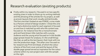
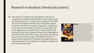
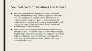
- Existing zines helped inform writing style and proven layouts. Poster research informed visual composition.
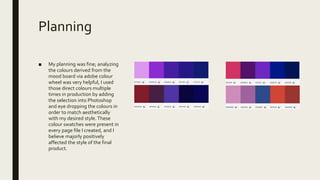
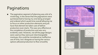
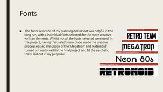
- Planning included mood boards, paginations, and font selection to guide production.
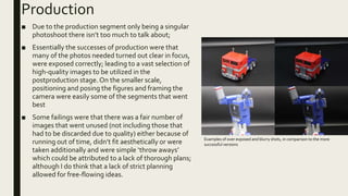
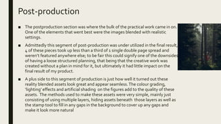
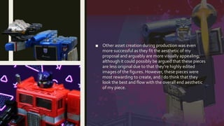
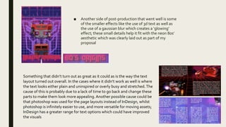
- Production consisted of a photoshoot. Post-production blended figures into realistic settings and created highly edited visual assets.
- Overall, the final product closely matched the original proposal, with minimal technical or management issues during the process.


![Ben college work [autosaved]](https://cdn.slidesharecdn.com/ss_thumbnails/bencollegeworkautosaved-200903215117-thumbnail.jpg?width=640&height=640&fit=bounds)


