SlideShare a Scribd company logo
Fanzine Evaluation
Planning and Preparation
I feel like before I made my fanzine I did a lot of planning and preparation for what it is I wanted to achieve as I felt with the subject I
was going into that planning was the best thing to do. I did a lot of research into the 4 bands that I choose to talk about so I started
with kind of mood boards as I really wanted to get an idea of colours that I could use for my fanzine and what would work best for the
front cover and back as well. With my mood boards when it came to the band I choose to do I did a lot of different kind of research so
I first started by looking at quotes of their songs as this showed me how their fan base see them so this was an insight on more of my
audience and what it is they like that I know I can include into my fanzine. Which is why on my rotoscopes I decided that I wouldn't
include popular lyrics from the band as I feel like when you look up pop punk music this is the most popular thing as with this kind of
music this is what people relate to a lot more. Which is why I used lyrics that a lot of people will know as well. I then looked over all at
the band as I felt like this could help me more with the images that I chose to rotoscope a this was going to be an important aspect of
my fanzine as it was going to be a full page for each. I then looked at more then just the bands that I had chosen as I decided to look
further into pop punk as a whole and how over the years it has changed but looked more at the fashion as I felt like this helped a lot
with the design that I wanted to make my fanzine and colours. As I noticed that when looking at things like the clothes people wore
and how they overall looked there was a lot of black but then you will notice they still wear a little bit of bright colours on them and
sometimes this could just be there hair. So I felt like when making my fanzine I wanted to stay away from solid black colours as I felt it
would be too dark and things like the rotoscopes and quotes wouldn't work as well as the black would be too overpowering so
instead I decided I would use a mixture of deep quiet dark colours and then some bright colours as this also went more with the band
that I was talking about as I did notice some of the bands where more brightly coloured then others. As when research into Paramore
I found that they are a lot more brighter so I thought that as there background I would include this by adding a bright blue to really
show this. Where as then when researching about Panic At The Disco you will find that this band is a lot more darker but the lead
singer wears this kind of signature red suite so I decided to get a deeper red and use this as the background as I feel like this shows
that I have researched them well and I'm not just using any colour I think will go well.
But when making my fanzine I feel like I was very prepared due to all the research I had done before hand as even before I started to
write all my articles I did a lot of research into their songs and looking at their music videos and even looking at songs lyrics so that I
could really understand the band as you will fin that with pop punk bands a lot of the time they will write their own lyrics.
I also had a look at interviews as I feel like this shows you a lot of how the band can think and
their opinion on certain things depending on what the article is about. But by doing this it also
led me to more research to help with my fanzine. But this mainly helped with writing my articles
more then it did when it came to making the fanzine altogether. As decided to write an article
for each one of my bands so the research really helped with what to help especially when it
came to Fall out Boy as I was able to learn ore about when they took a break and then came
back to performing and producing music again.
So I felt like my research was able to help me in multiple ways when it came to making my
fanzine as it was able to guide me to what I should make and the things that I should add in to
my overall project.
Time Management
I feel like my time management for my fanzine was both good but bad at the same time. As I feel like when it came to production this was something that I was good
at when it came to time management as I knew what I wanted to do the biggest thing I was working on was figuring out what to do for the overall lay out. I feel like
where my time management wasn’t the best was when I started my production as I had written only two of my articles and this included rewriting them as well so
that I could fix any problems that they may have had in them. This became a problem as where as post people just had 2 articles to write I had given myself more
work to write 6 articles which I then had to rewrite as well. Which wasn’t the hard part it was writing the article to begin with which was most difficult but I think I did
give myself a little help with the amount of research that I did so that when it came to writing the article it would be a lot more easier to do so. But since I did have so
many articles to write it did mean that my time management did get a bit bad as I wanted to be able to write my articles as fast as I could so that then I was able to
get on with making my actual fanzine. Which when it came to my production I was able to get back on track a little with my time management. As when it came to my
rotoscopes this was something that took around 2 lessons to do which was good as I didn't have to do too much detail on them. As long as people where able to
recognize who they were that was fine by me. But because I knew my time management was bad I tried to do these while writing my articles still so that I was able to
still make sure that I was able to get my pages done and figure out what I would like the layout to be. As when I first started making my fanzine I was going to have the
same layout on each page but because some of the articles were bigger then others this didn't work as well and I found it a little boring so by changing it for each
page it meant that this way they were all different and it just made the fanzine that little bit more interesting and engaging to look at. As it also meant that each of the
quotes on the page I was able to but somewhere different each time so that when you turned the pages you weren't just looking at the same thing each time. But by
doing my articles, rotoscopes and page layouts at the same time it meant that I was only a little bit behind then I would have liked to have been. I feel like it was only
my production when I was behind with where I would have liked to have been I feel like maybe with my research I was behind a little as well but this as because I
wanted to go into detail so that when it came to my production I did find it a lot easier as I knew that before my research I didn't really have any ideas of what I
wanted to do for my actual fanzine so I feel like with my research it did help a lot hence why this did maybe make me a little behind as well. But when I say that I was
behind it wasn’t anything big or major. But up until my evaluation I was okay and I was bale to get by just but when it came to my evaluation I feel like this is when y
time management went down the most as I started to look at my fanzine and just do a little bit more production as I wasn't too happy with the outlook and this was
mainly the front cover and back cover. As I found that when made my back cover for my fanzine in Photoshop it was fine and it looked good but then when I ended up
transferring it to InDesign this is when it started to look blurry which was something I then needed to try and fix which took a little bit of tie of my evaluation.
Content and style/ Does your work appeal to your audience?
I feel like when you look at the overall style of my work is very simple as I didn't want too much going on. I feel like the fact that my pages are very similar with style
keeps my fanzine looking simple. As I stayed with the fact that you would have a page of writing and then have the rotoscope of the artist right next to it. But the fact
that each of the articles is different I feel like gives it that little something and the fact that for each artist I have changed the colour. I feel like with the style of my
fanzine people wont get the background that I created as what I did was get a photograph of the sea and then put a colour overlay over the top. Which has given it
more of tis marble kind of look . I decided to do this as I found it aesthetically appealing without the colour overlay and I feel like this is a photograph that you will find
when you look up pop punk on Tumblr. But I had a look to see what it would look like but when it just the sea it doesn't work as well as a background as your not able
to read the writing so I then decided to go with the colour overlay which I then turned down the opacity so that you was still able to see the waves of the sea. Which I
think worked a lot better as this way with a white text it was a lot easier to read my writing. I feel like the overall style of my fanzine works but there are a few things
that I think cold be done better for example I think if I had more time I would change my front cover as yes I think it does go but I don’t like the over all look or style of
it as o think it looks rushed and you can tell there wasn’t much thought into it so I think if I had more time I would have changed the style and made it much more
better and made it go more then it just going due to the colours that have been used. I also like the style of my double page spread and I think I did that very well for
the layout and the content as well. As I managed to fit on my fact file as well which I think went really well as my fact file id id about songs and the top 10 songs which
I researched as well I didn't just pick random songs as the time I had a look at multiple charts to come up with that. But I made sure that everything was spread out
well and that everything was clear and easy to read. I think the only thing that I think could do to be improved a little with that page is the title as since I used black
text I think it is very hard to read where as the white text against that background was a lot easier. When looking at the content that I gave in my fanzine I made sure
that it was all factual as this would be kind of the first one you buy in a sense where it gives you all the information from the bands and then the next ones would be
more in depth of their music and the band themselves rather then how they got into music. So I think it is factual and I made sure everything I wrote about was
correct and that I made sure to research into it before I started writing. I feel like this is something my audience would buy.
I think my work would appeal to my audience which is a very large audience I believe as since I choice to write about music I feel like it’s a massive age range of people
that it can target. So I tried to keep age restricted incase a younger audience was to read it too. But then still keep it interesting for the younger audience by adding
things like the lyrics as I feel with music when you hit a certain age you can start to think about the lyrics a little bit more then when your younger and just enjoying
the music. I feel like as well my fanzine will appeal to my audience as I've made sure to use the kind of up to date pop punk bands as you will find that with pop punk
it’s a genre that is always changing as we have gone from bands like Green Day to Panic at the Disco who do have similar sounds but they forever keep changing. SO I
tried to get the most up to date bands that you have as you will find that the bands that I chose are also the ones that at the minute are playing all the festivals for this
year. If I was to carry doing these to make sure that appealed to a larger target of this big audience I would make different ones as I feel like even in the pop punk
genre you still have your smaller groups that show case a different kind of pop punk sound. I also feel like the fact that I have added a lot of the most popular lyrics
from the bands on the pages will appeal to my audience but the back page of my fanzine is also filled with lyrics but from a lot of different pop punk bands so ones
that are a lot older and may no longer even perform to the ones that people now a days are more popular and currently changing pop punk still.
The extent to which my intentions have been met
When I first started this production I wasn't too sure where I was going with it as I hadn't done a lot of planning to what I would like to do for my fanzine. I started to
know what I wanted to do when I did a lot of research as this is what gave me an idea to what I could do. The only thing that I really knew when it came to my fanzine
is that I was going to focus on a number of bands. Which is where I started to get the idea of then making a article for each of the bands I decided to write about. But I
didn't want to do a double page spread for each of these as I feel like this would make my fanzine boring and people wouldn't really like as it would be too much
reading where I felt like a single page of text on the band was enough as I still wouldn't fill the whole age with writing. But I then needed to find what I wanted to do
on the other page which when I was looking and researching into bands I decided that I would do rotoscopes as people who listen to pop punk seem to love poster
and images of the lead singer hence why I thought by doing rotoscopes it is a little different to just having the images of the bands. Which then brought the idea of
adding lyrics on to the face as this way I didn't have to do the small detail in rotoscoping but enough so that you could tell who the person is. Which I think des work.
But I think how my fanzine turned out is different to how I originally thought it would. As I thought I was going to ad loads of photographs to the pages of the band
and give it more of an edgy look to it rather then what I did go for. I think in my opinion that my fanzine has managed to to go passed my intentions for my work and it
did turn out a lot better than it did originally expect it too since I didn't have a clear idea at the start of what I wanted to do. Which I think was a real struggle as we
didn't really have time to plan what ideas we may have had we went straight into research which I did think in my case helped me more then planning would have as I
did a lot of pre production as well o getting mood boards and everything to do with pop punk so that I could get a clear idea of how I would like it to look and what
colours I think would be best to use. As you can see I went into depth with my pre production mood boards as I need to get an idea of colour schemes from each of
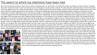
the bands as you can see from the two I picked one is more dark and the other is still dark but does has its bright colours which I
wanted to show in my fanzine which I think I have but I could have done this a little bit better still so I don’t think this part really
did meet my intentions as I had the idea that the colours would really go with the band that I was talking about but instead I feel
like some of the colours I did pick at random so this didn't meet my intentions too well with the outcome. I think my rotoscopes
did manage to meet my intention as your able to tell who each one of them is if you know of the band or the lead singers that I
had chosen to do as I feel even without the little details of the faces your still able to make out who they are and I think the lyrics
on the face did work but this something I could have worked a little bit more on. But as you can see I also researched into song
lyrics so I knew which ones to use on my fanzine which I think were okay but I think I could have chosen better ones so I feel like
this is something that was under me intention then what I wanted as I some song lyrics I chose which are very popular but I think
some I chose that people wont be able to tell which song they ae from.
The skills you have used and developed
I think for my fanzine I did develop a few different skills and developed some further that I did already have but with this task they did get better. As I had to focus on
things like page layout which I think I did develop during this project as I really had to think about where to place things to make sure that it was easy to read and that
nothing was too close or not clear especially when printed off a this is when things can change and I had to make sure that nothing was too close to the edge that
would then be hard to read. So I think this did develop more with my skills as I wasn’t to good at page layout and choosing where to out things beforehand but this
time I did really focus and think about what the outcome would look like. Also to keep it interesting I decided that for each page I would change the layout as well so
you didn't have a page that was the same which I think really added to my fanzine and I think this was a skill develop as well as it meant I really needed to think of
different ways that I was able to show case the written work I had done. I then developed skills in Photoshop with some of the things that I decided to do for my
fanzine for example when looking at the background this is something that I kind of made myself due to the fact that I got an image of the internet of waves which
then didn't work as a background due to the fact that you weren't able to read the writing no matter what colour it was but I still liked the way it looked as I thought it
was very Tumblr kind of photo and aesthetically pleasing to look at. So instead I decided that I would put a colour overlay over the top of the sea but with this I had to
turn down the opacity so that I was able too still see the waves but by doing this it gave it more of a marble look rather then it looking like waves. But I think this was a
skill that I had developed as its not something I have ever done before and I did need to learn how much control I needed so how I wanted the colour and how much
of the waves people were able to see. Another skill that I already had before this was the rotoscoping but I feel like I was able to develop this skill just a little bit more
as I feel like even though I didn't add any detail into these rotoscopes I managed to do them so that you can still tell who the artist is. I feel a new skill that I did learn
with this project is when it came to putting the lyrics on to the faces of the rotoscopes as when I first put the lyrics on you could see that it was hard to get them to fit
as the space was weirdly shaped. So I learnt a new skill of being able to get the text to fit with the face and not look weird as I was able to go to the edge and making
it kind of go round the face instead if just being all straight like you would see in normal writing.
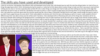
Here you can see my rotoscopes more clearly so that your able to see the skills more that I have used. I think
especially with the first rotoscope of Brendon Urie your able to easily tell who the artist is really easily I feel like
this is mainly because of his hair and the fact that when I was rotoscoping I tried my best to stay close to the
image. Which is the same with the second one which is Patrick Stump which I think you are able to see who it is
but its not as good as the one of Brendon Urie. With this your able to see how I did the song lyrics as well and
how they have been placed so that they fit the face well I've also tried to use visual hierarchy which you cant tell
as much as I thought you would be. As I wanted to make some words stand out which I feel like you can tell a
little with the first one especially the last word I feel like that one you can tell I have made a little bit bigger but
because of the small space and how many lyrics I chose to use it was hard to do as I could only make the words a
little bit bigger then the rest which will be why you cant really tell as much I feel like you can tell more which
ones are bigger then you can on the print out.
Reviewing work and Improvements
When looking at my work I do like the overall look I think it goes with what I had planned to do which I actually think that it looks better then I had expected it too.
But when looking at it on the computer to then looking at it when printing it off there are a few things about it that I think could be improved but I'm not too sure if
this what I had done or if its because of the printer that had been used. As when you look at the pages when they are on the computer you can see that they are
bright and your able to read all the text and overall I feel like it looks eye-catching and this is the same with the rotoscopes. The background colour really stands out
and even makes the rotoscopes stand out a lot as well. But when I had printed it all out the colours a lot more dull and darker then I had chosen on the computer. I
feel like overall as well when I have printed out the colour altogether has changed so when I did the Paramore page I had used a bright blue colour but then when you
look at it printed out you can see that it looks a lot more green then it does a bright blue but also the colour is dark. Then next when looking at the Fall out Boy I had
chosen a purple colour since I thought it would go ell with their newest album since this is where I had gotten the colour from as I really wanted the colours to match
with the bands but when printing it off the colour is more of a dark blue then a purple which doesn't go with the band at all which I feel like is a disappointment when
you see it in person so I feel like overall maybe I could have made the colours brighter when making it so that when it was printed off the colours wouldn't change so
much or be so dark and would be the colours that I wanted them to be. As I feel like it does kind of ruin it a little bit as no one will realize why I have chosen the
colours and will just think I choose some random ones. When in fact its something I had thought about and wanted go with the bands.
I feel like I did manage to really think about my work well and how I wanted to lay out. When
looking at my double page I think this you are able to tell that I had planned it and really thought
about where I wanted things to go as I wanted to make sure that I was able to fit my fact file onto
these pages as well as there wasn’t anywhere else that I was bale to put it. So I needed to think
about this. I feel like I still have a little that I could improve on this as when looking at it and having
it printed off you can see that the writing is a little close to the edge so this I do need to fix as since
it is so close it can cause trouble when trying to read it when printed out so I need to make sure
that I bring things away from the edge a little. But this is a hard thing to do since I had little room
and I still wanted to give each strip of text room so that they were more easy to read.
I think overall I do like the look of the final product I think I only have a few improvements that I
could make to the fanzine but then again it is simple things like my back cover and making that
look less blurry and just working on improving that and then I think my front cover too as
compared to when you open the fanzine I think it is very simple so I could have worked more on
improving that. But overall these aren't major things and wouldn't change the look overall of my
fanzine too much I think it is just more personal tweaks that I cold make to my end product.
Comparing to existing work
Here I chose one of my rotoscopes and got some things off google that are a little similar so I
got something that was fan art but similar to a rotoscope and then got fan art of the quote as
well so that I can compare them to my own work to see what is similar and also different. When
comparing my rotoscope to the fan art I had found that is similar but you can see straight off
how different they are as they have added a lot more detail then I have as I didn't want to do
an actual face as I knew this was something that isn't my strong point and I thought overall for
the look of my fanzine I think it looked better with having the lyrics on there instead. As this was
something that my audience liked as depending on the lyrics this how they connect with the
band more and use the lyrics in their own life sometimes apart from this one that I have used
that seemed to be more of a fun lyric that people of the fan base loved. But when comparing
their work to mine I do like there's a lot more with how it was done with shapes as I think it
adds a lot more detail and dimension to the photo. Where as mine looks very flat and cartoon
like which I think it does work and I have tried to add a little bit of detail in there with his suite
but I do think that if I was to do this again I would like to take more of their approach to my
work but in colour as I'm not too fond of the black and white and I don’t think it would work as
well if I did do it in black and white.
Then I found some art work of the quote I used and I think I do prefer there look on it as they
have made it more fun and especially when looking at the first quote and how they used
typography to do theirs I think this was something that I wanted to do with my own work but
because of the space I had available it was much harder to do and I decided to stick with the
same font through out my fanzine apart from I did have a different font for the word pop just
because I didn't think the font that I had for everything else would work and it just made it all a
little bit interesting. But I do think if I had more space then this is the kind of thing I would
definitely like to have done. But I like how in both of the quotes they have made it more fun
with adding the heels to really emphasize on the quote and what it is representing which at first
I had planned to add a high heel in my quote but like I've said something like this would be a lot
more difficult for the space that I had to work with and how long the quote is that I chose as its
not one I could cut down shorted that would still make sense.

More Related Content

What's hot

5. evaluation(1) fin
5. evaluation(1) fin5. evaluation(1) fin
5. evaluation(1) fin
amy foster
 
Fmp planning v6
Fmp planning v6Fmp planning v6
Fmp planning v6
Charlie Atkin
 
Evaluation for the factual layout
Evaluation for the factual layout Evaluation for the factual layout
Evaluation for the factual layout
RubySheepie
 
Evaluation
 Evaluation Evaluation
Evaluation
HannahMizen
 
Print evaluation
Print evaluation Print evaluation
Print evaluation
ChloeRoss10
 
Main evaluation
Main evaluationMain evaluation
Main evaluation
fintansedgwick
 
Main evaluation
Main evaluationMain evaluation
Main evaluation
fintansedgwick
 
Digital graphics evaluation powerpoint scott wilson 2
Digital graphics evaluation powerpoint scott wilson 2Digital graphics evaluation powerpoint scott wilson 2
Digital graphics evaluation powerpoint scott wilson 2
ScottWilson977
 
Fanzine evaluation
Fanzine evaluationFanzine evaluation
Fanzine evaluation
Alisha Marie Harrison
 
Fmp evaluation (final)
Fmp evaluation (final)Fmp evaluation (final)
Fmp evaluation (final)
HarrietSmith35
 
Fmp planning (final)
Fmp planning (final)Fmp planning (final)
Fmp planning (final)
HarrietSmith35
 
Pre production planning
Pre production planningPre production planning
Pre production planning
sofiamorana1
 
4. pre production fmp
4. pre production fmp4. pre production fmp
4. pre production fmp
AlicjaMorawska
 
FMP Evaluation
FMP EvaluationFMP Evaluation
FMP Evaluation
SamualWilliams
 
Writing copy evaluation
Writing copy evaluationWriting copy evaluation
Writing copy evaluation
shaniajane
 
Writing copy evaluation
Writing copy evaluationWriting copy evaluation
Writing copy evaluation
shaniajane
 
7. evaluation
7. evaluation7. evaluation
7. evaluation
Millie Bateson
 
Fanzine evaluation (1)
Fanzine evaluation (1)Fanzine evaluation (1)
Fanzine evaluation (1)
Olivia Groom
 
Reflective diary (final)
Reflective diary (final)Reflective diary (final)
Reflective diary (final)
HarrietSmith35
 
Evaluation
Evaluation Evaluation
Evaluation
Simran Jabbal
 

What's hot (20)

5. evaluation(1) fin
5. evaluation(1) fin5. evaluation(1) fin
5. evaluation(1) fin
 
Fmp planning v6
Fmp planning v6Fmp planning v6
Fmp planning v6
 
Evaluation for the factual layout
Evaluation for the factual layout Evaluation for the factual layout
Evaluation for the factual layout
 
Evaluation
 Evaluation Evaluation
Evaluation
 
Print evaluation
Print evaluation Print evaluation
Print evaluation
 
Main evaluation
Main evaluationMain evaluation
Main evaluation
 
Main evaluation
Main evaluationMain evaluation
Main evaluation
 
Digital graphics evaluation powerpoint scott wilson 2
Digital graphics evaluation powerpoint scott wilson 2Digital graphics evaluation powerpoint scott wilson 2
Digital graphics evaluation powerpoint scott wilson 2
 
Fanzine evaluation
Fanzine evaluationFanzine evaluation
Fanzine evaluation
 
Fmp evaluation (final)
Fmp evaluation (final)Fmp evaluation (final)
Fmp evaluation (final)
 
Fmp planning (final)
Fmp planning (final)Fmp planning (final)
Fmp planning (final)
 
Pre production planning
Pre production planningPre production planning
Pre production planning
 
4. pre production fmp
4. pre production fmp4. pre production fmp
4. pre production fmp
 
FMP Evaluation
FMP EvaluationFMP Evaluation
FMP Evaluation
 
Writing copy evaluation
Writing copy evaluationWriting copy evaluation
Writing copy evaluation
 
Writing copy evaluation
Writing copy evaluationWriting copy evaluation
Writing copy evaluation
 
7. evaluation
7. evaluation7. evaluation
7. evaluation
 
Fanzine evaluation (1)
Fanzine evaluation (1)Fanzine evaluation (1)
Fanzine evaluation (1)
 
Reflective diary (final)
Reflective diary (final)Reflective diary (final)
Reflective diary (final)
 
Evaluation
Evaluation Evaluation
Evaluation
 

Similar to Evaluation fanzine

Evaluation
EvaluationEvaluation
Evaluation
hayleylou11
 
6. production reflection
6. production reflection6. production reflection
6. production reflection
Millie Bateson
 
Script
ScriptScript
Music eva
Music evaMusic eva
Music eva
lukeleeks8
 
Task 9
Task 9Task 9
Task 9
olibrandon
 
Evaluation of my music magazine changes
Evaluation of my music magazine changesEvaluation of my music magazine changes
Evaluation of my music magazine changes
larissalovesbey
 
Evaluation of my music magazine changes
Evaluation of my music magazine changesEvaluation of my music magazine changes
Evaluation of my music magazine changes
larissalovesbey
 
Media question 7
Media question 7Media question 7
Media question 7
devoncassells
 
5. pre production
5. pre production5. pre production
5. pre production
Millie Bateson
 
7. fmp evaluation
7. fmp evaluation7. fmp evaluation
7. fmp evaluation
Ben Wincup
 
Evaluation
EvaluationEvaluation
Evaluation
Jordan Bohill
 
7. evaluation 2
7. evaluation 27. evaluation 2
7. evaluation 2
Aaron Aacster
 
7. evaluation
7. evaluation7. evaluation
7. evaluation
FelixStanton
 
Digital graphics evaluation pro forma
Digital graphics evaluation pro formaDigital graphics evaluation pro forma
Digital graphics evaluation pro forma
Alisia Morse
 
7. evaluation
7. evaluation7. evaluation
7. evaluation
adamchristiemileham
 
7. Evaluation
7. Evaluation7. Evaluation
7. Evaluation
Mel Nuttall
 
Evaluation
EvaluationEvaluation
Evaluation
Imogen Minto
 
Evaluation
Evaluation Evaluation
Evaluation
willydavisj
 
2. research
2. research2. research
2. research
Millie Bateson
 
Fanzine research
Fanzine researchFanzine research
Fanzine research
Emma Garthwaite
 

Similar to Evaluation fanzine (20)

Evaluation
EvaluationEvaluation
Evaluation
 
6. production reflection
6. production reflection6. production reflection
6. production reflection
 
Script
ScriptScript
Script
 
Music eva
Music evaMusic eva
Music eva
 
Task 9
Task 9Task 9
Task 9
 
Evaluation of my music magazine changes
Evaluation of my music magazine changesEvaluation of my music magazine changes
Evaluation of my music magazine changes
 
Evaluation of my music magazine changes
Evaluation of my music magazine changesEvaluation of my music magazine changes
Evaluation of my music magazine changes
 
Media question 7
Media question 7Media question 7
Media question 7
 
5. pre production
5. pre production5. pre production
5. pre production
 
7. fmp evaluation
7. fmp evaluation7. fmp evaluation
7. fmp evaluation
 
Evaluation
EvaluationEvaluation
Evaluation
 
7. evaluation 2
7. evaluation 27. evaluation 2
7. evaluation 2
 
7. evaluation
7. evaluation7. evaluation
7. evaluation
 
Digital graphics evaluation pro forma
Digital graphics evaluation pro formaDigital graphics evaluation pro forma
Digital graphics evaluation pro forma
 
7. evaluation
7. evaluation7. evaluation
7. evaluation
 
7. Evaluation
7. Evaluation7. Evaluation
7. Evaluation
 
Evaluation
EvaluationEvaluation
Evaluation
 
Evaluation
Evaluation Evaluation
Evaluation
 
2. research
2. research2. research
2. research
 
Fanzine research
Fanzine researchFanzine research
Fanzine research
 

More from millierobyn

Client pitch
Client pitch Client pitch
Client pitch
millierobyn
 
Client pitch
Client pitch Client pitch
Client pitch
millierobyn
 
Evaluation
Evaluation Evaluation
Evaluation
millierobyn
 
Factual products
Factual products Factual products
Factual products
millierobyn
 
Presentation1
Presentation1Presentation1
Presentation1
millierobyn
 
Working to a brief pro forma-2
Working to a brief pro forma-2Working to a brief pro forma-2
Working to a brief pro forma-2
millierobyn
 
Idea development pro forma 2
Idea development pro forma 2Idea development pro forma 2
Idea development pro forma 2
millierobyn
 
Evaluation
Evaluation Evaluation
Evaluation
millierobyn
 
Pre production
Pre productionPre production
Pre production
millierobyn
 
Client pitch
Client pitch Client pitch
Client pitch
millierobyn
 
Client pitch 2
Client pitch 2Client pitch 2
Client pitch 2
millierobyn
 
Idea development pro forma-2.5
Idea development pro forma-2.5Idea development pro forma-2.5
Idea development pro forma-2.5
millierobyn
 
Pop punk articles
Pop punk articles Pop punk articles
Pop punk articles
millierobyn
 
Existing products
Existing products Existing products
Existing products
millierobyn
 
Survey analyising
Survey analyising Survey analyising
Survey analyising
millierobyn
 
Evaluation 1
Evaluation 1Evaluation 1
Evaluation 1
millierobyn
 
Scheduel 1
Scheduel 1 Scheduel 1
Scheduel 1
millierobyn
 

More from millierobyn (17)

Client pitch
Client pitch Client pitch
Client pitch
 
Client pitch
Client pitch Client pitch
Client pitch
 
Evaluation
Evaluation Evaluation
Evaluation
 
Factual products
Factual products Factual products
Factual products
 
Presentation1
Presentation1Presentation1
Presentation1
 
Working to a brief pro forma-2
Working to a brief pro forma-2Working to a brief pro forma-2
Working to a brief pro forma-2
 
Idea development pro forma 2
Idea development pro forma 2Idea development pro forma 2
Idea development pro forma 2
 
Evaluation
Evaluation Evaluation
Evaluation
 
Pre production
Pre productionPre production
Pre production
 
Client pitch
Client pitch Client pitch
Client pitch
 
Client pitch 2
Client pitch 2Client pitch 2
Client pitch 2
 
Idea development pro forma-2.5
Idea development pro forma-2.5Idea development pro forma-2.5
Idea development pro forma-2.5
 
Pop punk articles
Pop punk articles Pop punk articles
Pop punk articles
 
Existing products
Existing products Existing products
Existing products
 
Survey analyising
Survey analyising Survey analyising
Survey analyising
 
Evaluation 1
Evaluation 1Evaluation 1
Evaluation 1
 
Scheduel 1
Scheduel 1 Scheduel 1
Scheduel 1
 

Recently uploaded

What is Digital Literacy? A guest blog from Andy McLaughlin, University of Ab...
What is Digital Literacy? A guest blog from Andy McLaughlin, University of Ab...What is Digital Literacy? A guest blog from Andy McLaughlin, University of Ab...
What is Digital Literacy? A guest blog from Andy McLaughlin, University of Ab...
GeorgeMilliken2
 
writing about opinions about Australia the movie
writing about opinions about Australia the moviewriting about opinions about Australia the movie
writing about opinions about Australia the movie
Nicholas Montgomery
 
Film vocab for eal 3 students: Australia the movie
Film vocab for eal 3 students: Australia the movieFilm vocab for eal 3 students: Australia the movie
Film vocab for eal 3 students: Australia the movie
Nicholas Montgomery
 
NEWSPAPERS - QUESTION 1 - REVISION POWERPOINT.pptx
NEWSPAPERS - QUESTION 1 - REVISION POWERPOINT.pptxNEWSPAPERS - QUESTION 1 - REVISION POWERPOINT.pptx
NEWSPAPERS - QUESTION 1 - REVISION POWERPOINT.pptx
iammrhaywood
 
Life upper-Intermediate B2 Workbook for student
Life upper-Intermediate B2 Workbook for studentLife upper-Intermediate B2 Workbook for student
Life upper-Intermediate B2 Workbook for student
NgcHiNguyn25
 
The Diamonds of 2023-2024 in the IGRA collection
The Diamonds of 2023-2024 in the IGRA collectionThe Diamonds of 2023-2024 in the IGRA collection
The Diamonds of 2023-2024 in the IGRA collection
Israel Genealogy Research Association
 
A Independência da América Espanhola LAPBOOK.pdf
A Independência da América Espanhola LAPBOOK.pdfA Independência da América Espanhola LAPBOOK.pdf
A Independência da América Espanhola LAPBOOK.pdf
Jean Carlos Nunes Paixão
 
How to Add Chatter in the odoo 17 ERP Module
How to Add Chatter in the odoo 17 ERP ModuleHow to Add Chatter in the odoo 17 ERP Module
How to Add Chatter in the odoo 17 ERP Module
Celine George
 
PCOS corelations and management through Ayurveda.
PCOS corelations and management through Ayurveda.PCOS corelations and management through Ayurveda.
PCOS corelations and management through Ayurveda.
Dr. Shivangi Singh Parihar
 
How to Fix the Import Error in the Odoo 17
How to Fix the Import Error in the Odoo 17How to Fix the Import Error in the Odoo 17
How to Fix the Import Error in the Odoo 17
Celine George
 
MARY JANE WILSON, A “BOA MÃE” .
MARY JANE WILSON, A “BOA MÃE”           .MARY JANE WILSON, A “BOA MÃE”           .
MARY JANE WILSON, A “BOA MÃE” .
Colégio Santa Teresinha
 
The basics of sentences session 6pptx.pptx
The basics of sentences session 6pptx.pptxThe basics of sentences session 6pptx.pptx
The basics of sentences session 6pptx.pptx
heathfieldcps1
 
ISO/IEC 27001, ISO/IEC 42001, and GDPR: Best Practices for Implementation and...
ISO/IEC 27001, ISO/IEC 42001, and GDPR: Best Practices for Implementation and...ISO/IEC 27001, ISO/IEC 42001, and GDPR: Best Practices for Implementation and...
ISO/IEC 27001, ISO/IEC 42001, and GDPR: Best Practices for Implementation and...
PECB
 
BBR 2024 Summer Sessions Interview Training
BBR  2024 Summer Sessions Interview TrainingBBR  2024 Summer Sessions Interview Training
BBR 2024 Summer Sessions Interview Training
Katrina Pritchard
 
C1 Rubenstein AP HuG xxxxxxxxxxxxxx.pptx
C1 Rubenstein AP HuG xxxxxxxxxxxxxx.pptxC1 Rubenstein AP HuG xxxxxxxxxxxxxx.pptx
C1 Rubenstein AP HuG xxxxxxxxxxxxxx.pptx
mulvey2
 
Chapter wise All Notes of First year Basic Civil Engineering.pptx
Chapter wise All Notes of First year Basic Civil Engineering.pptxChapter wise All Notes of First year Basic Civil Engineering.pptx
Chapter wise All Notes of First year Basic Civil Engineering.pptx
Denish Jangid
 
Natural birth techniques - Mrs.Akanksha Trivedi Rama University
Natural birth techniques - Mrs.Akanksha Trivedi Rama UniversityNatural birth techniques - Mrs.Akanksha Trivedi Rama University
Natural birth techniques - Mrs.Akanksha Trivedi Rama University
Akanksha trivedi rama nursing college kanpur.
 
Reimagining Your Library Space: How to Increase the Vibes in Your Library No ...
Reimagining Your Library Space: How to Increase the Vibes in Your Library No ...Reimagining Your Library Space: How to Increase the Vibes in Your Library No ...
Reimagining Your Library Space: How to Increase the Vibes in Your Library No ...
Diana Rendina
 
How to Manage Your Lost Opportunities in Odoo 17 CRM
How to Manage Your Lost Opportunities in Odoo 17 CRMHow to Manage Your Lost Opportunities in Odoo 17 CRM
How to Manage Your Lost Opportunities in Odoo 17 CRM
Celine George
 
Exploiting Artificial Intelligence for Empowering Researchers and Faculty, In...
Exploiting Artificial Intelligence for Empowering Researchers and Faculty, In...Exploiting Artificial Intelligence for Empowering Researchers and Faculty, In...
Exploiting Artificial Intelligence for Empowering Researchers and Faculty, In...
Dr. Vinod Kumar Kanvaria
 

Recently uploaded (20)

What is Digital Literacy? A guest blog from Andy McLaughlin, University of Ab...
What is Digital Literacy? A guest blog from Andy McLaughlin, University of Ab...What is Digital Literacy? A guest blog from Andy McLaughlin, University of Ab...
What is Digital Literacy? A guest blog from Andy McLaughlin, University of Ab...
 
writing about opinions about Australia the movie
writing about opinions about Australia the moviewriting about opinions about Australia the movie
writing about opinions about Australia the movie
 
Film vocab for eal 3 students: Australia the movie
Film vocab for eal 3 students: Australia the movieFilm vocab for eal 3 students: Australia the movie
Film vocab for eal 3 students: Australia the movie
 
NEWSPAPERS - QUESTION 1 - REVISION POWERPOINT.pptx
NEWSPAPERS - QUESTION 1 - REVISION POWERPOINT.pptxNEWSPAPERS - QUESTION 1 - REVISION POWERPOINT.pptx
NEWSPAPERS - QUESTION 1 - REVISION POWERPOINT.pptx
 
Life upper-Intermediate B2 Workbook for student
Life upper-Intermediate B2 Workbook for studentLife upper-Intermediate B2 Workbook for student
Life upper-Intermediate B2 Workbook for student
 
The Diamonds of 2023-2024 in the IGRA collection
The Diamonds of 2023-2024 in the IGRA collectionThe Diamonds of 2023-2024 in the IGRA collection
The Diamonds of 2023-2024 in the IGRA collection
 
A Independência da América Espanhola LAPBOOK.pdf
A Independência da América Espanhola LAPBOOK.pdfA Independência da América Espanhola LAPBOOK.pdf
A Independência da América Espanhola LAPBOOK.pdf
 
How to Add Chatter in the odoo 17 ERP Module
How to Add Chatter in the odoo 17 ERP ModuleHow to Add Chatter in the odoo 17 ERP Module
How to Add Chatter in the odoo 17 ERP Module
 
PCOS corelations and management through Ayurveda.
PCOS corelations and management through Ayurveda.PCOS corelations and management through Ayurveda.
PCOS corelations and management through Ayurveda.
 
How to Fix the Import Error in the Odoo 17
How to Fix the Import Error in the Odoo 17How to Fix the Import Error in the Odoo 17
How to Fix the Import Error in the Odoo 17
 
MARY JANE WILSON, A “BOA MÃE” .
MARY JANE WILSON, A “BOA MÃE”           .MARY JANE WILSON, A “BOA MÃE”           .
MARY JANE WILSON, A “BOA MÃE” .
 
The basics of sentences session 6pptx.pptx
The basics of sentences session 6pptx.pptxThe basics of sentences session 6pptx.pptx
The basics of sentences session 6pptx.pptx
 
ISO/IEC 27001, ISO/IEC 42001, and GDPR: Best Practices for Implementation and...
ISO/IEC 27001, ISO/IEC 42001, and GDPR: Best Practices for Implementation and...ISO/IEC 27001, ISO/IEC 42001, and GDPR: Best Practices for Implementation and...
ISO/IEC 27001, ISO/IEC 42001, and GDPR: Best Practices for Implementation and...
 
BBR 2024 Summer Sessions Interview Training
BBR  2024 Summer Sessions Interview TrainingBBR  2024 Summer Sessions Interview Training
BBR 2024 Summer Sessions Interview Training
 
C1 Rubenstein AP HuG xxxxxxxxxxxxxx.pptx
C1 Rubenstein AP HuG xxxxxxxxxxxxxx.pptxC1 Rubenstein AP HuG xxxxxxxxxxxxxx.pptx
C1 Rubenstein AP HuG xxxxxxxxxxxxxx.pptx
 
Chapter wise All Notes of First year Basic Civil Engineering.pptx
Chapter wise All Notes of First year Basic Civil Engineering.pptxChapter wise All Notes of First year Basic Civil Engineering.pptx
Chapter wise All Notes of First year Basic Civil Engineering.pptx
 
Natural birth techniques - Mrs.Akanksha Trivedi Rama University
Natural birth techniques - Mrs.Akanksha Trivedi Rama UniversityNatural birth techniques - Mrs.Akanksha Trivedi Rama University
Natural birth techniques - Mrs.Akanksha Trivedi Rama University
 
Reimagining Your Library Space: How to Increase the Vibes in Your Library No ...
Reimagining Your Library Space: How to Increase the Vibes in Your Library No ...Reimagining Your Library Space: How to Increase the Vibes in Your Library No ...
Reimagining Your Library Space: How to Increase the Vibes in Your Library No ...
 
How to Manage Your Lost Opportunities in Odoo 17 CRM
How to Manage Your Lost Opportunities in Odoo 17 CRMHow to Manage Your Lost Opportunities in Odoo 17 CRM
How to Manage Your Lost Opportunities in Odoo 17 CRM
 
Exploiting Artificial Intelligence for Empowering Researchers and Faculty, In...
Exploiting Artificial Intelligence for Empowering Researchers and Faculty, In...Exploiting Artificial Intelligence for Empowering Researchers and Faculty, In...
Exploiting Artificial Intelligence for Empowering Researchers and Faculty, In...
 

Evaluation fanzine

  • 2. Planning and Preparation I feel like before I made my fanzine I did a lot of planning and preparation for what it is I wanted to achieve as I felt with the subject I was going into that planning was the best thing to do. I did a lot of research into the 4 bands that I choose to talk about so I started with kind of mood boards as I really wanted to get an idea of colours that I could use for my fanzine and what would work best for the front cover and back as well. With my mood boards when it came to the band I choose to do I did a lot of different kind of research so I first started by looking at quotes of their songs as this showed me how their fan base see them so this was an insight on more of my audience and what it is they like that I know I can include into my fanzine. Which is why on my rotoscopes I decided that I wouldn't include popular lyrics from the band as I feel like when you look up pop punk music this is the most popular thing as with this kind of music this is what people relate to a lot more. Which is why I used lyrics that a lot of people will know as well. I then looked over all at the band as I felt like this could help me more with the images that I chose to rotoscope a this was going to be an important aspect of my fanzine as it was going to be a full page for each. I then looked at more then just the bands that I had chosen as I decided to look further into pop punk as a whole and how over the years it has changed but looked more at the fashion as I felt like this helped a lot with the design that I wanted to make my fanzine and colours. As I noticed that when looking at things like the clothes people wore and how they overall looked there was a lot of black but then you will notice they still wear a little bit of bright colours on them and sometimes this could just be there hair. So I felt like when making my fanzine I wanted to stay away from solid black colours as I felt it would be too dark and things like the rotoscopes and quotes wouldn't work as well as the black would be too overpowering so instead I decided I would use a mixture of deep quiet dark colours and then some bright colours as this also went more with the band that I was talking about as I did notice some of the bands where more brightly coloured then others. As when research into Paramore I found that they are a lot more brighter so I thought that as there background I would include this by adding a bright blue to really show this. Where as then when researching about Panic At The Disco you will find that this band is a lot more darker but the lead singer wears this kind of signature red suite so I decided to get a deeper red and use this as the background as I feel like this shows that I have researched them well and I'm not just using any colour I think will go well. But when making my fanzine I feel like I was very prepared due to all the research I had done before hand as even before I started to write all my articles I did a lot of research into their songs and looking at their music videos and even looking at songs lyrics so that I could really understand the band as you will fin that with pop punk bands a lot of the time they will write their own lyrics. I also had a look at interviews as I feel like this shows you a lot of how the band can think and their opinion on certain things depending on what the article is about. But by doing this it also led me to more research to help with my fanzine. But this mainly helped with writing my articles more then it did when it came to making the fanzine altogether. As decided to write an article for each one of my bands so the research really helped with what to help especially when it came to Fall out Boy as I was able to learn ore about when they took a break and then came back to performing and producing music again. So I felt like my research was able to help me in multiple ways when it came to making my fanzine as it was able to guide me to what I should make and the things that I should add in to my overall project.
  • 3. Time Management I feel like my time management for my fanzine was both good but bad at the same time. As I feel like when it came to production this was something that I was good at when it came to time management as I knew what I wanted to do the biggest thing I was working on was figuring out what to do for the overall lay out. I feel like where my time management wasn’t the best was when I started my production as I had written only two of my articles and this included rewriting them as well so that I could fix any problems that they may have had in them. This became a problem as where as post people just had 2 articles to write I had given myself more work to write 6 articles which I then had to rewrite as well. Which wasn’t the hard part it was writing the article to begin with which was most difficult but I think I did give myself a little help with the amount of research that I did so that when it came to writing the article it would be a lot more easier to do so. But since I did have so many articles to write it did mean that my time management did get a bit bad as I wanted to be able to write my articles as fast as I could so that then I was able to get on with making my actual fanzine. Which when it came to my production I was able to get back on track a little with my time management. As when it came to my rotoscopes this was something that took around 2 lessons to do which was good as I didn't have to do too much detail on them. As long as people where able to recognize who they were that was fine by me. But because I knew my time management was bad I tried to do these while writing my articles still so that I was able to still make sure that I was able to get my pages done and figure out what I would like the layout to be. As when I first started making my fanzine I was going to have the same layout on each page but because some of the articles were bigger then others this didn't work as well and I found it a little boring so by changing it for each page it meant that this way they were all different and it just made the fanzine that little bit more interesting and engaging to look at. As it also meant that each of the quotes on the page I was able to but somewhere different each time so that when you turned the pages you weren't just looking at the same thing each time. But by doing my articles, rotoscopes and page layouts at the same time it meant that I was only a little bit behind then I would have liked to have been. I feel like it was only my production when I was behind with where I would have liked to have been I feel like maybe with my research I was behind a little as well but this as because I wanted to go into detail so that when it came to my production I did find it a lot easier as I knew that before my research I didn't really have any ideas of what I wanted to do for my actual fanzine so I feel like with my research it did help a lot hence why this did maybe make me a little behind as well. But when I say that I was behind it wasn’t anything big or major. But up until my evaluation I was okay and I was bale to get by just but when it came to my evaluation I feel like this is when y time management went down the most as I started to look at my fanzine and just do a little bit more production as I wasn't too happy with the outlook and this was mainly the front cover and back cover. As I found that when made my back cover for my fanzine in Photoshop it was fine and it looked good but then when I ended up transferring it to InDesign this is when it started to look blurry which was something I then needed to try and fix which took a little bit of tie of my evaluation.
  • 4. Content and style/ Does your work appeal to your audience? I feel like when you look at the overall style of my work is very simple as I didn't want too much going on. I feel like the fact that my pages are very similar with style keeps my fanzine looking simple. As I stayed with the fact that you would have a page of writing and then have the rotoscope of the artist right next to it. But the fact that each of the articles is different I feel like gives it that little something and the fact that for each artist I have changed the colour. I feel like with the style of my fanzine people wont get the background that I created as what I did was get a photograph of the sea and then put a colour overlay over the top. Which has given it more of tis marble kind of look . I decided to do this as I found it aesthetically appealing without the colour overlay and I feel like this is a photograph that you will find when you look up pop punk on Tumblr. But I had a look to see what it would look like but when it just the sea it doesn't work as well as a background as your not able to read the writing so I then decided to go with the colour overlay which I then turned down the opacity so that you was still able to see the waves of the sea. Which I think worked a lot better as this way with a white text it was a lot easier to read my writing. I feel like the overall style of my fanzine works but there are a few things that I think cold be done better for example I think if I had more time I would change my front cover as yes I think it does go but I don’t like the over all look or style of it as o think it looks rushed and you can tell there wasn’t much thought into it so I think if I had more time I would have changed the style and made it much more better and made it go more then it just going due to the colours that have been used. I also like the style of my double page spread and I think I did that very well for the layout and the content as well. As I managed to fit on my fact file as well which I think went really well as my fact file id id about songs and the top 10 songs which I researched as well I didn't just pick random songs as the time I had a look at multiple charts to come up with that. But I made sure that everything was spread out well and that everything was clear and easy to read. I think the only thing that I think could do to be improved a little with that page is the title as since I used black text I think it is very hard to read where as the white text against that background was a lot easier. When looking at the content that I gave in my fanzine I made sure that it was all factual as this would be kind of the first one you buy in a sense where it gives you all the information from the bands and then the next ones would be more in depth of their music and the band themselves rather then how they got into music. So I think it is factual and I made sure everything I wrote about was correct and that I made sure to research into it before I started writing. I feel like this is something my audience would buy. I think my work would appeal to my audience which is a very large audience I believe as since I choice to write about music I feel like it’s a massive age range of people that it can target. So I tried to keep age restricted incase a younger audience was to read it too. But then still keep it interesting for the younger audience by adding things like the lyrics as I feel with music when you hit a certain age you can start to think about the lyrics a little bit more then when your younger and just enjoying the music. I feel like as well my fanzine will appeal to my audience as I've made sure to use the kind of up to date pop punk bands as you will find that with pop punk it’s a genre that is always changing as we have gone from bands like Green Day to Panic at the Disco who do have similar sounds but they forever keep changing. SO I tried to get the most up to date bands that you have as you will find that the bands that I chose are also the ones that at the minute are playing all the festivals for this year. If I was to carry doing these to make sure that appealed to a larger target of this big audience I would make different ones as I feel like even in the pop punk genre you still have your smaller groups that show case a different kind of pop punk sound. I also feel like the fact that I have added a lot of the most popular lyrics from the bands on the pages will appeal to my audience but the back page of my fanzine is also filled with lyrics but from a lot of different pop punk bands so ones that are a lot older and may no longer even perform to the ones that people now a days are more popular and currently changing pop punk still.
  • 5. The extent to which my intentions have been met When I first started this production I wasn't too sure where I was going with it as I hadn't done a lot of planning to what I would like to do for my fanzine. I started to know what I wanted to do when I did a lot of research as this is what gave me an idea to what I could do. The only thing that I really knew when it came to my fanzine is that I was going to focus on a number of bands. Which is where I started to get the idea of then making a article for each of the bands I decided to write about. But I didn't want to do a double page spread for each of these as I feel like this would make my fanzine boring and people wouldn't really like as it would be too much reading where I felt like a single page of text on the band was enough as I still wouldn't fill the whole age with writing. But I then needed to find what I wanted to do on the other page which when I was looking and researching into bands I decided that I would do rotoscopes as people who listen to pop punk seem to love poster and images of the lead singer hence why I thought by doing rotoscopes it is a little different to just having the images of the bands. Which then brought the idea of adding lyrics on to the face as this way I didn't have to do the small detail in rotoscoping but enough so that you could tell who the person is. Which I think des work. But I think how my fanzine turned out is different to how I originally thought it would. As I thought I was going to ad loads of photographs to the pages of the band and give it more of an edgy look to it rather then what I did go for. I think in my opinion that my fanzine has managed to to go passed my intentions for my work and it did turn out a lot better than it did originally expect it too since I didn't have a clear idea at the start of what I wanted to do. Which I think was a real struggle as we didn't really have time to plan what ideas we may have had we went straight into research which I did think in my case helped me more then planning would have as I did a lot of pre production as well o getting mood boards and everything to do with pop punk so that I could get a clear idea of how I would like it to look and what colours I think would be best to use. As you can see I went into depth with my pre production mood boards as I need to get an idea of colour schemes from each of the bands as you can see from the two I picked one is more dark and the other is still dark but does has its bright colours which I wanted to show in my fanzine which I think I have but I could have done this a little bit better still so I don’t think this part really did meet my intentions as I had the idea that the colours would really go with the band that I was talking about but instead I feel like some of the colours I did pick at random so this didn't meet my intentions too well with the outcome. I think my rotoscopes did manage to meet my intention as your able to tell who each one of them is if you know of the band or the lead singers that I had chosen to do as I feel even without the little details of the faces your still able to make out who they are and I think the lyrics on the face did work but this something I could have worked a little bit more on. But as you can see I also researched into song lyrics so I knew which ones to use on my fanzine which I think were okay but I think I could have chosen better ones so I feel like this is something that was under me intention then what I wanted as I some song lyrics I chose which are very popular but I think some I chose that people wont be able to tell which song they ae from.
  • 6. The skills you have used and developed I think for my fanzine I did develop a few different skills and developed some further that I did already have but with this task they did get better. As I had to focus on things like page layout which I think I did develop during this project as I really had to think about where to place things to make sure that it was easy to read and that nothing was too close or not clear especially when printed off a this is when things can change and I had to make sure that nothing was too close to the edge that would then be hard to read. So I think this did develop more with my skills as I wasn’t to good at page layout and choosing where to out things beforehand but this time I did really focus and think about what the outcome would look like. Also to keep it interesting I decided that for each page I would change the layout as well so you didn't have a page that was the same which I think really added to my fanzine and I think this was a skill develop as well as it meant I really needed to think of different ways that I was able to show case the written work I had done. I then developed skills in Photoshop with some of the things that I decided to do for my fanzine for example when looking at the background this is something that I kind of made myself due to the fact that I got an image of the internet of waves which then didn't work as a background due to the fact that you weren't able to read the writing no matter what colour it was but I still liked the way it looked as I thought it was very Tumblr kind of photo and aesthetically pleasing to look at. So instead I decided that I would put a colour overlay over the top of the sea but with this I had to turn down the opacity so that I was able too still see the waves but by doing this it gave it more of a marble look rather then it looking like waves. But I think this was a skill that I had developed as its not something I have ever done before and I did need to learn how much control I needed so how I wanted the colour and how much of the waves people were able to see. Another skill that I already had before this was the rotoscoping but I feel like I was able to develop this skill just a little bit more as I feel like even though I didn't add any detail into these rotoscopes I managed to do them so that you can still tell who the artist is. I feel a new skill that I did learn with this project is when it came to putting the lyrics on to the faces of the rotoscopes as when I first put the lyrics on you could see that it was hard to get them to fit as the space was weirdly shaped. So I learnt a new skill of being able to get the text to fit with the face and not look weird as I was able to go to the edge and making it kind of go round the face instead if just being all straight like you would see in normal writing. Here you can see my rotoscopes more clearly so that your able to see the skills more that I have used. I think especially with the first rotoscope of Brendon Urie your able to easily tell who the artist is really easily I feel like this is mainly because of his hair and the fact that when I was rotoscoping I tried my best to stay close to the image. Which is the same with the second one which is Patrick Stump which I think you are able to see who it is but its not as good as the one of Brendon Urie. With this your able to see how I did the song lyrics as well and how they have been placed so that they fit the face well I've also tried to use visual hierarchy which you cant tell as much as I thought you would be. As I wanted to make some words stand out which I feel like you can tell a little with the first one especially the last word I feel like that one you can tell I have made a little bit bigger but because of the small space and how many lyrics I chose to use it was hard to do as I could only make the words a little bit bigger then the rest which will be why you cant really tell as much I feel like you can tell more which ones are bigger then you can on the print out.
  • 7. Reviewing work and Improvements When looking at my work I do like the overall look I think it goes with what I had planned to do which I actually think that it looks better then I had expected it too. But when looking at it on the computer to then looking at it when printing it off there are a few things about it that I think could be improved but I'm not too sure if this what I had done or if its because of the printer that had been used. As when you look at the pages when they are on the computer you can see that they are bright and your able to read all the text and overall I feel like it looks eye-catching and this is the same with the rotoscopes. The background colour really stands out and even makes the rotoscopes stand out a lot as well. But when I had printed it all out the colours a lot more dull and darker then I had chosen on the computer. I feel like overall as well when I have printed out the colour altogether has changed so when I did the Paramore page I had used a bright blue colour but then when you look at it printed out you can see that it looks a lot more green then it does a bright blue but also the colour is dark. Then next when looking at the Fall out Boy I had chosen a purple colour since I thought it would go ell with their newest album since this is where I had gotten the colour from as I really wanted the colours to match with the bands but when printing it off the colour is more of a dark blue then a purple which doesn't go with the band at all which I feel like is a disappointment when you see it in person so I feel like overall maybe I could have made the colours brighter when making it so that when it was printed off the colours wouldn't change so much or be so dark and would be the colours that I wanted them to be. As I feel like it does kind of ruin it a little bit as no one will realize why I have chosen the colours and will just think I choose some random ones. When in fact its something I had thought about and wanted go with the bands. I feel like I did manage to really think about my work well and how I wanted to lay out. When looking at my double page I think this you are able to tell that I had planned it and really thought about where I wanted things to go as I wanted to make sure that I was able to fit my fact file onto these pages as well as there wasn’t anywhere else that I was bale to put it. So I needed to think about this. I feel like I still have a little that I could improve on this as when looking at it and having it printed off you can see that the writing is a little close to the edge so this I do need to fix as since it is so close it can cause trouble when trying to read it when printed out so I need to make sure that I bring things away from the edge a little. But this is a hard thing to do since I had little room and I still wanted to give each strip of text room so that they were more easy to read. I think overall I do like the look of the final product I think I only have a few improvements that I could make to the fanzine but then again it is simple things like my back cover and making that look less blurry and just working on improving that and then I think my front cover too as compared to when you open the fanzine I think it is very simple so I could have worked more on improving that. But overall these aren't major things and wouldn't change the look overall of my fanzine too much I think it is just more personal tweaks that I cold make to my end product.
  • 8. Comparing to existing work Here I chose one of my rotoscopes and got some things off google that are a little similar so I got something that was fan art but similar to a rotoscope and then got fan art of the quote as well so that I can compare them to my own work to see what is similar and also different. When comparing my rotoscope to the fan art I had found that is similar but you can see straight off how different they are as they have added a lot more detail then I have as I didn't want to do an actual face as I knew this was something that isn't my strong point and I thought overall for the look of my fanzine I think it looked better with having the lyrics on there instead. As this was something that my audience liked as depending on the lyrics this how they connect with the band more and use the lyrics in their own life sometimes apart from this one that I have used that seemed to be more of a fun lyric that people of the fan base loved. But when comparing their work to mine I do like there's a lot more with how it was done with shapes as I think it adds a lot more detail and dimension to the photo. Where as mine looks very flat and cartoon like which I think it does work and I have tried to add a little bit of detail in there with his suite but I do think that if I was to do this again I would like to take more of their approach to my work but in colour as I'm not too fond of the black and white and I don’t think it would work as well if I did do it in black and white. Then I found some art work of the quote I used and I think I do prefer there look on it as they have made it more fun and especially when looking at the first quote and how they used typography to do theirs I think this was something that I wanted to do with my own work but because of the space I had available it was much harder to do and I decided to stick with the same font through out my fanzine apart from I did have a different font for the word pop just because I didn't think the font that I had for everything else would work and it just made it all a little bit interesting. But I do think if I had more space then this is the kind of thing I would definitely like to have done. But I like how in both of the quotes they have made it more fun with adding the heels to really emphasize on the quote and what it is representing which at first I had planned to add a high heel in my quote but like I've said something like this would be a lot more difficult for the space that I had to work with and how long the quote is that I chose as its not one I could cut down shorted that would still make sense.