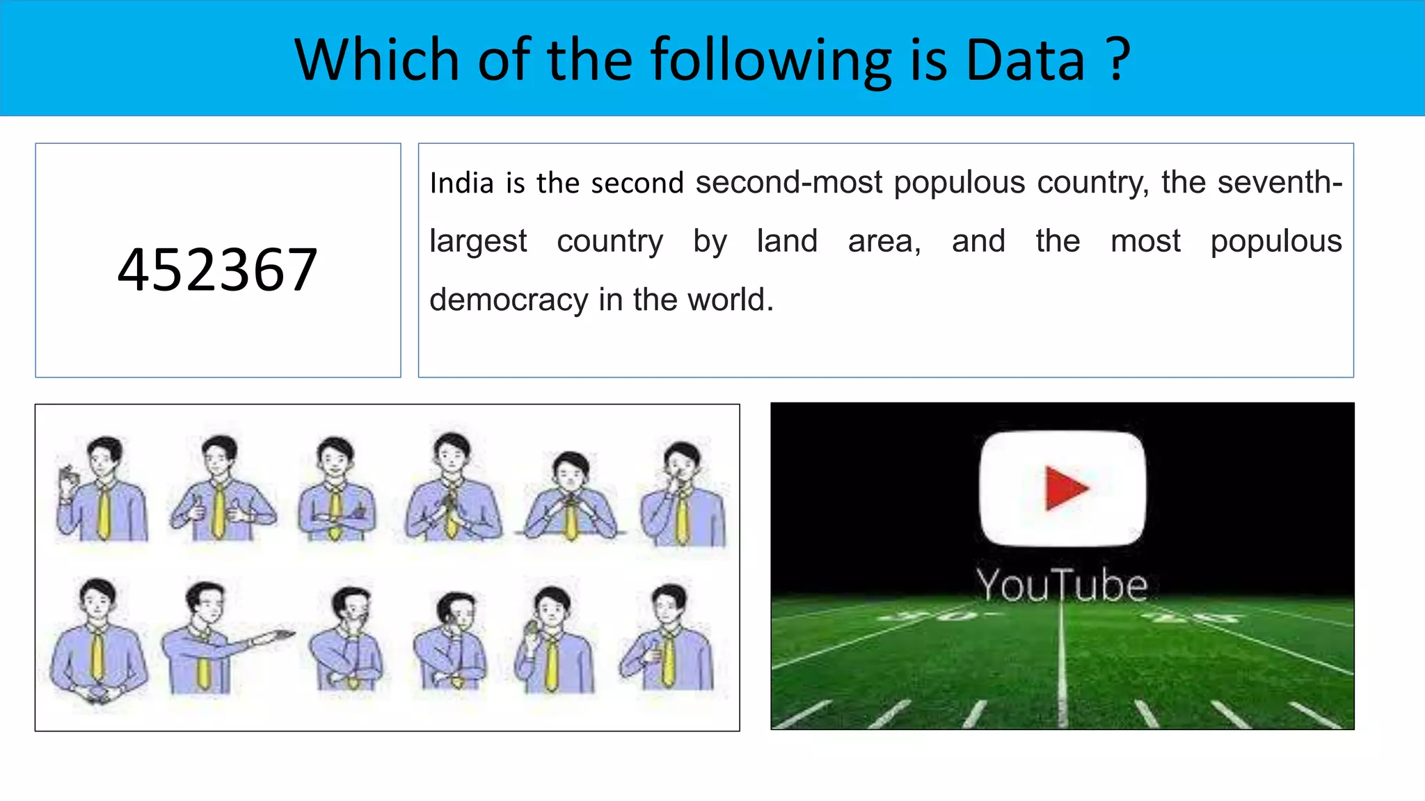
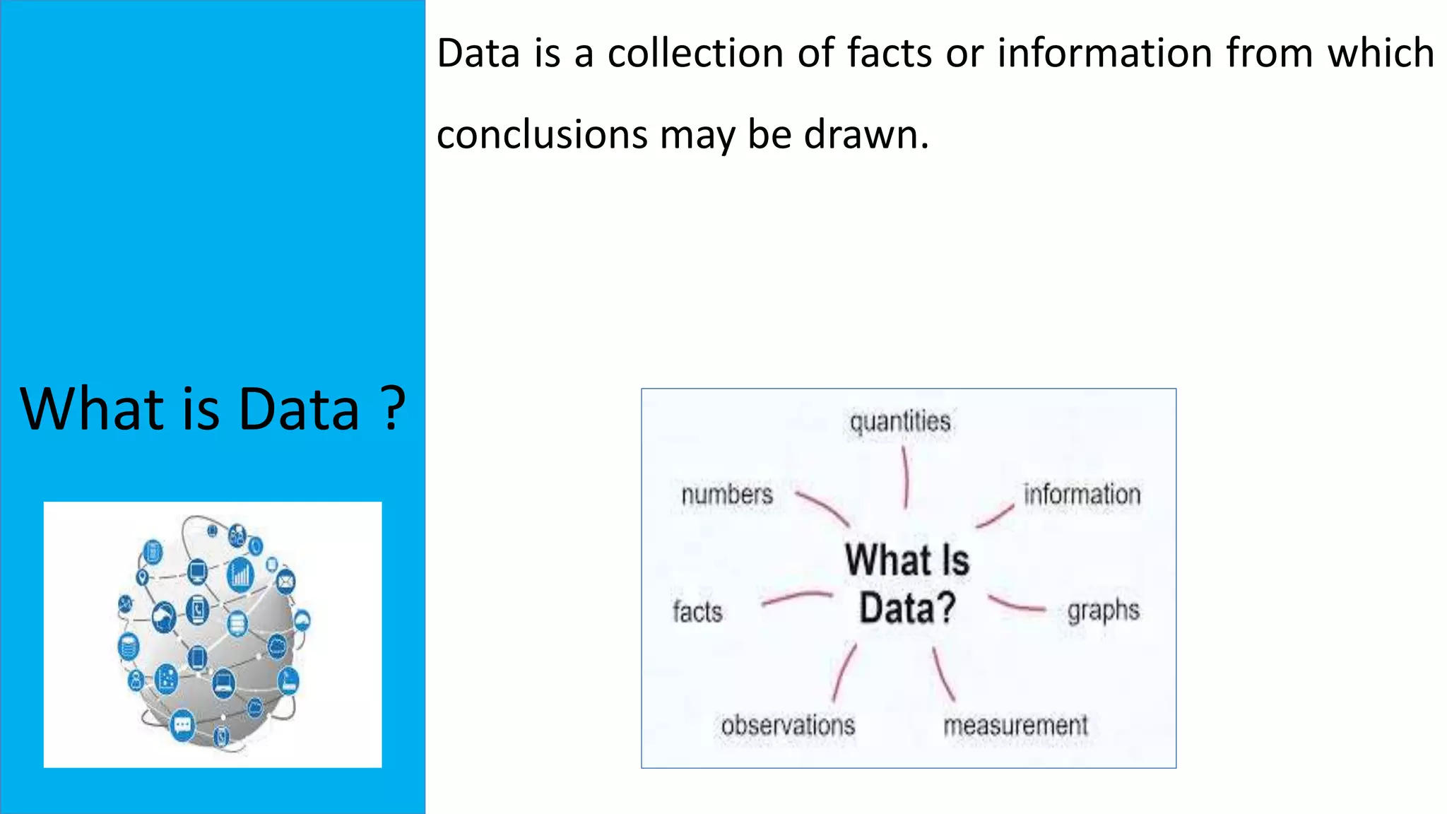
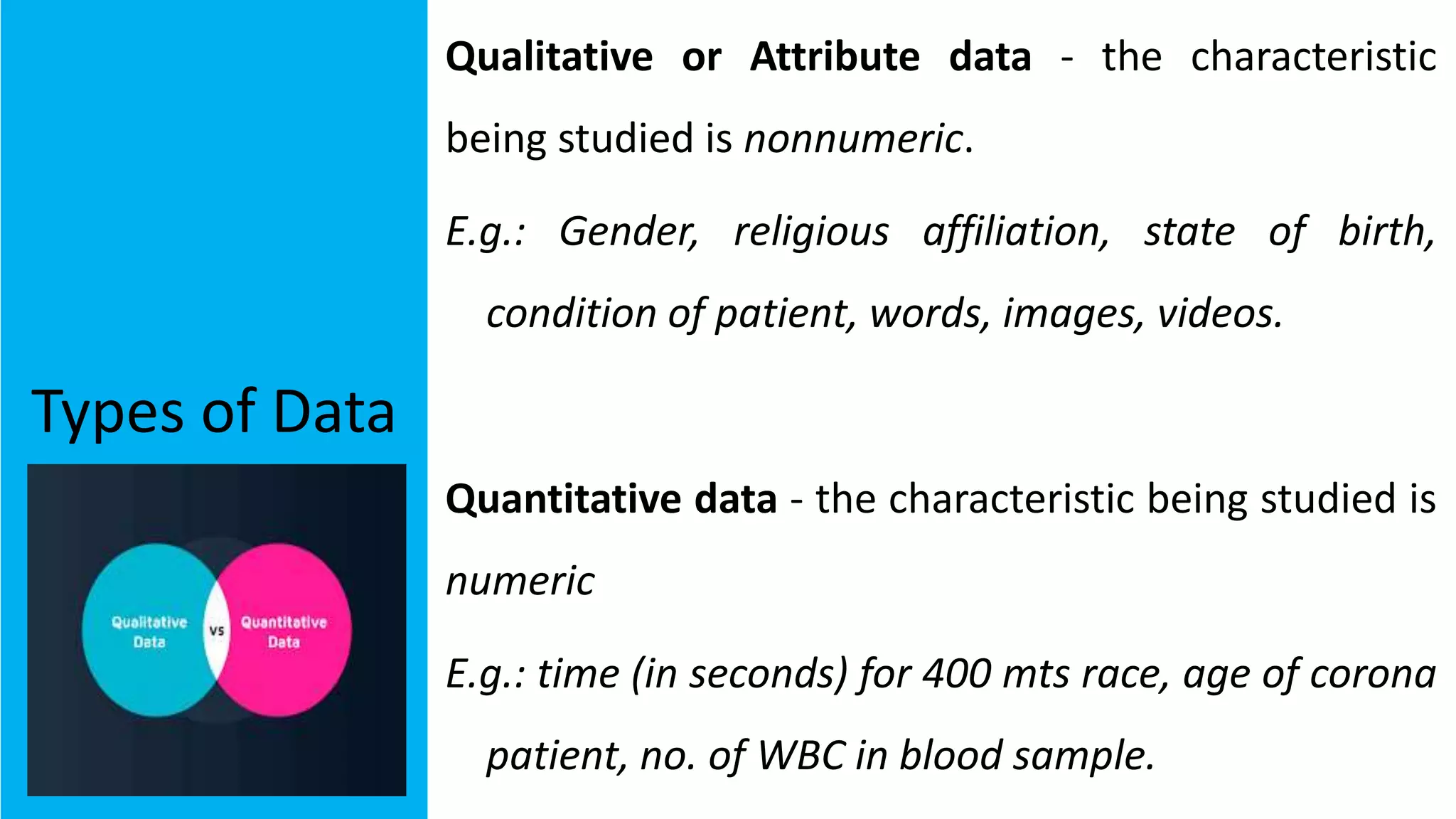
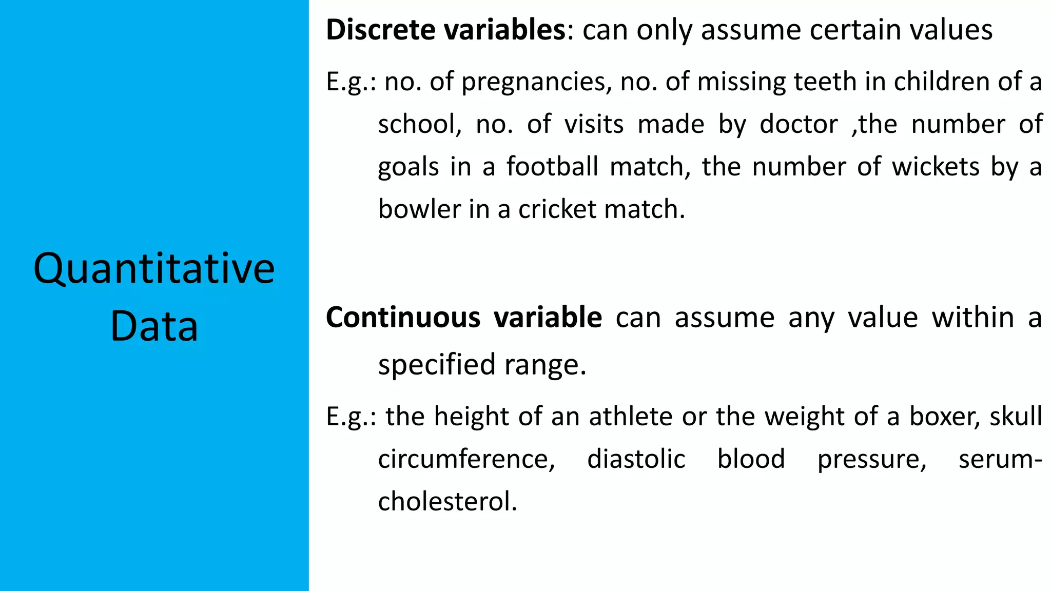
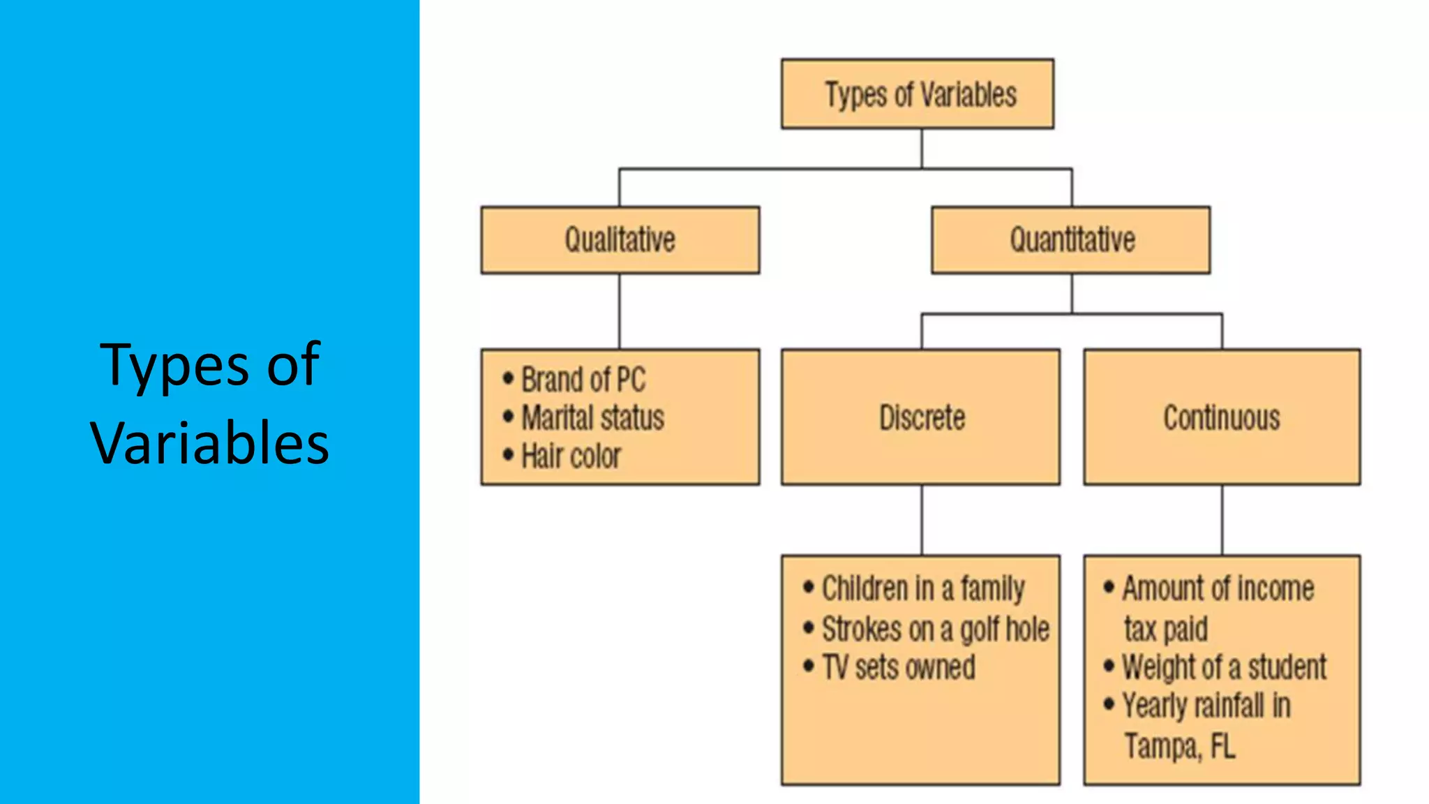
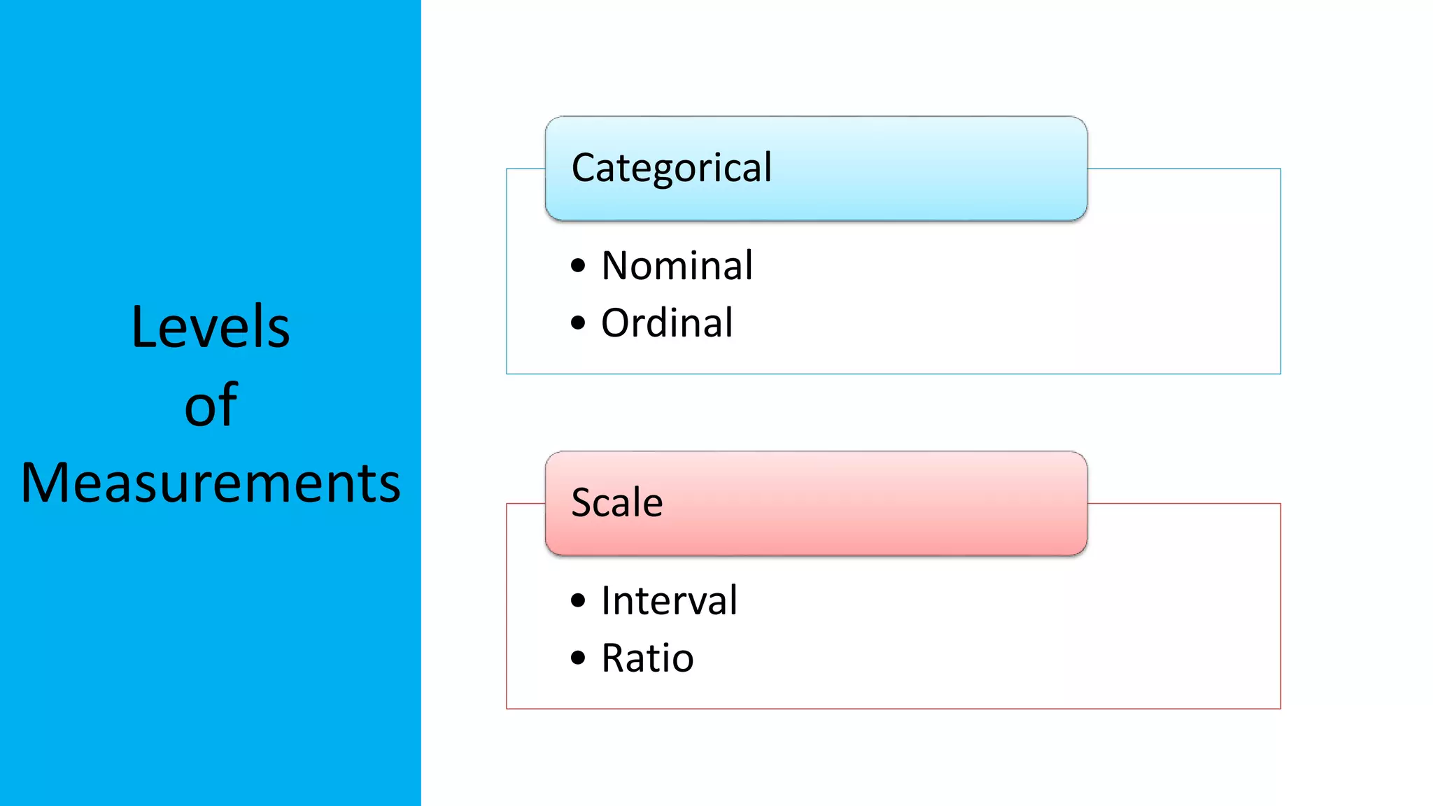
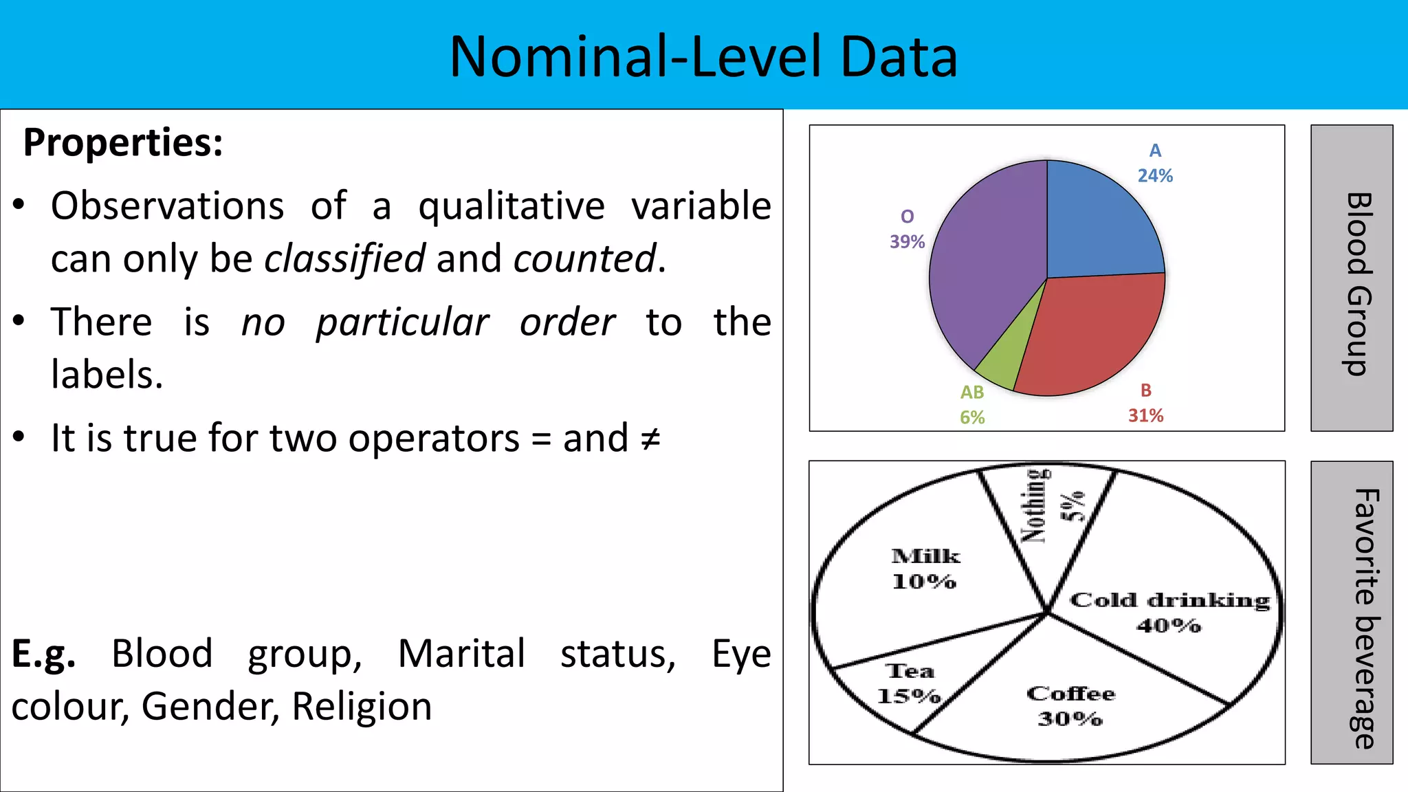
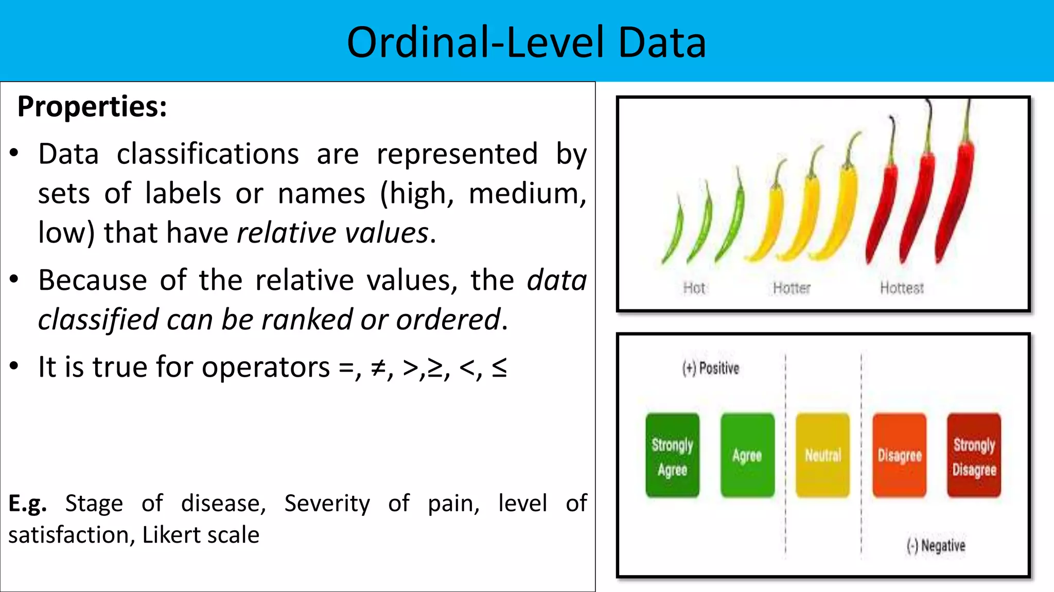
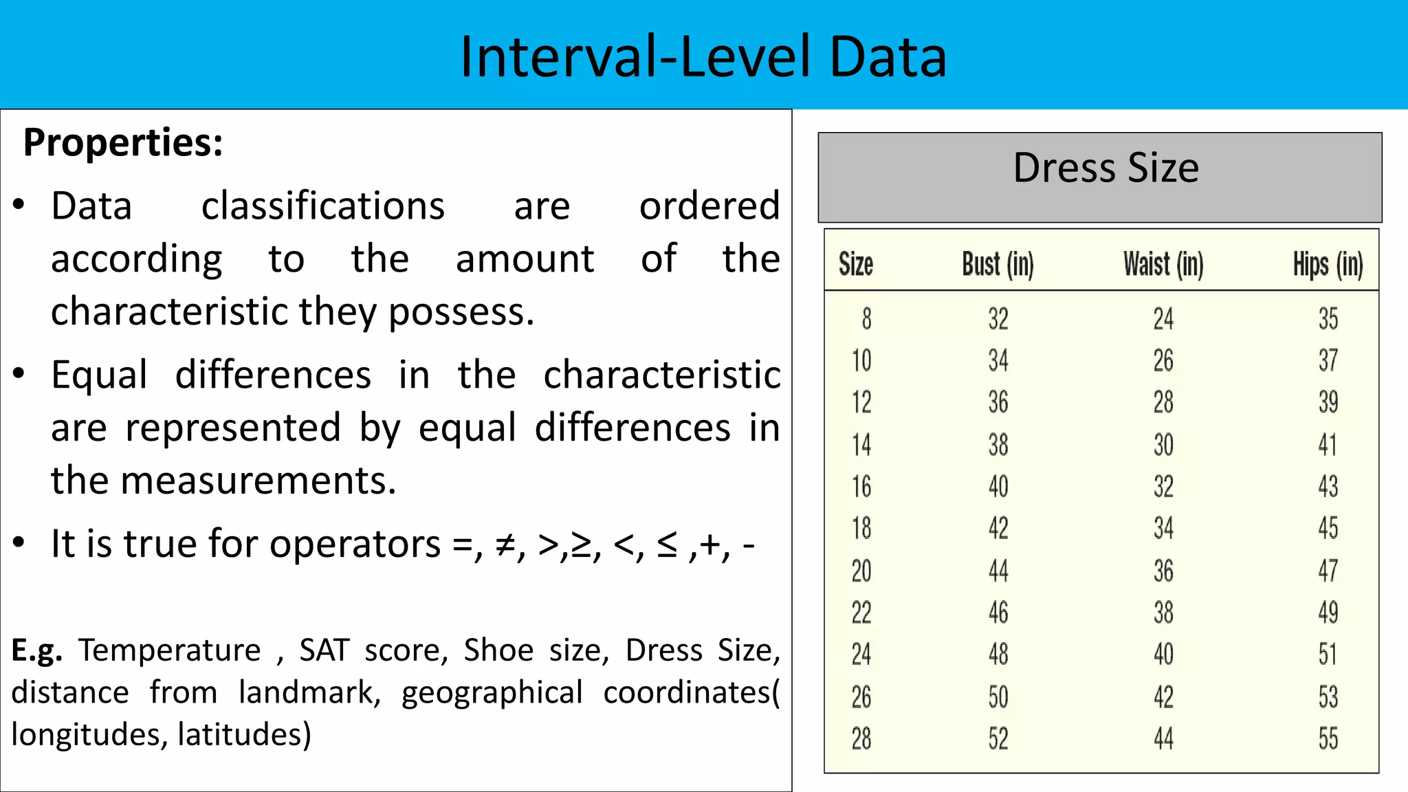
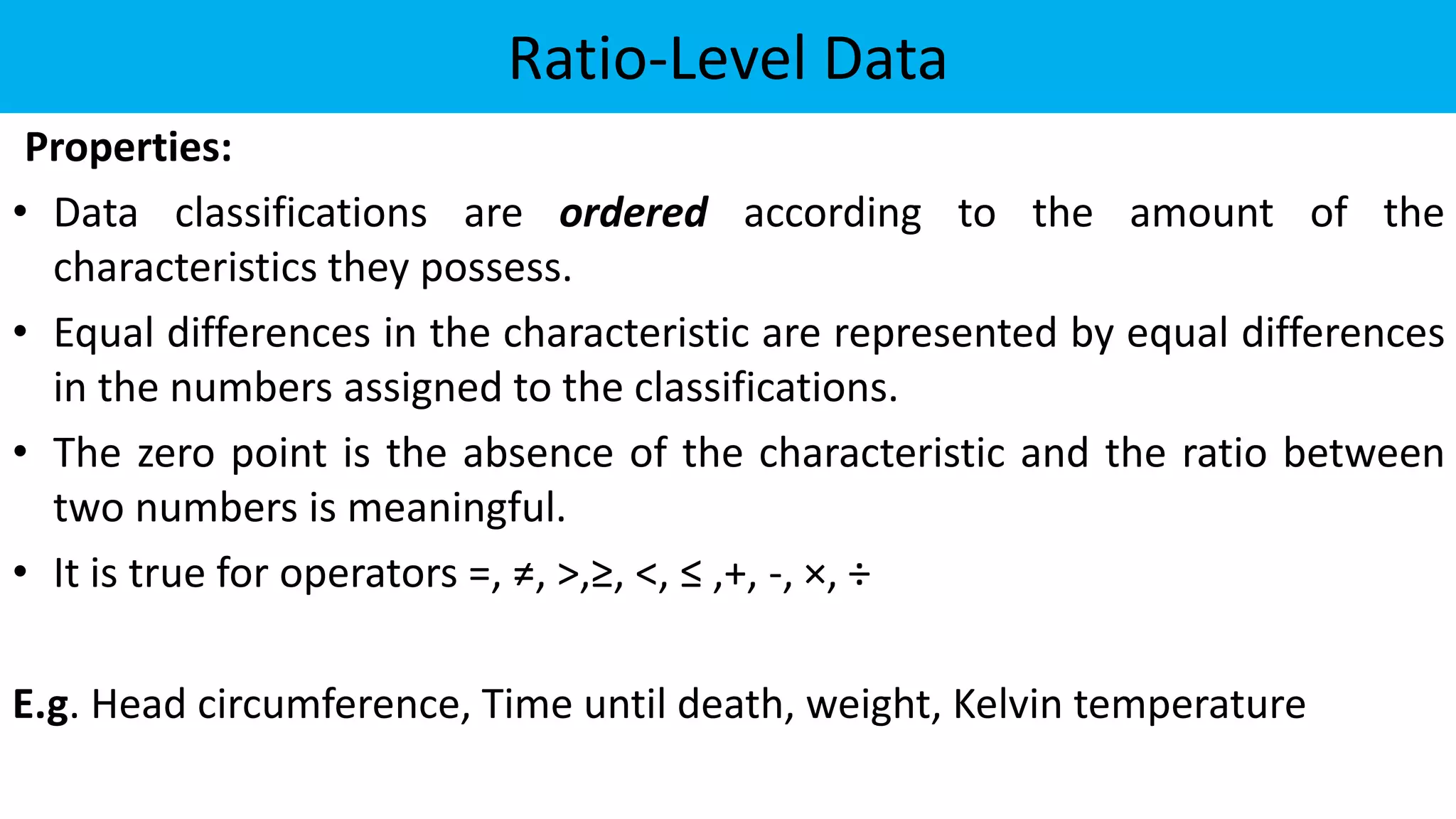
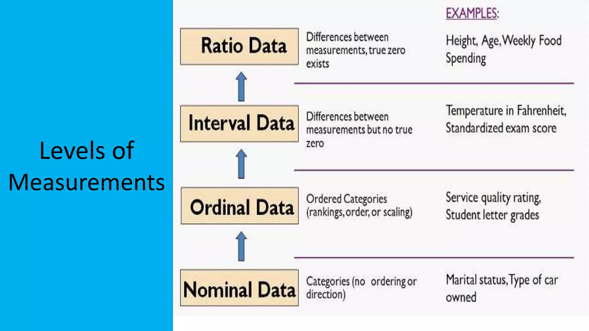
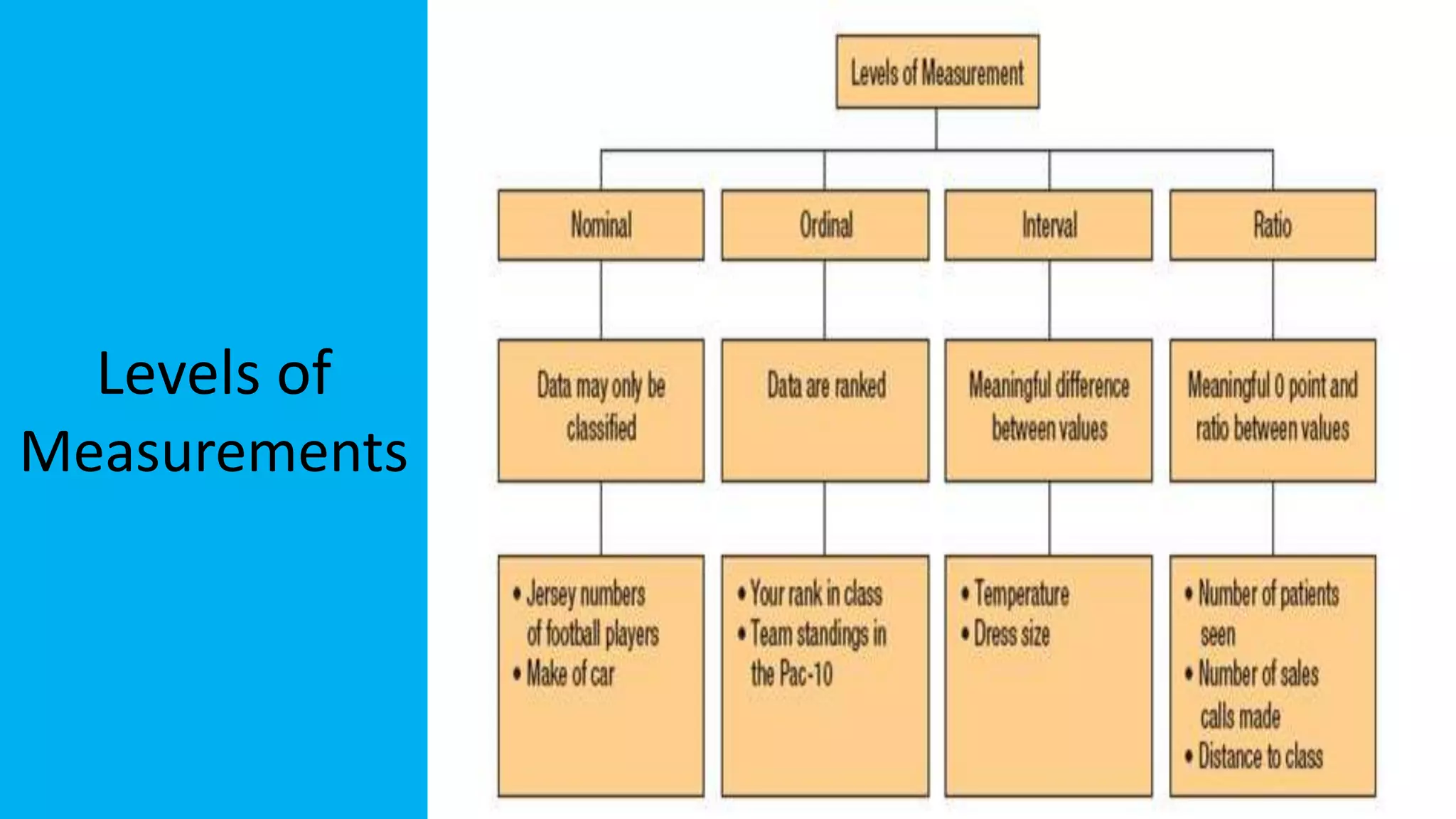
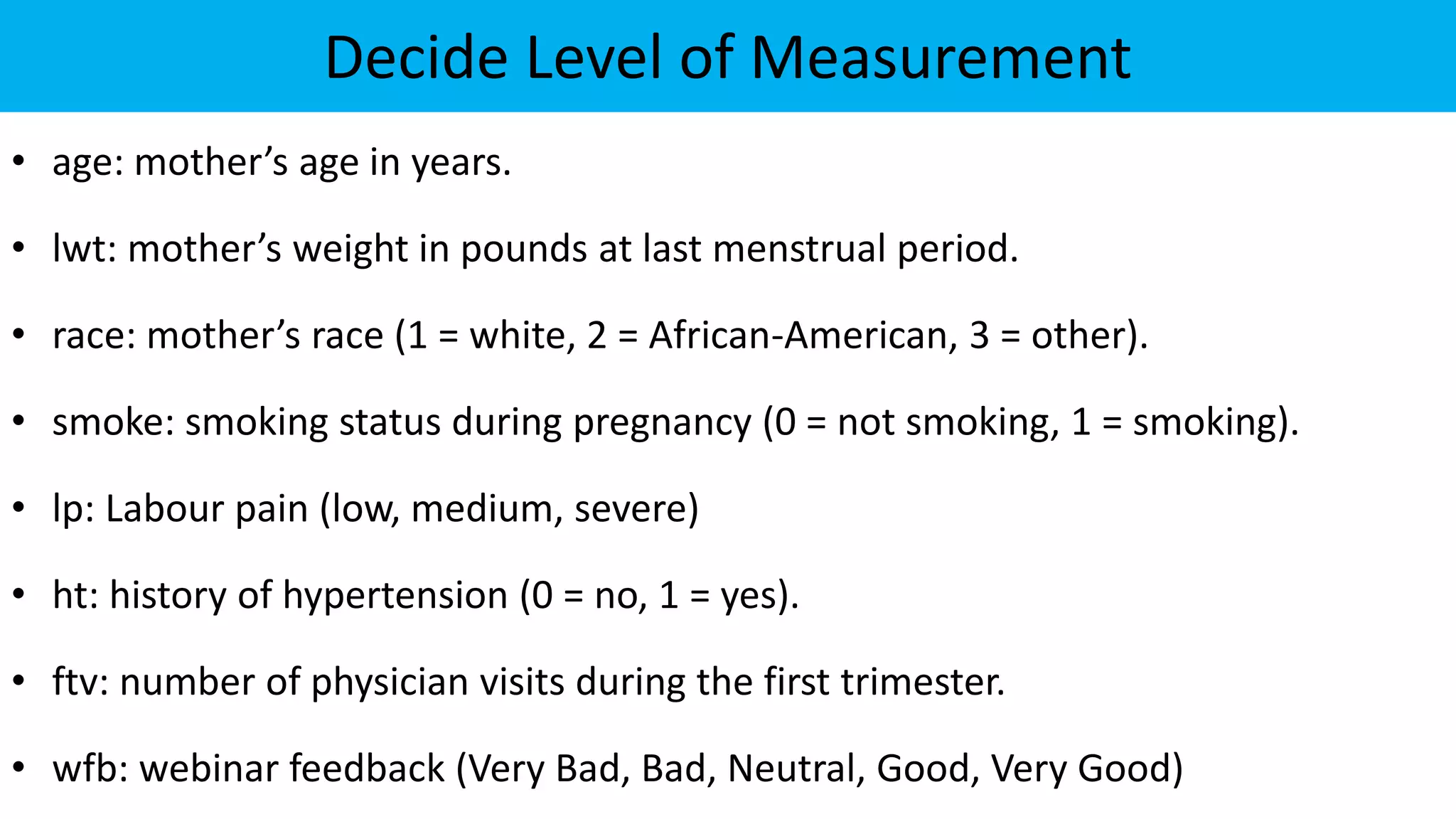
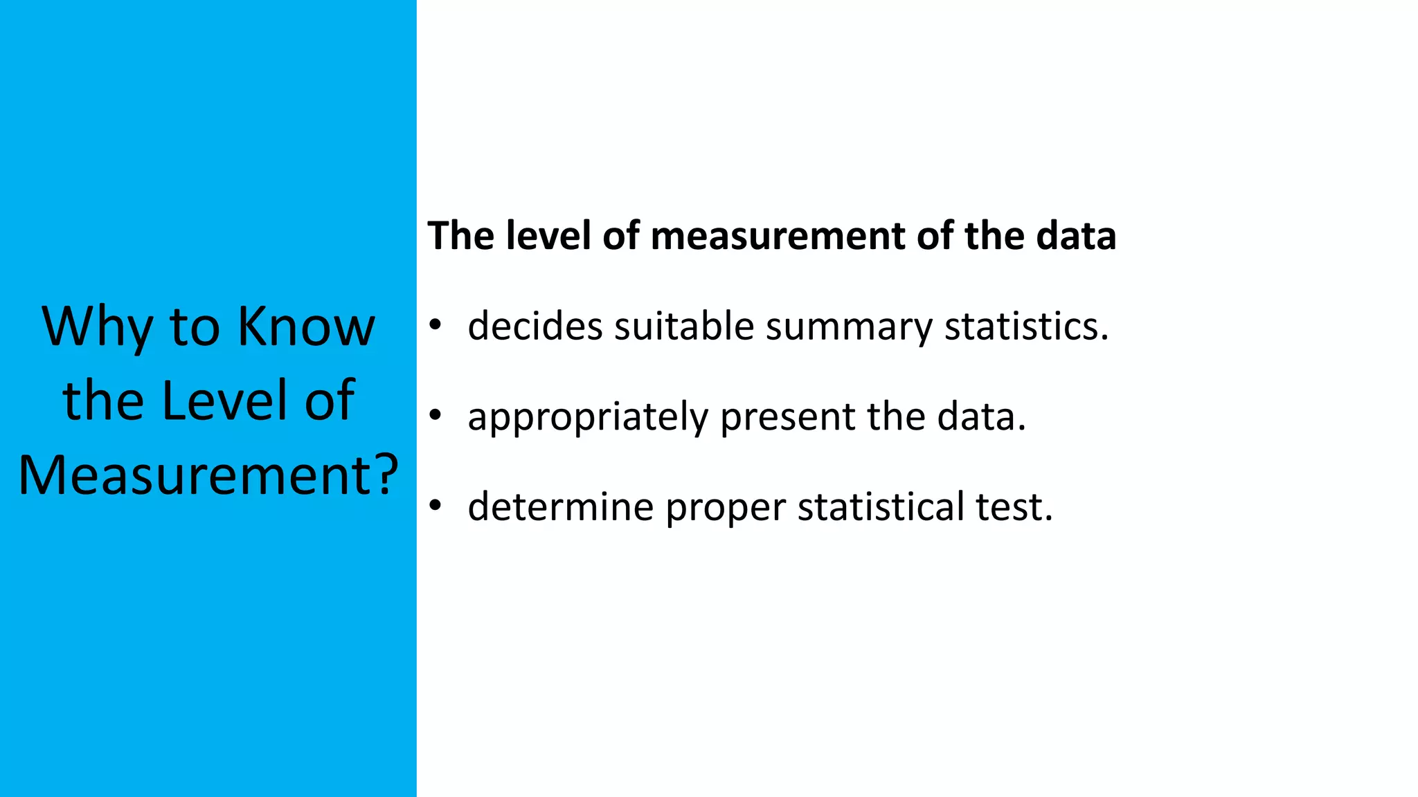
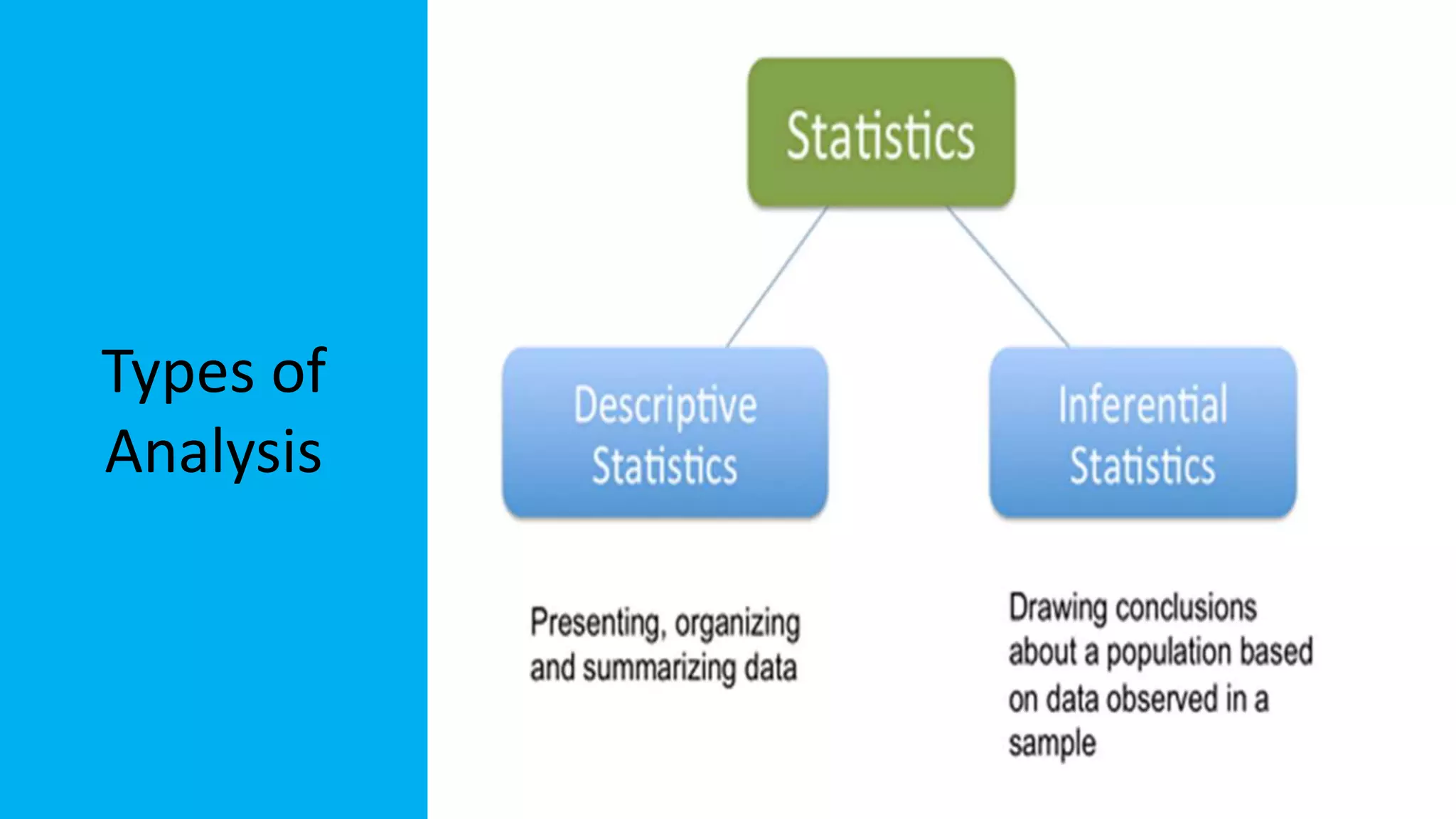
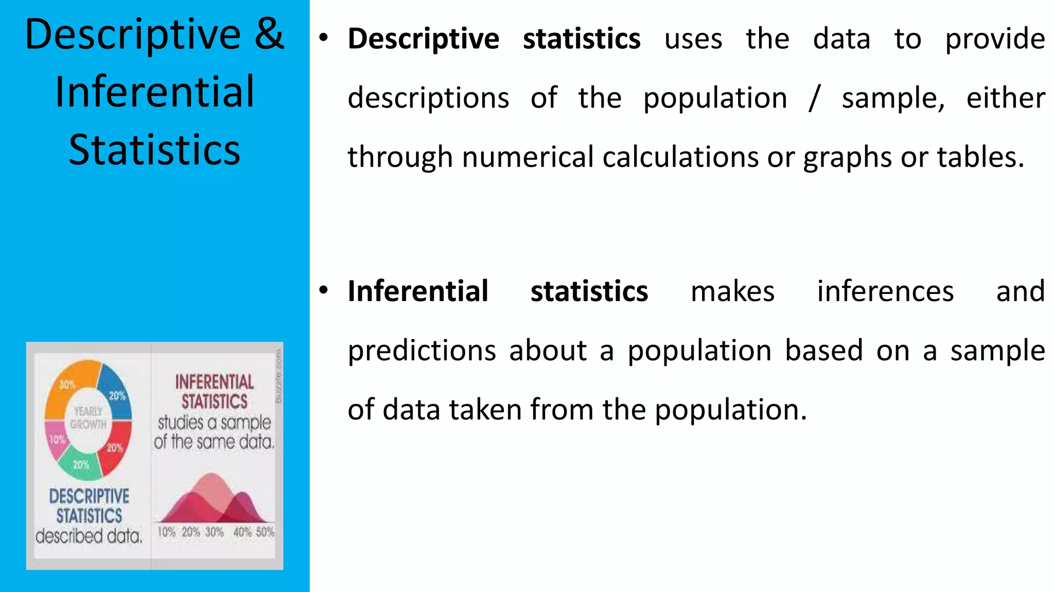
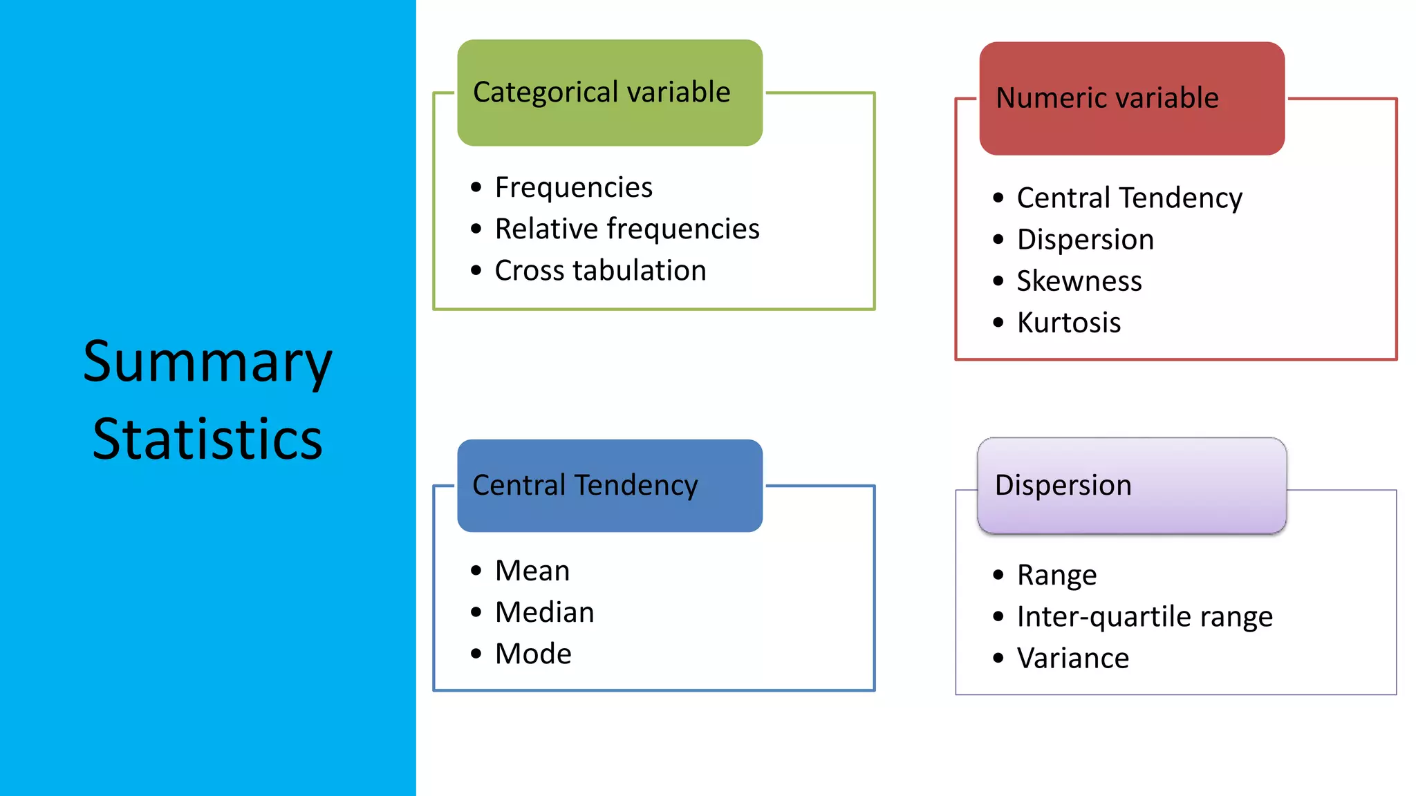
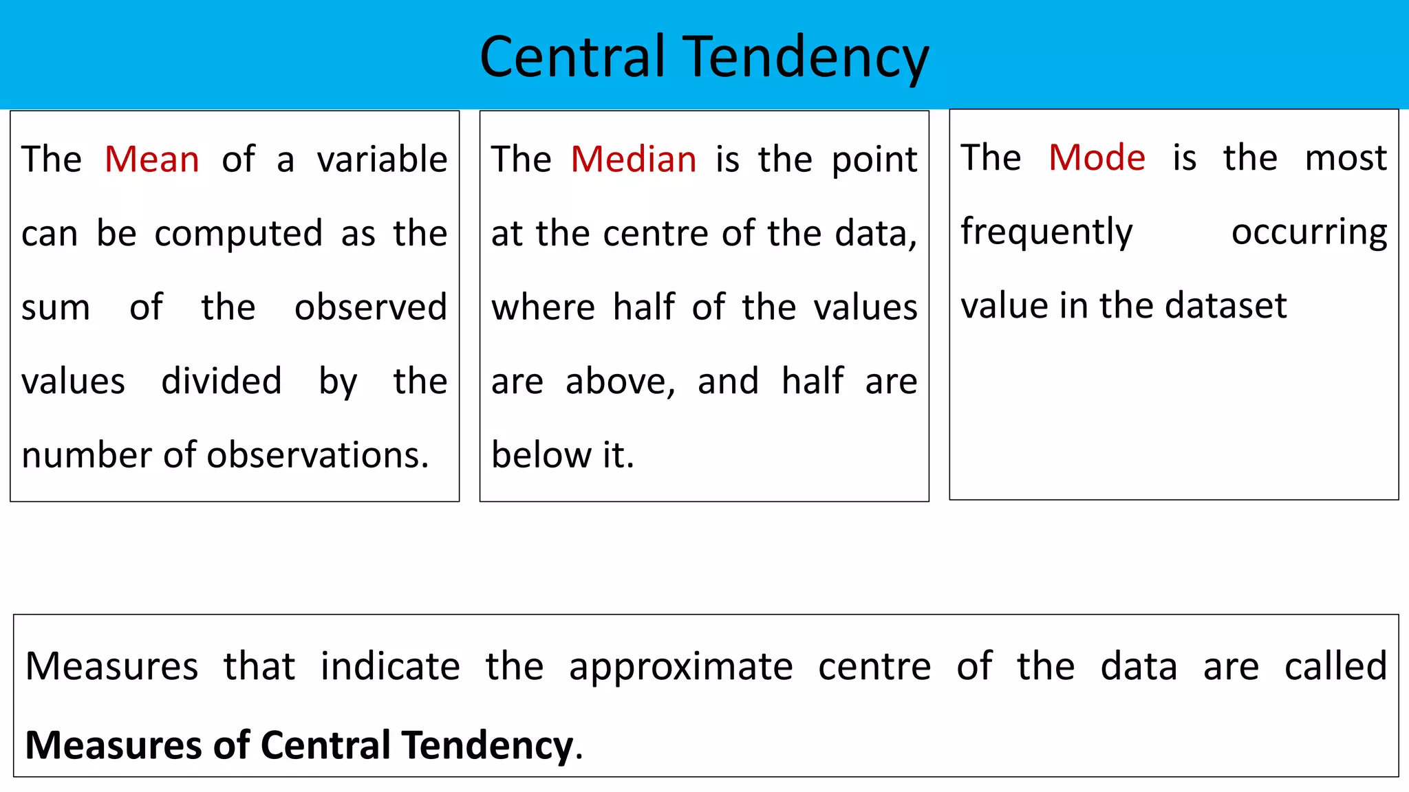
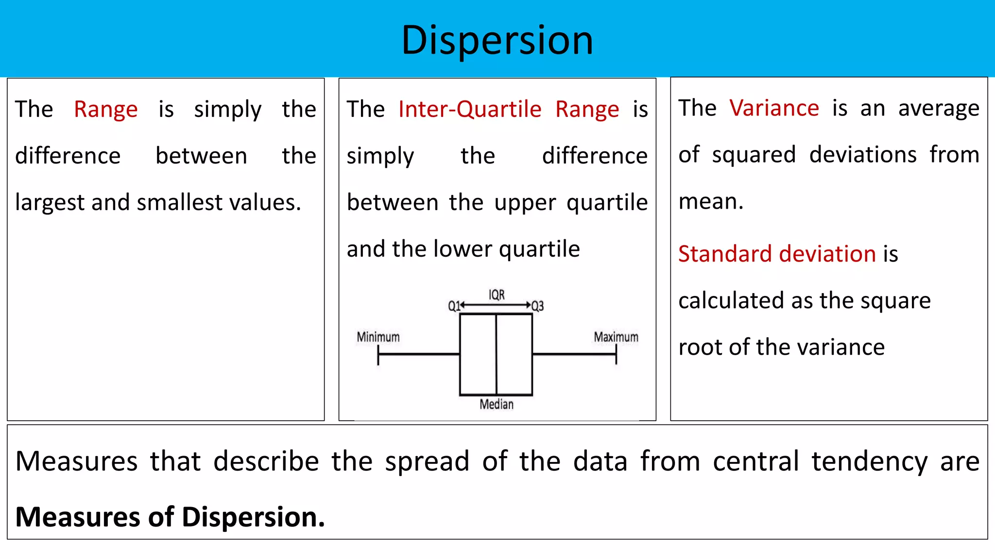
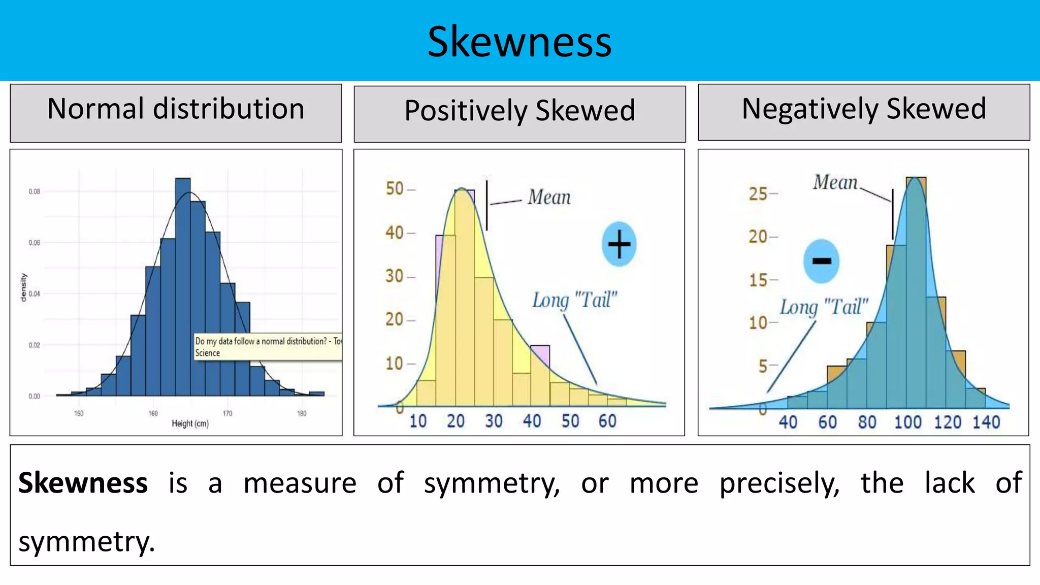
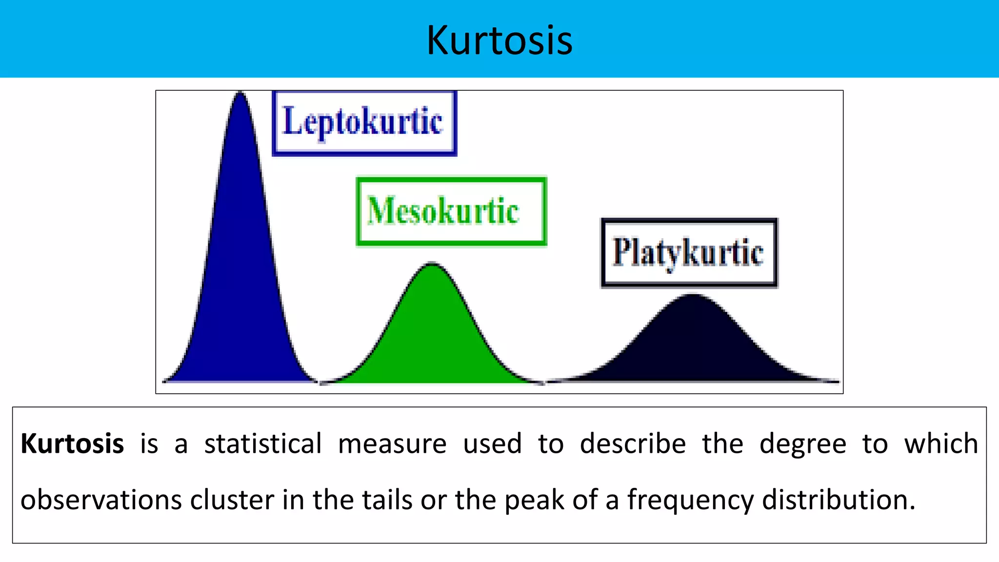
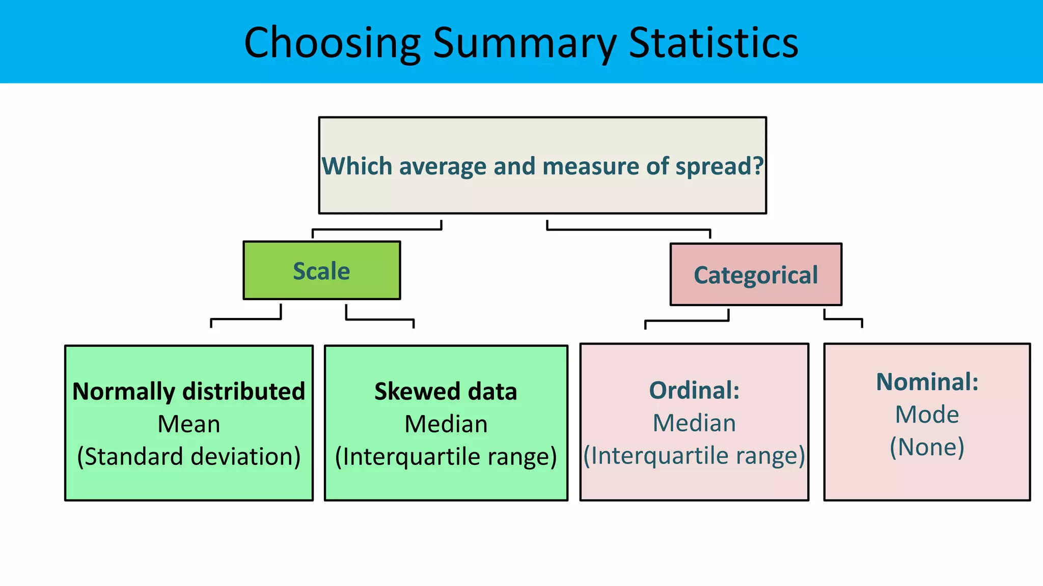
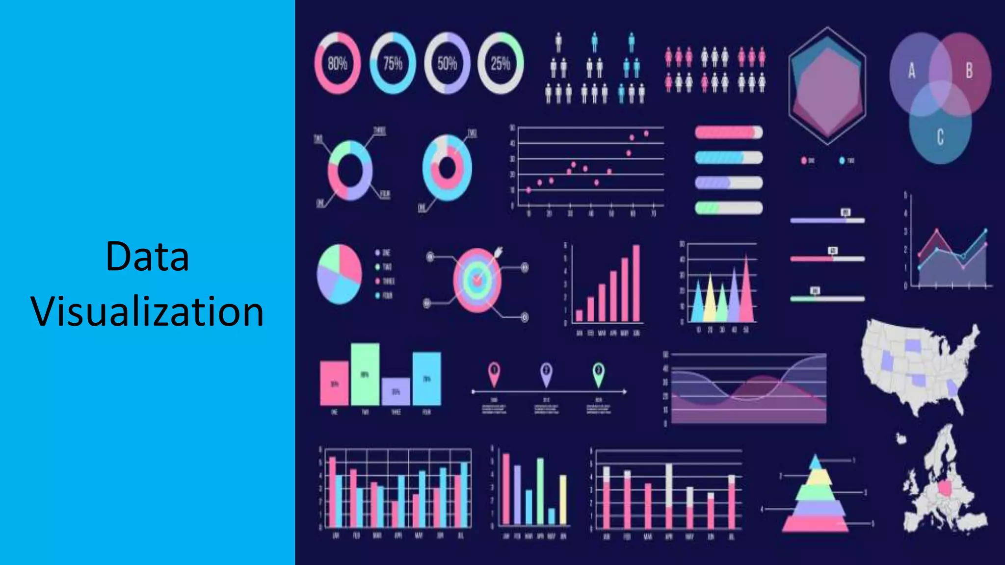
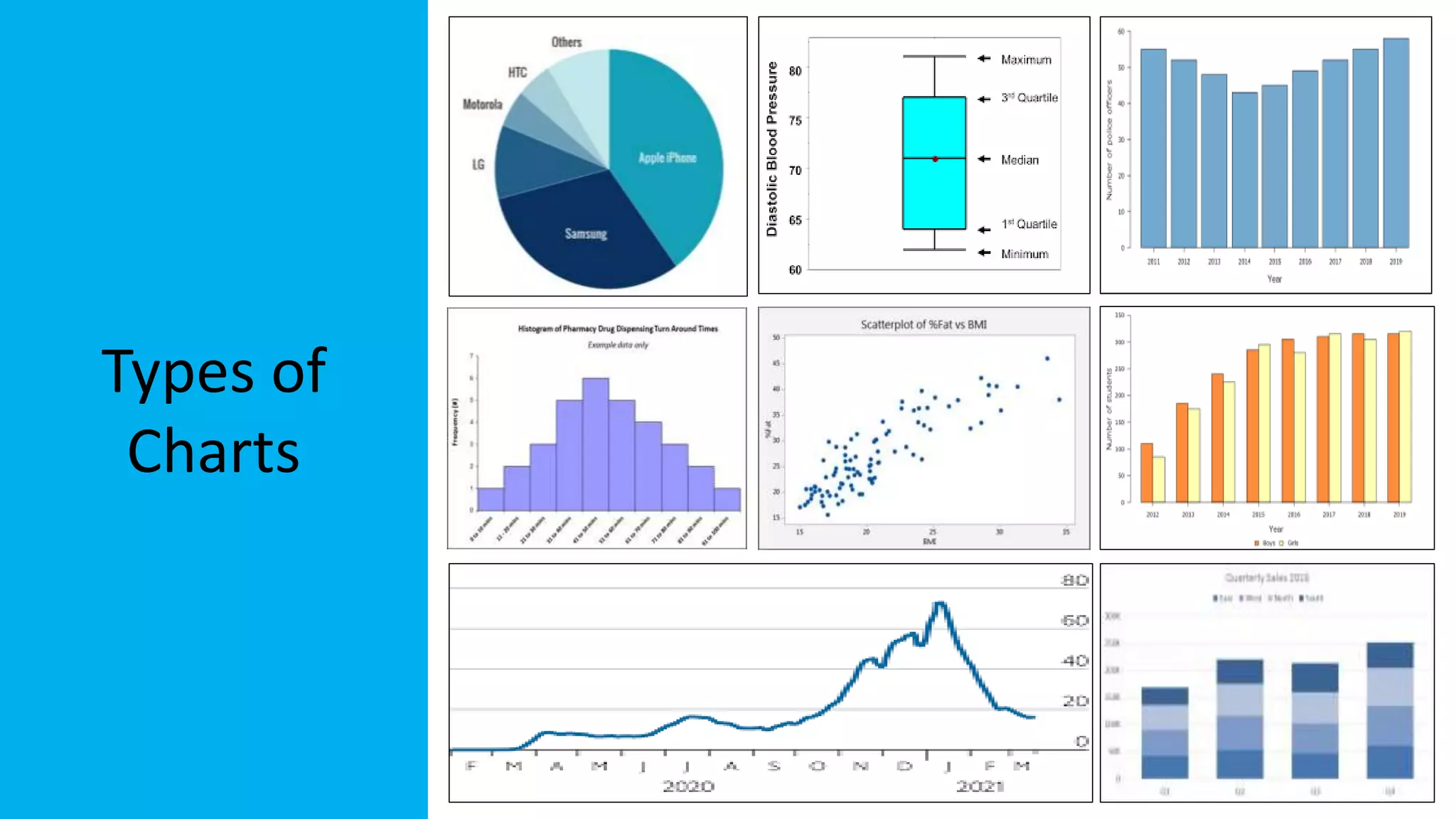
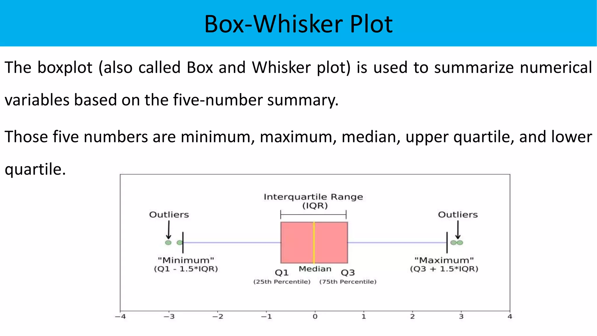
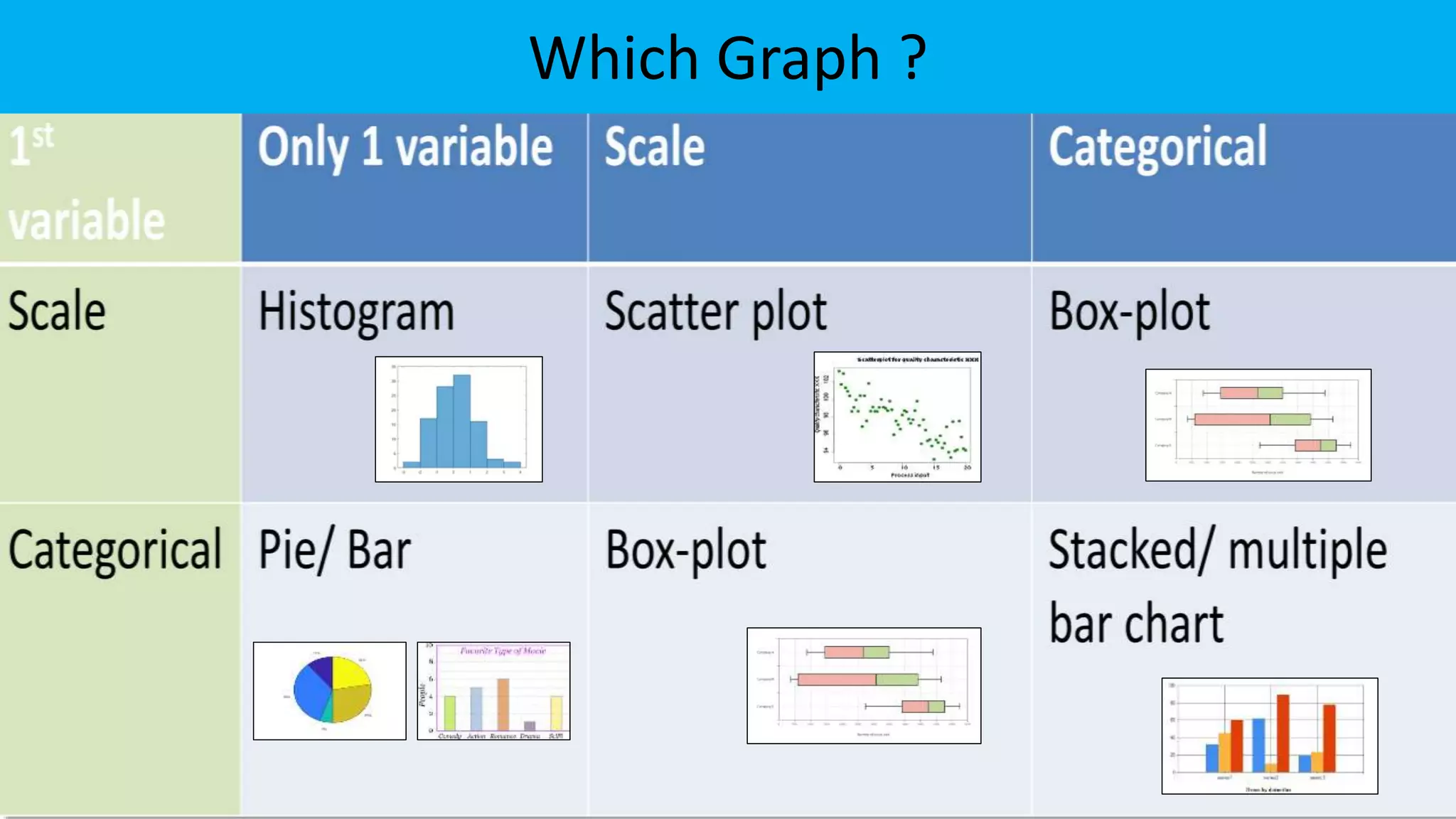
EXPLORATORY DATA ANALYSIS
for
BIOTECHNOLOGY
&
PHARMACEUTICAL SCIENCES
Dr Parag Shah | M.Sc., M.Phil., Ph.D. ( Statistics)
pbshah@hlcollege.edu
www.paragstatistics.wordpress.com
DATA TYPES &
EXPLORATORY
DATA ANALYSIS
DATA
Which of the following is Data ?
452367
India is the second second-most populous country, the seventh-
largest country by land area, and the most populous
democracy in the world.
What is Data ?
Data is a collection of facts or information from which
conclusions may be drawn.
Types of Data
Qualitative or Attribute data - the characteristic
being studied is nonnumeric.
E.g.: Gender, religious affiliation, state of birth,
condition of patient, words, images, videos.
Quantitative data - the characteristic being studied is
numeric
E.g.: time (in seconds) for 400 mts race, age of corona
patient, no. of WBC in blood sample.
Quantitative
Data
Discrete variables: can only assume certain values
E.g.: no. of pregnancies, no. of missing teeth in children of a
school, no. of visits made by doctor ,the number of
goals in a football match, the number of wickets by a
bowler in a cricket match.
Continuous variable can assume any value within a
specified range.
E.g.: the height of an athlete or the weight of a boxer, skull
circumference, diastolic blood pressure, serum-
cholesterol.
Types of
Variables
Levels
of
Measurements
• Nominal
• Ordinal
Categorical
• Interval
• Ratio
Scale
Nominal-Level Data
Properties:
• Observations of a qualitative variable
can only be classified and counted.
• There is no particular order to the
labels.
• It is true for two operators = and ≠
E.g. Blood group, Marital status, Eye
colour, Gender, Religion
Favorite
beverage
Blood
Group
A
24%
B
31%
AB
6%
O
39%
Ordinal-Level Data
Properties:
• Data classifications are represented by
sets of labels or names (high, medium,
low) that have relative values.
• Because of the relative values, the data
classified can be ranked or ordered.
• It is true for operators =, ≠, >,≥, <, ≤
E.g. Stage of disease, Severity of pain, level of
satisfaction, Likert scale
Interval-Level Data
Properties:
• Data classifications are ordered
according to the amount of the
characteristic they possess.
• Equal differences in the characteristic
are represented by equal differences in
the measurements.
• It is true for operators =, ≠, >,≥, <, ≤ ,+, -
E.g. Temperature , SAT score, Shoe size, Dress Size,
distance from landmark, geographical coordinates(
longitudes, latitudes)
Dress Size
Ratio-Level Data
Properties:
• Data classifications are ordered according to the amount of the
characteristics they possess.
• Equal differences in the characteristic are represented by equal differences
in the numbers assigned to the classifications.
• The zero point is the absence of the characteristic and the ratio between
two numbers is meaningful.
• It is true for operators =, ≠, >,≥, <, ≤ ,+, -, ×, ÷
E.g. Head circumference, Time until death, weight, Kelvin temperature
Levels of
Measurements
Levels of
Measurements
Decide Level of Measurement
• age: mother’s age in years.
• lwt: mother’s weight in pounds at last menstrual period.
• race: mother’s race (1 = white, 2 = African-American, 3 = other).
• smoke: smoking status during pregnancy (0 = not smoking, 1 = smoking).
• lp: Labour pain (low, medium, severe)
• ht: history of hypertension (0 = no, 1 = yes).
• ftv: number of physician visits during the first trimester.
• wfb: webinar feedback (Very Bad, Bad, Neutral, Good, Very Good)
Why to Know
the Level of
Measurement?
The level of measurement of the data
• decides suitable summary statistics.
• appropriately present the data.
• determine proper statistical test.
Types of
Analysis
Descriptive &
Inferential
Statistics
• Descriptive statistics uses the data to provide
descriptions of the population / sample, either
through numerical calculations or graphs or tables.
• Inferential statistics makes inferences and
predictions about a population based on a sample
of data taken from the population.
Descriptive
Statistics
Summary
Statistics
• Frequencies
• Relative frequencies
• Cross tabulation
Categorical variable
• Central Tendency
• Dispersion
• Skewness
• Kurtosis
Numeric variable
• Mean
• Median
• Mode
Central Tendency
• Range
• Inter-quartile range
• Variance
Dispersion
Central Tendency
The Mean of a variable
can be computed as the
sum of the observed
values divided by the
number of observations.
The Median is the point
at the centre of the data,
where half of the values
are above, and half are
below it.
The Mode is the most
frequently occurring
value in the dataset
Measures that indicate the approximate centre of the data are called
Measures of Central Tendency.
Dispersion
The Range is simply the
difference between the
largest and smallest values.
The Inter-Quartile Range is
simply the difference
between the upper quartile
and the lower quartile
The Variance is an average
of squared deviations from
mean.
Standard deviation is
calculated as the square
root of the variance
Measures that describe the spread of the data from central tendency are
Measures of Dispersion.
Skewness
Normal distribution Positively Skewed Negatively Skewed
Skewness is a measure of symmetry, or more precisely, the lack of
symmetry.
Kurtosis
Kurtosis is a statistical measure used to describe the degree to which
observations cluster in the tails or the peak of a frequency distribution.
Choosing Summary Statistics
Which average and measure of spread?
Scale
Normally distributed
Mean
(Standard deviation)
Skewed data
Median
(Interquartile range)
Categorical
Ordinal:
Median
(Interquartile range)
Nominal:
Mode
(None)
Data
Visualization
Types of
Charts
Pie Chart
The pie (circle) represents 100% of the variable and is divided into sectors.
The area of each sector represents the frequency of each category in the
variable it represents.
Bar Chart
Bar graphs are more
commonly used to
represent categorical
variables. It can be
vertical or horizontal
graphs and can show
the frequency or the
percentage of each
category.
Histogram
It is similar to the bar chart, but
there are no gaps between the
bars as the variable is continuous.
The width of each bar of the
histogram relates to a range of
values for the variable, but in
most cases, the width is kept the
same.
Scatter Diagram
If we have two variables that are
numerical, the relationship between
them can be illustrated using a scatter
diagram.
It plots one variable against the other in
a two-way diagram. One variable is
represented on the horizontal axis and
the other is plotted on the vertical axis
with each dot representing one case.
Box-Whisker Plot
The boxplot (also called Box and Whisker plot) is used to summarize numerical
variables based on the five-number summary.
Those five numbers are minimum, maximum, median, upper quartile, and lower
quartile.
Which Graph ?

Exploratory Data Analysis for Biotechnology and Pharmaceutical Sciences

  • 1.
    EXPLORATORY DATA ANALYSIS for BIOTECHNOLOGY & PHARMACEUTICALSCIENCES Dr Parag Shah | M.Sc., M.Phil., Ph.D. ( Statistics) pbshah@hlcollege.edu www.paragstatistics.wordpress.com
  • 2.
  • 3.
  • 4.
    Which of thefollowing is Data ? 452367 India is the second second-most populous country, the seventh- largest country by land area, and the most populous democracy in the world.
  • 5.
    What is Data? Data is a collection of facts or information from which conclusions may be drawn.
  • 6.
    Types of Data Qualitativeor Attribute data - the characteristic being studied is nonnumeric. E.g.: Gender, religious affiliation, state of birth, condition of patient, words, images, videos. Quantitative data - the characteristic being studied is numeric E.g.: time (in seconds) for 400 mts race, age of corona patient, no. of WBC in blood sample.
  • 7.
    Quantitative Data Discrete variables: canonly assume certain values E.g.: no. of pregnancies, no. of missing teeth in children of a school, no. of visits made by doctor ,the number of goals in a football match, the number of wickets by a bowler in a cricket match. Continuous variable can assume any value within a specified range. E.g.: the height of an athlete or the weight of a boxer, skull circumference, diastolic blood pressure, serum- cholesterol.
  • 8.
  • 9.
  • 10.
    Nominal-Level Data Properties: • Observationsof a qualitative variable can only be classified and counted. • There is no particular order to the labels. • It is true for two operators = and ≠ E.g. Blood group, Marital status, Eye colour, Gender, Religion Favorite beverage Blood Group A 24% B 31% AB 6% O 39%
  • 11.
    Ordinal-Level Data Properties: • Dataclassifications are represented by sets of labels or names (high, medium, low) that have relative values. • Because of the relative values, the data classified can be ranked or ordered. • It is true for operators =, ≠, >,≥, <, ≤ E.g. Stage of disease, Severity of pain, level of satisfaction, Likert scale
  • 12.
    Interval-Level Data Properties: • Dataclassifications are ordered according to the amount of the characteristic they possess. • Equal differences in the characteristic are represented by equal differences in the measurements. • It is true for operators =, ≠, >,≥, <, ≤ ,+, - E.g. Temperature , SAT score, Shoe size, Dress Size, distance from landmark, geographical coordinates( longitudes, latitudes) Dress Size
  • 13.
    Ratio-Level Data Properties: • Dataclassifications are ordered according to the amount of the characteristics they possess. • Equal differences in the characteristic are represented by equal differences in the numbers assigned to the classifications. • The zero point is the absence of the characteristic and the ratio between two numbers is meaningful. • It is true for operators =, ≠, >,≥, <, ≤ ,+, -, ×, ÷ E.g. Head circumference, Time until death, weight, Kelvin temperature
  • 14.
  • 15.
  • 16.
    Decide Level ofMeasurement • age: mother’s age in years. • lwt: mother’s weight in pounds at last menstrual period. • race: mother’s race (1 = white, 2 = African-American, 3 = other). • smoke: smoking status during pregnancy (0 = not smoking, 1 = smoking). • lp: Labour pain (low, medium, severe) • ht: history of hypertension (0 = no, 1 = yes). • ftv: number of physician visits during the first trimester. • wfb: webinar feedback (Very Bad, Bad, Neutral, Good, Very Good)
  • 17.
    Why to Know theLevel of Measurement? The level of measurement of the data • decides suitable summary statistics. • appropriately present the data. • determine proper statistical test.
  • 18.
  • 19.
    Descriptive & Inferential Statistics • Descriptivestatistics uses the data to provide descriptions of the population / sample, either through numerical calculations or graphs or tables. • Inferential statistics makes inferences and predictions about a population based on a sample of data taken from the population.
  • 20.
  • 21.
    Summary Statistics • Frequencies • Relativefrequencies • Cross tabulation Categorical variable • Central Tendency • Dispersion • Skewness • Kurtosis Numeric variable • Mean • Median • Mode Central Tendency • Range • Inter-quartile range • Variance Dispersion
  • 22.
    Central Tendency The Meanof a variable can be computed as the sum of the observed values divided by the number of observations. The Median is the point at the centre of the data, where half of the values are above, and half are below it. The Mode is the most frequently occurring value in the dataset Measures that indicate the approximate centre of the data are called Measures of Central Tendency.
  • 23.
    Dispersion The Range issimply the difference between the largest and smallest values. The Inter-Quartile Range is simply the difference between the upper quartile and the lower quartile The Variance is an average of squared deviations from mean. Standard deviation is calculated as the square root of the variance Measures that describe the spread of the data from central tendency are Measures of Dispersion.
  • 24.
    Skewness Normal distribution PositivelySkewed Negatively Skewed Skewness is a measure of symmetry, or more precisely, the lack of symmetry.
  • 25.
    Kurtosis Kurtosis is astatistical measure used to describe the degree to which observations cluster in the tails or the peak of a frequency distribution.
  • 26.
    Choosing Summary Statistics Whichaverage and measure of spread? Scale Normally distributed Mean (Standard deviation) Skewed data Median (Interquartile range) Categorical Ordinal: Median (Interquartile range) Nominal: Mode (None)
  • 27.
  • 28.
  • 29.
    Pie Chart The pie(circle) represents 100% of the variable and is divided into sectors. The area of each sector represents the frequency of each category in the variable it represents.
  • 30.
    Bar Chart Bar graphsare more commonly used to represent categorical variables. It can be vertical or horizontal graphs and can show the frequency or the percentage of each category.
  • 31.
    Histogram It is similarto the bar chart, but there are no gaps between the bars as the variable is continuous. The width of each bar of the histogram relates to a range of values for the variable, but in most cases, the width is kept the same.
  • 32.
    Scatter Diagram If wehave two variables that are numerical, the relationship between them can be illustrated using a scatter diagram. It plots one variable against the other in a two-way diagram. One variable is represented on the horizontal axis and the other is plotted on the vertical axis with each dot representing one case.
  • 33.
    Box-Whisker Plot The boxplot(also called Box and Whisker plot) is used to summarize numerical variables based on the five-number summary. Those five numbers are minimum, maximum, median, upper quartile, and lower quartile.
  • 34.