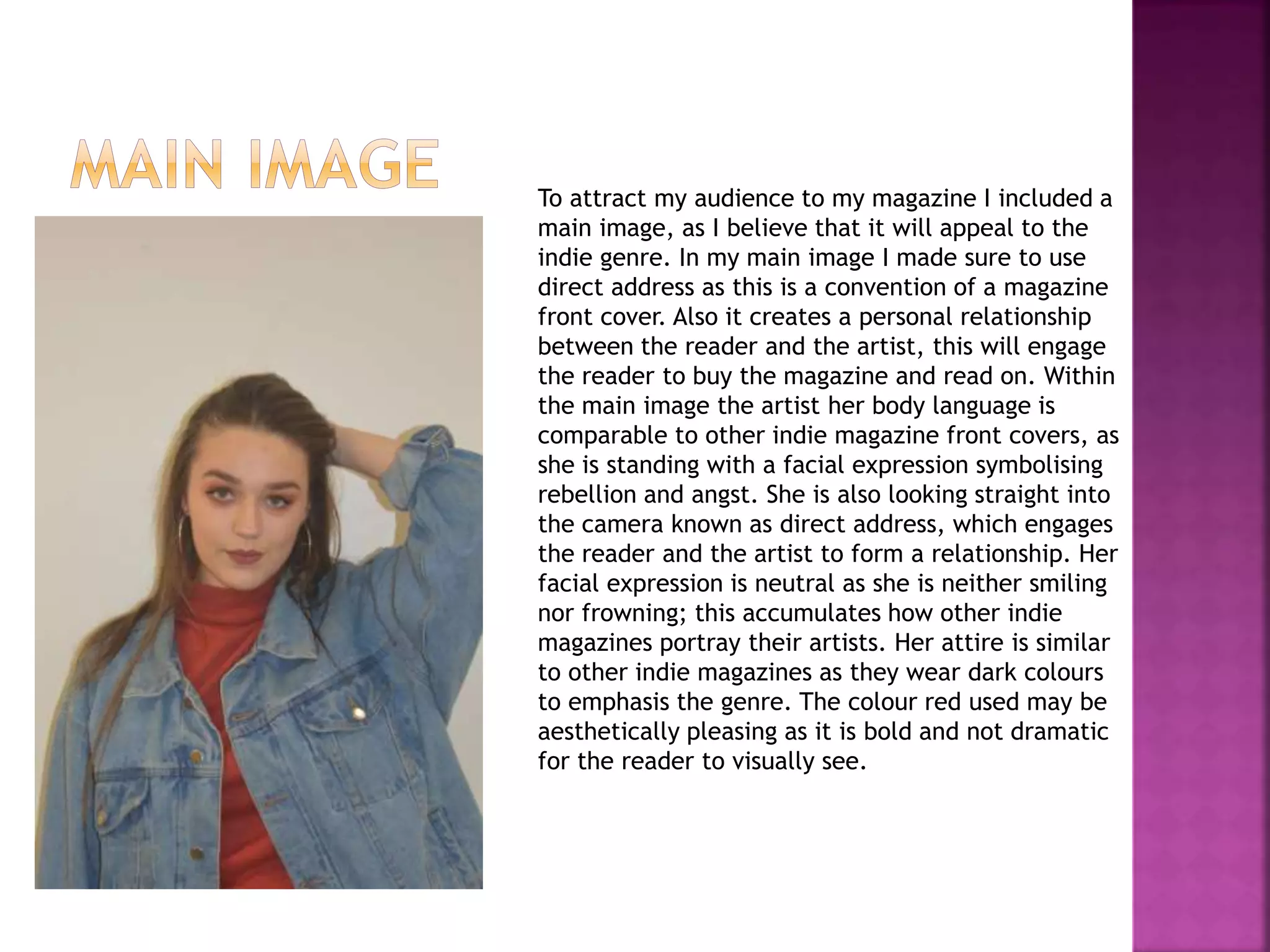
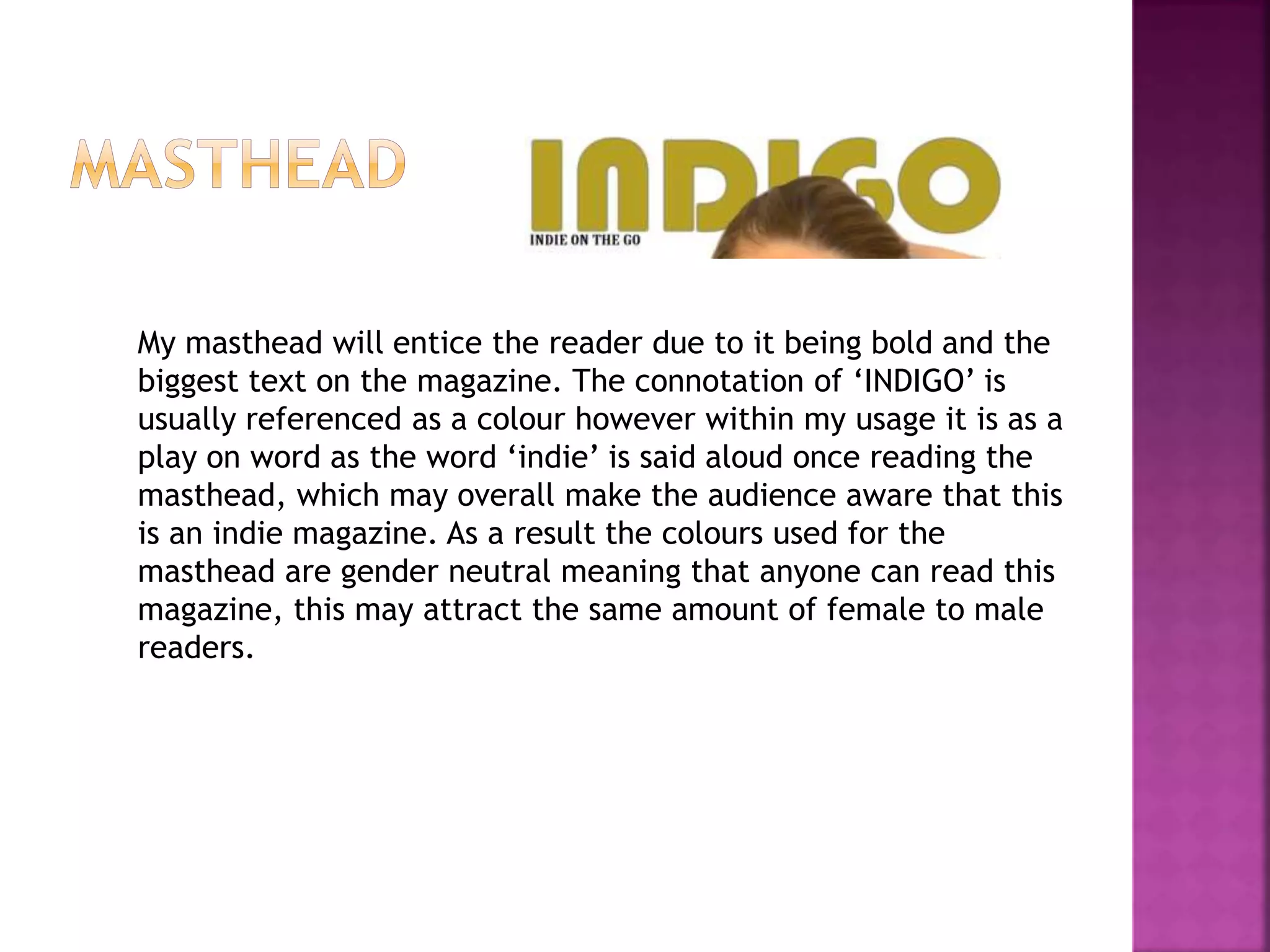
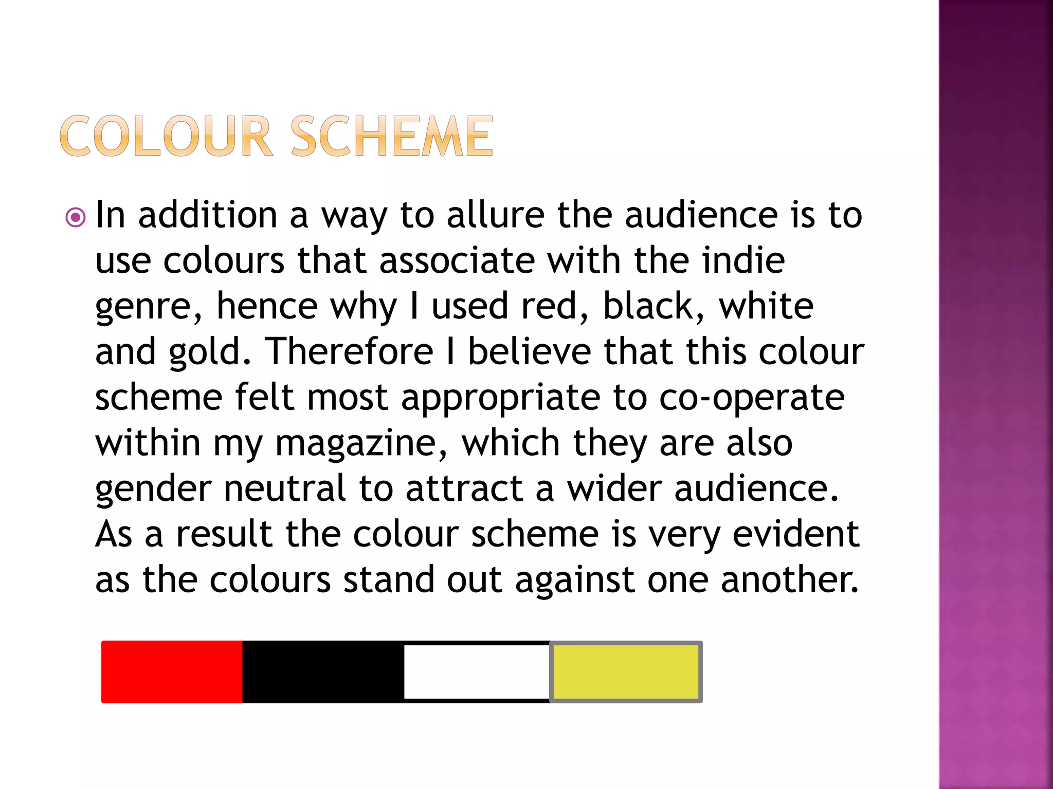
The document discusses the design choices made for various elements of an indie magazine, including the front cover, masthead, coverlines, contents page, and double page spread. For the front cover, direct address is used in the main image to create a personal relationship with the reader. The masthead "INDIGO" is intended as a play on words for "indie" to signal the genre. The coverlines and contents page include band images and articles to attract fans. Color schemes throughout appeal to the indie genre and use gender-neutral tones.