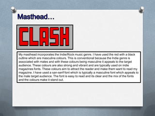
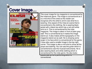
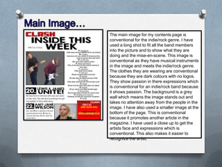
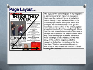
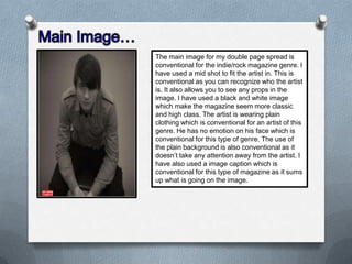
The document discusses the conventions used in the design of an indie/rock music magazine. It summarizes the conventions used for various design elements including the masthead, cover images, layouts of the front cover, contents page, and double page spread. Conventions discussed include using masculine colors like red and black, sans-serif fonts, mid-shot portraits of artists, and route-of-the-eye layouts that make elements easy to navigate. Pull quotes, headlines, and images are placed in conventional locations to guide the reader's eye through the pages.