The document summarizes the key design elements of a magazine front cover, contents page, and double page spread for an indie/rock music magazine. For the front cover, conventions like the masthead, date, issue number, and main cover image were used along with a red, black, white, and gold color scheme associated with indie/rock magazines. The contents page drew inspiration from NME magazine and used pictures and numbers creatively across the page to display content listings. For the double page spread, conventional elements like images, pull quotes, column writing, and bold text were implemented, and creative backgrounds like Polaroid and puzzle piece templates were incorporated.
This is our first evaluation question, answering "In what way does your media product use, develop or challenge forms and conventions of real media products"
This is our first evaluation question, answering "In what way does your media product use, develop or challenge forms and conventions of real media products"
síla duchovní energie - zdroj akce, úspěchu a dosažení cílů, byznys spirit - bezduché značky nemohou slavit úspěch, léto je tu - máte ho i ve svém interiéru?
MyVideoTalk Mauritius Compensation planHome Business
MyVideoTalk Compensation Plan for Mauritius. Learn how MyVideoTalk gives you the opportunity to set up your own home based business. Work from home. Invite people with similar goals and personality traits to join your network.
The Rationale for Continuous Delivery (The culture and practice of good softw...C4Media
Video and slides synchronized, mp3 and slide download available at URL http://bit.ly/1Ff5T3D.
Dave Farley discusses the problems raised by inefficient processes creating poor quality output, too late to capitalise on the expected business value, and proposes solutions to them. Filmed at qconlondon.com.
Dave Farley is a thought-leader in the field of Continuous Delivery, DevOps and Software Development in general. He is co-author of the Jolt-award winning book 'Continuous Delivery', a regular conference speaker, blogger and a contributor to the Reactive Manifesto.
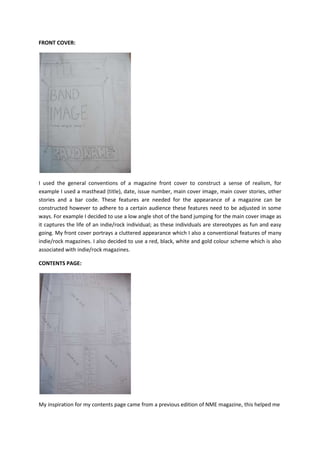
1. FRONT COVER:
I used the general conventions of a magazine front cover to construct a sense of realism, for
example I used a masthead (title), date, issue number, main cover image, main cover stories, other
stories and a bar code. These features are needed for the appearance of a magazine can be
constructed however to adhere to a certain audience these features need to be adjusted in some
ways. For example I decided to use a low angle shot of the band jumping for the main cover image as
it captures the life of an indie/rock individual; as these individuals are stereotypes as fun and easy
going. My front cover portrays a cluttered appearance which I also a conventional features of many
indie/rock magazines. I also decided to use a red, black, white and gold colour scheme which is also
associated with indie/rock magazines.
CONTENTS PAGE:
My inspiration for my contents page came from a previous edition of NME magazine, this helped me
2. Adjust my contents page to the style of an indie/rock music magazine. The contents page does not
follow the conventional concept of a list of numbers labelling the information however it takes a
more creative perspective on things and uses the entire page and uses pictures and numbers to
display the information which is featuring in the magazine. I followed the colour scheme from the
front cover onto the contents page as this is conventional, it also keeps consistency. I labelled the
top of the page with ‘This Week’s News’, this is a conventional feature in which NME use therefore
addressing the features of an indie/rock magazine however it also allows the reader to know this is
the contents page.
DOUBLE PAGE SPREAD:
I followed the conventional features of a double page spread by using images, pull quotes, writing
my story in columns, story headline and putting names or important information in bold. I also tried
to be as creative as I could by using Polaroid templates for the background for some of my pictures. I
also used puzzle pieces as a background for some of my pull-quotes. I thought this was creative yet
also symbolic for aspiring young artists/musicians as those careers are like climbing up a ladder, like
reaching to the top you have to few the bigger picture, and all the little shows piece together for
bigger recognition.